A typeface for the world: Adelle Sans Multiscript

July 2021

Nearly a decade after Adelle Sans Latin was first published, we are proud to share with you our even-more-expanded multiscript Adelle Sans family. Designed through the joint effort of now three dozen experts, Adelle Sans supports eleven writing systems and over 400 languages, making it the go-to typeface for international brands and products in the digital and physical world. We are excited to invite you — again — to see the unparalleled global reach of our multiscript Adelle Sans family.

Adelle Sans multiscript


Together with its slab-seriffed and monospaced siblings, Adelle Sans provides the tools and flexibility to create the most demanding interfaces and complex typographic layouts, all while offering a friendly personality and exceptional readability on screens. In its latest edition, it has been equipped with a suite of icons designed specifically for electronic publications. Adelle Sans is the ideal typeface for global brands and products, thanks to its unparalleled script and language repertoire. The Latin has pan-European, pan-African, and Vietnamese support, covering over 400 languages. In addition, designers from around the world have come together to create Arabic, Armenian, Chinese, Cyrillic, Devanagari, Greek, and Thai counterparts of Adelle Sans. This month will see the release of Georgian, Hebrew, and Lao versions, with Bengali currently under development.


Defining sans serifs

Dr Gerard Unger once said, “Sans serifs are delicate things.” This may seem a puzzling statement, even an oxymoron, from the perspective of a reader or a graphic designer — and he was both a book lover and a very successful designer himself. As a type user it is more natural to define sans serifs differently: they may look sturdy, serious, mechanical, or, in the worst cases, even neutral. But Dr Unger was seeing things through a type designer’s loupe, and he was merely explaining the enormous level of precision and careful adjustment these typefaces entail.

By now in history it is clear that the generic categories “serif” and “sans” are simultaneously limiting and vague. First, there is a wide range of typefaces that fall well outside these two groups. But more importantly, these terms are insufficient to describe any typefaces that do fall inside.

The historic or formal classification systems like Thibodeaux’s or Vox’s got into some level of detail to describe serif typefaces by the shape and size of serifs, stress angle, and amount of stroke contrast, and coined terms we still use today like Garalde, Didone, or Transitional. They failed, among other things, to do the same for sans serif styles.

Part of the problem is likely in the descriptor itself. “Sans serif” is telling us what the font is not (without serifs) rather what it is. It does not say anything about its construction, its vertical or horizontal proportions, the speed of the strokes, and their subtle contrast. It also fails to say much about its personality, the tone and volume with which it talks to the reader, its recognizable glyphs, or its cultural, historical, and morphological connections.


First draft of Adelle Sans, originally named Calandra. Screenshot taken from Fontlab, shared in Flickr (2011).


The first use of the “sans” suffix in font naming that comes to mind is Eric Gill’s design, but it really became necessary in the digital era, when type foundries started creating super families to improve their commercial sales based on successful franchises. Take a successful serif typeface, chop off the serifs, and make a wide range of sans weights to capitalise on the established name. This is a reasonable and expected evolution in Latin font design, but experienced type designers know that simply removing serifs is not enough to justify great design.


On the heels of our popular Adelle family, released in 2009, we began work on a new and independent sans serif family we named Calandra. We wanted it to be a suitable companion to Adelle, which was a common request from our clients back then, but we knew simply severing Adelle’s slabs was not the right way of handling its creation. Adelle was very popular at that time, so naming this new family Adelle Sans made sense commercially. We knew it needed to bring something fresh, exciting, and timeless to our retail library — it had to be a novel design and a successful font in its own right.

From TypeTogether’s perspective, successful font matching requires some level of tension between the different styles, which is impossible to accomplish with typefaces that mimic each other too much. (Read our font matching article to learn more.) We decided that Adelle (slab) needed a warm and welcoming partner and thus we leaned toward grotesque styles from late 19th century for inspiration.

Rather than re-interpreting the cold neo-grot style (Helvetica, again), we set out to infuse Adelle Sans with some personality and humanist traits that would feel approachable. Thus the sans would pick up on the organic features of the slab, share its vertical proportions and stroke balance, but have its own voice.

We released Adelle in 2009 and its sans serif counterpart followed in 2012. Both type families were very successfully implemented in intensive editorial applications such as magazines and newspapers, sometimes together and sometimes solo. But it was Adelle Sans that would take a leading role as TypeTogether committed fully to multiscript support for corporate and institutional localisation.


Adelle and Adelle Sans were boldly used by César Sesio in the promotional material of Móvil, an Argentinian art-focused non-profit and non-commercial organisation based in Buenos Aires, Argentina. Photographs courtesy of Santiago Porter.


In 2014 the Swiss labor union SIT redesigned its paper, Sit-info, using a combination of Adelle and Adelle Sans, and they have used them ever since, as can be seen in the latest issue.


A wide and diverse world

As we explored the possibilities with Adelle Sans and added more scripts, it quickly became clear that Adelle Sans was more than an editorial asset, the pal to the leading role; it was itself able to capture the limelight. In fact, it was the designers and developers using it who saw it as a broader communications tool, implementing it for corporate identity programs and digital user interfaces among other wide-ranging uses. Fortunately, our own interests in complex scripts and global typography matched to perfection the requirements from our customers. The world was rapidly shrinking and they needed fonts that could speak many languages.

This is, of course, easier said than done.


Adelle Sans Multiscript


There are two initiatives by the Summer Institute of Linguistics (SIL) that help us understand how marvelous, complex, and diverse human communication is. The first one is Ethnologue, which puts the amount of languages in the world around 7000. A number that is shrinking quickly as many languages have less than 1000 speakers. From the typesetting point of view, only a percentage of these languages have a written form. The second SIL initiative is ScriptSource, a website that contains information about writing systems. It lists 272 scripts, with 148 of them currently in use.

A single writing system can be used for many languages. For example, Cyrillic is used for both Russian and Bulgarian while Arabic is used for Persian and Urdu. Some writing systems use the extension mechanisms of diacritical marks or additional signs to be able to support more languages. This is especially true with Latin which supports a good number of European languages with its basic character set, but requires extensive additions to support Vietnamese, Yoruba, or Dinka. (To read more about this, take a look at this article, where Filip Blasek  explains the peculiarities of typesetting in Latin-based languages).


A non-exhaustive list of Adelle Sans‘s language support in the 11 scripts.


ELEVEN writing systems

Adelle Sans currently supports 11 writing systems — 11 scripts covering several hundred languages — a number we hope to keep growing. We selected them based on our own interests and abilities, balanced against thinking about the world’s regions rather than its countries, always trying to reach as many speakers as possible.

For each of these writing systems we found and collaborated with linguists, consultants, and local designers who could make a correct cultural translation of Adelle Sans’s voice. The current credit list for collaborators on this project already includes 35 names. And here are some of their voices.


Liron Lavi Turkenich, designer of Adelle Sans Hebrew
“Designing a companion to an existing script is a delicate work of balance: harmonising with the Latin and other scripts while staying loyal to the writing system. Designing Hebrew tends to present a general challenge. Since the characters lean toward squareness, it is not an easy task to create forms that will give the round flexibility the Latin has without making the Hebrew cartoonish.”

Vera Evstafieva, designer of Adelle Sans Cyrillic:
“My personal impression of Adelle Sans is that it’s attractive with its compactness combined with the closed apertures, it is delicate by temperament and intonation but stands confidently on the baseline, catching the surface with curvy terminals.”


Pooja Saxena, designer of Adelle Sans Devanagari
“With its omnipresent headline, busier shapes, and opposite conventional angle of stress, Devanagari doesn’t make easy bedfellows with Latin. But through a common approach of balancing rationality with spiritedness, Adelle Sans came to harmonise the two scripts while staying true to itself. The extensive weight range is impressive, and its allows Devanagari text to quietly whisper or pack a real punch.”

Akaki Radmadze, designer of Adelle Sans Georgian:
“There are not many font families available for Georgian script, especially traditional grotesque typefaces loved by designers and users equally. Georgian characters for Adelle Sans are simultaneously natural and harmonious with the original Latin style. Combining the original characteristics as well as natural forms for additional scripts is quite challenging. Georgian characters have all these harmonious feelings in Adelle Sans and I am sure Georgian users will love to use the typeface.”


/resources/-2016/editorial/articles/2021_adelle-sans/2021_adelle-sans_10.jpg


Anuthin Wongsunkakon, designer of Adelle Sans Lao and Adelle Sans Thai
“Collaborating with TypeTogether is always a joy. It was like working with an old friend you know so well that you know what she needs before she even asks.”

Gor Jihanian, designer of Adelle Sans Armenian:
“The unique Armenian script stems from a long history of traditions, yet it cannot be easily defined within the Latin classification models of serif and sans serif — it is in this grey area that the updated Adelle Sans Armenian finds a new voice.”


Qiu Yin (FounderType), designer of FZ Lantinghei–Adelle Sans Chinese
“FZ Lantinghei’s design concept is consistent with Adelle Sans. There is more white space in characters, it is clear and lively, robust in structure, and has an even centre of gravity and typographic colour. Strokes are organic, concise, powerful, and detailed.”

Azza Alameddine, designer of Adelle Sans Arabic:
“The Adelle Sans family’s naturally clean and spirited shapes lend themselves to a graceful Arabic translation of the colour and feel of the Latin, matching the overall functionality, purpose, and cultural awareness.”


OpenType superpowers

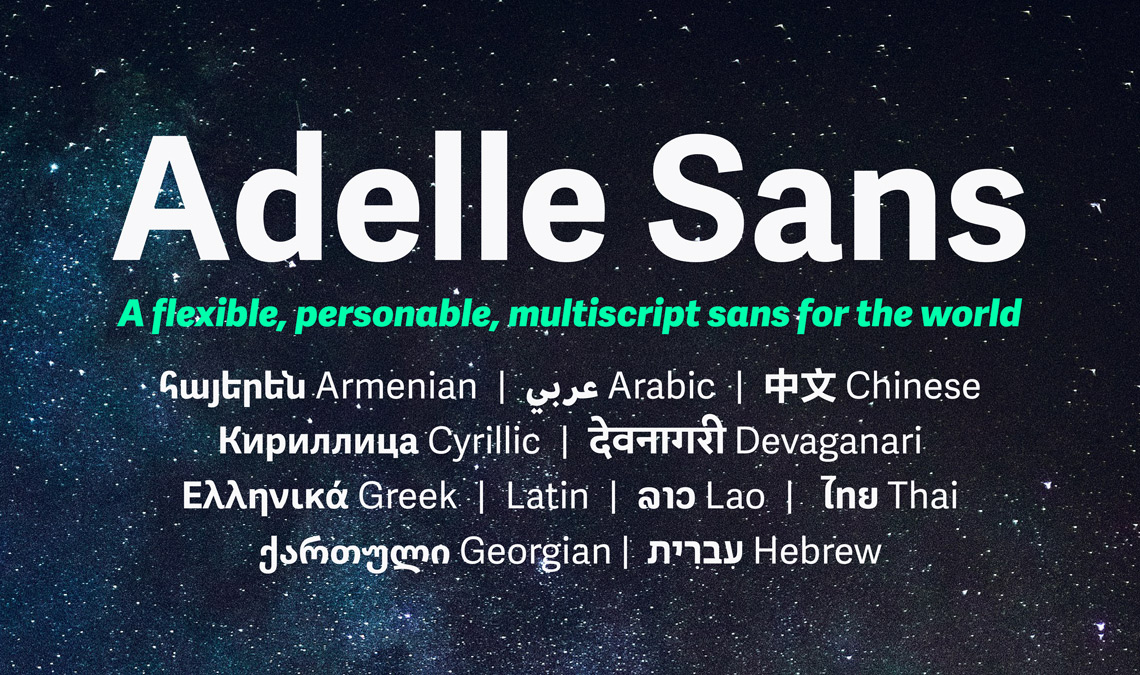
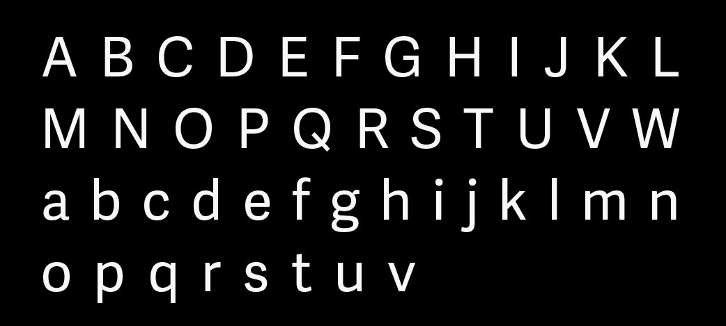
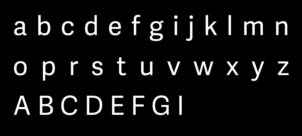
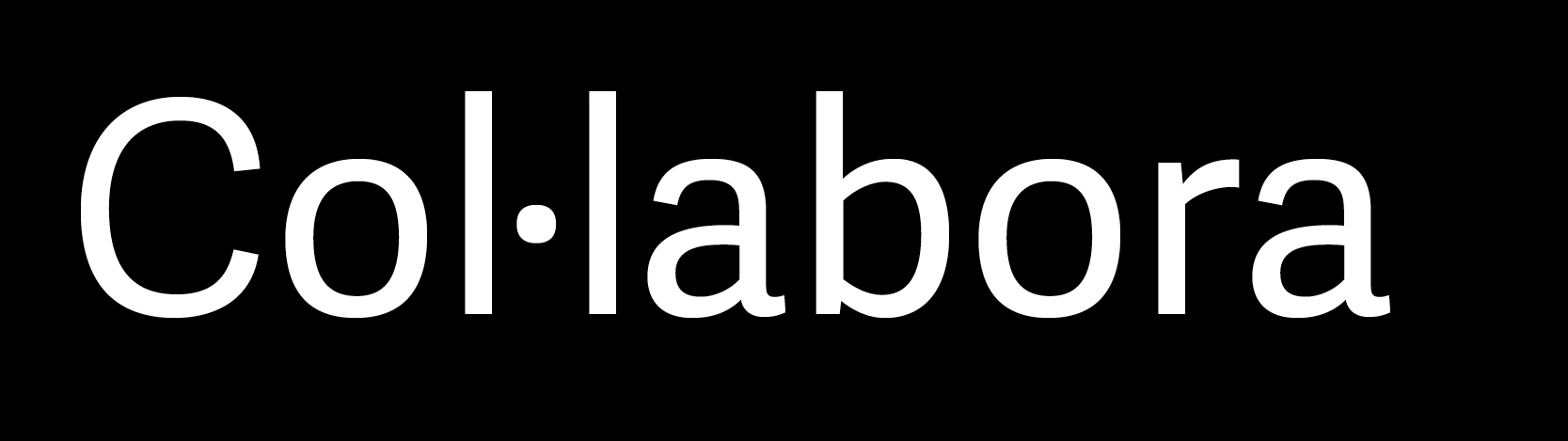
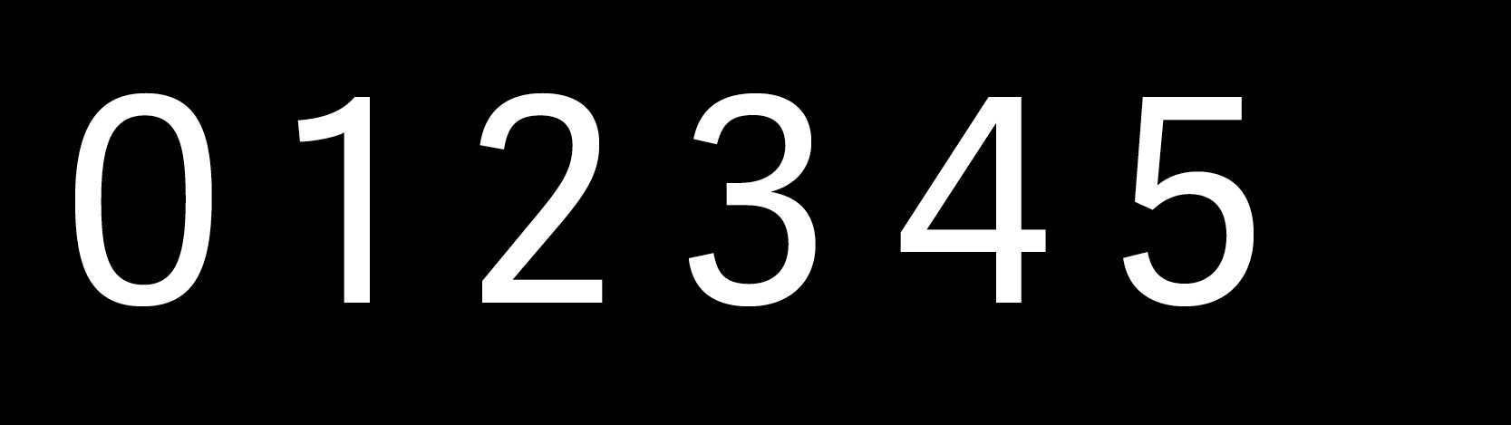
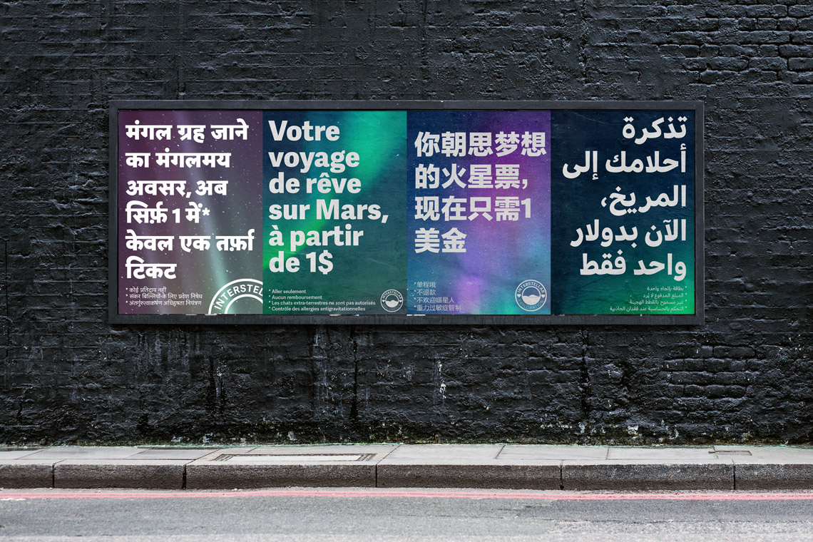
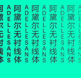
Because the Latin is included alongside each of the subsequent Adelle Sans scripts, buying one global script will at least get you those two. Each Latin version comes with support for more than 150 languages and plenty of typographic goodies: small caps, ligatures, contextual alternates, a wide range of figures (oldstyle numerals, lining figures, proportional figures, tabular figures, denominators & numerators, fractions, superiors & inferiors, alternative fractions, historical forms, 5 sets of figures, slashed zero, etc.), as well as localised forms (Catalan, Turkish, Romanian, and Dutch), arrows, symbols, and a set of social media icons. 

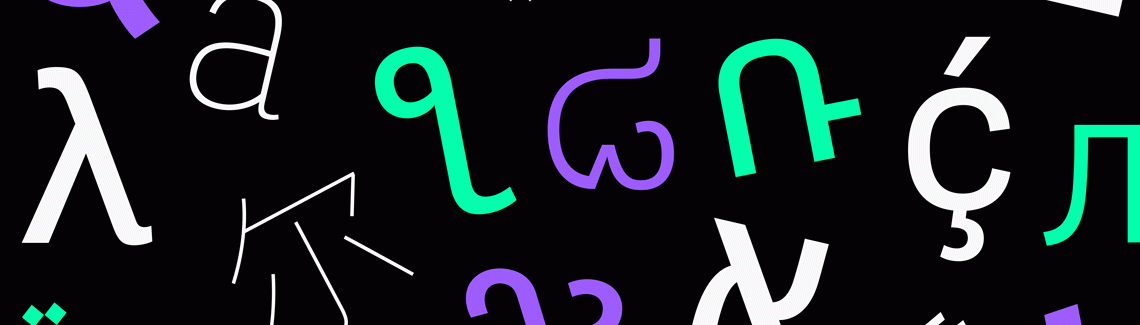
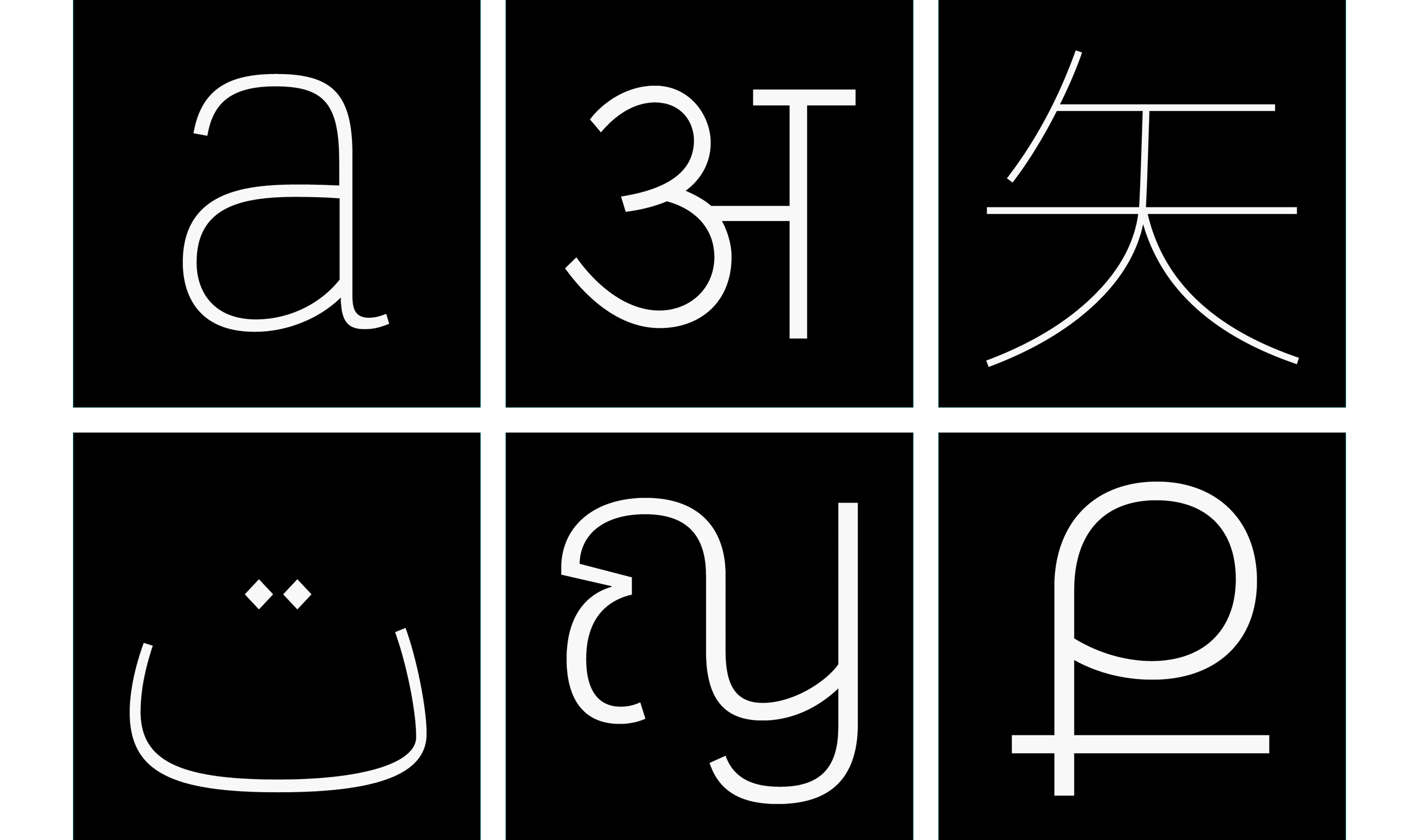
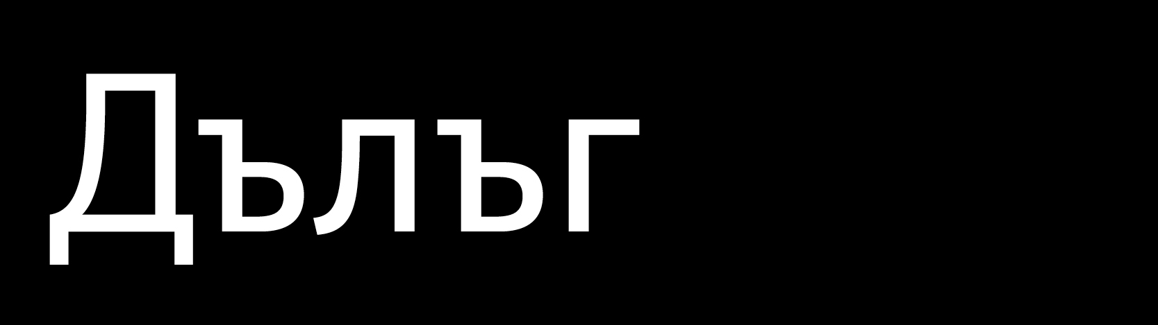
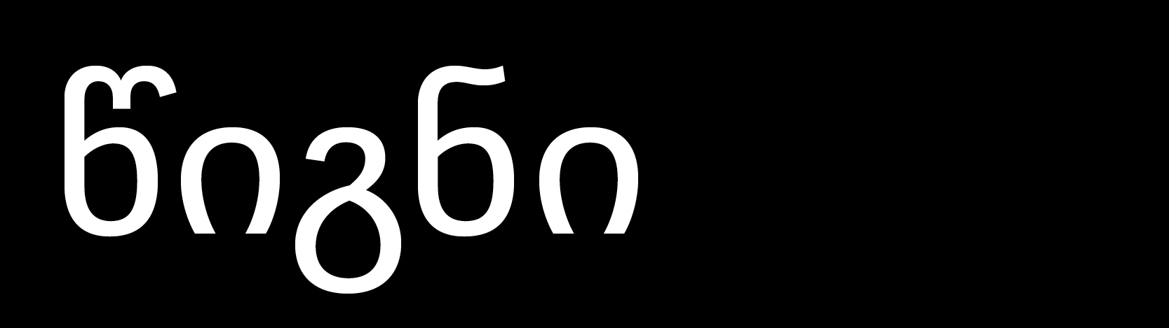
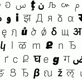
Additionally, each script includes stylistic alternates (like in Georgian and Latin Extended), localised alternates (Marathi and Nepali in Devanagari; Bulgarian, Ukranian, and Serbian in Cyrillic), ligatures (Thai, Armenian), contextual alternates (Armenian), and punctuation (Chinese).

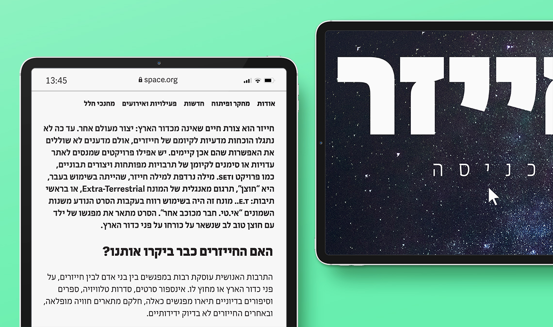
Each script of the Adelle Sans family includes their specific currency: lary sign in Georgian; dong, French franc, and naira in Latin Extended; ruble in Cyrillic; rupee in Devanagari; dram in Armenian; kip in Lao; new shekel in Hebrew; baht in Thai; and of course euro in Latin and Greek.

In this new update* the stylistic sets are organised. This means that simply by applying stylistic sets, several scripts, fonts, and families can be used at the same time without them clashing into each other. Future scripts and future stylistic sets will be added into the organisation scheme when they are published.

[*NOTE: not implemented in all scripts; Devanagari, Greek, and Arabic have not been updated.]

Here are some of the OpenType features you will find in the Adelle Sans family:


From top to bottom, left to right: Georgian lari, Cyrillic ruble, Armenian dram, Turkish lira, US cent and dollar, EU euro, British pound, Israel’s new shekel, Lao kip, Vietnamese dong, Thai baht, Nigeria’s naira, French franc, Japanese yen, and Indian rupee.  


SS01: arrows


SS02: Icons 


SS04: alternate ‘l’. A rounded version that helps with legibility.


SS08: Bulgarian alternates in Adelle Sans Cyrillic.


SS09: Georgian alternates in Adelle Sans Georgian.


Local form: Catalan.


Figures: Proportional oldstyle, tabular oldstyle, proportional lining, tabular lining.


Local form: Marathi


Adelle Sans now has a revamped set of 27 social media icons as part of the new and updated families (Latin, Georgian, Armenian, Lao, Hebrew, and Cyrillic). The existent icons have been updated to fit better with the entire family and new ones have been added (Tiktok, Mastodon, Baidu, Telegram, Wechat, etc.).


Creating synergy

A large part of TypeTogether’s foundation is our collaborative approach to design. It’s even the most important part of our company name. But such a collaborative scheme cannot be achieved without trust, generosity, and the utmost respect for cultural diversity — all values that are part of what we like to call good karma.

We were at the right place and time, thankfully, as the 21st century saw an increase of international forums and educational institutions setting the right tone for the development of a healthy and cosmopolitan typographic community. It was easy for us to find like-minded professionals from all over the world. Some of them became part of our core team, which is spread across many different time zones, starting in Beijing and ending in Kansas City. Others collaborated with us on specific projects, and many more became part of a long list of colleagues we love to hang out with at any typography conference.

It was this collaborative network of designers and consultants that allowed us to confidently publish typefaces for scripts that were not native to us, and it pushed us to learn about them in a deep and respectful way. To these colleagues we want to say, not just that we are grateful, but how grateful we are to have been honoured by your presence, skills, and friendship throughout this process.

And now, nine years from the first release of Adelle Sans, we are pausing for a few minutes to look at the path behind us, happy and proud of what we’ve accomplished together. But what really moves us is the road that lies ahead and where it will take us — into a more connected and collaborative world, one where karma is good and communication is clear. Join us and let’s continue to do type together!


 Credits

Type Design
Azza Alameddine (Arabic)
Veronika Burian
Suppakit Chalermlarp (Lao)
Jan Charvát (Georgian)
Yan Cui, FounderType (Chinese)
Vera Evstafieva (Cyrillic)
Roxane Gataud (Latin Extended)
Gor Jihanian (Armenian)
Erin McLaughlin (Devanagari)
Octavio Pardo (Cyrillic)
Li Qi, FounderType (Chinese)
Akaki Radmadze (Georgian)
Pooja Saxena (Devanagari)
José Scaglione
Vaibhav Singh (Devanagari)
Smich Smanloh (Thai)
Shipeng Su, FounderType (Chinese)
Liron Lavi Turkenich (Hebrew)
Irene Vlachou (Greek)
Junfang Wang, FounderType (Chinese)
Anuthin Wongsunkakon (Thai)

Consultancy
Pilar Cano (Thai)
Vera Evstafieva (Cyrillic)
Borna Izadpanah (Arabic)
Alexandra Korolkova (Cyrillic)
Ben Mitchell (Lao & Thai)
Dr Don Osborn (Latin Extended)
Hrant Papazian (Armenian)
Fiona Ross (Arabic & Devanagari)
Vaibhav Singh (Devanagari)
Adi Stern (Hebrew)
Aleksander Sukiasov (Georgian)

Translation & proofreading
Shani Avni (Hebrew)
Vera Evstafieva (Cyrillic)
Sirin Gunkloy (Thai)
Gor Jihanian (Armenian)
Zhao Liu (Chinese)
Akaki Radmadze (Georgian)
Sengkeo Vangxiengvue (Lao)

Quality assurance
Azza Alameddine
Ben Mitchell (Thai & Lao)

Engineering
Joancarles Casasín
Suppakit Chalermlarp (Lao)
Ying Luan (Chinese & Latin)
Pooja Saxena (Devanagari)
Smich Smanloh (Thai)
Sonja Stange (Greek)

Graphic design
Rabab Charafeddine
Roxane Gataud (Arabic)
Pooja Saxena (Devanagari)
Mint Tantisuwanna (Thai)
Elena Veguillas (Art Editor)

Motion Design
Cecilia Brarda

Copywriting
Joshua Farmer


About Us

TypeTogether is an indie type foundry committed to excellence in type design with a focus on editorial use. Additionally, TypeTogether creates custom type design for corporate use. We invite you to browse our library of retail fonts or contact us to discuss custom type design projects.