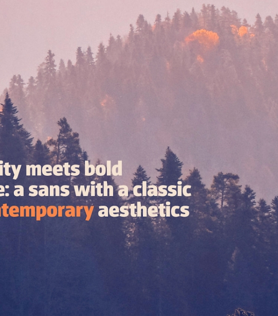
Identity meets bold performance: a sans with a classic soul and contemporary aesthetics.
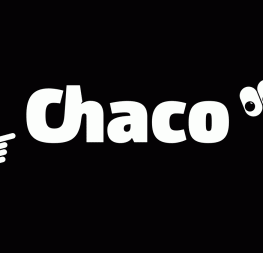
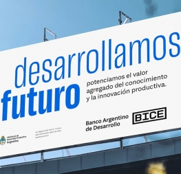
Combining aesthetic needs for identities, international wayfinding research, and the extreme details needed for small text, Rubén Fontana’s Chaco font family is an outrageously contemporary offering from classic roots. His solution is a pitch-perfect typeface for identity and branding work, wayfinding, and composing immersive reading texts.
Chaco began as a research project to solve specific wayfinding and roadway signage problems in Argentina, expanding to become a signage system based on the international standards of seven additional countries. Since differentiating between easily-confused signs at a long distance or in small sizes is a major concern, many of its solutions account for this issue. Chaco was designed with the rare ability to maintain internal space in word composition, offer better performance, and avoid word shortenings that are naturally illegible on a sign, without using the crutch of faux condensation.
After solving for large-scale use, great consideration was given to headings and paragraph text to ensure Chaco met a bevy of common scenarios. These refinements include narrower proportions overall, spacious internal angles, and inktraps that are both functional and aesthetic to improve readability. Particular attention was paid to the shape and proportions of the numerals to differentiate them from small caps and capital letters, making alphanumeric strings foolproof.
In addition to the traditional ligatures, the ‘ch’ digraph was specially designed since it is a prominent sound in native South American languages. Furthermore, with the intention of optimising Chaco’s identity and distinction in the font world, some vertical strokes have their weight reversed, which reinforces its memorability.
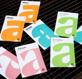
The Chaco family features TypeTogether’s standard Latin character set, with support for over 150 Latin-based languages and Vietnamese. It has a repertoire of seven weights plus matching italics that increase its ability to compose headlines and texts for mass media, particularly newspapers and periodicals. For those perfectionistic designers and editors who sweat the details, stylistic sets for regular caps and small caps numerals are included that add serifs to create classic forms of Roman numerals. And all the arrows, symbols, icons, and geometric shapes match each of the typographic weights for flawless integration into media of all sorts.
Chaco is a full-fledged, multipurpose font created to optimise legibility even in extremely poor reading conditions: distant road signage on foggy days, increased word length in small spaces, memorable branding and identity packages in crowded markets, and reversed-out colour printing on imperfect substrates. The bold and contemporary Chaco family has been designed to convincingly succeed where so many other sans typefaces flounder.
CREDITS
Lead design & concept
Rubén Fontana
Assistant designer
Yorlmar Campos
Engineering
Joancarles Casasín
Quality assurance
Yorlmar Campos
Graphic design
Elena Veguillas
Rabab Charafeddine
Felicia Priscillya
Motion design
Cecilia Brarda
Copywriting
Joshua Farmer
Social media manager
Doug Arellanes


