Peculiarities of typesetting Latin-based languages
October 2020
With over 100 languages supported by Latin, we present an article by specialist Filip Blažek about typesetting those different tongues.
With over 100 languages supported by Latin, we present an article by specialist Filip Blažek about typesetting those different tongues.
At first sight, texts in different languages set in the Latin alphabet look very similar. Sentences start with a capital letter and end with period, you can find numerals, various punctuation marks, and other symbols in the text. But a close look can reveal tiny differences between the languages, and if you really dive into this rabbit hole you’ll discover specific regional typographic solutions even among the users of the same language!
If you deal with a text in any foreign language, you should respect local orthographic and typographic rules. The requirements change not only language by language, but also in various geographic locations. Typographic tradition differs in the United States and the United Kingdom; German rules used in Germany are different from the rules used in Austria, Switzerland, and Liechtenstein. Similarly, typographic tradition in France is not the same as in Québec, since Canadian French is highly influenced by its American and Canadian surroundings rather than true European French typesetting rules.
I’ve been designing and typesetting books for over 25 years, many of the which contained parts in various languages. During those years, I’ve extended my typographic knowledge to cover both the local differences and the preferences of major European languages. Here’s my list of nine selected details you should keep in mind when dealing with multilingual Latin typesetting.
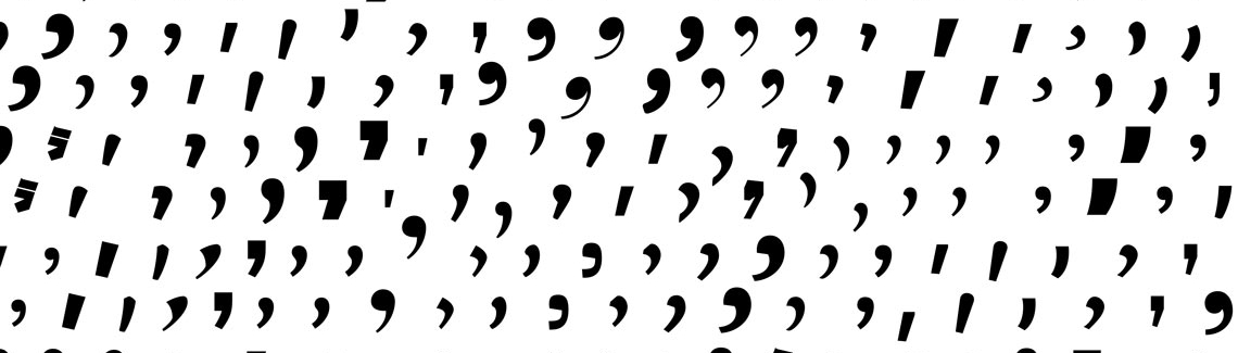
1. Quotation marks
Perhaps the most famous example of local typographic differences are quotation marks. In most languages, the initial and final marks differ from each other and the marks are written without spaces. In addition to basic quotes, there are also secondary quotes that are used as nested ones. Many languages also have an alternative form which is formally equivalent but less frequently used.
In the US, the “double” quotes are the standard, while in the UK, the basic form is ‘simple’. In France, angle quotation marks or « guillemets » are used and they are separated from the expression by spaces. Several other languages like Spanish prefer the same marks but «without spaces». In Germany and some other Central European, Baltic, and Balkan countries, the „baseline“ marks are used for the quote opening. In Sweden or Finland, only one ”character” suffices.
Using the proper marks is not enough because punctuation should also be considered. Should the comma or period stay “inside,” or “outside”, remains a question. For English it depends on the location: in the US the punctuation should be inside; in the UK, outside. In many European languages it depends on the context. If you quote a single “expression”, the comma is outside the quotes. “While the whole sentence inside the quotes usually includes the final punctuation mark.”


2. Basic punctuation
The use of period, comma, colon, semicolon, question mark, and exclamation mark is the same in most European languages. The two major exceptions are French and Spanish. In Spanish, each interrogative sentence must start with an inverted question mark (¿) and each exclamatory sentence with an inverted exclamation mark (¡). In French, you have to a add fixed-width nonbreaking space (narrower one is preferred) before four symbols: colon, semicolon, question mark, and exclamation mark.

3. Numbers
If you’d write 1,000, some readers will understand the value as one, others as one thousand — obviously a big difference! First of all, you should get familiar with thousands and decimal separators used in the particular language. In some countries there are more options: one official, one colloquial. Depending on the audience, one thousand with two decimal digits could be written as 1 000,00; 1 000.00; 1,000.00, 1.000,00; or 1’000.00; in some countries four-digit numbers are written without the separator (1000). On the top of it, each language has its own way to express radical numerals: it could be a suffix, superscript indicator, or a simple period.
4. Date and time
Expressions of time and date are fundamentally different in each language, and dates have many ways they can be written. The day and month separator could be a period, slash, hyphen, or just a space. In some regions, the leading zeros could be omitted. The biggest problem though is the order of day, month, and year: 20.02.02 could be understood as either 20 February 2002 or 2 February 2020!
The 12-hour clock convention is dominant in nations that were part of the former British Empire — in the United Kingdom, the United States, Ireland, Australia, New Zealand to name a few — half past eight in the evening will be represented as 8:30 p.m., sometimes as 8:30 pm or 8:30 pm. In continental Europe however, the 12-hour clock is mostly used in colloquial language, the written form is usually based on the 24-hour clock. Half past eight in the evening could be expressed as 20:30, 20.30, 20 h 30, 20h30… and more. A leading zero is usually optional.
5. Dashes
The majority of European languages — including English in the UK — treats dashes similarly. In a sentence, the standard form is an en-dash with one space on either side. Nevertheless, there are exceptions, notably in Spanish: they prefer em-dashes and treat them —although it may look weird— as brackets that touch the words inside. In some languages the en-dash and em-dash are considered replaceable. The US way—long em-dashes without spaces—is also common in Australia and Canada.
There are also differences when it comes to print versus on screens. Many US and European writers prefer spaced em- and en-dashes on screen simply because of its aesthetic appearance — it’s just a cleaner break. Erik Spiekermann popularized this version, while unspaced em-dashes are still used in print.
In case the dash means time span or interval, the most common ways is the en-dash without spaces (Berlin–Barcelona, 12–26 July). But, no surprise, the standard Spanish rules require a hyphen even if Spanish typographers prefer the European way.
6. Hyphenation
Hyphenation rules are crucial for correct typesetting. Fortunately, design apps include preinstalled hyphenation directories which perform quite well. If your language is not listed, both Adobe InDesign and Affinity Publisher allow users to install additional Hunspell dictionaries for free.
But what if you need to set text with a plethora of technical terms or unusual names? Then you should familiarize yourself with basic principles of hyphenation. Some languages divide words according to grammar (prefix–word root–suffix), others prefer division between syllables. Therefore, in one language mar-ket-ing is the correct form, while mar-ke-ting in another. Languages evolve and rules change, so in cases when you have a choice, ask which hyphenation dictionary should be used: in case of German, Adobe InDesign offers five options!
7. Symbols and units
What’s correct, 10 % or 10%? That depends on language and usage. There are symbols or units preceded by a space, followed by a space, or preceded and followed by a space, nevertheless it differs language by language. The correct form in English is 10%, but is 10 % in French. And to make it more complicated, in Czech, 10 % means ten percent while 10% is an adjective form ten-percent. Similar principles apply to scientific units or monetary values, so while in the UK a price tag would read £9,999.90 but would read 9 999,90 € in France.
8. Special characters
With the exception of English, Indonesian, or Malay (and perhaps a few more), Latin based languages use accented letters — actually, a lot of accented letters. If you receive a text manuscript, it is not complicated at all to deal with accented letters, provided your font contains those characters. But sometimes you have to add missing diacritics to correctly spell composers Saint-Saëns or Dvořák.
Be careful when picking the proper character from the glyph panel, as some accented characters look alike in certain fonts. I suggest to copy and paste the names from reliable websites. Similar care should be taken when typing superscript letters since the Spanish ordinal indicator º might be interchangeable with the degree symbol or an accent called ring.

9. Other rules
In the German language, all nouns are capitalized. In French, accents above capital letters should always be used (although they are sometimes omitted, books about typography warn against this practice). In many European languages a single-letter word at the end of a line of text is considered a mistake. In Italy or France, it is not that big of a deal; only professional typographers care. But in Poland, Russia, Hungary, Czechia, or Slovakia, it is a type crime, to paraphrase Ellen Lupton. Typesetters in those countries are familiar with local plugins and scripts solving this issue automatically by inserting nonbreaking spaces after single-letter words.
There is another language specific rule: alphabet sorting. Each language has its own ways of how to deal with accented or special characters, lower- and uppercase letters, spaces, or symbols. So be careful when creating an index. Sometimes the accented letters are treated as non-accented ones, they have their own position in some languages, or they are placed at the very end of the alphabet. There are sophisticated scripts for InDesign which will help you sort paragraphs correctly.

Many languages share the latin script, but each have their own individual alphabet. A list like this brings many questions to the table: is there a consensus order for each alphabet? What shall be done with letters used only in foreign words (like q, v and x in Polish)? Also it is important to notice that not all diacritics and diagraphs are necessarily included in the alphabet (for instance á, é, í, ó, ú in Spanish).
This table shows a limited amount of alphabets, for a complete and detailed focus we recomend Omniglot and Wikipedia. Main sources: Omniglot and Wikipedia.

Conclusion
Each language has its own typographic tradition. Designers working with multilingual texts should get familiar with local preferences, rules, and exceptions. Typographic and orthographic tradition is an integral part of cultural heritage and we should respect it. Delivering perfectly processed text should bring everyone the joy of a job well done.
TypeTogether is an indie type foundry committed to excellence in type design with a focus on editorial use. Additionally, TypeTogether creates custom type design for corporate use. We invite you to browse our library of retail fonts or contact us to discuss custom type design projects.
Schedule an introduction meeting to learn more.