And that was 2018
January 2019
This year — 2018 — was a full and involved year for TypeTogether and we’re glad you joined us!
This year — 2018 — was a full and involved year for TypeTogether and we’re glad you joined us!
Though we released some amazing type families, we lost our dear friend Gerard Unger late in the year, so that was a difficult event. If you haven’t read our thoughts about him, please do so here. His model and interactions with us confirmed our direction as a team; we remain committed to those values that have served us so well: collaboration, problem-solving, creativity and appropriateness, educating and encouraging, serving languages globally, and having fun through it all.
There was so much going on that you may have missed something great. Here’s a look back on our achievements and involvement during 2018.
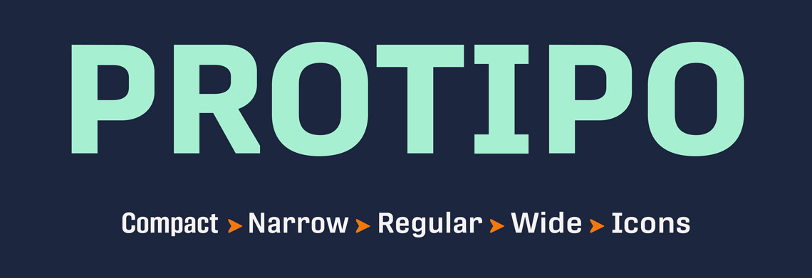
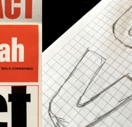
In 2018 we released the infographic type family, Protipo, and followed it up with a microsite to show off the impressive and cutting-edge variable font format. It was created specifically for apps, infographics, UI, wayfinding, transport, posters, display, and even internet memes. Add to all this the icon sets and variable font capability, and you’re assured a level of creativity, productivity, and impact on a much greater scale.
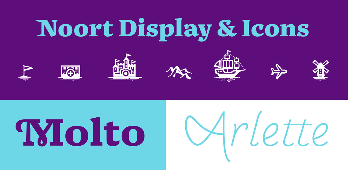
As soon as our Gerard Unger Scholarship (previously known as the Typeface Publishing Incentive Programme) winner, Juan Bruce, completed his award-winning Noort, he began work on its extended character set with a display style and a creative and map-worthy icon style. Molto was created by Xavier Dupre as a combination of solid cement and surprising curves to shake up the slab serif category. Arlette is Pilar Cano and Ferran Milan’s Latin and Thai category-expanding sans serif font that’s part experiment and part modern update. Arlette wowed many with its chic look, modern appeal, and OpenType features available in both scripts.
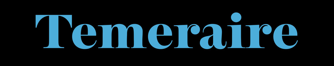
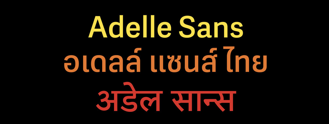
Temeraire received rave reviews on social media for its originality and overall voice. And speaking of voices, our enormous Adelle Sans family was expanded by two more distinct and impressive scripts: Devanagari and Thai. Adelle Sans now inhabits that rarified super-family category, and we still have more multiscript goodness coming to the family!
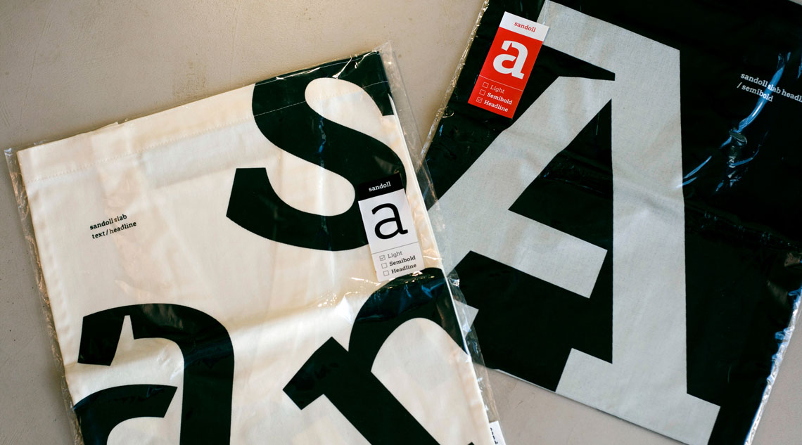
This year we took the lessons learned from previous years and put them to use to create the Sandoll fonts and Sandoll logotype. More custom type work was accomplished this year and we will announce it soon. Could a custom type family or logotype work for you? Get in touch and we can talk about it.
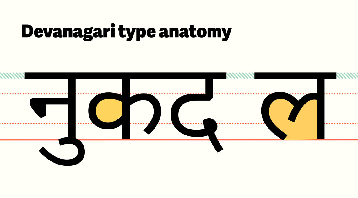
When we say we love, believe in, and support education, we mean it. This year we released well-documented articles on the anatomy of Arabic and Devanagari alphabets from two of our teammates, Azza Alameddine and Pooja Saxena, respectively. How can non-native speakers discuss the minutiae of a font’s forms? Hopefully this gave an answer to the language of this question. We also continued our team interviews series and conducted an interview with Nicolien Van de Keur.
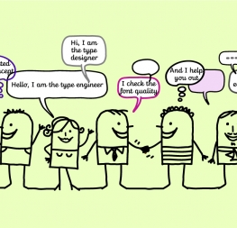
We documented and discussed setting a new standard for crediting within the type design industry, and implemented accurate and complete crediting for every one of our new releases. How much of a difference has it made? A lot. Honour is brought to each team member for their efforts; insight is brought to the long and complex path a type family takes prior to (and after) its release; accuracy for record keeping is reinforced; value is founded on the years (decades!) of specific learning and individualised work that goes into producing those final font files you use every day for decades on end and without a glitch; interest is piqued as the communications, marketing, and publicity teams bring the project to light in interesting and informative ways. And this is only a summary of the amount of work that goes into creating a brand new type family.
SPECIMENS
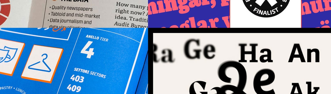
We love printed specimens because it shows off a typeface’s abilities in an additional way that a screen does not. But we don't sell them — they’re free! Pay only for shipping & handling and it’s yours. This year we released a specimen for the balanced Hebrew and Latin Noam Text family. We had to reprint our full 2014 catalogue due to demand, and followed that with an entire specimen dedicated to the fonts of Leftloft: LFT Etica, LFT Etica Sheriff, and LFT Iro Sans. Our much-loved Protipo and Portada families received their own catalogue this year, with the theme of reading and infographics. What’s our next specimen? We can’t wait to show you! In the meantime, head over to our store and grab your favourites. And since they’re free, you should probably grab a few for a designer friend.
TYPE IN USE
On our blog is a section called Type In Use where we showcase how others have used our typefaces to set their brand, their book, or their table. Our fonts have shown up on food packaging, on apps and websites, and in books, editorials, and products of all kinds. This year we saw the first use of Adelle Sans Armenian, and the traditional card game Jass sported a new look with Abril. A sheep was named Maiola after the font family that was used to tell its story, Portada and Tablet Gothic were used in the Informe Cotec annual report, and Alverata and Sanserata were used to set Dr. Gerard Unger’s watershed book, “Theory of Type Design”. Have you used our typefaces? Send some examples our way. We’d love to see it!
VIDEO
As a font foundry, many of our users are established brands. Establishing a clear brand makes you noticeable, engenders trust, and can turn a one-time buyer into a raving fan. Since fonts give your communication a specific voice, what voice does your brand have? Our video “Fonts Are Voices: Building Better Brands” shows the benefits of choosing a great typeface as your brand voice. Check it out and ask us how we can help give your brand a leg up on all the others.
AWARDS
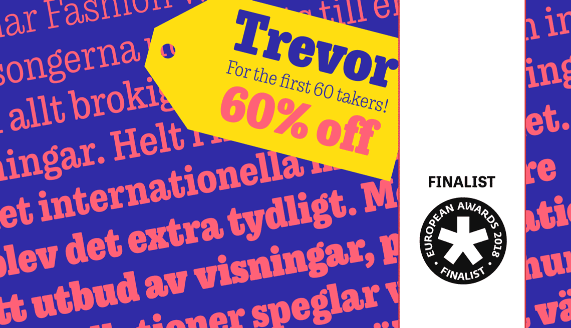
Awards aren’t everything, but they can indicate a certain level of professionalism, creativity, aesthetic value, and functional usefulness. This year, out of only 74 typefaces, Noort and Portada won awards from the Latin American biennial platform Tipos Latinos. Noort also won the TDC Certificate of Excellence and was a Finalist in the Bienal Iberoamericana 2018, and Trevor was a finalist in the European Design Awards.
EXHIBITION
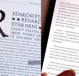
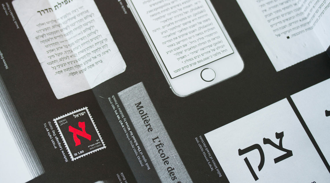
Noam Text not only got its own specimen, but had its own exhibition in Tel Aviv to celebrate its release. The location was flanked with posters designed for and with Noam Text in a multilingual environment of Hebrew and Latin. Adi Stern and Veronika Burian spoke at the packed event.
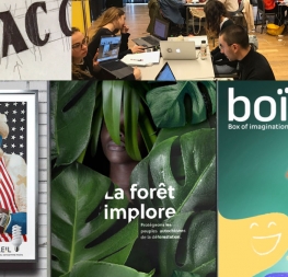
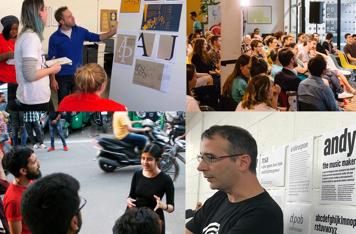
Speaking of packed, 2018 was a packed year of TypeTogether traveling, giving talks, and leading workshops around the world. Most of the core team attended TypoLabs, and our entire team went to Antwerp prior to ATypI for our annual meeting where we made progress on our workflow and a few secret upcoming project ideas. Josh led a full-day workshop at TypeCon and gave a lecture and two critiques at Kansas City Art Institute, Roxane gave a lecture and workshop in Nantes and a talk in Shanghai, and Pooja continued her Lettering Walks in Delhi. Veronika and José spoke at Typographics, Veronika spoke in Berlin, Munich, Portugal, Norway, and France, and José gave a workshop in Perú and served as judge and lecturer in Beijing at the Founder Type Design Competition. Irene spoke at Ampersand in Brighton and Dynamic Font Day in Munich… and, with the intense schedules the core team has, there’s a possibility we’ve left something out. All that to say that we remain steadfastly committed to encouraging others, teaching whenever possible, and giving back to the design community at large. Interested in having one of our team speak at your event or lead a workshop? Let us know!
Wow, 2018 was a great year for us and we hope it was awesome for you as well! Our next year is shaping up to be incredible and we’re so glad you’ve joined us for the journey. We put our best into our work because we love it. Type design is not something we have to do, it’s something we get to do and we wouldn’t trade that for anything. This year, as every year, we want to thank you for supporting our independent font foundry. We’ve had great successes in the past and now we’re looking ahead at how we can create wonderful things together with you. Here’s to more and better!
Best regards,
The TypeTogether Team
TypeTogether is an indie type foundry committed to excellence in type design with a focus on editorial use. Additionally, TypeTogether creates custom type design for corporate use. We invite you to browse our library of retail fonts or contact us to discuss custom type design projects.
Schedule an introduction meeting to learn more.