Iskra

Designed by Tom Grace. Released 2012.

Sporting a low-contrast profile, Iskra is a study of bridled energy with eye-catching forms that contain daring and elegant curves and the slightly top-heavy asymmetry seen in brush lettering. Its warmth comes from the subtle emphasis on the details of individual letterforms, while its predictability is seen in a balanced rhythm over long spans of text. It is a memorable choice for presentations, articles, branding, and advertising. Iskra is a stimulating, forward-looking perspective on how we see both the vitality of the particular letter and the overall harmony of text. See the Cyrillic version here.

  • 2013 Type Directors Club Certificate of Excellence in Typeface Design for Latin and Cyrillic typeface
  • 2014 TDC Annual, Typography 34
  • Rutenia 2014

De strijd om de stuwdammen

Click to Edit
Change Font Settings

Gedwongen verhuizingen voor miljoenen mensen, verlies van cultureel erfgoed, ernstige milieuvervuiling, beïnvloeding van watervoorraden en ruzies met buurlanden.

Click to Edit
Change Font Settings

Om nieuwe bronnen van schone energie te ontwikkelen zijn er de afgelopen twee decennia miljarden euro’s uitgegeven aan de bouw van stuwdammen overal ter wereld. Stuwdammen worden aangelegd om een waterkrachtcentrale te kunnen bouwen die de krachtige stroom van het water om kan zetten in energie. Inmiddels is een derde van alle landen voor minstens 50% afhankelijk van waterkrachtcentrales voor hun elektriciteit (bron: WWF). Toch blijkt maar al te vaak in de praktijk dat de bouw van een stuwdam gepaard gaat met veel verzet van lokale bevolkingsgroepen en ngo’s en politiek getouwtrek met omliggende landen. In de Volkskrant stond woensdag een artikel over de protesten tegen de bouw van een stuwdam in Honduras die door ontwikkelingsbank FMO gefinancierd wordt. Het stuwdam project Agua Zarca lijkt gedoemd, onder andere door de gewelddadige dood van activistenleider Tomas Garcia vorig jaar juli door een ordehandhaver op het bouwterrein.

Click to Edit

Verderop in Panama is er verzet tegen de bouw van de Barro Blanco stuwdam. Inmiddels is er een officiële klacht ingediend door de Panamese bevolking, gesteund door SOMO en Both ENDS, die zich verzet tegen de bouw in de Tasabara rivier (waarvan FMO ook medefinancier is).

Zelf geeft FMO aan in een reactie op het Volkskrant artikel dat zij de gebeurtenissen van juli vorig jaar betreuren. Ze leggen in hun reactie de nadruk op de voordelen van het Agua Zarca project: bijvoorbeeld de banen die gecreëerd worden en de schone energie die beschikbaar zal zijn voor de omwonenden. Ook is volgens hun eigen onderzoek de meerderheid van de bevolking voor de bouw van de dam. De beschuldigen van ngo’s, dat FMO medeplichtig zou zijn aan de dood van Garcia en andere mensenrechtenschendingen, zijn gebaseerd op speculatie en niet op feiten, aldus FMO.

Click to Edit

The Backstory

Iskra

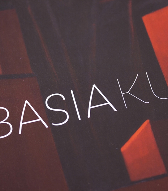
A sans serif challenging the limits between utilitarian and decorative.

A practical sans serif need not appear dry, constructed, or derivative. It can excel in its sensible role and yet possess a distinct flair. Iskra (meaning spark or flash) is an unique sans serif designed by Tom Grace to challenge the limits between utilitarian and decorative type.

Sporting a low-contrast profile, it is a study of bridled energy in the Cyrillic and Latin scripts. Iskra’s eye-catching forms contain daring and elegant curves, economical proportions, a slightly top-heavy asymmetry, and are an oblique tribute to the less predictable style of brush lettering. Its warmth comes from the subtle emphasis on the structures and details of individual letterforms, whereas its predictability is demonstrated through its balanced rhythm over long spans of text.

Available in 14 styles, Iskra is a stimulating, forward-looking perspective on how we see both the vitality of the particular letter and the overall harmony of text. Iskra’s support for more than 75 languages makes it an excellent and memorable choice for presentations, articles, branding, and advertising.

The complete Iskra family, along with our entire catalogue, has been optimised for today’s varied screen uses.

About Us

TypeTogether is an indie type foundry committed to excellence in type design with a focus on editorial use. Additionally, TypeTogether creates custom type design for corporate use. We invite you to browse our library of retail fonts or contact us to discuss custom type design projects.