Arabic type anatomy

June 2018

Arabic type anatomy looks complex, particularly for those not native to Arabic languages. In this article Azza Alameddine presents an attempt to simplify and standardise the different parts of Arabic letterforms: the anatomy of Arabic type.

by Azza alamedDine

As I was researching for this article about Arabic type anatomy, I dug into calligraphy books to refer back to the origin of the letter structure. The first thing I noticed was the disparity of terms between resources. It was clear we do not have standardised terminology for Arabic letters compared to Latin type terms.

However, the aim of this article is not to confuse you with terminology that has been used through history, but rather to consolidate the most important terms in an attempt to standardise the terminology for Arabic typography.


In calligraphy books from the 19th century, the most recurring terms used were to describe alternate shapes of one letter rather than parts of a letter. Those alternates were descriptive of three features of a letter: its width, shape, and style. For example, a ‘seen’ (س) could be compact (مجموعة), extended (مبسوطة) or halted (موقوفة). An initial ‘ha’ (ه‍) could be cat-faced or horse-eared. A ‘LamAlif’ (لا) could be of Muhaqqaq style (محققة) or paper-like (ورقية).

Although these names don’t describe the anatomy of a letter, they help describe precise shapes of a letter and could, therefore, be of use for Arabic fonts terminology.


Alternate forms of the letter ‘seen’

Alternate forms of the letter ‘seen’ in the same Arabic style (in black) and their respective names (in red).


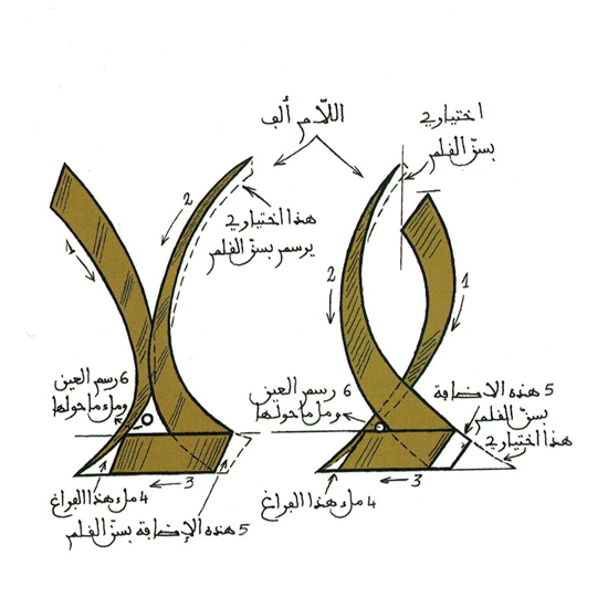
Because Arabic calligraphy follows a very strict system based on rhombic dots, my assumption is that it did not have the need to describe part of a letter but rather to show the specific number of dots for each of its parts. In a teaching context, the student’s job was to simply imitate their master’s ‘mashq’ or guidebook, where each letter’s proportion would be accurately drawn. The teacher would then make corrections directly on the student’s calligraphic sheet by pointing out the wrong shapes or proportions.


Mashq of individual letters in Naskh and Thuluth style

Mashq of individual letters in Naskh and Thuluth style by Mohammad Chawqi.


In Latin calligraphy, models for a specific hand-style existed as well but they were not definitive. Proportions were not explicitly set and therefore the black and white space of a letter needed to have names. Most of those names ended up having a connection with human anatomy — arm, leg, shoulder, ear — the same terms we use today for Latin typography.

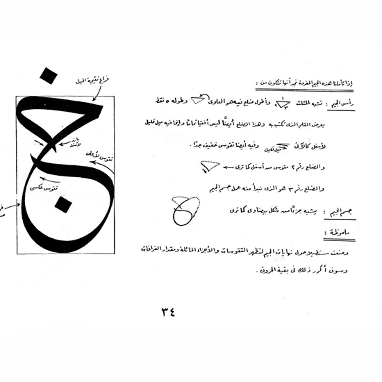
In Arabic calligraphy, some sources mention parts of anatomy as well: head, body, eye, tooth, and neck. These terms are found in more recent books and might have been chosen for their intuitively connotative qualities. In a traditional one-on-one calligraphy lesson, the teacher would communicate mostly with drawings, though in a context of book-learning, precise words had to compensate for the lack of live interaction.


Description of Arabic letters taken from different books, using body anatomy terms.


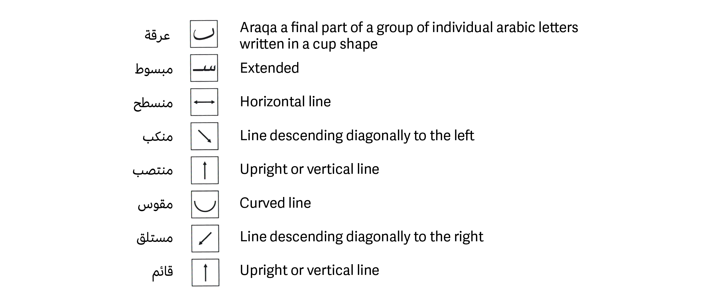
Another way to describe Arabic letters that I have found in books was to break down each letter to a series of directional strokes. This seems like a practical solution if you are out of words or trying to point out a very specific part of a letter. The problem is that, although those strokes are described using only one word in Arabic, their English translation doesn’t seem as concise. For example, in Arabic there is a specific word for a descending diagonal stroke going to the left, while in English the whole sentence would need to be said.


Here ‘منتصب’ and ’قائم’ both describe a vertical line. I am not sure what the difference is. Adelle Sans Arabic and Latin used here.


Although some of the names mentioned above don’t seem practical to use in a typographic context, it’s always interesting to shed light on the historical aspect of letter terminology. In this case, it allows us to understand the importance of each feature in the Arabic script: The lack of terminology for parts of a letter indicate their low flexibility in the context of calligraphy, while the abundance of alternate names show that they are a big part of the script.


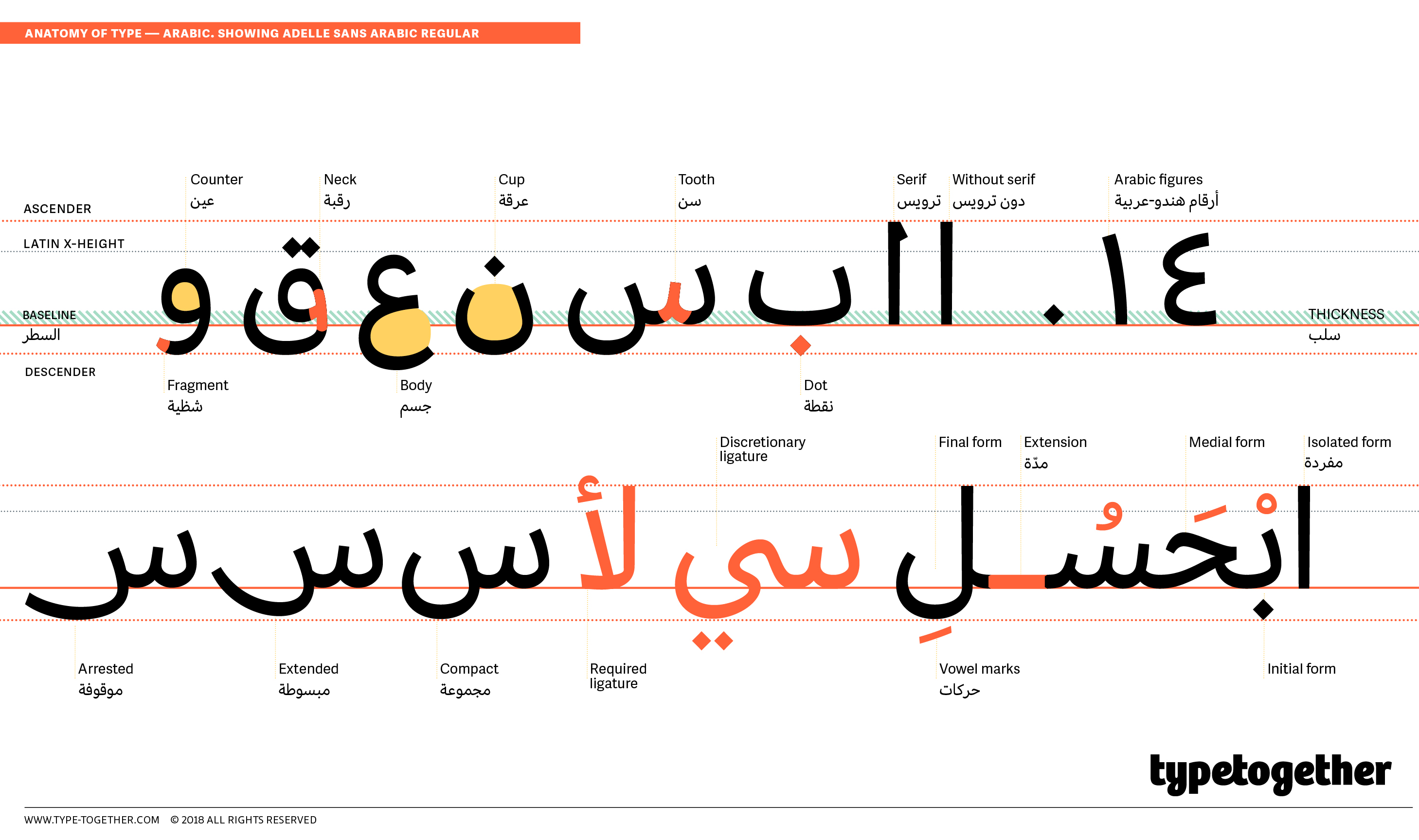
Arabic type anatomy, most common terms

Arabic type anatomy’s most common terms. The three forms shown at bottom left (compact, extended, arrested) are not included in Adelle Sans Arabic by default.


Just like its Latin counterpart, the anatomy of Arabic typography would eventually borrow terms from calligraphy. The ones that will most probably survive are the most intuitive ones: those that refer to body or nature. Below is a summary of the most common terms that will be helpful to use in Arabic typography.

Summary

• The established terminology in Arabic type anatomy is: head, body, eye, tooth, neck, cup.
• The terms ascender and descender may be used for Arabic because it has characters that extend below the baseline and others that stand out higher than middle heights.
• Some technical terms could be borrowed from Latin typography, such as kerning and ligature.
• Do not use ‘x-height’ and ‘cap height’ simply because there are no ‘x’ or capitals in Arabic.

Resources
Sacred script: Muhaqqaq in Islamic calligraphy, Nassar Mansour
Mizan Al Khat Al Arabi, Mustafa Helmi Effendi
Qawa’ed Al Khat Al Arabi, Hashem Mohammad
‘Allem Nafsaka Al Khotout Al Arabiya, Mahdi Al Sayed Mahmoud
Qawa’ed AL Khatt Al Koufi Al Firouwani, Amer Ben Jado
Amshaq Al Khattat Mohammad Chawqi Fi Al Thuluth Wal Naskh, Mohammad Chawqi
A Dictionary of Arabic Calligraphy Terms & Calligraphers, Dr Afif Bahnassi


SaveSave

About Us

TypeTogether is an indie type foundry committed to excellence in type design with a focus on editorial use. Additionally, TypeTogether creates custom type design for corporate use. We invite you to browse our library of retail fonts or contact us to discuss custom type design projects.