a first-timer‘s personal account by veronika burian
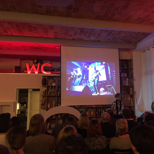
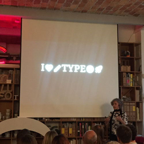
The well established Berliner Typostammtisch took place at the comfortable space of LucasFonts as a preamble to the TYPO Labs conference. People gathered in a lively atmosphere with drinks and nibbles to listen to Veronika Burian speak about her very personal path to type design and TypeTogether’s collaborative approach to running an indie foundry. You can read a nice review by Sonja Knecht here.
event space
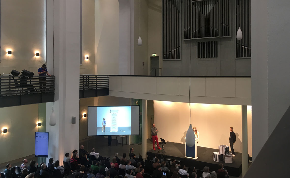
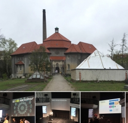
The organising team of the TYPO Labs conference have a propensity for unusual event places. Last year it took place in a former cremation hall, now turned cultural centre, and this year they chose a functioning church/environmental forum for the third edition of this very special and quite geeky tech conference. You can read our review of 2017 here. Also a big positive shout-out for the increase in gender balance of speakers and audience alike.
Weiter so!
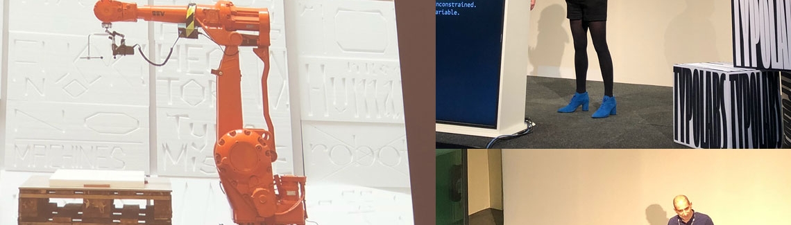
As previously, the excitement for the new variable font technology was tangible in almost all of the talks, but we also heard about a repurposed industrial robot carving letters into foam with hot wire, virtual reality experiences, pre-digital tools, and how the Korean Hangul script is structured. Together with the friendly atmosphere and social mingling during breaks, TYPO Labs 2018 was indeed a memorable event.
Matthieu Cortat & Thibault Brevet talking about the experimental workshop at ECAL, Lausanne.
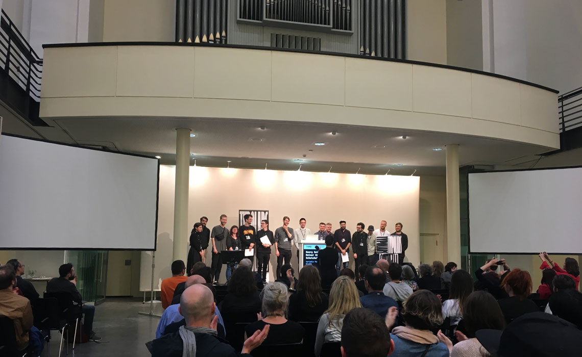
Students of the Typography class from the czech design academy UMPRUM presented their experiments with the variable format.
multiscript & variable
Gerry Leonidas started the conference off suggesting that new technologies don’t increase quality of type design per se, but should be viewed as possibilities to re-examine the user’s market and how new type design could meet its demands. In the case of variable fonts, Gerry proposed to find a way to ‘storyboard’ a typeface, apart from the current sliders visualisation, and to understand the user’s perspective better. This means looking especially at relationships within and between fonts and styles and taking into account document design and its need for hierarchies.
John Hudson and Sahar Afshar with José Solé continued to explore opportunities the variable font format could bring to complex multi-script design. John described parts of the Nirmala project for Microsoft Windows and how technology over the past 10 years influenced and defined many of the type design decisions, suggesting to turn this modus around with the variable format and adapt technology to the design instead.
Sahar and José have been working on ways to justify Arabic texts using the variable format to set kashidas. Kashidas are either extensions of an Arabic letter or connections between letters helping to form an aesthetically pleasing, legible, and justified text. After much experimentation and several dead-ends, they proposed a variable axis that can operate on top of other axes by changing only individual characters with the help of a drag tool instead of global sliders. This proposed extension would not be limited to the Arabic script only, and they showed an example of it in use with swashes in an English script font.
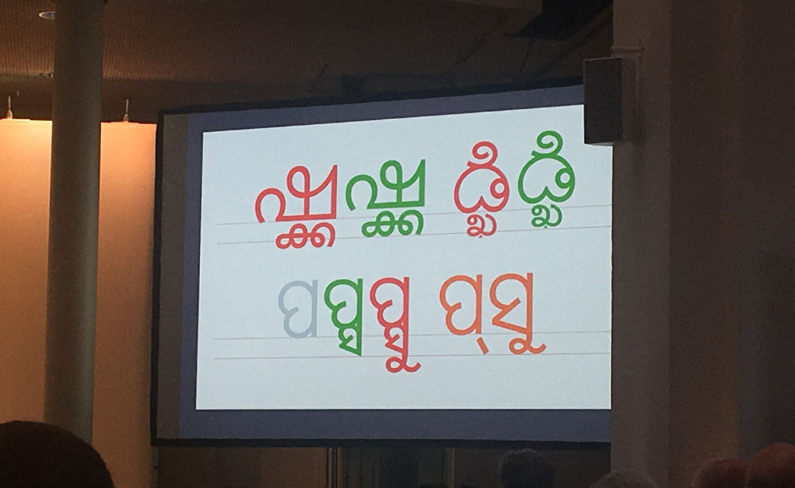
The topic of multi-script design was also picked up by Minjoo Ham, a Korean type designer who explained the origins and structure of Hangul. She discussed in-frame vs. out-of-frame concepts, fixed and proportional widths, and how Hangul is unlike other writing systems in that metal type came first and only afterward was handwriting developed. As far as script harmonisation goes, inspired by LettError’s Type Cooker, she believes that the design intention and spirit of a type family should count rather than direct translation of details between scripts. With that in mind, a conceptual recipe merged with cultural impressions can be elaborated to guide the design.
Rod Sheeter and Garret Rieger presented Korean from a more technical side, discussing how they developed a method to subset Korean websites to reduce font download times — a constant concern in the web community. With the help of unicode ranges and analysing character frequency, they managed to define segments in Korean, allowing a particular web page to download only a fraction of the font file according to need.
From John Hudson's talk ‘Constrained. Unconstrained. Variable’.
the future
Several talks focused on current developments of AR/VR experiences and what new challenges it creates for rendering typography in a 3D environment. The current status produces a rather bad experience overall and is therefore avoided as much as possible by most AR/VR developers. However, it should be a field of interest for type makers given the increased applications of AR/VR in training and business contexts.
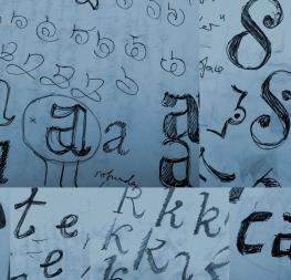
The three main font editing software apps, Glyphs, Fontlab, and Robofont, again presented their latest updates for handling OpenType Variations, and there were many more presentations of various tools helping with subsetting, proofing, analysing and comparing, debugging, spacing, and font identification. Speaking of tools, Ferdinand Ulrich gave a very nice introduction to the panel discussion ‘Tools and Shapes’ reminding us of pre- and early digital means of representing and designing lettershapes.
The conference title ‘How far can we go’ fit seemingly to three presentations of student projects experimenting with variable fonts, pushing imaginary limits, and automatisation in the form of an industrial robot:
1) ‘The next big Thing in Type’ by the type class of the UMPRUM Academy in Prague,
2) ‘How to let students step into the unknown universe of VF’ by Verena Gerlach and Maciej Połczyński,
3) ‘Grève Générale’ by ECAL
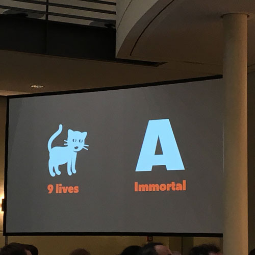
Even more so, the last two presentations of the three-day event playfully explored abstract futuristic ideas within the type realm. In their talk ‘Export Future’ Underware talked about an invented one word language (OWL) and how it could contain all texts, current and future; and HOI (higher order interpolation) creating smooth interpolation curves instead of linear interpolation. They also proposed the concept of FoFi (Font Fiction, compared with SciFi) which would be a set of instructions included in the TTF as a table describing how this font should be made with future technology not available to the present designer.
Luc(as) de Groot is also concerned with perfect curvature, wishing for a font format that would allow both Postscript and TrueType curves at the same time because PS is better for some types of curves (inflection, shallow, > 90˚) and TT for others (transitions, complex, round). He explained his theory and formula for interpolation and how he developed, together with Andrej Kuzmin a 3D tool to visualise a multi-axis variable font.
summary
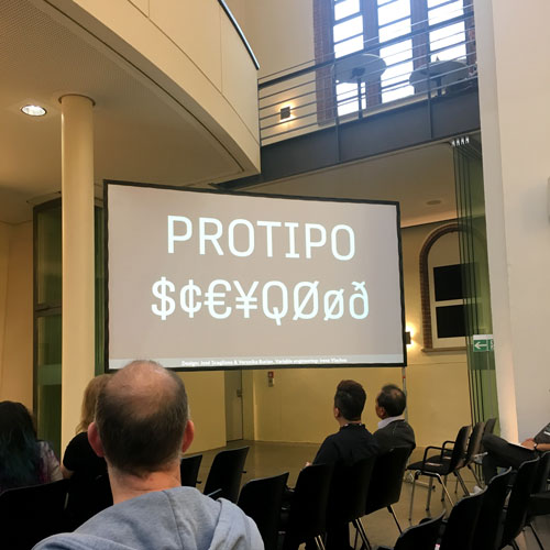
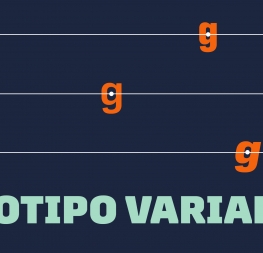
It became quite clear again at TYPO Labs 2018 that the Variable font format is here to stay. By now several commercial Variable fonts, including our own Protipo Variable, have been made available to the market, software and browser support expanded, and students and experts alike continue to explore new possibilities of the design space.
It is equally exciting to hear that the TYPO Labs organisers are planning to broaden the scope of this conference to get font users, especially web and app developers, more involved. So we look forward to an increased dialogue between both sides of the type world and can’t wait to take part in 2019!
All the conference videos are available to watch here.
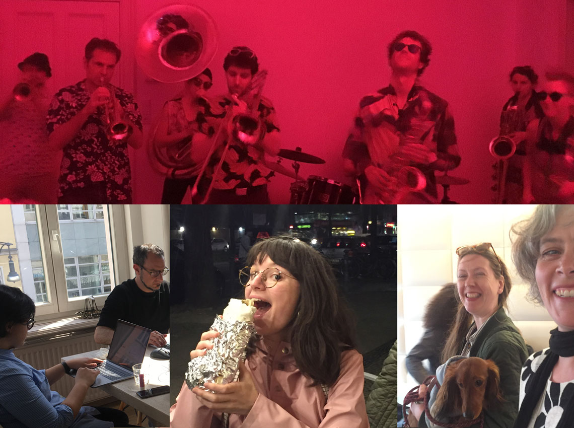
Live band at the Alphabettes party, TypeTogether work session, Roxane eating a huge vegetable kebab and Veronika with Franziska Parschau and dog Bosco.
About Us
TypeTogether is an indie type foundry committed to excellence in type design with a focus on editorial use. Additionally, TypeTogether creates custom type design for corporate use. We invite you to browse our library of retail fonts or contact us to discuss custom type design projects.
Schedule an introduction meeting to learn more.