Interview with Nicolien van der Keur

July 2018

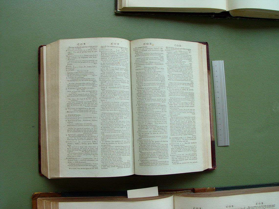
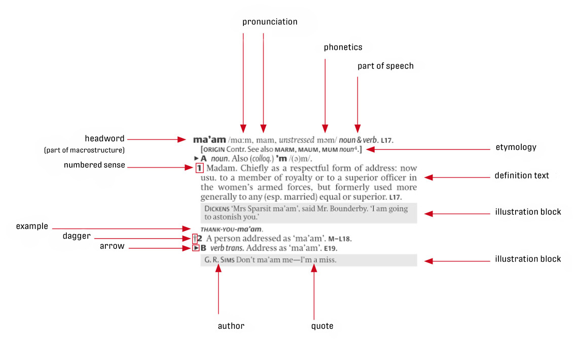
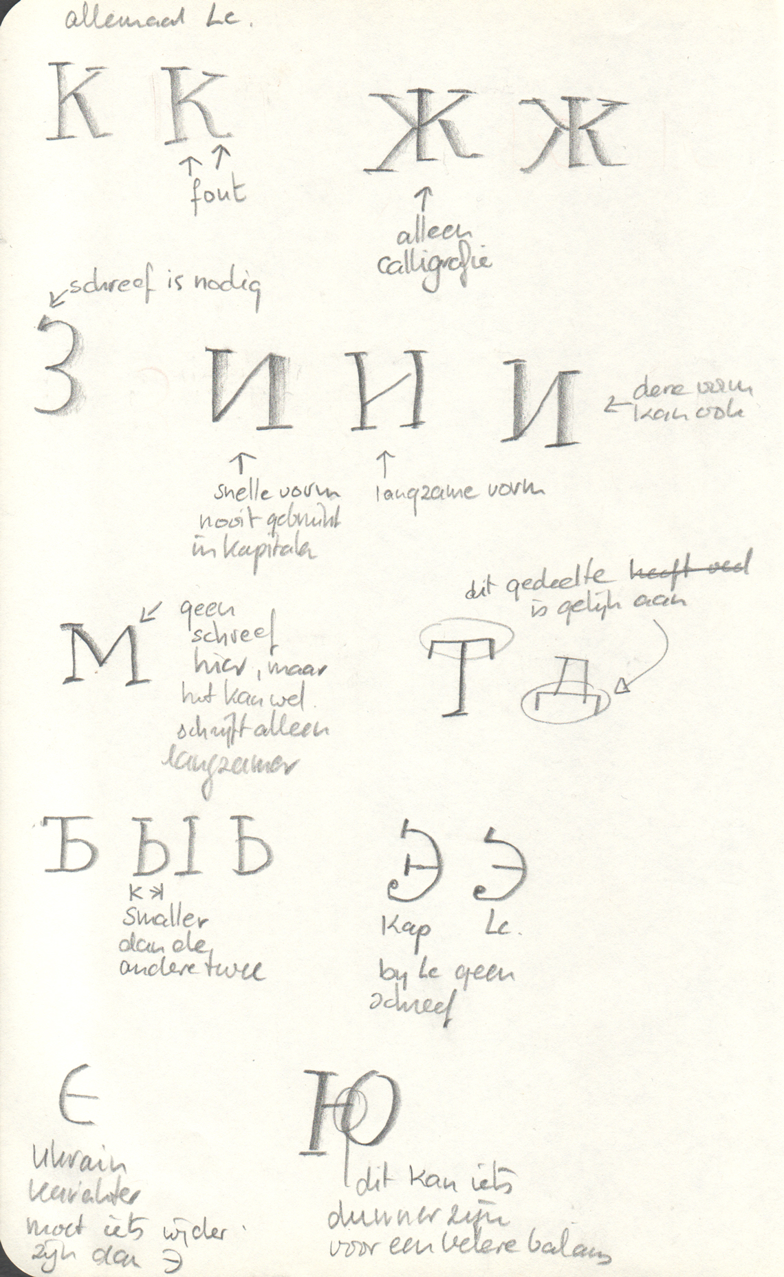
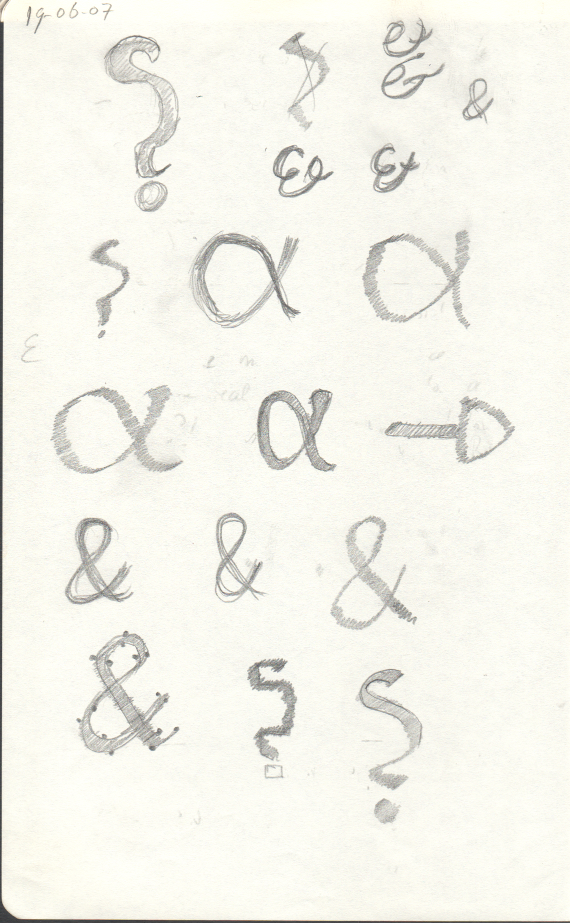
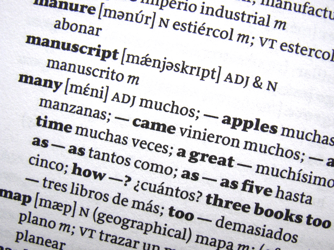
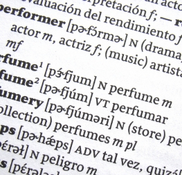
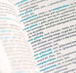
Acquiring an advanced degree often means moving somewhere new. But not many embark on this kind of adventure once they are well established. Nicolien van der Keur is just such a rare individual, risking safety for the opportunity to better herself and improve in her practice. Over a digital cup of coffee we talked with Nicolien about her history of making, her transition to font student then professional type designer, and her future plans. After reading this interview we hope you’ll read your home dictionary with a more critical eye and greater respect as well.

The Beginning 

Hello, Nicolien! Thank you for taking time out of your busy schedule to talk with us.
Thank you! I am glad you asked me for this interview.

Let’s start with the basics. Can you tell us a bit about yourself, your background as a designer, your design studio, and in what sort of work you specialise?
My education is in so-called old school graphic design. At the time when I was a student in art school, no computers were available. Also for nostalgic reasons the movie “Graphic Means” was a feast of recognition. It brought back many memories, such as specifying which typefaces the typesetter needed to use and in which point sizes, for which the text had to be calculated manually. I especially enjoyed the sketching of the layout by hand. That was a very relaxing job. You could see what a page would look like when it was finally printed.

In 1990 I started my own studio. It was the right decision for me. I could follow my own intuition in designing so that it suited my clients and me. My first assignments were about the design of magazines, but finally the work changed more toward book design, complex study books, and psychological tests for children that included a lot of forms. The best part of the design is the typography part, to find out what typeface suits best to the subject and its readers. How good the font will behave with headlines, subheads, body text, and all other components that the author needs to express his thoughts. I always say that I am not mainly a designer, but more of a typographic translator of the author’s text into a manageable book for the reader.


Nicolien van der Keur’s office

Nicolien’s early days in her office, back in 1992. Photo: Chris Hoefsmit


Can you describe your path for us? Why were you attracted to type design? 
I was 29 before I started my education in art school and my classes were during the evening hours. I could not figure out what I really wanted to do the rest of my life. You could say I am a late bloomer.

In art school I liked the lessons about type and typography best. The teacher, Joost van de Woestijne, was amazing. He inspired me to appreciate the shapes of the characters and subconsciously I knew this was what I would like doing most. Working as a graphic designer, the typography part was the best part of my job.

The demands of having my own studio, the workload, and daily life kept me from exploring other possibilities with typography, and I felt a growing need to find out more about the design of the typefaces I used: What was the inspiration for the designer? How were the typefaces made? And what was their historic background? When I was 52 I was determined to learn more about the history and design of type, so I took a year off from my studio. Thanks to the Internet I was able to find the MA program in Reading. I chose the MA program not only for the design part, but also for the serious research part as well.

You went back to school in 2007 and graduated with a Master of Arts in Type Design (MATD) from Reading University in the UK. Tell us a little about the programme, the processes you went through, and the instructors you had.
For my husband and me, it was a big decision to abandon my life in the Netherlands for a year and move to England. I had to go alone because my husband has his work in the Netherlands which he could not quit for a year. It was an adventure. We were determined to make the best of it and we did! The MA program in Reading turned out to suit me best because of the combination of research and the practical experience. It was an amazing year. The programme involved a lot of lectures by the amazing Michael Twyman and James Mosley, as well as guest lecturers. The research part was a challenge for me. It was unknown territory but it was fascinating; one reason being the ability to look and touch the original typographic source material. Also great teachers like Gerry Leonidas, Dr Gerard Unger, and Fiona Ross inspired me to understand type and typography better than I ever had done. I developed better typography skills and designed a typeface — thanks to them, my classmates, and much hard work.


Nicolien van der Keur drawing in London

Drawing in London during her studies at the Department of Typography and Graphic Communication, University of Reading. Photo: Norbert Vitha


Nicolien van der Keur stone carving

A session of stone carving.


Considering that you live in the Netherlands, why did you choose to study in England instead of studying at KABK in The Netherlands? Wouldn’t that have been much easier in practical terms?
The main reasons to go to Reading were the interesting programme they offered and the fact that it forced me to make a real commitment to study. If I would’ve stayed at home and went to the KABK in The Hague, I would always give priority to my studio clients. I still had a few clients while in England, but the periodical jobs that consume a lot of time were done by someone else. This arrangement was not something I would have done if I had not attended Reading.


The Process

At Reading you developed an interest in typefaces for dictionaries and other complex, high-density text environments. What led you onto that path?
My professional career as a graphic designer led me to design complex forms and complex high-density study books. So in a way the path started before the Master’s program. The publishers I worked for at that time had a department for books and also a department for psychological tests. These tests have forms  that need to be filled in by the examiners of the tests. Most of the time the books I designed had many tables in it; some of them simple and some more complex. I think because they were happy with me as a designer, they introduced me to the department that developed the psychological tests.

I always liked dictionaries because they are more structured than most of the study books I design, and so I was interested in knowing what was necessary for a font to fulfil the needs for typesetting a dictionary. It was not a big step to design a typeface for these environments.

Reading University is known for intense research and it’s also where you came up with Sirba. How did your research inform its design?
Specialised knowledge was available at the University of Reading by Paul Luna and Nadja Guggi. They gave me useful material to study — articles and books — and the in-house and main libraries were sources of information. Among other things, I observed dictionaries like the 1805 Dictionary of the English Language.


 Dictionary of the English language

Image of the dictionary Dictionary of the English language, 9th edition, by Samuel Johnson, published in 1805 by Longman, et al in London. Photo by Nicolien van der Keur.


Based on my experience as a graphic designer, I had an idea of what I wanted and needed in a font: I wanted the content of the text to be as clear as possible for the reader. The microstructure in a book determines the navigation for the reader and it has to be very clear. If the distinction, for instance, between headlines and subheadings is not clear enough, the reader may lose their way through the text. The differences between main subjects and side subjects can become unclear when the microstructure is not clear.

The study of dictionaries showed me that their typography had two main ways of looking at the structure: a main structure and an underlying structure. The main structure includes the navigation, among other things, while the underlying structure includes the chosen font and the typography. This extensive research led to my Sirba typeface.


Microtypography of a dictionary

Microtypography of a dictionary: “Organising the information in terms of typographical text helps the reader to find the required information.” Part of Nicolien’s research for her dissertation at the Master in Typeface Design.


The Sirba family has been expanded into different scripts over time, correct?
Yes, after graduating from the MA in Reading, I went back to my graphic design work in my studio, so it took me some time to continue work on Sirba. What really helped me was the initial interest of José Scaglione. When I showed him proofs of Sirba, he said he would like to publish the typeface through TypeTogether when I was ready. I dare say that believing in Sirba and the endless support and commitment of José and Veronika Burian made it possible for this font to be published in 2010. I am very grateful for their support. It was a pleasure working with TypeTogether during the revision of the Latin version. The design work on the Greek and Cyrillic came at a later date.


Sirba serifs sketches

Sketching the serifs for Sirba, 2006.


So when you proceeded with the Greek and Cyrillic extensions, did you have the inclination to change anything about the Latin? How was the process of revisiting the family? Was it enjoyable, like a visiting an old friend?
Oh sure, I enjoyed the process of revisiting Sirba and it gave me the chance to fine-tune some elements. It was good to see how the family became a family despite the different scripts. I started the design of the Greek while at Reading, so it was not so surprising that the Greek felt like a relative of the Latin since their design began together.


Sirba letter a evolution

Evolution of the letter ‘a‘ from 2006 to the final version in 2007.


Sirba Italic sketches

Sketches for Sirba italic, 2006.


expanding the scripts

Sirba started with Latin and International Phonetic Alphabet (IPA), then later was expanded to Greek and Cyrillic. Tell us about the experience of designing scripts as a non-native speaker and what kind of research you employed.
In 2006–2007, during my time in Reading, one of the conditions of the practical part was to design a non-Latin along with a Latin typeface. I chose Greek because I was attracted to the freedom of the curves. They were so different from the rigid vertical system of the Latin I was accustomed to. What also contributed to the decision was the proximity of Gerry Leonidas and his honest and structural comments. Gerry also gave good and useful support on the programming of the polytonic version of the Greek. The decision to add the polytonic addition was for publishers who need to make study books for students studying old Greek texts.

It was a challenge to get used to the forms of the Greek letters during their sketching. In that regard the vertical system of the Cyrillic suits better, but that script took until 2016 before it was published. To be able to design a good non-Latin script while being unfamiliar with it, you definitely need good consultancy of experienced native type designers. Also in this regard TypeTogether supported me by pointing me to the right people who were able to give good feedback.

The design of the Greek and the Cyrillic and the Latin —  you said they didn’t happen at the same time. How did the three scripts inform each other? Or did the Latin lead the design, with those features applied to theGreek and Cyrillic? And what were the challenges?
The Greek and the Cyrillic were not developed at the same time, no. The Greek started in Reading in 2007 and was completed in 2012, then Cyrillic started in 2013. The design of the Greek surely influenced the Latin, especially the italics of the Latin. Since the design of the Greek is more fluid than Latin, I could use some of that fluidity in the Latin. By the design of the Cyrillic, the biggest challenge were the proportions of the similar characters. These are slightly different than the Latin and I am grateful for the help of Cyrillic type designers who pointed it out to me. Also the articles from Maxim Zhukov gave interesting and helpful background information [Zhukov, M (1996) ‘The peculiarities of Cyrillic letterforms: design variation and correlation in Russian typefaces’ in Typography Papers 3, pp5–26. Reading: University of Reading; Zhukov, M (2002) ITC Cyrillics, 1992; Berry, JD (2002) Language Culture Type. International type design in the age of unicode. New York: ATypI, pp45–61].


Sirba Cyrillic sketches
sirba cyrillic sketches  
Sirba Greek sketches
sirba greek sketches

sirba in use

Sirba has been on the market for a while. Is there any use that has surprised you, something you did not expect?
Yes, the use of Sirba as a magazine masthead. Since Sirba was mainly designed for small sizes in high-density text environments, it was a surprise to see it used in such a big size for Door magazine since that wasn’t its original intention. I am still not sure if I like the shapes of Sirba used so large, but it was unexpected and it gives the opportunity for the details to really stand out.


Door magazine header Sirba font

Dutch magazine Door, 2012.


Is there a dream situation where you would like to see Sirba being used?
One of my dreams was that Sirba would actually be used in a dictionary. To my delight, it was used by the University of Chicago in their 2012 Spanish–English dictionary (sixth edition) and in the accompanying digital app for a smartphone or tablet. Sirba is also used in a Latin–Norwegian dictionary. I would like to see more of Sirba in use in different design areas.


SPANISH–ENGLISH DICTIONARY
SPANISH–ENGLISH DICTIONARY, UNIVERSITY OF CHICAGO  6th edition, 2012. Photo by Nicolien van der Keur.
SPANISH–ENGLISH DICTIONARY
SPANISH–ENGLISH DICTIONARY, UNIVERSITY OF CHICAGO  6TH EDITION, 2012. PHOTO BY NICOLIEN VAN DER KEUR.


What upcoming projects do you have in the works?
At the moment I am working on a new typeface with a typewriter flavour. It is my intention to make a monospaced and proportional version that feel like a typewriter font, and another one for coding.

The monospaced version will be digital, but also analogue. I would like to use this font on an actual typewriter. Preparations are therefore in progress! It will be part of research I am doing on typewriter fonts. Besides that, I think of it as a challenge to see a typeface made in the twenty-first century in use on a machine from the twentieth century.

Thanks for discussing Sirba, your process, and giving us an update, Nicolien!
Of course! And thank you for the interview and all the support Sirba and I get from the TypeTogether team.


SaveSaveSaveSaveSaveSaveSaveSave

About Us

TypeTogether is an indie type foundry committed to excellence in type design with a focus on editorial use. Additionally, TypeTogether creates custom type design for corporate use. We invite you to browse our library of retail fonts or contact us to discuss custom type design projects.