Combining the constructed and human feel while brushing away the dust from a century of geometric derivatives.
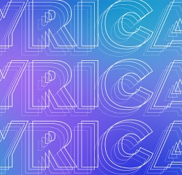
The Postea font family is Veronika Burian and José Scaglione’s take on German geometric typefaces, reshaped with the right attributes for setting paragraphs and headings, and perfect for branding and text use. Some typefaces are a rough tool, like a pumice rock: abrasive to the senses, unforgiving, and unhelpful for most reading situations. Postea is an obsidian: smooth and classy, with attractive nuances in any light. The classic curves and purposeful details keep its individuality intact while allowing it to fit an incredible range of geometric font needs. Because of these qualities, Postea makes normal reading in paragraphs a cinch and your branding memorable.
Compared to Bauhaus attributes of restraint and a sparse appearance, Postea’s deliberate play between character widths injects life and distinctiveness into its personality. The default ‘t, f’ have lyrical doses akin to a robust evening drink and are rounded out with a serpentine ‘s’ and rotund ‘o, g, b’. Another nice surprise awaits: spacing for the Hairline weight is tighter for optimal use in large headings and titles, while the regular weights have the expected, slightly looser spacing for text. Setting the test word ‘bogarts’ brings all this together nicely, invoking a balance between a constructed and human feel while brushing away the dust from a century of derivatives.
Postea is opinionated and has modern stylistic sets with softer, specially-designed alternate characters. Wallpaper-worthy geometric symbols, arrows, and ornaments are packed into SS01 and SS09. For the ultimate in customisation and glamour, the second and third stylistic sets are where geometric and typographic alternates are found.
Postea’s 14 styles (seven upright and italic) and two variable fonts are accompanied by an all-new family of icons in three weights, for which we developed a new, easy activation method. Simply bookend the desired icon name with colons (:arrowUp: :firstAid: :aid: :chargingStation:), making sure to capitalise each word after the first word, then select it and activate SS10. Icons include wayfinding, social interface, and sanitary precautions like face masks, thermometers, hand washing, and much more.
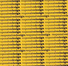
Postea now comes in five scripts (Arabic, Cyrillic, Greek, Hebrew, and Latin, now including Vietnamese) and is resilient in the number of ways the family can be used. Its recognisable characters make it a prime selection for branding, signage, corporate typefaces, and magazines. Beginning with self-restrained Bauhaus virtues, Postea is the rational response for text — a lyrical take on geometric sans serifs.
CREDITS
Lead design and concept
Veronika Burian, José Scaglione
Type Design
Azza Alameddine (Arabic)
Veronika Burian (Greek)
Yorlmar Campos (Greek)
Vera Evstafieva (Cyrillic)
Tom Grace (Hebrew, Greek)
Icon Design
Luciana Sottini
Quality Assurance
Azza Alameddine
Engineering
Joancarles Casasín
Kerning
Radek Sidun (Latin)
Graphic Design
Rabab Charafeddine
Elena Veguillas
Felicia Priscillya
Motion Design
Cecilia Brarda
Copywriting
Joshua Farmer
Consultation
Meir Sadan (Hebrew)
Irene Vlachou (Greek)
Social media manager
Douglas Arellanes