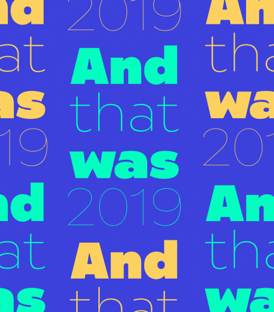
A category-expanding sans serif font that’s part experiment and part modern update.
Pilar Cano and Ferran Milan’s Arlette font family is an expansion of the sans serif genre. Every type family that TypeTogether releases endeavours to add something to the category in which the font resides, to inject a jolt of life into a category, or solve a significant problem in an appealing way. Arlette boldly attempts all three.
Pilar and Ferran based Arlette on the fast stroke of one letter from a Roger Excoffon family, but along the way they abandoned that starting point in favour of experimentation. Many sans serifs are like a svelte black dress: functional, beautiful, and the unfussy outfit for a nice evening get-together. The Arlette family isn’t like this. It’s a stunner — an incandescent reimagining of what defines a sans and how it can look.
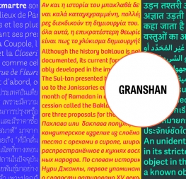
Arlette explores the boundaries of the sans serif landscape and returns with forms developed from gestural vigour. Thinking of it as “painterly” may at first seem to fit, but it underestimates Arlette’s ability to master an unseen world of countless emotions and physical applications: magazines, branding, editorial, teen and young adult works, book covers, and a host of products and packaging whose content will be amplified with Arlette’s voice. Not only does Arlette use its eight weights plus italics to speak in Latin-based scripts, it is also fluent in Thai and has six weights (hairline through bold) with which it meets that challenge, whether in text or display.
Arlette Thai’s modern nature is seen in two features for the script. One is the decorative Thai characters that are based on original palm leaf manuscripts. Another is a version of the Latin numerals adapted to the height of the script due to their wide use in Thailand. Arlette Thai has been meticulously developed, including contextual kerning to avoid mark clashes.
Arlette’s OpenType capabilities include mathematic and scientific figures, positional forms, pointers, arrows, and oldstyle, lining, and tabular lining numerals. In addition to all this, it’s packed with swashes and swash ligatures in both scripts for enthusiastic typesetting. Because it pushes experimentation without compromising readability, both Arlette Thai and Latin are surprisingly legible in small sizes and arrestingly beautiful when their details can be seen.
CREDITS
Lead Designer
Pilar Cano
Ferran Milan
Engineering
Joancarles Casasín
Quality Assurance
Azza Alameddine
Graphic Designer
Roxane Gataud
Elena Veguillas
Copywriting
Joshua Farmer