2020 review: Looking back, forging ahead

January 2021

2020 has been a weird year for everyone. Our main goals this year were to take on the challenge of the variable font format, invest in education, and align our produced pieces with our values and style. Type design was not yet heading toward variable fonts full throttle; it was kind of hovering in the distance and yet still seemed a bit far off. But we could see the major benefits of variable fonts (as well as the challenges) and decided to move forward in a serious way with it. We set our trajectory so the future would intersect with our business goals and our values. And we’re glad we did because we’ve learned so much in the process.


We also wanted to give away as much as we could in the form of education. Our increase in articles tells that story all on its own, and we’ll continue that trajectory in 2021. And our videos on social media and our blog have seen a big bump in quantity and quality as well. Have you seen them all?


New typefaces in 2020

We’ll start with the newest font families and work our way back. Florian Fecher’s Lektorat was the winner of the 2019 Gerard Unger Scholarship and was released this year. Methodical in rationale and irrepressible in function, Lektorat’s 27 styles are the embodiment of editorial expression. 


Our megafamily Adelle received a monospaced option just a couple months ago. With 20 styles designed with both the developer and the aesthete in mind, the Adelle Mono family has a true monospaced width (Adelle Mono), a proportional width (Adelle Mono Flex), and a variable font that modulates between the two to boost creativity and coherence.


Our partnership with FounderType, the top Chinese font foundry in the world, had a great release in the form of Adelle Sans Chinese in April. Through this strategic collaboration, we provide the Latin counterparts to PanAsian typefaces and they provide the Chinese to our Latin. It’s a fruitful relationship that we value and will continue to build upon for years to come.


Designed for superlative performance in long form reading on screens, in UI, and apps, Portada is a looped Thai and Latin serif font family and icon set that’s clear and readable in restrictive digital environments. This family has proven its effectiveness — and it’s the font you’re reading right now. Yep, we take our own medicine, eat our own dog food, and generally walk the talk.


Our continued partnership with Leftloft, the top strategy, brand, and design company in Europe, yielded LFT Arnoldo — a flared humanist sans that is intelligent and refined. Its chiselled structure sets dramatic titles worthy of any classic work, and its calm and dependable nature grounds paragraphs in the now.

When we say we set out to master variable fonts, we mean it. Over 80% of our releases this year come in the variable font format, and our variable fonts come with a 15% discount compared to buying the full static family: Literata, Lektorat, Adelle Mono, and LFT Arnoldo


Custom fonts

We added to our custom work by completing an extensive brand overhaul for the Ötztal valley in the Austrian Alps, including a customised version of our serif and sans Adelle font family.

Literata is a distinct variable font family for digital text that is now in its third version. Originally created as the brand typeface for Google Play Books, it exceeds the strict needs of a comfortable reading experience on any device, screen resolution, or font size. The Literata family has matured into a full-fledged digital publishing toolbox — headline, paragraph, and caption text.


content

At the end of 2019 we had already decided to increase our website’s educational content. It was a massive, coordinated effort by the entire TypeTogether team: some were coming up with ideas, some were writing, others editing, and still others working on the accompanying images or marketing plan. We also wanted to bring in other scripts besides Latin-based languages, so we asked some good friends to contribute.

Once it became obvious that the pandemic would seemingly lock down the world, we knew we had made the right decision — so we committed to it even more. We put out more in-depth articles than ever, balanced by the breezy and stimulating Instagram quizzes we created, and the bookmarkable repository of online typography videos. This also fulfilled another related need: most of the TypeTogether team travel to lecture, lead workshops, and contribute to significant amounts of in-person education around the world. Due to restricted travel, these outlets in a small way replaced that important commitment.


General articles & interviews

  • An exhaustive list of type and typography videos (conferences and talks mainly).
  • Working remotely: Elena Veguillas shared some times on  working remotely as a team.
  • Online meetings: Pooja Saxena describes how we do online meetings, the TypeTogether way. 
  • At the begining of the year we talked with type designer Wolfgang Homola, about Soleil and more.
  • Marking the collaboration between TypeTogether and FounderType we talked about FounderType, Qiu Yin, and of course, FZ Lantinghei and Adelle Sans Chinese. 
  • To celebrate the release of Lektorat we recently interviewed Florian Fecher.


Educational articles


Videos
Cecilia Brarda officially joined TypeTogether this year as our resident animation expert. You can read more about her and her book release in our team bios, but here are some videos she made for TypeTogether:


And the collaboration with St Bride Library, ‘Two minutes of type’, to celebrate the Library’s 125th anniversary.

.


Community: education, talks & workshops

We’ve already made a lot of noise about 2020 Gerard Unger Scholarship winner Anya Danilova and her Rezak type family. Here’s an interview with her and the scholarship announcement. José co-authored another book (Legibilidad y tipografía: la composición de los textos, “Legibility and typography: the composition of texts”,) this past year and wrote a short blog post as well. 
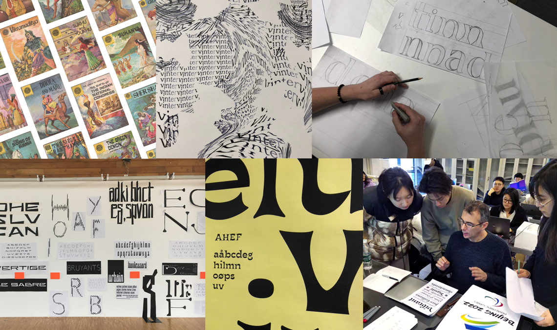
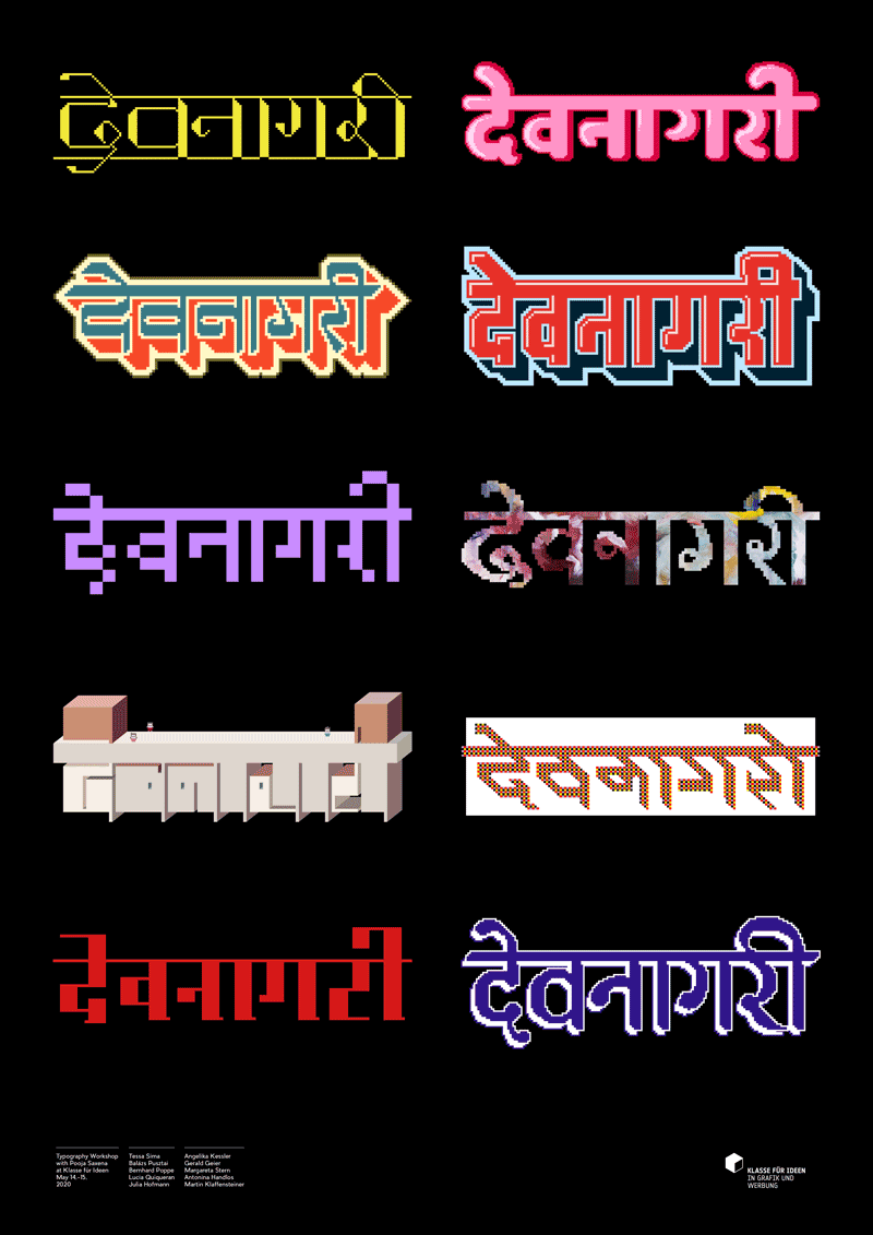
Workshops & talks
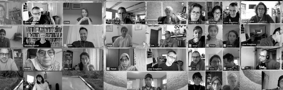
Veronika led a workshop in February at NTNU in Norway and served as the curator for TypeTech MeetUp. Veronika & José led a consultancy critique for the Beijing Winter Olympics font project, at CAFA (Central Academy of Fine Arts of Beijing). Roxane was busy this year. She led a workshop in January at ESAM Caen, gave a Lecture at Université PARIS 8, was on the jury for the Masters graduation at ECV Nantes, taught at ESAD TYPE September 2020–January 2021, and gave a crit for Alphabettes & for ATypI. Cecilia gave several virtual conferences on type in motion, such as TypeWknd and Latir Festival. She gave virtual talks for Argentinian design events and led the postgraduate Type in Motion course at her university in September. And Cecilia will soon publish an article for the International Congress of Digital Graphics (SiGraDi) that is held in Colombia, where she’ll also give a lecture. Pooja was on the Typography jury for the ADC 99th Annual Awards, led a workshop at University of Applied Arts, Vienna, gave a talk at TypeWknd, and another at GlugBirmingham. Josh mentored a project manager turned type designer, helped him release his first font family, and is consulting on upcoming releases. 


Student work from Pooja’s remote typography workshop at University of Applied Arts, Vienna. Every student, new to the Devanagari script, created pixel lettering for the script’s name. Poster design by Balázs Pusztai.


And that was 2020

The beginning of each year holds promise and hope; the end is the perfect time to see how we kept our promises and fulfilled those hopes, both as a small independent business and individually. Thanks for joining us on this look back at how far we’ve come with the new and expanded typefaces we’ve released, the technology we’ve invested in, how we’ve continued to contribute to education, the awards bestowed on our work, and the special events to which we’ve been fortunate to contribute.

But most of all, our sincerest thanks to you. You have supported us for 15 years! Our team meets once a week to get updates and make plans, and every time our questions revolve around you: how we can help you, how our upcoming releases will excite and further you and your career, how we can simplify your life, how we can support your goals, how we can educate and inspire you. You’re at the center of our thoughts, our plans, our business. We have some amazing things coming this year but it’s not worth doing unless we can do it together and put good into the world. So here’s to 15 more years!
 
All our best,
The TypeTogether team


About Us

TypeTogether is an indie type foundry committed to excellence in type design with a focus on editorial use. Additionally, TypeTogether creates custom type design for corporate use. We invite you to browse our library of retail fonts or contact us to discuss custom type design projects.