And that was 2019

January 2020

Seasons serve as markers along our timeline. They are reminders to be grateful for what has transpired and hopeful for what comes next. We all mark our lives by the annual reminders of holidays, personal celebrations, and such international demarcations as a calendar year. So here we are, together again to mark the passing of 2019 and usher in 2020. There’s lots to review so let’s get to it!

“

New Typefaces in 2019

2019 marked the ten-year anniversary for Bree so we decided it was time to give it a major update. Along with adding a few characters, we added Greek and Cyrillic scripts and fine-tuned everything to work brilliantly together. Soleil got its long-awaited Black weights and Eskapade received a huge update to almost triple its weights and add all-new ornaments. Both the Ebony and Adelle Sans expansions included Vietnamese, while Pan-African was also added to the Adelle Sans megafamily. Each major family update was years in the making and is a significant step forward in multilingual type families, especially families intended to carry the same tone across cultures and dialects.


What about the brand new font families to grace our catalogue? That would be Catalpa, Laima, and LFT Etica Mono. LFT Etica Mono is the monospaced companion to the LFT Etica family with two italic forms; great for actual coding work or aesthetic design. Laima is the lively, brand-ready stencil for unexpected and captivating work. Catalpa was made to be an overwhelming headliner, like the quirky and hulking wood type that inspired it. With only four thin and four heavy weights, being a bellowing display family is its single-minded purpose  — and it’s part of a wider related editorial family that will be released throughout this next year. We’ve accomplished a lot in one year and we still have a lot more coming up in 2020.


Custom Fonts

Our custom font work continues to grow. The German-based industrial manufacturing company, Siemens, created a new healthcare business with a new branding concept, Siemens Healthineers. After choosing Bree for their logotype, it is now being used in headlines on websites, communication collaterals, graphics, magazines, trade shows, events, and as a product tag. One of our most popular and influential families, Adelle, also continues its wide use in digital and print. Langara College (Vancouver, B.C. Canada), in collaboration with the Musqueam people of Canada First Nations, commissioned TypeTogether to extend Adelle to support the indigenous Halkomelem language, thus reaching the community with authenticity and credibility.

Several years ago Google commissioned TypeTogether to create Literata, a serif font for reading novels on a range of digital devices. It became the standard typeface for all Google Play Books, known by its ease of use for reading and by its unique look. Well, we gave it a major update this year (version 2.1) to include more scripts and weights, and will update it once more in the coming months to include the variable font format for wider use on more devices, a smaller digital footprint, less bandwidth usage for developers, and more accessibility. Even better, the update will also be free from our website. Stay tuned for that announcement!


Content

We think it’s good to know who the TypeTogether team is so we’ve continued with the team introduction series. This year we highlighted writing and editing pro Josh, senior designer and Greek specialist Irene, communications manager and idea generator Elena, and co-founders José and Veronika. We also had interviews with the creator of the Eskapade family, Alisa Nowak, and with Florian Fecher, the winner of the 2019 Gerard Unger Scholarship. Irene Vlachou informed us on Greek type anatomy as the third instalment to our Type Anatomy series, and Elena reported on taking part in an immersion into designing Arabic, Devanagari, Tamil, and Bengali type at the British Library.


Specimens
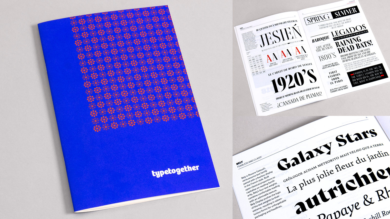
Printed specimens are some of our favourite things: the tactile experience, the aesthetic impact, the colours, and the way print demonstrates nuances not noticed in a digital format. Every five years we design and release a printed specimen that includes all the new font families released within that five years. So if you want an update on our new typefaces, grab our 2019 general catalogue.

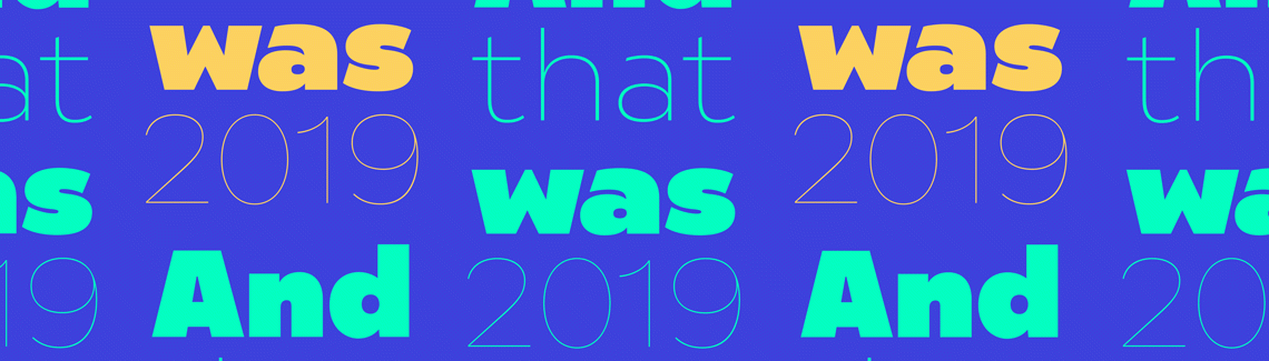
We created a fun newspaper after our annual team get-together just for us (too many inside jokes probably). But for all you dedicated readers and specimen lovers, we reprinted our black cover Adelle and Soleil trifolds and designed a trifold with Portada and Protipo to show how both families help designers build brands and have been optimised for infographics, signage, screens — the works. Our poster additions include the both-new-this-month Temeraire and Noort posters. All available merchandise is free, pay only for shipping and handling.

Type in use
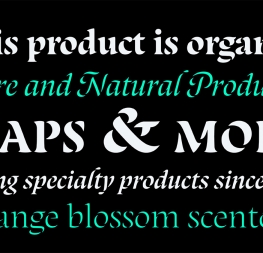
You keep sending in wonderful uses of our typefaces. This year we saw Bree Serif used for organic products from Rewe, one of Germany’s largest supermarket chains. Adelle Sans was typeset beautifully in Choreografia, a book on choreography and its political aspects. The hit app Evernote busted out of the gate with their rebrand using Soleil, and Protipo became the brand voice for Libora’s minimalistic design in print and digital formats.

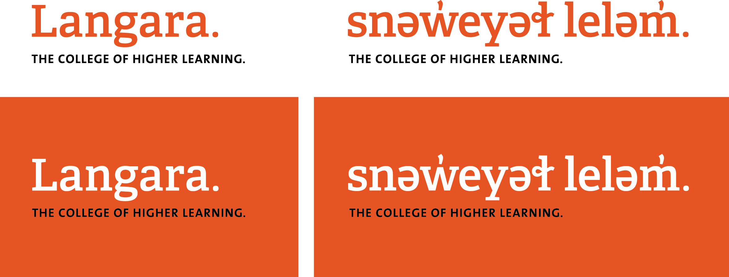
The new and captivating Arlette showed up in a children’s book about dinosaurs, and Lisbeth and Temeraire made debuts in Européens magazine, which carries stories of European innovators, entrepreneurs, and creators. One of the most substantial brand overhauls was Portada’s use — literally everywhere — for Austrian Airlines. To balance a look that is approachable and professional, everything from airport signage and their in-flight magazine to the digital app and the livery name has been set in Portada. As a result of the efforts to boldly update Austrian Airlines with a contemporary classic, the rebrand won a prestigious Red Dot Award. We’re always thrilled to see our designs put to exemplary use, so keep sending your projects in!

Awards
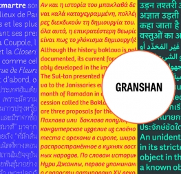
Awards aren’t everything, but they can indicate a certain level of professionalism, creativity, aesthetic value, and functional usefulness. This year the annual Granshan competition has awarded TypeTogether with another bevy of awards for our hard work and consistent progress in multiscript typefaces. Among the winners are the families of Arlette, Adelle Sans, and Bree, focusing on their Thai, Arabic, Devanagari, Greek and Cyrillic scripts. A huge thank you to the Granshan judges and a huge shoutout to our eleven amazing designers. Such a rewarding close to a successful year! 

Videos

For the past two years we have invested in short videos to highlight our fonts. LFT Iro Sans used its story connected to sport to show off its look. Laima’s stencilled forms gave way to looking good in animation. Bree and Bree Serif teamed up for a summertime theme and Ronnia lent support to Women’s Day. Lisbeth’s italic structure was paired with some jazzy-rock and Ebony’s speed inspired characters made for a punchy countdown. Our latest variable font, Literata, also was shown in action. What’s next? More videos, of course! Check out the ones you missed here.  


Community: exhibition, education, talks & workshops

As a company that creates fonts, we strongly support education; it’s the most logical thing. Each person on the team does this through volunteer work, teaching, giving talks, running workshops, and holding exhibitions. This year we again sponsored conferences and exhibitions and led workshops around the world and with various themes.

Veronika hosted the Noam Text exhibition and talks at TDC New York with Adi Stern, led workshops in Norway and Bulgaria, ran the type crit at ATypI, spoke at Cañas & Tipos in Valencia, and was joined by José for their talk at ISType. Roxane led another workshop in France, Elena gave a presentation at Serifalaris, and Irene spoke on designing dynamic logos at ICTVC. Pooja continued with her lettering walks through New Delhi, a workshop on choosing typefaces, and contributed to a working seminar on type design. Joanca ran a workshop in Barcelona with Bas Jacobs from Underware and another with Laura Meseguer. The entire team celebrated the release of the Chinese translation of How to Create Typefaces and the awarding of the Gerard Unger Scholarship to Florian Fecher while at our annual meeting in Italy. So much accomplished in just one year! Interested in having one of our team speak at your event or lead a workshop? Let us know!

Hello & goodbye
The best thing about having an international team is working with amazing people regardless where they live. The worst thing about it is not getting to see them more often or having to say goodbye when they move on to pursue other projects, as is the case with our dear Irene Vlachou. We adore her, support her, and wish her all the best, knowing that this is not the last time we’ll be interacting or working together. After all, she’s part of the family.

This past year we welcomed Rabab Charafeddine to our team. Rabab does a lot of our graphic design work, some layout work, and pitches in on various projects. We’re excited to have her on board!


And that was 2019

We have much to be thankful for. This past year, as every year, we remain committed to those values that have served us so well: collaboration, problem-solving, creativity and appropriateness, educating and encouraging, serving languages globally, and having fun through it all. We’re not famous. No one is cheering for us when we arrive at airports and we don’t have security guards ushering us safely through busy corridors. We simply serve with our skills to the best of our ability and hope that it makes a positive difference in this world. We put our best into our work because we think it’s valuable. Type design is something we love deeply and we’re lucky enough to share it widely.

We want to thank you for supporting our independent font foundry. We’re small, but we believe we can create wonderful things together with you. Here’s to more and better in this upcoming year!

Best regards,
The TypeTogether team


About Us

TypeTogether is an indie type foundry committed to excellence in type design with a focus on editorial use. Additionally, TypeTogether creates custom type design for corporate use. We invite you to browse our library of retail fonts or contact us to discuss custom type design projects.