The history behind Adelle Sans Chinese: interview with Qiu Yin

May 2020

The release of Adelle Sans Chinese marked the beginning of a global collaboration between TypeTogether and FounderType, and the expansion of Adelle Sans as a true multiscript type family, now covering nine scripts. This interview is a short introduction to FounderType, the recently deceased Qiu Yin, and of course, FZ Lantinghei.

Foundertype

As the world’s leading supplier of Chinese typefaces, the FounderType font library touches almost every category of life across Asia. Their font families transmit news, sports, and entertainment and they are recognised as the leader in printing newspapers, books, magazines, and packaging. The screen capapbilities of FounderType fonts also make them the top choice for websites, mobile devices, advertising, games, animation, and office applications. They are now partnering with TypeTogether to harmonise Chinese with Latin and offer multiscript capabilities to a wider audience.


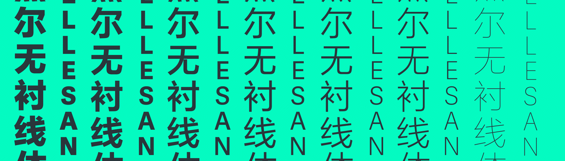
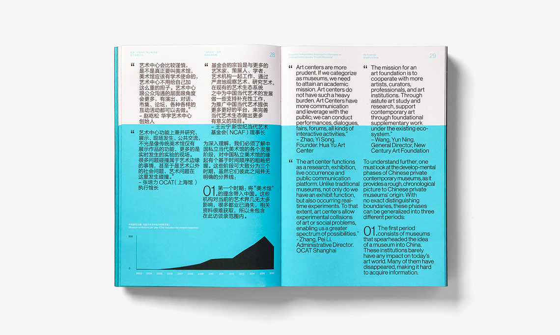
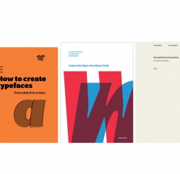
FZ Lantinghei & adelle sans

Adelle Sans began as a Latin family with 30 weights. It has since grown to include seven other scripts (Arabic, Armenian, ChineseCyrillic, Devanagari, Greek and Thai — as well as Latin Extended). Each time a new script was created, the original Latin was bundled with it for multiscript typesetting use. For each additional script, the team had to decide which weights and styles to include as companions based on what was expected for each script. Some families have seven styles and others have 14. Adelle Sans Chinese (a modified FZ Lantinghei plus Adelle Sans) is no different; it’s bundled with the Latin and has seven weights for pitch perfect side-by-side use.

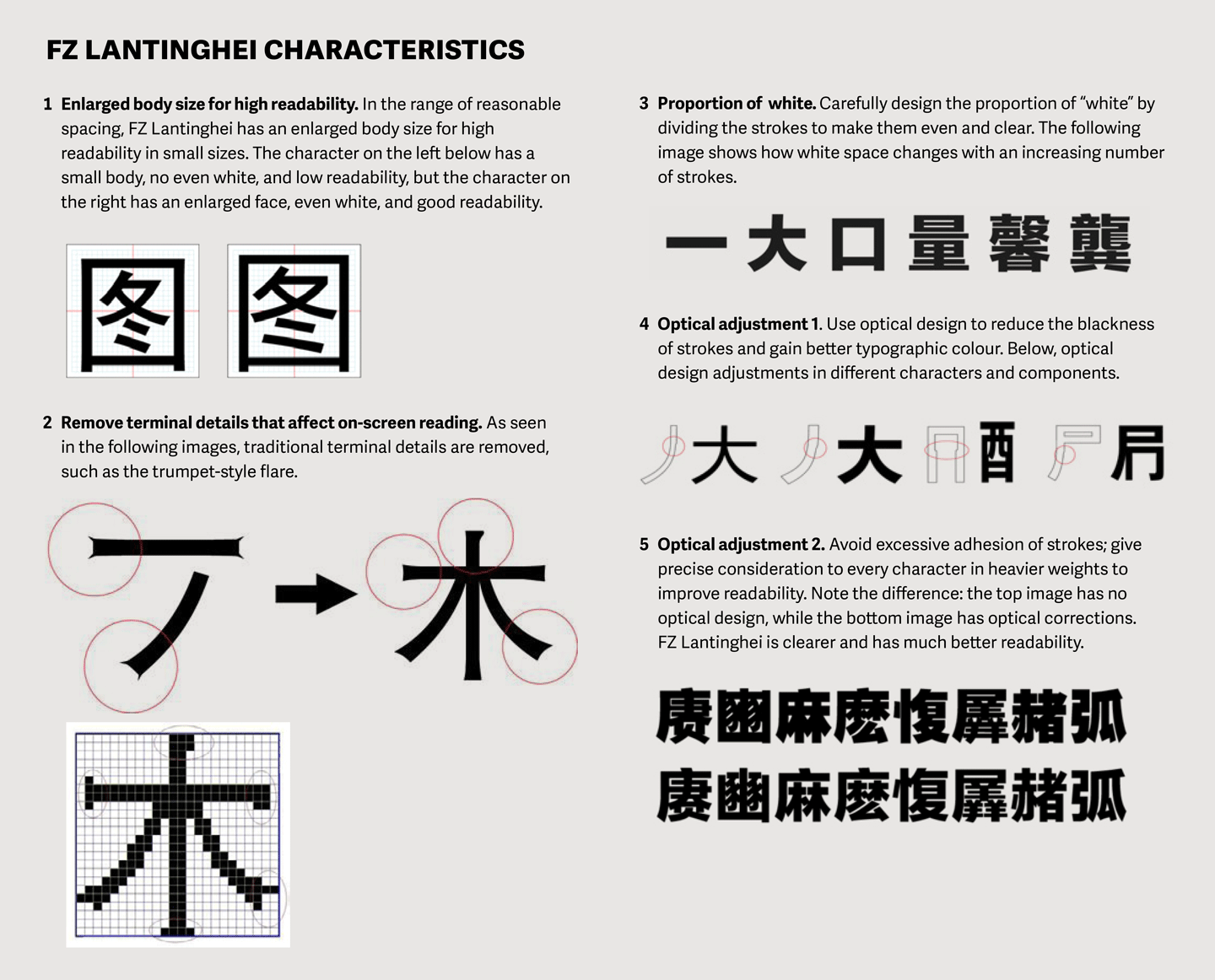
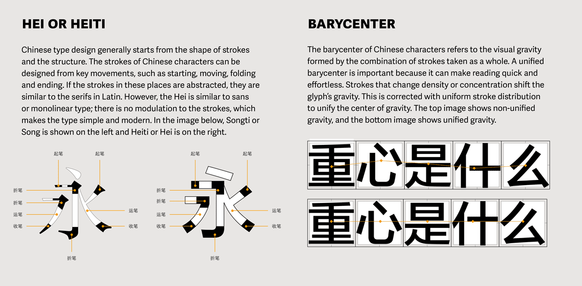
For our Latin readers, Hei and Heiti are similar to our sans serif category, and Song or Songti are comparable to our serif category.


1. Let’s start with the basics, Qiu Yin. What are the characteristics of FZ Lantinghei compared with other similar styles?
FZ Lantinghei is a very effective and modern Heiti (sans) style. There is more white space in characters, it is clear and lively, robust in structure, and has an even centre of gravity and typographic colour. Strokes are organic, concise, powerful, and detailed.


2. What makes TypeTogether’s Adelle Sans super-family and FZ Lantinghei so compatible in terms of design?
Adelle Sans is a widely used font family because of its excellent readability, especially for screens, text, and other wide uses. FZ Lantinghei’s design concept is consistent with Adelle Sans. As a steady and gentle modern style with perfect readability and aesthetic experience in the East and the West, the matching of the two is a good choice for both digital media and the wide application of cross-media platforms.


FounderType Lantinghei and Adelle Sans have highly consistent characteristics: both are lively and clear, rigorous and powerful, firm and soft, with a distinct sense of the times. The strokes of the characters are sharp and purposeful, the white space inside the character is even, and the font is simple and clean.


Comparing the design adjustment of weight (here in bold), complex shapes are simplified and the colour is even. These design adjustments take into account its use in software apps and different media. Whether in mobile or traditional printing, FZ Lantinghei and Adelle Sans will fully reflect the identity of any brand putting it to use.


 The origin

3. Who is behind FZ Lantinghei? Can you introduce the team who designed FZ Lantinghei?
In 2004, Microsoft commissioned FounderType to design a Heiti for screen, which is the default font of Windows Vista Chinese version, named “微软雅黑” (Microsoft YaHei, Msyh). This was the predecessor of FZ Lantinghei.


“微软雅黑” (Microsoft YaHei, Msyh).


In order to make this Heiti suitable for newspapers, advertisements, and other media beyond screens, many adjustments were made to the original and the FZ Lantinghei family was born. Qi Li, the chief designer, led the design team to complete the design in 2006 — including ten weights, two condensed styles, and two expanded styles for a total of 14 fonts. At that time, Qi Li was a senior designer at FounderType and was the designer of many excellent typefaces, such as FZ Qianti, FZ Pangwa, FZ Zhiyi, FZ Paper-cut, FZ Lanting song, etc.


FZ Lantinghei in use

4. We know that FZ Lantinghei has been widely used, so what famous brands use FZ Lantinghei in China and abroad?
FZ Lantinghei has been used by Qualcomm’s mobile phone chip, Apple’s Mac OS, Samsung mobile phone, Xiaomi mobile phone and MIUI system, Hanwang ebooks, and many other products.


FZ Lantinghei in Apple’s Mac OS.


FZ Lantinghei in Samsung
FZ Lantinghei in use in Duokan ebook


5. How is it generally used? And is there any particular use that has surprised you?
FZ Lantinghei is a modern design for screens. In addition to its outstanding performance on screen, it has also been popular with many high-quality magazines and books in China. FounderType has been fortunate to see it integrated into almost every aspect of Chinese life and become known as a ‘great Heiti’ in this century. [Note: Similar in the Latin world to a genre-defining typeface, like a Futura, Helvetica, or DIN.]


FZ Lantinghei paired with Helvetica in a book about Chinese contemporary private art galleries designed by ABCD studio.


FZ Lantinghei paired with Helvetica on the environmentally friendly bags designed by ABCD Studio for Innovation China Festival in New York and Boston.


FZ Lantinghei used as the branding and advertising element.


FZ Lantinghei paired with Futura.


LOOKING AHEAD

6. What can you tell us about the collaboration between FounderType and TypeTogether?
In design, the matching of Chinese with other scripts is something difficult for many designers. Many good, professional-level Chinese typefaces have no other matching scripts that were made to work together. At present, while there are many Latin fonts globally, there are very few professional Latin fonts developed by Chinese foundries or within a good partnership. So the problem of matching East and West typefaces persists.

From the beginning of our collaboration, FounderType and TypeTogether have emphasised harmonising our fonts. Since then, we have released several type families with harmonious multilingual scripts in the Chinese market — the Chinese fonts from FounderType and the Latin or other scripts from TypeTogether, bundled together as one family. These multiscript families support over 110 European languages, giving designers more and much better choices in this respect.

With China heavily invested in international trade, Chinese enterprises increasingly need global typefaces that can meet various needs in different countries and regions around the world. The cooperation between FounderType and TypeTogether is the right start to help Chinese enterprises more with internationalisation.

We are looking forward to this growing collaboration and to see more typefaces released, together.


About Us

TypeTogether is an indie type foundry committed to excellence in type design with a focus on editorial use. Additionally, TypeTogether creates custom type design for corporate use. We invite you to browse our library of retail fonts or contact us to discuss custom type design projects.