by veronika burian & josé scaglione

One of the most common questions we have encountered over the past fifteen years as professional type designers is about combining typefaces. How can you successfully pair fonts? What general guidelines can be applied to find the right match? What are the pitfalls? This short guide offers some answers, but be aware — they are subjective opinions expressed from a type designer’s perspective with a heavy bias toward editorial design.

Starting is often the hardest part. The first useful steps toward a happy typographic match are to define clear goals, to analyse the content being designed, and to understand its structure, function, and audience. Appropriate font selection (read our article here) also plays an important role in this initial process. This sets the stage by choosing the right fonts for the content in question.

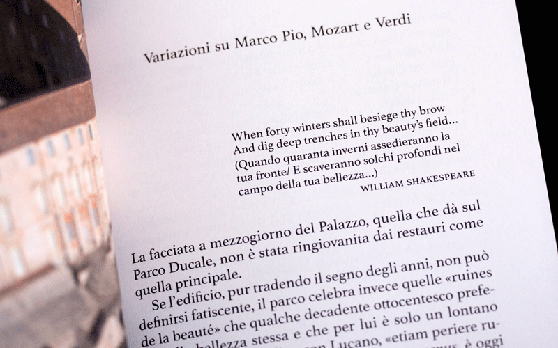
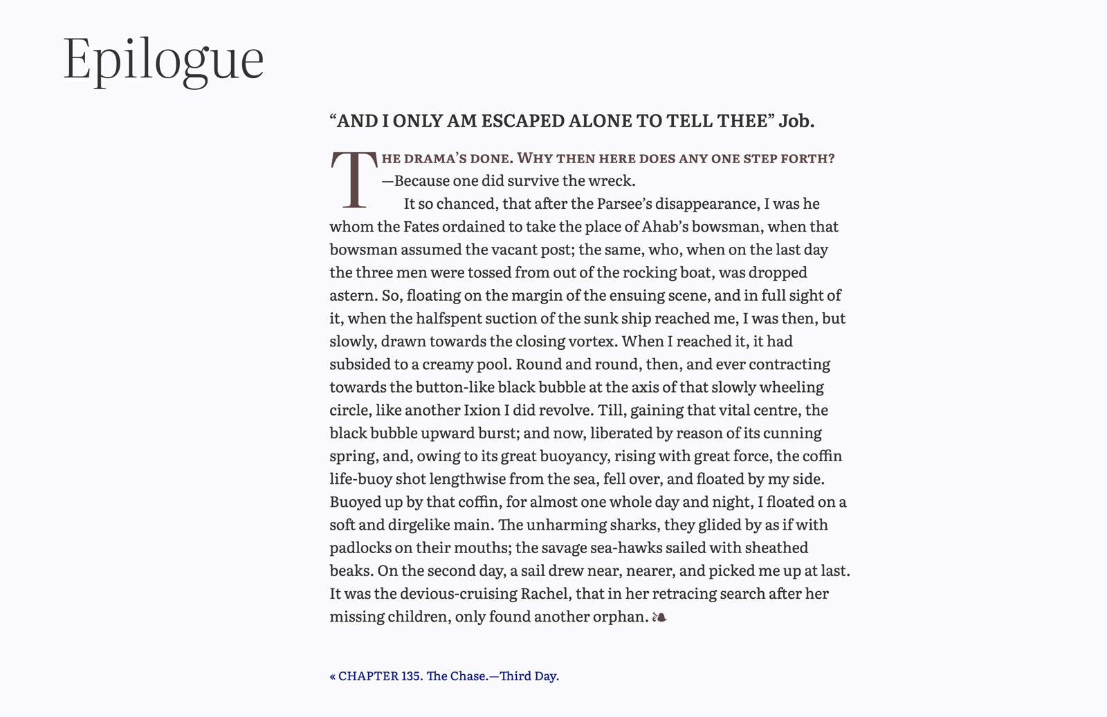
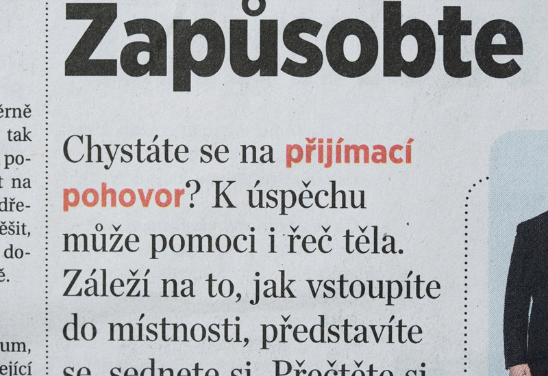
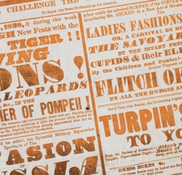
As Robert Bringhurst wonderfully put it, “Letterforms have tone, timbre, character, just as words and sentences do.” Indeed, letters have formal, aesthetic qualities that relay different emotional properties. Fonts have a voice and carry a tone, so matching what you’re saying to the way the font feels is important.

For example, setting a Shakespearean play in a sans serif font (even a “humanist” sans) or using a fragile modern serif for an aggressive advertising message doesn’t work because their tones don’t match. Our subconscious mind will feel something very different from what was intended because these intangible associations we have with lettershapes are conditioned by our common visual heritage. So your concern should be about a good match between the style, semantics, and intended impact of your text and the corresponding properties of the chosen typeface. Do they match?


1. So lonely: the power of singleness
The often quoted phrase “Less is more” by Adolf Loos also holds true in typography. Excessive use of fonts is not a sign of good design if there is no structural need for variety. In communication design, type has the task of serving the content and delivering information in an engaging, not confusing, way. So one of the first questions you should ask is, “Is another typeface really necessary?”

Many issues can be solved with just one typeface or even a single style. (Granted, your options to give enough personality to the design are limited when using just one style.) Focus on making the most out of it and really fine-tune your microtypography by taking special care of letter spacing, indents, line-spacing, column width and length, hyphenation, and the like.


Setting a piece in just a single style is tough, but the simplicity of it can produce some beautiful results. Occam’s Typographic Razor might say, “Don't use more fonts than are necessary to accomplish your goal.” Like learning a new instrument, good typography is learned by starting with one and mastering it. How much can you do with one great typeface? The example above shows a wonderfully typeset page using only Athelas Regular from a book series for the small Italian publishing House, Incontri Editrice.


2. Meet the family: each member has their own skill & personality
It is obviously demanding to design something eye-catching with just a single style, and it is perfectly reasonable to resort to other styles within the chosen type family. [Note: A font weight is when you increase or decrease the thickness of the character. A font style is when you switch from an upright to an italic, a display or titling version, a contrasting width, or a special case like a unicase style.] This should be the first step of combining type: use a different style within the same family. Choosing small caps or an italic can be a perfect way to suggest a change of pace and add visual texture without drawing as much attention as a bold weight would.

As a piece grows in complexity and requires different levels of hierarchy you should reassess how well a type family is handling those requirements. Using a font made for paragraphs in a headline situation will usually not produce the desired results. Fonts for continuous paragraph reading have built-in design details necessary for legibility in small text sizes, but look rather crude and clumsy in big sizes. 


Typefaces for body text and titling are different in their design even if they belong to the same family. Fonts for small text sizes need to be more robust, and a lower stroke contrast is preferable because thin lines would break up when scaled down to small type sizes. Titling styles can be more refined and show more play like the open ‘g’ and the tail of ‘a’ in Abril Titling shown here above.


A comprehensive type system can display even bigger differences in stroke contrast, design features, and width proportions between the members, as shown here in the new Literata variable font. A variable font offers even more possibilities to fine-tune these factors according to function and medium of the piece.


3. Famous characters: getting to know you
Some master punchcutters left us their legacy of typefaces they made during the first centuries of type-making. Students in their first typography lessons in design school are introduced to Granjon, Griffo, Didot, and many others. This is perfect for learning how typefaces differ from each other, getting to know the various typographic categories, and basic typesetting rules, but special care is needed when selecting one of these typefaces.

The original Garamond was made by hand out of metal, but today’s fonts are mostly made digitally; and when they are, the designer makes certain adjustments based on their own goals for their new family design. There are many different interpretations and versions of typefaces called Garamond, but they certainly aren’t the same. They differ in quality, aesthetic value, language support, and character set so that no two Garamonds are the same. Garamond ≠ Garamond. The font name should therefore not be the exclusive point of reference and be accepted without further scrutiny.


The three typefaces shown above are all called Garamond because they are based on the original Garamond, but they display quite a variation in letter width, structure, and design features between them. Meaning, one should not simply rely on the name of a “classic” to assume quality.


4. My valentine: balance similarities & differences
When combining typefaces, one common need is to create emphasis or to separate one part of the text from another within the same section. Changing the appearance is useful for many reasons: to stress words or comments, to acknowledge speakers or speech level changes, to create cross references, and more. However, when too many different typefaces are used, the reader is unable to determine quickly what is and is not important. Clarity suffers.

Probably the most important factor to consider when using different fonts in the same block of text is to match their optical size and not their point size notation. The Latin alphabet is mainly read along the x-height, so matching x-heights will ensure that distinct fonts fit each other more graciously in a line of text.

Another aspect to bear in mind is combining similar letter proportions and their look and feel, unless you want to clearly change the pace of reading. For example, using a word set in a Garalde italic within a narrow stiff Bodoni style will inevitably stop the reading flow. 


Combining such distinctly different typefaces (Abril and Essay Text) in the same paragraph and line is not recommended because it disturbs the flow of reading and draws the reader’s focus to an unintended place.


In this example there are two levels of emphasis: change of colour and change of typeface (from serif to sans). Even if you can't understand the language, it is clear the author wanted the reader to pay particular attention to these words. The choice of combination is successful because the two fonts share a similar design language and feel, including their x-heights.


5. The right personality: more than a pretty face
A useful approach is to organise typefaces according to their intrinsic structure and general feel, which provides a more simple and helpful system than traditional classifications such as the Vox system.

We recommend thinking in terms of two big groups: on one hand, the organic class has shapes that relate to handwriting, where hints of the broad nib pen are seen more easily, both in general proportions and how strokes are created. They appear to be made by a human with a tool. On the other hand, the mechanical class have shapes with more equalised proportions, more stiffness, and usually have vertical stress. These look machine-made.

Sticking to one of these broad categories when combining fonts, especially within the same block of text, can lead to a much more harmonious typographic palette. Contemporary typefaces may very well fall into a grey area, having both mechanic and organic features. It is therefore the designer’s task to assess and to find matching typefaces that share a similar language.


Combining fonts that fall into one of the broader categories, mechanical and organic, will have a more successful and harmonious outcome, especially when used in the same block of text. Abril Text is top-left, Tablet Gothic is bottom-left, Maiola is top-right, and Karmina Sans is bottom-right. Choose either the right or left sides for good combinations.


6. Dominants and submissives: obvious hierarchies
In situations where a block of text is significantly larger than the rest, as when comparing headlines to body text, a more eclectic approach to type pairing can create the desired tension. There is certainly more typographic freedom for matching text and titling couples. Combining distinct and diverse typefaces can create a more obvious hierarchy and generate higher levels of visual interest.

Always take into consideration the aesthetic concordance between fonts and the content, and between different typographic blocks. Some level of continuity will reinforce the general atmosphere of the design. Be bold though and clearly decide to either accentuate diversity or deliver a more homogeneous result.


The design language and atmosphere of the fonts used in this sample is so far apart, that the outcome creates an unpleasant tension despite the distance to each other. There is also a striking imbalance of content and the appearance of the typeface used in the sub headline. It evokes a very different feel from what the actual content is.


7. Marriage between cousins: not always the best idea
The so-called superfamilies can be an appealing choice when designers are faced with complex design problems. It seems simple when all the design decisions have been prepackaged. Keep in mind though, just because they belong to the same type system does not automatically mean all family members work well together.

The most common mix are serif and sans serif (sometimes semi-serif) subfamilies which share typographic colour, general proportions, and style. They are a safe choice when consistency is required, keeping a similar atmosphere and information level. However, a critical caveat to this solution is whether the selected styles still have enough tension and a good amount of their own personality between them.

It is important to remind ourselves about a crucial principle: if another font is needed, it is important that readers can recognize it as a different design element. If fonts look too much alike, it will seem like an error and not as a conscious design decision.


It is recommended to not rely exclusively on type family systems. Sometimes the differences are too weak and produce too much uniformity because the letterforms have the same structure with just small details changed. The apparent family connection might lead to combinations that actually don’t work.


8. Opposites attract: select fonts from different categories
Trying to match two serif fonts (or two sans serif fonts) might be one of the most delicate scenarios a designer can encounter. As mentioned, a situation in which fonts are set at very different sizes and for different functions is less likely to pose problems. But you may need to resort to other tools in order to help readers navigate the page in cases when printing size is quite similar.

Strong typographic contrast typically doesn’t create problems, but when typefaces from different families that are aesthetically similar are combined, design imbalance is often the result. The casual reader might experience a subtle, discordant, and unpleasant undertone within the design. Conscientiously choosing type from different categories is the simple solution to this problem.


Though website development has advanced drastically, rendering performance of text fonts online can still be problematic, especially if the audience is more likely to read on older computers. Using web-safe fonts is a good decision in those cases. In this sample, Coranto 2 was chosen as headline font to create consistency with the print edition. As text font Georgia is used, getting the right performance on screen. Both fonts work well together, because they share similar structure and are used in radically different sizes. They do not compete with each other.


9. Love across continents: adding font flavour
Combining different scripts on a page requires, first and foremost, certain knowledge of how these scripts work and a very clear understanding of the role different scripts play in each design. Are scripts equally important or is one of them taking the leading role? Is the same information presented in both languages or does the content complement each other? Understanding these issues will give designers the tools for font matching. Even in writing systems that are nothing like the Latin script, we can find typographic colour, organic and mechanical natures, stroke tension, and modulation — all things that we can visually assess and intuitively use to create a perfect typographic pair. Read more about multiscript typography in Pooja Saxena’s article, part of our educational guide series.


In this sample the author seemingly wanted the Japanese texts to have the same distinctive hierarchy for each piece of information as the two Latin texts alongside it. This was achieved by translating the Latin serif/sans combination to calligraphic/monolinear for the Japanese.


The designers of bilingual publications (where two scripts have similar volume and importance) would usually choose one of two design strategies: They may choose two similarly looking typefaces that create an even ‘colour’, or they might wish to distinguish the two scripts overtly. In this latter case they would probably use two very different typefaces. The Adelle Sans superfamily above is comprised of nine scripts so far, each with harmonious proportions, tone, capabilities, and purpose so that typesetting them is as simple as possible.


10. Office romance: typeset your way to the top
In both digital and print editorial design, the delivery of information is multifaceted and makes the selection of a good typographic palette increasingly complex. For example, newspapers, information design, reference books, and multilingual manuals need to convey the many kinds of content with different levels of importance and stress. Headlines, decks, and body text interacts with images, footnotes, tables with numbers, section titles, and navigation items… all of which should work together as one whole design object to grant the best possible readability and provide a spicy mix of harmony and tension.

Simply apply the matchmaking criteria we have elaborated in the points above to this complex scenario, just on a greater scale. In these cases, it is not uncommon to employ several large type families together or even commission a tailor-made typeface family that would cater to all the typographic needs.

A professional matchmaker may be required — a typographic cupid so to speak — who could help with the selection and pairing process early in the conceptual stage. So, if in doubt, simply contact your trusted type foundry and start the conversation. And if you have yet to make such a connection, reach out to us. We’d be honoured to be your resource for all things type!


Clarin, the largest newspaper in Spanish language, uses a careful mix of retail and tailored fonts to create a cohesive appearance and effective content delivery.


About Us

TypeTogether is an indie type foundry committed to excellence in type design with a focus on editorial use. Additionally, TypeTogether creates custom type design for corporate use. We invite you to browse our library of retail fonts or contact us to discuss custom type design projects.