Interview with Wolfgang Homola
March 2020
For a man whose deliberate and methodical ways don’t follow trends, Wolfgang Homola seems to have struck the right balance with his Soleil font family. Read the interview.
For a man whose deliberate and methodical ways don’t follow trends, Wolfgang Homola seems to have struck the right balance with his Soleil font family. Read the interview.
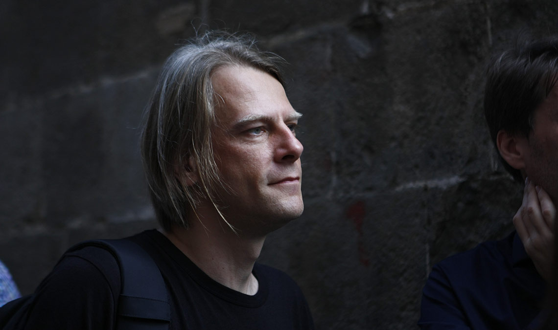
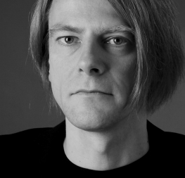
Wolfgang Homola, ATypI Barcelona, 2014. Photo: Elena Veguillas.
Wolfgang Homola’s Soleil seems like part of his soul has been placed on paper — rational but human, accessible but unswayed. Its tranquil geometry has attracted the commitment of respected brands, such as Evernote, who are using it as a cornerstone of their new look. Take a few minutes to get to know under-the-radar designer, Wolfgang Homola.
Hello, Wolfgang! Thank you for taking time out of your busy schedule to talk with us.
Thank you for inviting me!
Let’s start with the basics. Can you tell us a bit about yourself, your background as a designer, your design studio, and in what sort of work you specialise?
I am based in Vienna where I have my own small studio. These days I portion my time between type design projects and graphic design work. I work mainly on print design projects — quite often books, but I have also designed posters, postage stamps, signage and wayfinding systems, websites, and visual identities. I try to stay away from any stylistic fads and instead focus on clarity, simplicity, and functionality. For me, modernism isn’t yet another style choice, as our all-pervasive consumerist culture suggests. It’s a way of somehow being of service to society, by trying to change it — for the better, I hope.
Can you describe your path for us? What initially attracted you to type design? Did a certain kind of schooling lead you to end up creating fonts?
During my studies at the Graphische in Vienna, I loved Dada, Russian Constructivism, Bauhaus, and Swiss typography. The modernist writings of the young Jan Tschichold were very important to me. If you strip graphic design from any superfluous elements, you end up with typography. And if you reject the nostalgia that is so often prevailing in traditionalist typographic circles, you end up with a specific blend of modernism, functionalism, and typography.
I was very fortunate to work several years for and with Walter Bohatsch. I learned a lot from his methodological approach, part of which can be traced back to his studies at the Kunstgewerbeschule in Basel, Switzerland. I think it is fair to say that I owe to him almost everything I know about how to use typefaces.
I always loved to draw, which was why I initially had become a graphic designer. Later, after my modernist beliefs led me to typography as the most pure and functional form of graphic communication, my love for drawing slowly returned: I started to draw letters. Initially I had been happy to just work with typefaces created by others. Later on my desire to design typefaces that incorporate the knowledge I had acquired in the years before simply became too strong. After ten years of working as a graphic designer, I went back to Reading University (UK) in order to study type design.
You graduated with a Master’s degree in Typeface Design from Reading. Can you tell us about the programme, the instructors you had, and the processes you went through?
For me, Reading came exactly at the right moment. I already had a quite clear idea about what I wanted to achieve, and Gerry Leonidas, Fiona Ross, and Gerard Unger, my teachers at Reading, were really great and extremely helpful. We also had lectures and seminars by Robin Kinross, Chris Burke, James Mosley, Michael Twyman, and many more. And I learned a lot from my fellow students, too. It was a year of intense learning. A very important part of the whole process was learning how to look, thereby refining the ability to perceive fine details and their impact on the whole texture of a typeface. At the end of the day, type design is not that much about creating single shapes, it is more about creating an interlocking system of related shapes — an even, well balanced texture of shapes with a specific rhythm, a specific pace. There is also a strong focus on research at Reading. I found the academic writing part of my education really useful, especially in the long run, albeit at the time I found it a bit tedious.
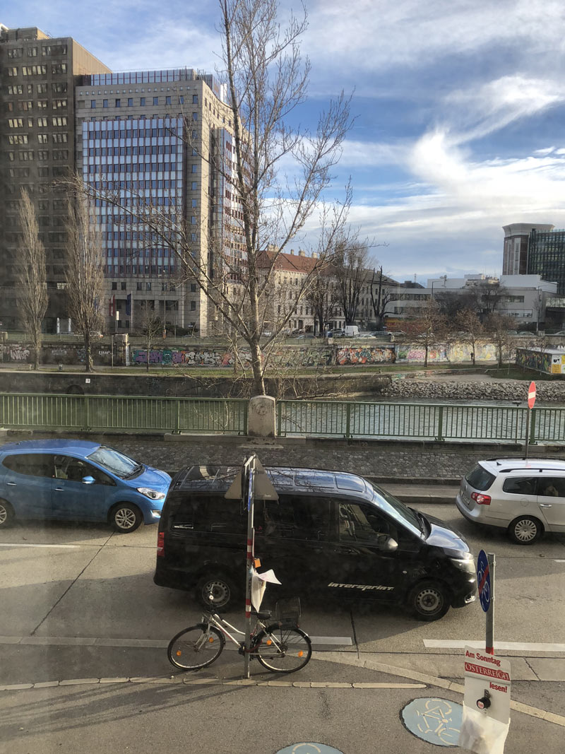
The view from Wolfgang’s studio in Vienna.
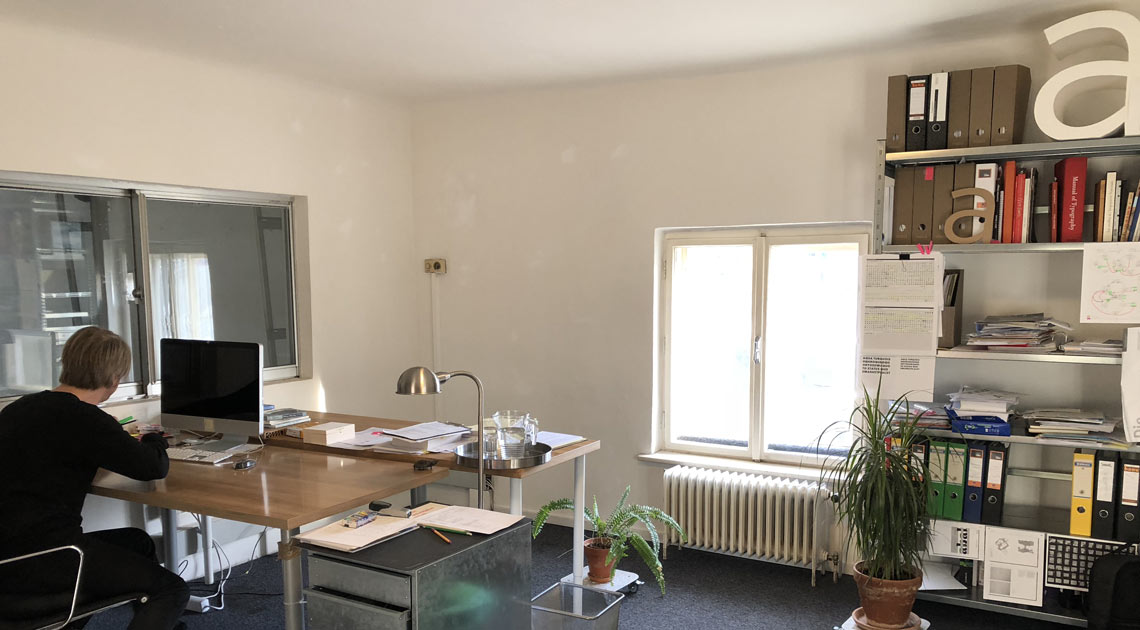
Wolfgang’s studio, 2018.
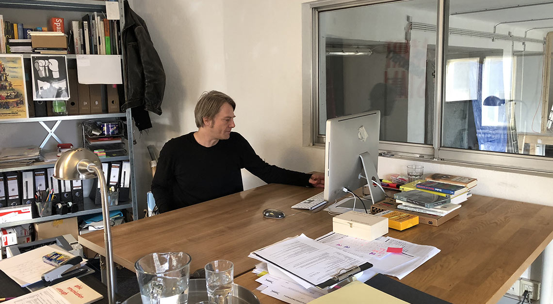
Wolfgang’s studio, 2018.
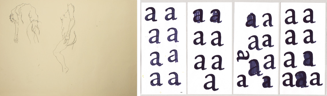
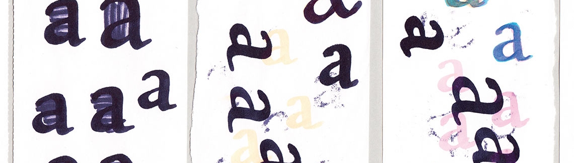
“I always loved to draw, which was why I initially had become a graphic designer. […] My love for drawing slowly returned: I started to draw letters.”
Drawing (1992); Four drawings of letters (ca. 2012).
At Reading you furthered your interest in geometric fonts. What led you onto that path?
Well, I would put it this way: I think it was probably not that much the geometric aspect that I was interested in. I was more interested in creating shapes that had more of a modernist, clear-cut sculptural element to it and less of a calligraphic element. These could take on different forms, geometric shapes being just one of them. I guess the idea back then was to introduce more movement into these clear-cut modernist forms, but without reducing the impact of these forms.
I am generally interested in combining characteristics that are said to be on the opposite side of a continuous spectrum. It is suggested, for example, that geometric sans serif typefaces are more static than humanist sans serif typefaces. But does it have to be that way? Can we conceive of forms that have geometric characteristics but are nonetheless quite dynamic? How can we design forms that combine characteristics that are supposed to be irreconcilable?
When did your Soleil font family originate? Can you explain how you arrived at a design that feels so fresh and familiar at the same time?
The proto-version of Soleil was initially designed for the signage and wayfinding system of the Arbeiterkammer (Chamber of Labour) in Vienna, an organisation that represents the interests of workers, employees, and consumers. I worked with Walter Bohatsch and his design team on that project. The organisation’s building had to be renovated, and we proposed a new typeface that would fit onto the original metal letters used in the staircases of the building. The metal letters were in a geometric style, so this is where the geometric style of this typeface originates. It was the specific circumstances of this project that led me to design Soleil in this particular style.
When I made all the usual test prints, I was surprised to see that Soleil worked quite well also for longer texts, which is rather unusual for a geometric sans serif typeface. So I decided to expand it into a family with more weights.
Wolfgang’s presentation during TypoDay 2013 is available online as well as his paper about the signage and wayfinding system of the Arbeiterkammer (Chamber of Labour) in Vienna. Moving on to Reading, it is known for intense research. How did your research inform the Soleil design?
Well, Reading for sure equipped me with the skills for designing this typeface, but the geometric style was a direct consequence of the letters used in the building. Soleil was not the project with which I graduated from Reading; I started Soleil two or three years after graduation.
Soleil has a rotating display style called Magic Caps. How difficult was it to arrive at its design?
Not difficult at all. It was rather fun. After all this functionalist design work, it was very refreshing. I guess my love for Dada drove the whole thing. But I am afraid that staring at these shapes for hours and hours burned some holes into my retinas!
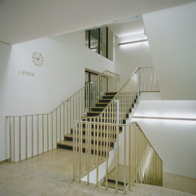
The proto-version of Soleil was designed to go with the cast metal letters used in the staircases of the Arbeiterkammer Wien (Chamber of Labour, Vienna). Photo: Andreas Soller
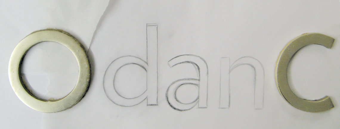
Initial drawings for Soleil’s lowercase (2007).

Asymmetrical counters give the typeface a more dynamic and lively note.
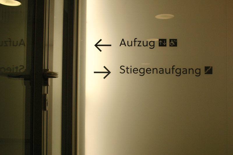
Proto-version of Soleil, as used in the signage and wayfinding system in Arbeiterkammer Wien (Chamber of Labour, Vienna). Signage system designed by Bohatsch Visual Communication (Art Director: Walter Bohatsch; Design: Walter Bohatsch, Wolfgang Homola, Julia Krauth, Ingrun Schnell, Andreas Soller), 2008.
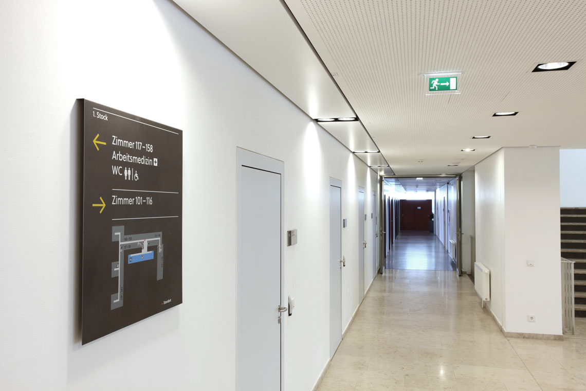
Proto-Version of Soleil, as used in the signage and wayfinding system in Arbeiterkammer Wien (Chamber of Labour, Vienna). Signage system designed by Bohatsch Visual Communication (Art Director: Walter Bohatsch; Design: Walter Bohatsch, Wolfgang Homola, Julia Krauth, Ingrun Schnell, Andreas Soller), 2008. Photo: Franz Ebner.
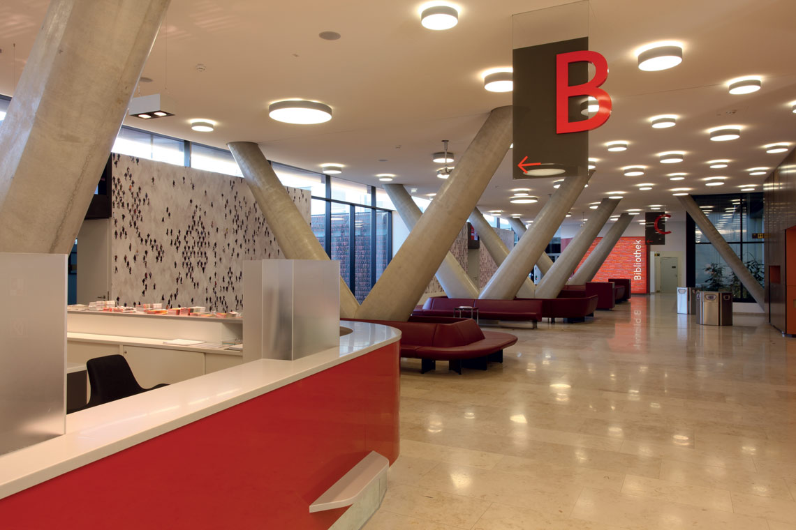
Proto-version of Soleil, as used in the signage and wayfinding system in Arbeiterkammer Wien (Chamber of Labour, Vienna). Signage system designed by Bohatsch Visual Communication (Art Director: Walter Bohatsch; Design: Walter Bohatsch, Wolfgang Homola, Julia Krauth, Ingrun Schnell, Andreas Soller), 2008. Photo: Franz Ebner.
Yes, we recently added the Black and a Black Italic weights. There had been plans to do this for quite a while, but it just took some time to get back around to it. I am quite happy that it’s finally done and that I can now devote my time to new projects.
You’re known as being methodical, deliberate, maybe even perfectionistic. These traits have allowed you to create award-winning work in several categories. How does it play into your work as a whole or into specific projects?
This approach goes back to my time at Walter Bohatsch’s office on one hand and to what I had learned in Reading on the other hand. The main idea is that a clear analysis of a design task already offers clues for the design. I think perfectionism helps me working on graphic design projects but really slows down my typeface design. But then again, that is how I enjoy working. I do not think I could achieve the quality I consider necessary if I were working in a different way.

Soleil has been on the market for a while. Is there any use that has surprised you, something you did not expect?
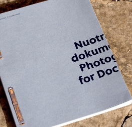
I am quite happy to see Soleil in use, but the way I see it is that a typeface takes on a life of its own. So I do not have strong ideas on how it should be used. But I have to say that I quite liked the way Tomas Mrazauskas used Soleil in some book projects.
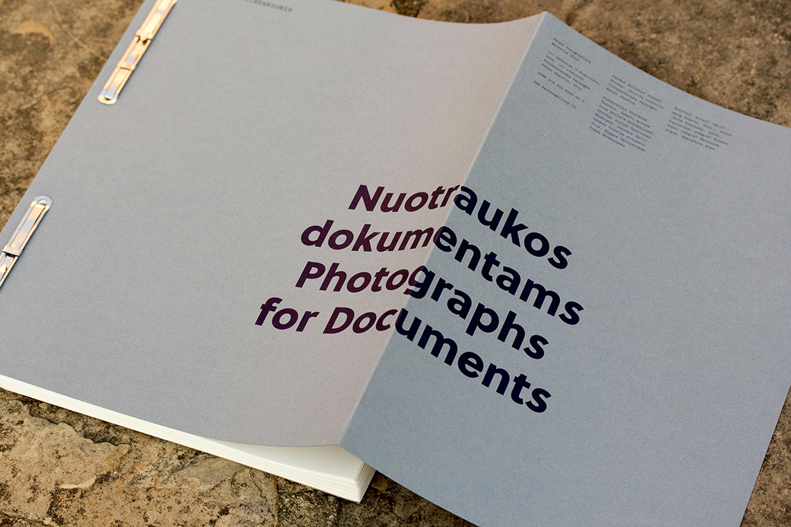
Berlin-based book designer Tom Mrazauskas created this beautiful publication, crafted with special attention to detail. He chose Wolfgang Homola’s Soleil as the main typeface. The book “Nuotraukos Dokumentams” (“Photographs for Documents”) contains 40 double-portraits taken by Vytautas V. Stanionis (1917–1966).
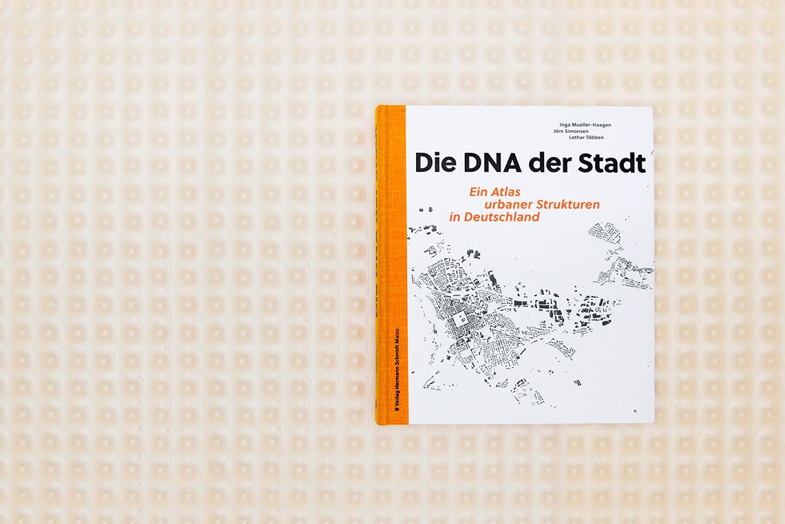
Another example of Soleil put to work by graphic designer Tom Mrazauskas in the German book “Die DNA der Stadt. Ein Atlas urbaner Strukturen in Deutschland”.
What are you currently researching or working on? Do you have any current projects or interests you’d like to discuss?
I am currently working on some graphic design projects, including a book project and some pro bono work for a non-governmental organization. And then I have several typefaces in the pipeline I have been working on for quite a while. I hope to be able to release some of them within the next few years.

Thanks to Wolfgang for taking the time to talk through his process behind Soleil and for letting us get to know him better!
TypeTogether is an indie type foundry committed to excellence in type design with a focus on editorial use. Additionally, TypeTogether creates custom type design for corporate use. We invite you to browse our library of retail fonts or contact us to discuss custom type design projects.
Schedule an introduction meeting to learn more.