Florian, can you briefly describe your Lektorat family? What kind of typeface is it?
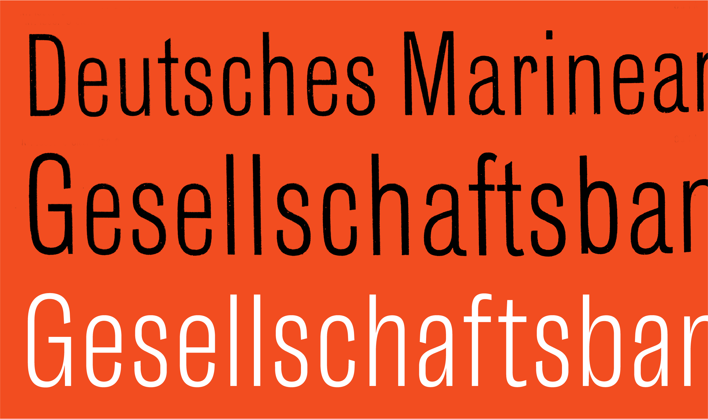
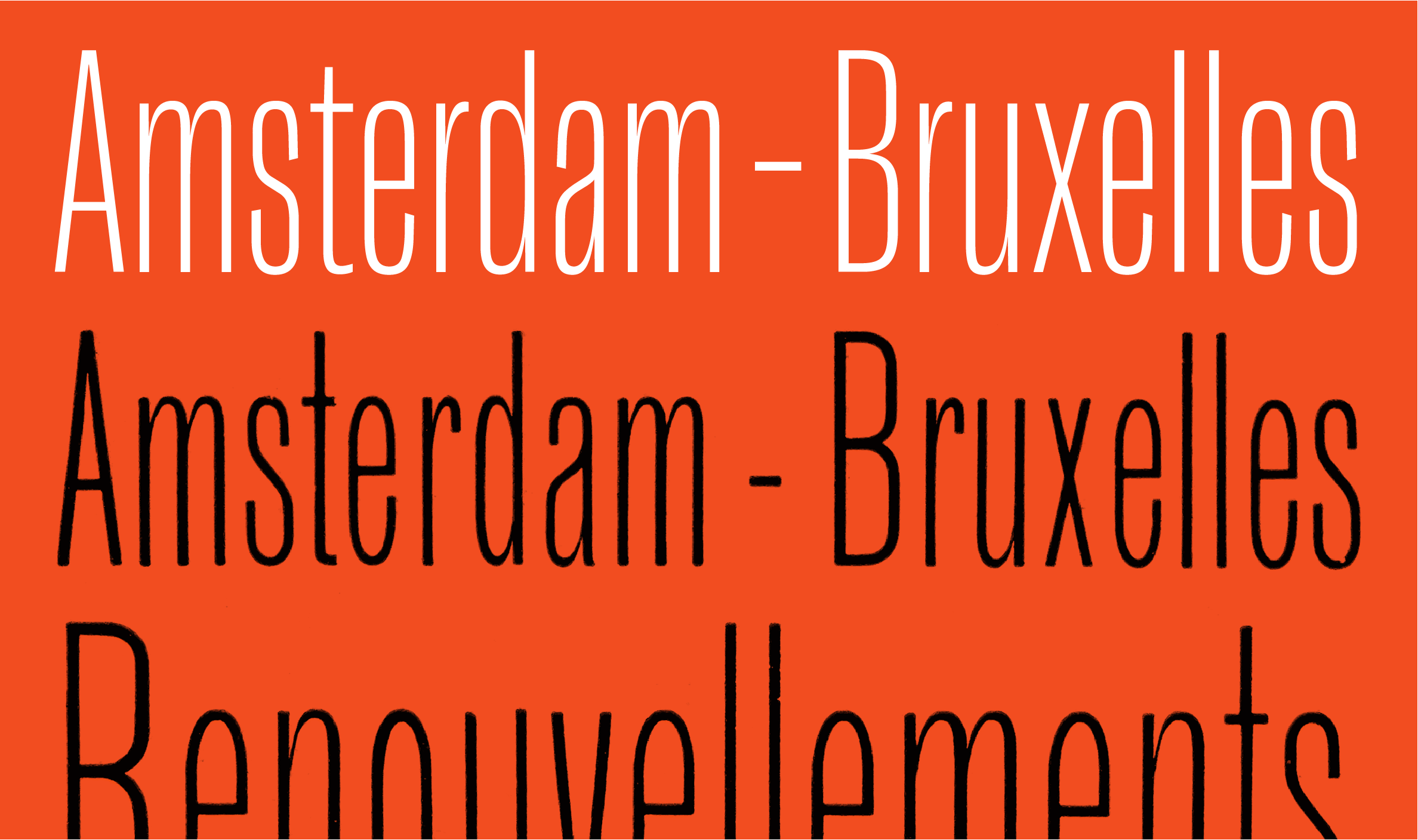
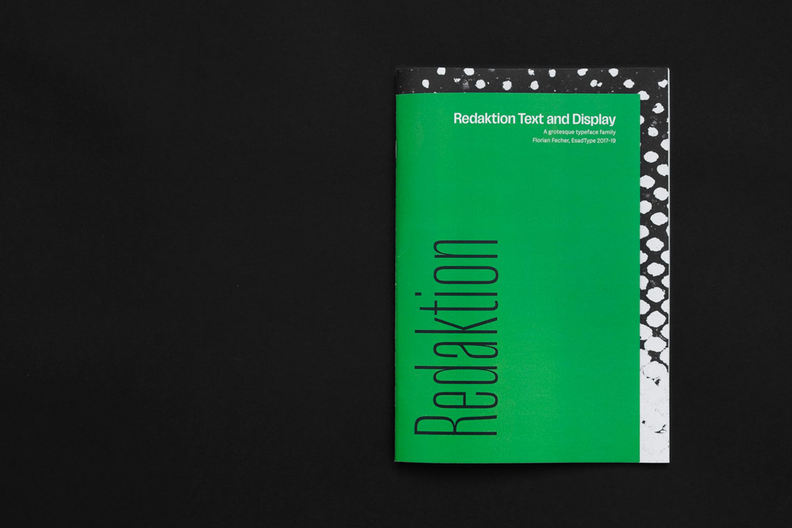
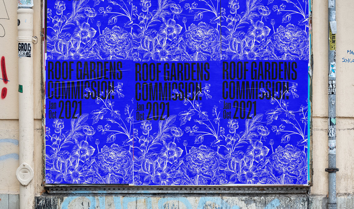
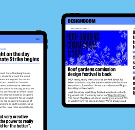
Lektorat is a grotesque for headings from deck to display sizes. It is a response to the needs of complex layouts, offering seven upright weights in three widths: Compressed, Condensed, and Narrow. Lektorat’s light and heavy weights are especially well suited for activating typography — being used as a stimulus to read, grabbing attention while informing about a subject matter, and competing with or assisting large images.
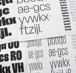
Lektorat Text is its companion for body copy. A sober typeface, not distracting from the content, with a concise setup from regular to bold and with matching obliques. While suited for informative or selective reading, this is a sans serif specifically aimed at immersive reading — the long reads.
The world has changed in many ways since we last talked. We will not see Lektorat used to announce “Brexit cancelled!” anymore, as you suggested in the previous interview. Who is Lektorat meant for?
Though Lektorat was originally developed in the context of news magazines, this family’s possible applications are not limited to editorial design environments. It can deliver a broad range of subjects appropriately, on- and off-screen. Even bad news, if it must.

