Quality Type: How to spot fonts worth your money

June 2020

Graphic designers play a fundamental role in visual communication, whether in print or digital format. They sit between content and reader and, for better or worse, they shape the way the public interacts with information. So when graphic designers choose typefaces they have a responsibility to the reader that should be taken seriously. We covered the type selection process in a previous article so now it’s time to discuss how to assess font quality.

by veronika burian & José Scaglione

Not so long ago, making type required a certain infrastructure, machinery, a sales force to hawk the physical products, and shipping logistics. It was industrial in nature. In fact most of us still refer to it as the typographic industry instead of the typography business. Compared to today’s standards, typefaces were extremely expensive and choices were paltry.

Nowadays there are tens of thousands of fonts available, whether for free or at a very reasonable price — especially knowing they can be used almost infinitely and with no degradation as opposed to lead or wooden fonts. But against any forecast, the glut of digital type has made graphic designers’ lives harder than before. A font does not come with enough information about itself. It can only be judged in relation to the context that is external to the typeface.

Before you hand over your hard earned money or pitch your font suggestion to a client, how can you tell if a typeface is high calibre — if it’s a good font or not? Will it be worth the purchase? What should you look for? What warning signs are a dead giveaway of a bad font? Will it be outdated and unusable in the near future? This primer will get you headed in the right direction.


1. Fonts must be tested
The only way to evaluate quality and appearance of a typeface is by seeing it at work. Ideally, designers must test the fonts in an environment that is as close as possible to the final production means. Furthermore, it’s a good idea to compare several typefaces against each other and if possible against a couple of fonts that, even if not interesting in aesthetic terms, can act as a benchmark for comparison. Using the language or the actual text that will be typeset in the final design as also useful.

In the case of free and open source type families this is a rather easy task, but options may be limited when it comes to commercial typefaces. Most foundries have an online font tester that allows typesetting some text and playing around with the important moving parts: combining styles and changing size, leading, and line length. In the best cases OpenType features can be applied and the test sheets can be printed.

Foundries usually have a pre-made digital type specimen for download. These documents contain important information about the typeface, its character set and features, as well as samples of text composed in different styles, sizes, and languages. If these specimens are not enough, contact the type foundry and request a temporary testing license.


2. Horizontal proportions
The lettershapes of the Latin script developed over centuries. They sometimes evolved slowly, taking little steps at a time, and sometimes with dramatic leaps triggered by technological advancements. After over 500 years of looking at printed letters, readers have come to expect that the shapes exist within the boundaries of certain standards in terms of horizontal proportions — the width of each glyph.

These standards may not be the same for different type categories. For example, oldstyle fonts are expected to have a rather narrow ‘s’ or ‘a’, while contemporary styles may favour less variation in their letter width. In all cases, though, the horizontal proportions provide the rhythm and a consistent rhythm makes for better reading.

A good way to begin assessing the quality of any font is by looking at the most basic alphabet and analyzing its proportions. The countershapes of ‘n’ and ‘o’ must appear optically to be of a similar size; ‘e’ should be more narrow than ‘o’; ‘u’ more narrow than ‘n’; the sum of two ‘v’ letters side by side is wider than the ‘w’, etc.


A typeface is a system of elements with dependencies sharing the same visual language. Their proportions have developed and manifested over centuries within certain categories to result in a harmonious flow of black and white shapes. Quality comes from understanding these proportions and following certains rules of type design. Above compares an overlay of Portada (top row), Portada alone, and Garalda (bottom row).


3. Vertical proportions
There is some flexibility to what type designers can do with horizontal proportions of a font, but there is almost none when it comes to vertical proportions. The lowercase Latin alphabet relies on careful optical alignment on its four main measurements: baseline, x-height, ascender, and descender. Different writing systems may have completely different vertical alignment zones, which is an important consideration when combining scripts in the same paragraph (read Pooja Saxena’s guide to multiscript typography to learn more).

Some fonts that were designed for very demanding printing sizes, or styles that are very heavy, may require a creative approach toward alignment for the sole reason that shapes may simply not fit the allocated ascender or descender space. But other than those exceptions, misalignments are usually a sign of poor drawing quality.


Vertical proportions are much less flexible than the previously discussed horizontal ones. Shapes need to be adjusted in some cases for optical reasons, for example Protipo Compact, shown here in the bottom row.


4. Consistent typographic colour
Good typography aims for an even texture in any block of text. Designers and typographers should train their eyes to find light and dark spots that may become apparent either in individual letters or in certain letter combinations. These design inconsistencies can appear dozens of times on a single page and become subtle obstacles to the flow of reading. One way to spot these inconsistencies is to squint until the letters lose their precision to see where the dark spots are located.

Inconsistent stroke width, contrast, or modulation are clear clues that one has stumbled upon a low quality design. All of the strokes, letters, numbers, punctuation, and symbols must look like they were created with the same tool that is held at the same angle.


This image, from Laura Meseguer and reproduced in the book How to Create Typefaces, shows how the pen angle defines the shape and contrast of each glyph. Broad nib (left) and pointed pen (right) create characters with different looks.


Another problem that should raise a red flag is the absence of optical corrections. A good typeface will have many small adjustments that are especially necessary where one stroke connects with another one or where shapes join at very tight angles. Even strict geometric styles are not mathematical creations either; look closer and you’ll find they break almost every rule of geometry and math in order to actually look correct. These optical corrections are necessary and are a sign of a quality typeface.

Type design is a craft where many factors must come together. Balanced curves, generally well-formed shapes, consistent relationships between elements, and logical proportions should form an harmonious and evenly coloured whole.


One of the easiest ways to evaluate font quality is to look at the overall colour of text to discern dark areas, uneveness in spacing, and rough, bumpy outlines. An important rule in type design is that connections have to be thinner to avoid dark spots and that spacing between letters and words should have an even rhythm of black and white. No letter should be too close to one and too far from the other.


5. Spacing and kerning
Verifying spacing and kerning of a typeface is probably one of the fastest ways to discover how much effort was put into its development. Tuning the space inside and in between letters is as important as harmonising the black enclosing the white. They both exist in a permanent state of mutual dependency.

Spacing is the general area on both sides of each character, the overall rule you could say. Kerning is the exceptions to the general rule due to problem characters that create more space because of their combined shapes, like ‘VW’ and ‘TY’.

Spacing between letters can certainly vary from one font to the next. Display typefaces can be spaced tighter than those created for body copy or captions. The very first test should involve checking that there is a good balance between the space inside letters and the space between them. This can be verified with the countershapes of so-called control characters ‘n, o, H, O’.

Secondly, shapes that are similar should appear to have similar amounts of white around them, for example the space in the pairs ‘nc, ne, no’ should look similar. Symmetric shapes should also appear to have the same space on both sides, which can be checked by inserting them into three-letter strings such as ‘HOH, HIH, HAH, HVH, olo, ovo, oio, 010, 080’.


Comparing Portada above with a free font at the bottom. The red triangles mark the uneven spacing.


Kerning can be similarly checked since lack of kerning is easy to spot. For this we recommend starting with the most problematic glyphs — the triangular letters ‘AV, AW, FA, PA, TA’. Next check mixed upper- and lowercases like ‘Ta, To, Ty, Av, Ve’, and check letters and numbers next to punctuation: A” A* V, „V P. 7. f) (j.


Lastly, verify the kerning exceptions for accented glyphs and look for possible clashes: ‘Vă, Tä, Tî, ďá, ďu, ŀl, gj, ľk’. It’s a good idea to create a text document with some of these strings and have them ready to copy–paste into online font testers, like the ones available on each of our font family’s individual pages. Go ahead — copy and paste the above strings into Abril’s tester page now.


Comparing Portada (top) with a free font (bottom). Balanced kerning is important for a pleasant rhythm of text. To check font quality, a string of letter combinations as seen above can be tested quickly.


6. Technical validity
The spacing and kerning check should be part of a general technical analysis. Does the font cover all the basic necessary glyphs? How well do the lettershapes and their spacing render on various devices and in print? Do they clog up or seem uneven? Are there white areas visible in the glyphs (meaning that the overlapping individual strokes were not merged)? Does the font family name and styles appear correctly in the font menu? Do OpenType features work as expected? Does the font install without problems? Does the font perform well in its intended use? These kinds of questions can help create a good picture of the technical validity of a typeface.


7. Languages and accents
Each type designer and font publisher have their own approach to language support in their products. Supporting languages correctly demands longer development, testing, and quality assurance processes. More languages means more characters, more design, more kerning, and so on. Good diacritic design and localisation features are a sign of a neatly crafted font.

But why do we need more language support if we are only working for English-speaking readers? Well, firstly, in our fully globalized world every language uses a surprising amount of loanwords, not to mention names. Let’s see just a few: piñata, hors d’œuvre, frappé, naïve, façade, jalapeño, Brönte, Beyoncé, Skarsgård.

Secondly, a good font is a treasurable asset that a designer can use thousands of times over. In fact, it’s one of the few pieces of software (maybe the only!) that can be expected to continue working on machines from decades past to those yet to be created decades from now — and without any additional expense. Therefore choosing a font that has at least support for most Latin-based European languages is a wise business decision.

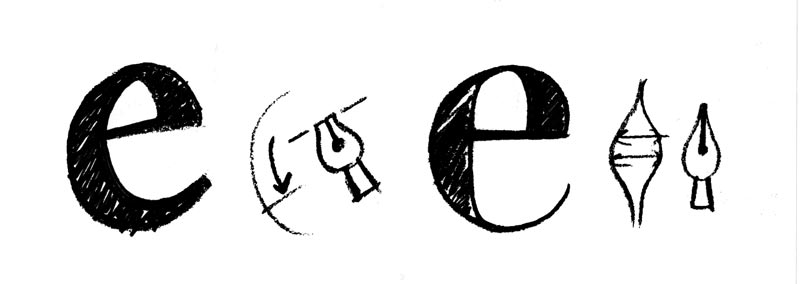
Here are three tests to add to your quality checks before purchasing a typeface. First, make sure the necessary characters are included. Foundries publish this information in their type specimens and it is usually possible to type some accented letters in an online tester. Second, the design of the diacritic marks should match the same ductus — weight, contrast, and modulation — as the rest of the letters and symbols. And finally, accents must be properly positioned above, below, or through the base glyph.


Even everyday written English includes a variety of loanwords from other languages and a series of signs and symbols that are required for othographic support. With the set of sample words above you can quickly test if the font has these accented letters and symbols included.


8. Style linking: bold and italic
Individual font styles will rarely solve a design problem by themselves. That could be the reason why graphic designers have an obvious preference for typographic toolboxes that include many styles to address various typesetting situations. It is therefore necessary to verify how each of the styles performs on its own and, more importantly, how they work with each other. Let’s discuss some basic tests.

Italics and bolds have distinct purposes when used within a block of text set in an upright regular weight. Italics generate a change of texture while maintaining typographic colour. (Remember, squint your eyes to see the overall paragraph colour.) Bold styles should generate enough colour contrast to a regular weight in order to produce stress. Both of these things can be easily verified.

It is also important to review whether letterspacing and width in the different styles relate to each other or not. A sentence set in italics generally takes less space then a regular style but a bold will take up slightly more. Unless there is a clear design intention apparent, diverging from this rule of thumb is most likely a sign of design problems.

The last test we can use to verify font quality is to check how complex shapes are adapted to bold weights. The usual suspects for such a test are some currency symbols and characters that have three horizontal strokes or stroke diacritics such as ‘$, &, €, ø’. In all these cases the typographic colour should look balanced and the design should be related to the regular style.


In most typefaces, as here with Portada, bold styles take up more space along the line and italic styles take up less. The relationship between all styles within a font family is important and bespeaks quality if typographic colour and letterspacing are in balance.


9. Design consistency
All the points mentioned above play into the overall quality of the font in question. While hand lettering is meant to stimulate the eye and emotions with every little detail, a typeface needs to be designed as a system with logical relationships between the elements; it’s quite different from hand lettering. This does not mean that everything has to look the same without exceptions. Introducing small inconsistencies into certain characters creates visual interest without dissolving into random “creativity” where the entire typeface doesn’t have enough rhythm and cohesion to hold it together.

When judging the quality of a font, look for stroke harmony, and consistency of modulation, curve tension, and letter structure, as well as a common design language, all with balanced and consistent design features. You can test these by looking at the letters ‘c, r, s, f, y, a, g, n, d, q’. Take those letters and compare how the style and thickness of serifs, the terminal shape, and the connections, whether hard or soft, behave amongst each other.


Depending on the genre of the typeface, design features as well as other elements can be more consistent than others. However, there needs to be a common design language throughout the typeface to create an harmonious whole. Mixing and matching arbitrary features is not acceptable.


10. Originality
This is probably the hardest and most tricky point to evaluate. It has several interpretations and is subjective. What do you consider as novel and unusual? Type design per se, as other cultural creations, is a constant iteration, hybridisation, mixing, and interpretation of history. Therefore nothing by itself is truly unique, but derives its originality from the combining and contextualising of ideas, impressions, experiences, and technology.

Having good knowledge of past and present typefaces therefore certainly helps to spot the clones and reproductions. But for those less versed in font history, just know this: a bad score in the nine previously explained tests is an indicator that you’re looking at a badly made font or a copycat.


About Us

TypeTogether is an indie type foundry committed to excellence in type design with a focus on editorial use. Additionally, TypeTogether creates custom type design for corporate use. We invite you to browse our library of retail fonts or contact us to discuss custom type design projects.