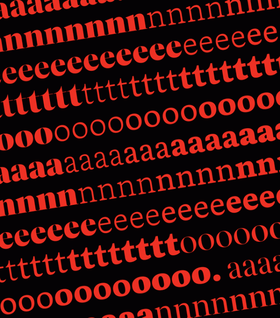
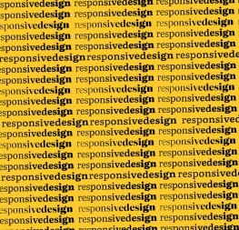
A VARIABLE FONT THAT SHIFTS FROM SANS TO SLAB SERIF.
Belarius is the second font family within a trilogy by José Scaglione and Veronika Burian, with Catalpa being the first and Aneto the last. Each of the three have a distinct purpose and their own look, but they serve a common goal as a combinatory suite covering an editorial’s wide array of needs. Like a highly prized drink, the Belarius type family seems like it was aged in oak barrels filled with one part deeply researched editorials and one part vintage advertisements. These two influences give the typeface both its ability to fit many uses and its warm, burnished look.
Belarius is a three-axis variable family that shifts from sans to slab serif, from condensed to expanded widths, and from light to bold weights, including every possibility in between. With serifs that can appear and lengthen at will, Belarius’s baritone voice opts for poignancy instead of the overly quirky nature of poster slab serifs. This is modern tech for discerning (and often demanding) work, making it a multitool for magazine, digital editorial, and packaging design.
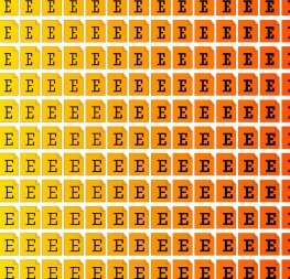
Several styles of Belarius properly wrangle the information laid out in tables and charts. Rounding out its OpenType capabilities are sets of rulers, patterns, endmarks, and fleurons. These features are needed for professional text layouts, especially complementing the capital settings, while the sans serif version allows smaller reproduction sizes. The Poster styles extend the normal slab serif length with deliberate exaggeration for a unique, crackly texture in headings, and we’ve flexed our coding muscles to automatically adjust for appropriate spacing in response. Regardless how suave and modest it may be, Belarius’s 90 total styles are universally magnetic and serve up hierarchy in the clearest of ways.
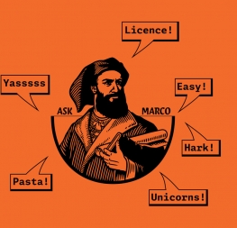
Belarius is by nature restrained to fulfill its midrange purpose: packaging, headlines and subheads, advertising, decks, and pull-quotes. Its yesteryear purity imbues it with a suave, polite, and genuinely modest manner. Belarius may not become the darling of the branding world, but it sure will cause packaging, editorial, and website makers to say, “Yes, this is what I had in mind!”
CREDITS
Lead design and concept
Veronika Burian, José Scaglione
Type Design
Azza Alameddine
Pooja Saxena
Quality Assurance
Azza Alameddine
Engineering
Joancarles Casasín
Irene Vlachou
Kerning
Radek Sidun
Graphic Design
Rabab Charafeddine
Elena Veguillas
Roxane Gataud
Motion Design
Cecilia Brarda
Copywriting
Joshua Farmer


