Adelle Cyrillic

Designed by Veronika Burian José Scaglione. Released 2009.

While the Adelle Cyrillic font family is a slab serif for intensive editorial use, its personality and flexibility make it a true multipurpose typeface, especially on the web. The unobtrusive appearance, excellent texture, and slightly dark colour allow it to behave flawlessly in continuous text, even in the most unforgiving applications. As it becomes larger in print, the Adelle Cyrillic fonts show their personality through a series of measured particularities which make it easy to remember and identify. Extended from the Latin, Adelle Cyrillic is a versatile and authoritative slab serif font family with no shortage of personality.

  • Third prize, 2009 Granshan Type Design Competition
  • Gold, 2010 European Design Awards
  • Ukrainian typeface competition, 2010
  • Rutenia Calligraphy & Typography Festival Exhibition, 2010
  • 2011 Type Directors Club Tokyo Exhibition
  • Communication Arts 2011 Typography Annual
  • Yearbook of Type I, 2013
  • «Call for Type» and subsequent book Neue Schriften
Change Font Settings

Это легче, чем видеть, слышать

Click to Edit
Change Font Settings

Коростеля легче услышать, чем увидеть. Эта птица прекрасно прячется на земле в высокой траве. Птица отличается тем, что практически не поднимается в воздух. 

Click to Edit
Change Font Settings

Во время токования самцы коростеля выдают типичное носовое скрипение, которое иногда напоминает звуки "крэк-крэк" или "рерп-рерп". Их крики похожи на звуки, которые можно услышать, если провести чем-то по расчёске. Крики повторяются во время брачного периода достаточно часто, однако найти коростеля только по голосу нелегко. Когда к самцу, который токует, приближается самка, он начинает исполнять брачный танец, делая танцевальные "па" и демонстрируя рыжеватые пятна на крыльях. Иногда он приносит своей избраннице подарок, которым может быть дождевой червяк или улитка.

Самка выкапывает небольшую ямку и выстилает её мхом, листьями и стеблями трав. Затем она откладывает от 7-9 до 12 яиц. Самка одна насиживает яйца. Через три недели на свет появляются птенцы. Они покрыты коричнево-чёрным шерстистым пухом. Мать кормит их первые 3-4 дня. Потом птенцы сами отыскивают для себя пищу.

Click to Edit

Коростель является типичным обитателем влажных лугов. Его можно встретить в плодородных местностях на полях, которые засевают зерновыми. Коростели - ночные птицы-одиночки. Дергачи редко выдают своё местонахождение. Они бегают в высокой траве, пригнувшись к земле, так, что передняя часть их тела и голова находятся ниже хвоста. На бегу птица постоянно кивает головой. Время от времени дергачи выпрямляются и вытягивают шею, чтобы оглядеться вокруг и убедиться, что им не грозит опасность. В таком положении они издают свой особый крик.

Птицы поднимаются в воздух только в случае крайней необходимости. Испуганный коростель медленно отрывается от земли с опущенными вниз ногами и, пролетев несколько метров, садится в высокую траву. В случае опасности птицы чаще всего спасаются бегством. Коростель-дергач невероятно быстро бегает.

Click to Edit

The Backstory

Adelle Cyrillic

A versatile and authoritative slab serif with no shortage of personality.

While the Adelle font family is a slab serif conceived by Veronika Burian and José Scaglione specifically for intensive editorial use — mainly in newspapers, magazines, and online — its personality and flexibility make it a true multipurpose typeface. Adelle’s superior screen rendering and cross-platform consistency has also made it one of our most popular webfonts.
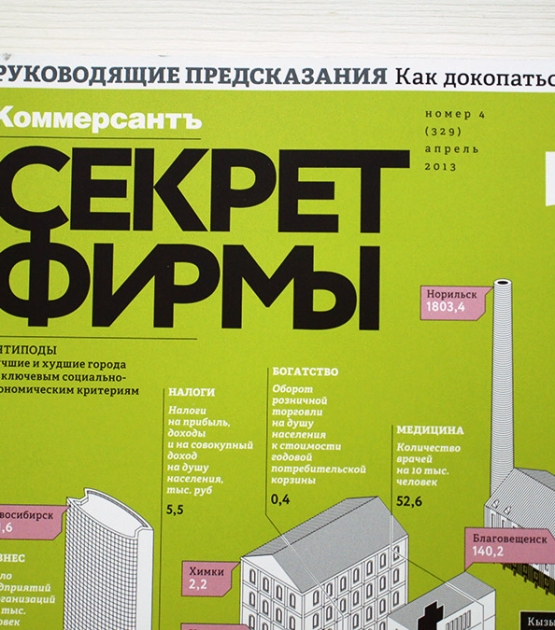
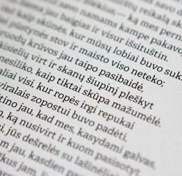
The intermediate weights deliver a neutral look when used in text sizes, providing the usual robustness expected in a newspaper font. The unobtrusive appearance, excellent texture, and slightly dark colour allow it to behave flawlessly in continuous text, even in the most unforgiving editorial applications. As it becomes larger in print, Adelle shows its personality through a series of measured particularities which make it easy to remember and identify. Its energetic character, so inherent to slab serif fonts, becomes evident when used for subheadings and headlines.

A condensed series of seven weights with matching italics expand Adelle’s possibilities. This extension provides flexible solutions in situations where saving space is vital but losing legibility is not an option. The new condensed series shares the same personality, proportions, and skeleton of the Adelle family, creating an harmonious texture when combined.

To ensure typographic adherence to current trends in each script, Russian designer Alexandra Korolkova consulted on the Cyrillic script.

Be sure to check out the companion to Adelle, Adelle Sans, to complete the look of your design with the intended personality and flexibility.

About Us

TypeTogether is an indie type foundry committed to excellence in type design with a focus on editorial use. Additionally, TypeTogether creates custom type design for corporate use. We invite you to browse our library of retail fonts or contact us to discuss custom type design projects.