The making of Postea

April 2021

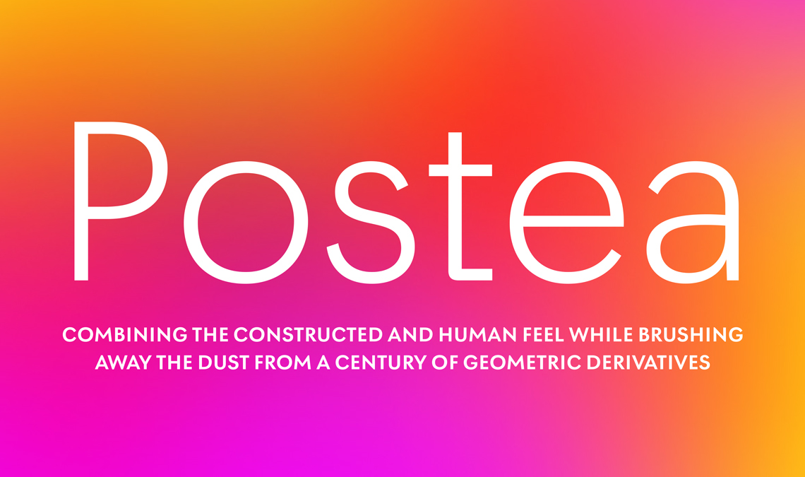
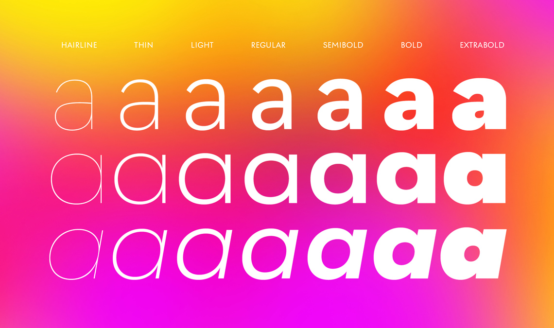
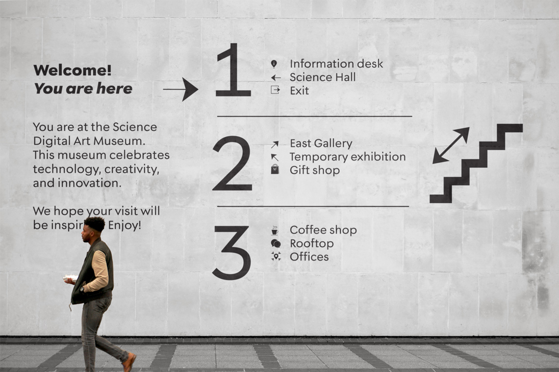
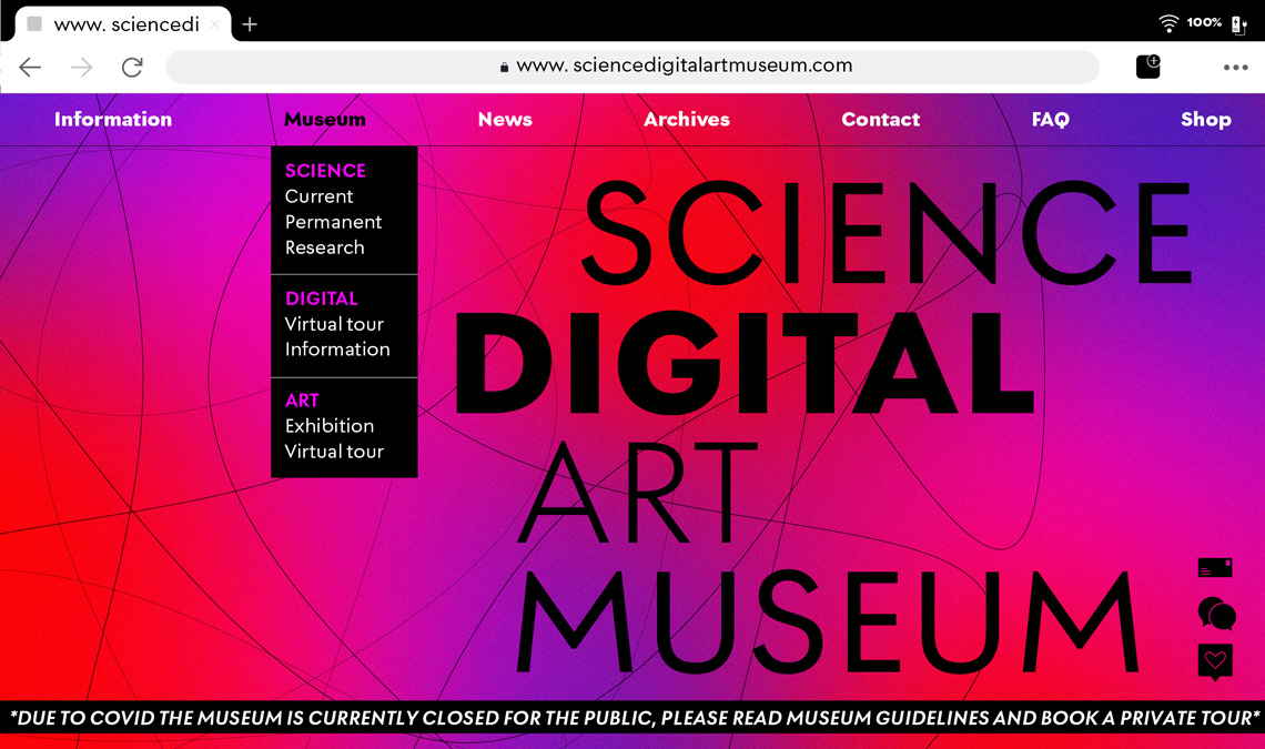
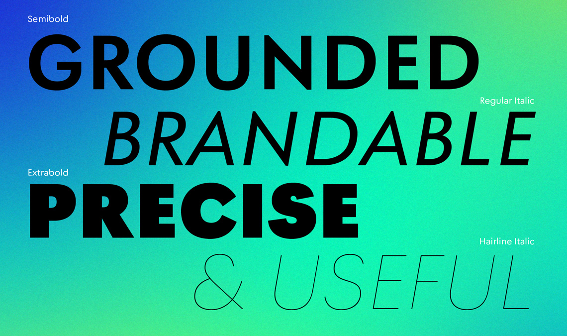
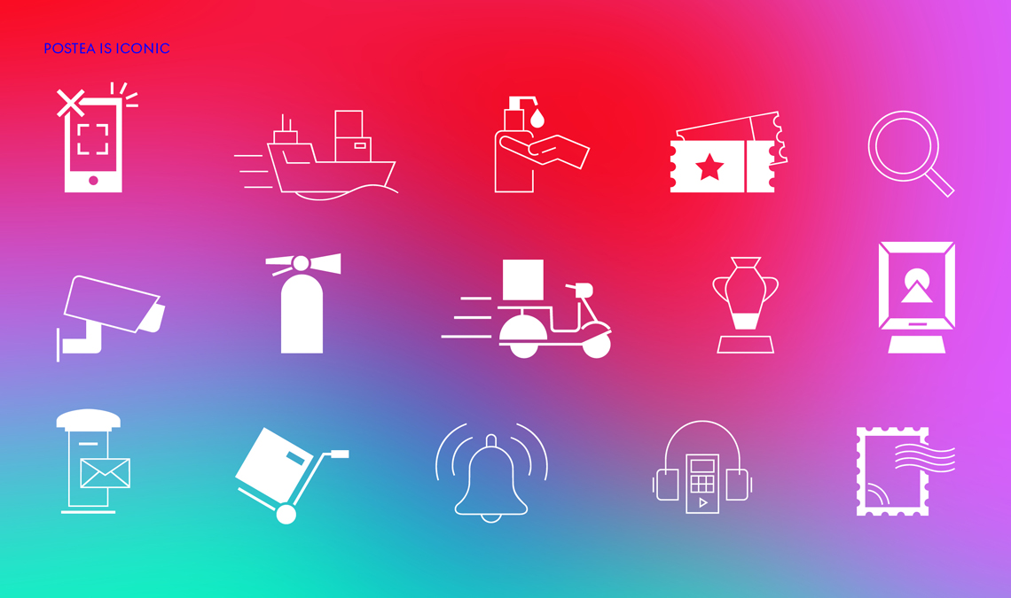
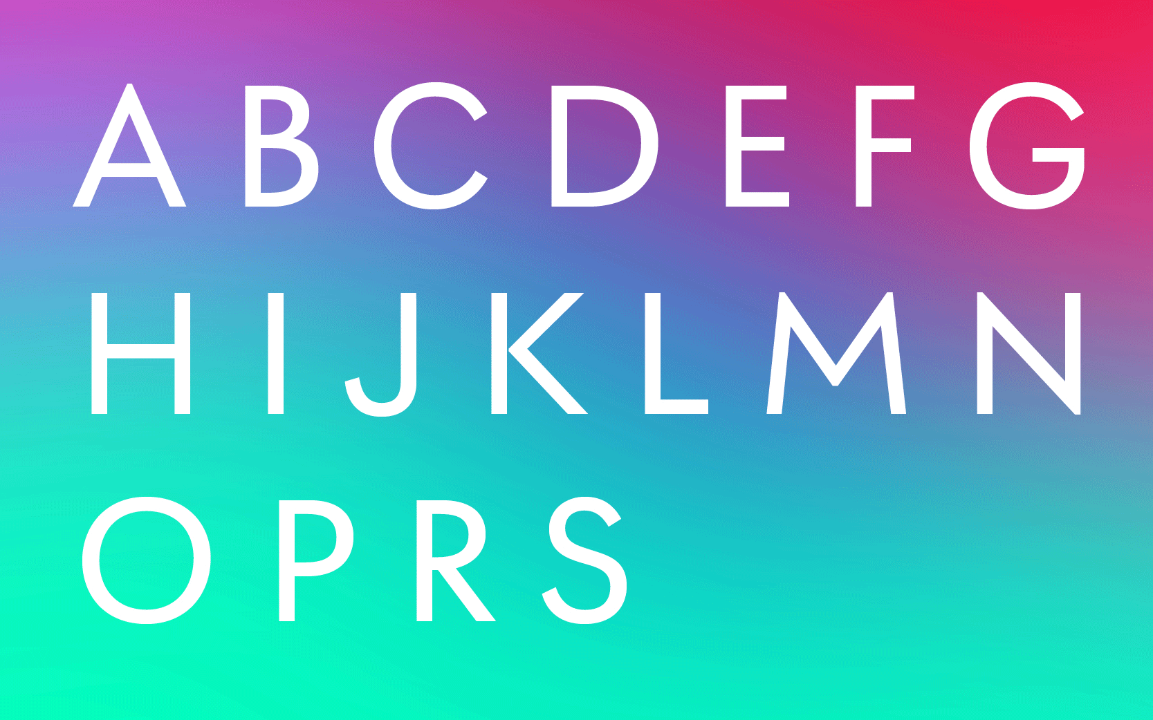
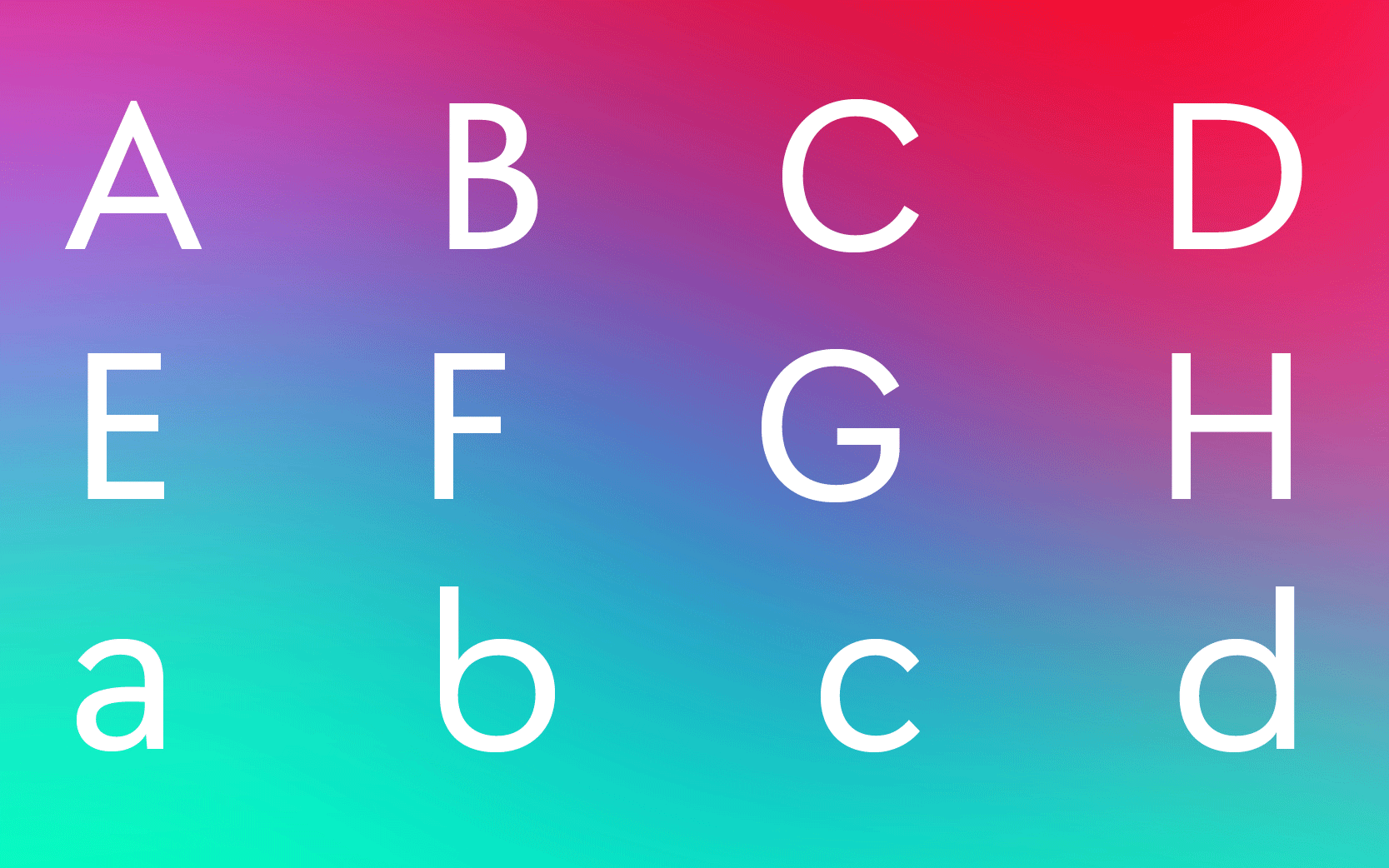
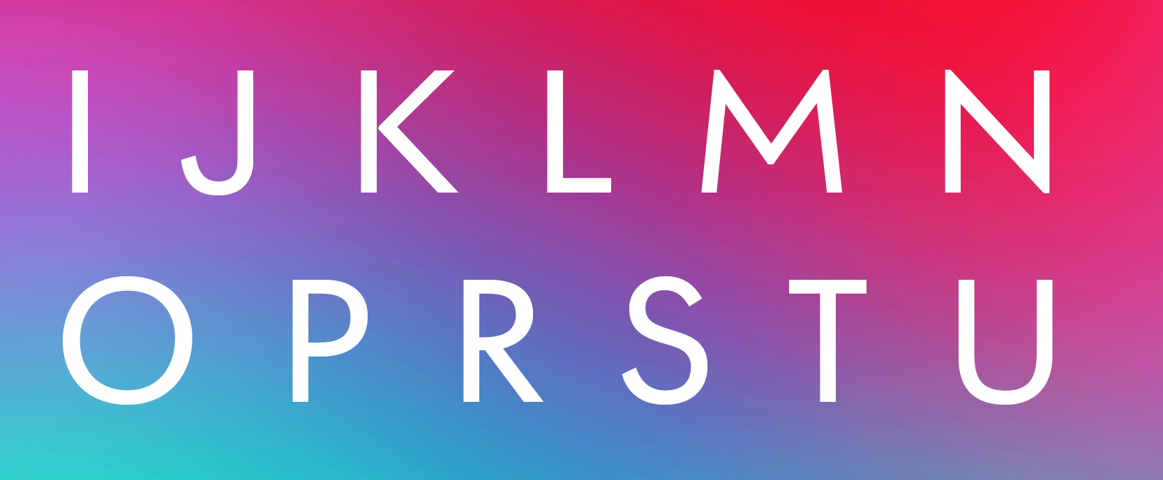
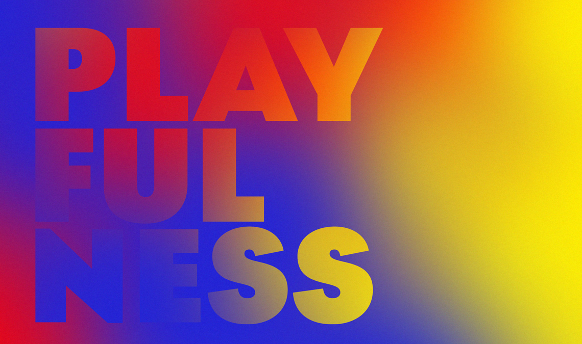
This was one of those “all hands on deck” seasons for us as we put the finishing touches on this family, and now we’re happy to introduce you to Postea. Read all about our charismatic and distinct geometric sans, its origins, and how it should be used.


Postea’s background lowdown

The story of Postea starts with Veronika Burian sometime in Spring 2020 during Covid lockdown. In Germany, outdoor sports and activities were still allowed and going for a walk was a highlight of her day. One venture led Veronika to discover an unfamiliar part of Munich.

Here in the middle of a large and usually busy public square stands a post office building from the 1920s in the architectural style of “Neue Sachlichkeit”, commonly known as Bauhaus. The clean, simple, and slightly quirky Deutsche Post signage lettering caught her eye, with its longish extenders and varied letter widths, especially the bottom-heavy ‘s’.

During further explorations into the realm of the geometric sans, Veronika decided to develop a type family that would reside somewhere between our stark headliner Catalpa and the calmer geometric–humanist hybrid sans Soleil by Wolfgang Homola.


Geometric Pedigree

It is no surprise that Germany might inspire a new geometric sans serif design; this is, after all, where everything began in the early twentieth century. During a period marked by a reaction against the industrial context that shaped society, the revolutionary Bauhaus instead prioritized an ergonomic unity of function and form in art, design, and architecture.

The movement aimed for radically simplified forms, where rationality and functionality dominated the individual artistic drive. The Universal Alphabet proposed by Herbert Bayer in 1925, even if it would not become a font, opened the door for a series of designs that became incredibly popular in a very short period of time. The spread of Bauhaus design virtues was so rapid that it was cemented even while blackletter typefaces were still widespread in Germany. Think of that — two wildly distinct styles in simultaneous use, and both immensely popular!


Kabel by Rudolf Koch, Klingspor foundry from 1927 onwards. Photograph taken from the book Krásné písmo ve vývoji latinky (František Muzika, 1963).  


Jakob Erbar’s Erbar Grotesk (1926) was followed by Paul Renner’s Futura, which became an immediate commercial success — and still remains so. In 1928 Jan Tschichold published his treatise Die Neue Typographie (The New Typography), which encapsulated the ideas behind typographic modernism. That very same year Rudolf Koch published Kabel, a design showing Art Deco influences, and the Berthold type foundry released Berthold Grotesk.


Drawings described as ‘Paul Renner’s first designs for futura’. Many of the most extreme characters were not included in the final font. Photograph taken from the book Paul Renner: the art of typography (Christopher Burke, Hyphen Press 1998).


Different weights of Futura, as it was released in 1930. Photograph from the book Paul Renner: the art of typography (Christopher Burke, Hyphen Press 1998)
Herbert Bayer’s explorations for a geometrical alphabet. From the book Paul Renner: the art of typography (Christopher Burke, Hyphen Press 1998).


Futura, designed by Paul Renner and released by the Bauer foundry. Photograph taken from the book Krásné písmo ve vývoji latinky (František Muzika, 1963). 


Postea: beautiful, useful & distinct

Postea is a rather small type family, especially when compared with TypeTogether’s latest releases, Lektorat (27 styles) and Belarius (90 styles). But smaller, in this case, does not mean either simpler or less accomplished. The challenge is represented in the typographic goal of the new typeface: Postea is meant to have outstanding performance in a wide range of situations.


Postea’s possible uses are manifold, from branding, indoor signage, and posters, to photography and architecture magazines and books. In practice, this creates a couple scenarios that demand different levels of volume and tone with which the fonts must speak to the reader. Our goal was to address each requirement with a rather economic range of resources. In other words, the few weights we created do the job just right.


The intermediate weights of the Postea font family are intended for applications that demand high readability, and the extreme styles are geared to produce impact and recognition. Think of large titles and headings using a thin font weight. It would obviously need to be set tighter, so we baked this spacing into the family from the beginning. However, paragraph text should be set looser so this is also built into the family.

The game Postea continuously plays is to find a balance between the two extremes of readability and charisma, so we included a small amount of stylistic alternates that give designers the ability to easily tilt the scale one way or another.


If the design calls for a more restrained tone, stylistic set number 1 replaces five glyphs (‘M’, ‘b’, ‘f’, ‘t’, ‘u’) with alternate shapes that enhance legibility while attracting less attention to themselves. This is a feature that may be desired for body copy and signage, where typography should play an anonymous but functional role. On the other hand, stylistic sets 2 and 3 will change the shapes of ‘a’ and ‘y’ respectively, boosting the geometric appearance and overall tone of composed texts. This is ideal for branding, poster design, and large headlines.

Beginning with midcentury virtues, Postea is the rational response for text — a lyrical take on geometric sans serifs.


More than symbolic: Postea’s icons

Inspiration for Postea’s icons comes from geometry, art deco, and the use of specific icons related to museums and art. One of the most complex goals was to create functional iconography that is both recognisable and consistent with the typographic structure: the icons must feel like they belong with the text. As with the character designs, simplicity prevails, which ensures compatibility with all the glyphs that make up the family.

Postea’s all-new set of 63 icons (plus eight arrows and six manicules) were designed by Luciana Sottini in three weights to ensure compatibility across the family. The Hairline and Extrabold icons will work better at large sizes, while the Regular is better for text sizes. They cover present-day needs (charging stations, QR codes, and silencing phones), the usual wayfinding icons (elevators, meeting point, stairs), six standard museum sections (art, science, antiques), and a set of sanitation and Covid-19 related icons (handwashing, masks, temperature measurement), and much more.


There are two ways to access the icons in desktop publishing software. The first is via the Glyphs panel (in Adobe InDesign or Affinity Publisher) by simply clicking on the icon. However, for quicker access — and in software where getting to the glyphs panel is not straightforward (Pages, Word, TextEdit, Figma) — we developed a new, easy way to activate them by typing the icon name and applying stylistic set 05. Simply bookend the desired icon name with colons (:arrowUp: :chargingStation: :aid: :firstAid:), making sure to capitalise each word after the first word, then highlight and activate SS05. This 30-second video will show you how:


To make Postea’s icons even more discoverable, we have sometimes provided several names for the same icon. For instance, coffee can be accessed by typing cafe, coffee, or coffeeCafe. The icon names must be enclosed between colons so the entire text can be selected as SS05 without fear of accidents.


Technically Supercharged

Postea features a Latin character set with support for over 140 languages and plenty of typographic goodies. Here’s a partial list: a full set of small capitals, including vertically adjusted punctuation; symbols, currency, and numerals; complete alphabet, numbers, and selected math in the ordinal, superior, and inferior positions; plus the usual ligature and fraction support included in all our typefaces.

In addition to the icons and the alternative designs for letters, we added two additional stylistic sets that are packed with wallpaper-worthy geometric patterns, ornaments, arrows, and symbols aplenty. Postea’s 14 styles (seven upright and italic) and two variable fonts are packed with our standard TypeTogether character set covering all major European languages, including the Bitcoin symbol, other currency symbols, and much more.


SS01: lowercase ‘f’ and ‘t’ become rounded, while ‘b’ and ‘u’ gain spurs and become more calligraphic.


SS01: the middle apex of uppercase ‘M’ shifted down to the baseline, and the ‘u’ becomes more humanistic.


SS02: one story ‘a’, more typical of the geometric sans genre.


SS03: the attention-grabbing straight lowercase ‘y’.


SS01: ligature ‘fl’ with and without ‘f’ alternate.


SS04: Bauhaus inspired geometric ornaments.


SS06: arrows show the way.


SS06: geometric shapes.


Ready to start using this distinct geometric already? Postea is available to experiment with on our desktop type tester — including stylistic sets — and it’s just a couple clicks away when you’re ready to buy it. Get cracking!


About Us

TypeTogether is an indie type foundry committed to excellence in type design with a focus on editorial use. Additionally, TypeTogether creates custom type design for corporate use. We invite you to browse our library of retail fonts or contact us to discuss custom type design projects.