Digital excellence meets casual handwriting.
Some typefaces do more than one thing well, and others excel at one great thing. The Playpen Sans font family by Veronika Burian, Laura Meseguer, and José Scaglione, excels at imitating casual handwriting with a completely natural look — the aesthetic form of something made by hand and the digital function of a professional typeface.
The font world has a general tension between what’s organic and what’s digital. When scribbling a quick note, the letters have slight differences but all look similar because they come from the same person. Handwritten text is inconsistent, while digital typefaces are intended to be consistent — each character exactly the same every time it’s typed.
The goal of a typeface that is both casual in look and digital in nature is to appear authentically human within the bounds of digital reproduction. So a typeface with a set of characters that are “the same but different” has the authenticity everyone craves. The main problem with casual fonts is not having enough alternate characters to look real. And when a family has more than one alternate, another problem arises in controlling how and when a character gets replaced.
To solve these problems, we designed Playpen Sans with seven versions of each character. We also created a built-in shuffler so no single shape is repeated in close proximity. The result is text with spontaneous inconsistencies that feel fun and organic… all the benefits of a modern, pro typeface that looks natural.
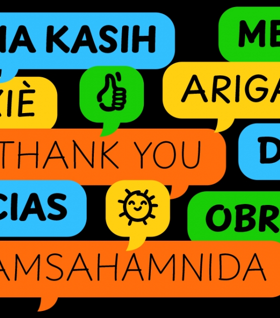
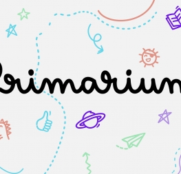
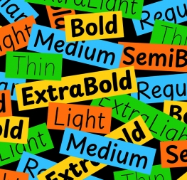
Playpen Sans has eight weights, emoji stickers for breezy and encouraging uses, and supports over 150 Latin-based languages. Its straight and curved endings for ‘i, l, y’, the two-storey ‘a’, and optional shapes for ‘f, G, I, M’ are clarifying features. The family was made for non-designers and to shine within short, informal settings: greeting cards and invitations, casual signs and documents, and of course children’s books and educational materials, comic books, and graphic novels. It also comes in a variable font version for developers and designers who value ultimate control, data savings, and design superiority.
Playpen Sans is the extension of technological and aesthetic potential, showing the best of both worlds with its digital capabilities and casual, handmade look. Is it spontaneous? Is it authentic? Thankfully, yes and yes.
CREDITS
Lead design and concept
Veronika Burian
Laura Meseguer
José Scaglione
Assistant designers
Yorlmar Campos
Fernando Pujolá
Emoji designers
Luciana Sottini
Cecilia Brarda
Engineering
Joancarles Casasín
Quality assurance
Azza Alameddine
Kerning
Filip Blazek
Graphic design
Rabab Charafeddine
Felicia Priscillya
Elena Veguillas
Motion Design
Cecilia Brarda
Copywriting
Joshua Farmer
Social Media Manager
Douglas Arellanes


