Setting modern and historical text with the serif equivalent of optical poetry.
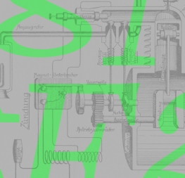
The Aeroplan serif font family is the first by type designer and crafts-maker Nina Faulhaber. With a history in sculpting, she wanted to create a typeface with a tactility and presence that would set the tone in a modern publication or when representing a bygone era. During her type design course in Augsburg, Germany, Nina took the familiarity of a forgotten, custom font she found in a 1916 book about aircraft engines and updated it to work in printed magazines, books, and on digital screens as only a sculptor could.
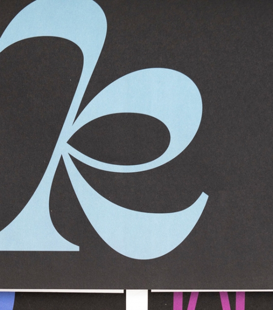
Aeroplan’s classical forms and bookish structure make it an excellent reading serif, assisted by sturdy shapes, a bit of contrast, and teardrop serifs that balance out the sharp wedges. But it’s the details that put Aeroplan in a different category, like the bracketed ‘E, F’, the modern connection on ‘K, k’, and the sharp turns on the serifs of ‘C, G, S, Z’. The slightly-wider-than-classical proportions brings this familiar-feeling text up to a modern standard. And Aeroplan has one of the most distinct italics found in a typeface — so much so that text could be set in the italics only and it would remain an invigorating, unique read.
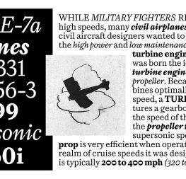
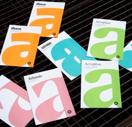
As an interpretation and further development of the original source, Aeroplan now has eight styles (four uprights with italics) designed for paragraph text, with another ten Titling styles that will be released later this year to complete the family. The text styles are robust, enjoy a healthy dose of contrast, and contain functional inktraps for rendering in print as pristine and on screen as unique. Aeroplan’s perfect use would be in contemporary magazines or books about art, engineering, or architecture, newspaper text, and even more edgy and obscure subjects. Anywhere Baskerville could be used, replace it with Aeroplan for an immediate update and texture improvement in paragraphs.
Designers reach out to their users through creative imagination and utility. So when a creator makes something and we appreciate what they’ve made, we enter into the enjoyment they intended. With a liberal helping of serifs, digital sharpness, and optical poetry, Aeroplan is aggressive in aesthetically pleasing ways. It is not restrained by caution: it believes it can fly.
CREDITS
Lead design and concept
Nina Faulhaber
Supervision
Veronika Burian
José Scaglione
Engineering
Joancarles Casasin
Quality assurance
Azza Alameddine
Graphic design
Elena Veguillas
Rabab Charafeddine
Felicia Priscillya
Motion Design
Cecilia Brarda
Copywriting
Joshua Farmer


