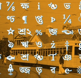
An expression of confidence across two scripts, subduing complexity of information, medium, and style.
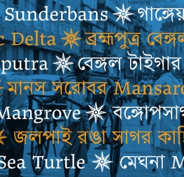
Four years after Juan Bruce’s initial release of Noort, we are proud to release Noort Bengali — the first Bengali typeface in our retail library. On its own, Noort Bengali is a modern offering that covers the text and display needs of around 270 million people on the Indian subcontinent and beyond. And it takes harmony and calligraphy to the next level when it is paired with the Latin for multiscript text.
From the beginning of Noort’s design, the Bengali was always planned as part of the family. As with all typefaces, font creators must balance the functional needs of their audience with the desire for aesthetic progress and its technical ability. And just as two cultures can live side-by-side in our close-contact world, both scripts should, by nature, look unique and combine exquisitely. Noort Bengali and Noort Latin each needed to have their own DNA, purpose, and aesthetic value, while equally sharing the spotlight.
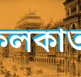
Noort Bengali brims with expressiveness rather than being hindered by unnecessary caution. The strong serifs, tight curves, and stylised angles of the award-winning Latin version are expertly and appropriately echoed in the Bengali terminals, calligraphic forms, and curve-to-diagonal transitions throughout the character set. With a range of diverse letterforms — diagonals in four directions, knot sizes, triangles, and staccato headlines contrasted with loops, flourishes, and bowls — Noort Bengali can barely contain its exuberance. Much aesthetic refinement also led to creating flat rather than piercing terminals and unique headline interruptions, so designers have all the visual impact they could want, but without the sharp points.
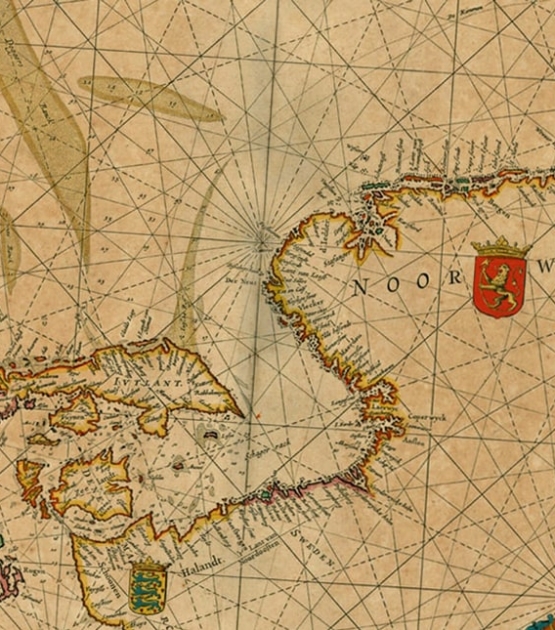
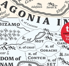
Set Noort Bengali in large headings and the details will grab attention, but set it in average sized paragraph text and it recedes into an overall texture for smooth reading. OpenType features, such as variants and contextual forms unique to the script and position of glyphs, are as much a part of Noort Bengali as the shoreline on a map. And speaking of maps, it was made for both printed and digital information-dense publications: travel guides, books, and magazines featuring graphics, photos, and infographics. Noort Bengali’s adamant dynamism turns brands into a showcase on the newest screen layouts or in layered print.
Whether in display or text settings, it stands apart in layered editorial pieces and brings eye-catching energy to packaging, advertisements, book covers, and posters. The best news is that when purchasing the Bengali script, the complimentary Latin styles are automatically included as our gift to you. Noort Bengali can be intense or docile and its five weights make it easy for the designer to choose which, in the moment, it should be.
CREDITS
Lead design and concept
Quality assurance
Graphic design
Copywriting
