The Ephemerist
February 2018
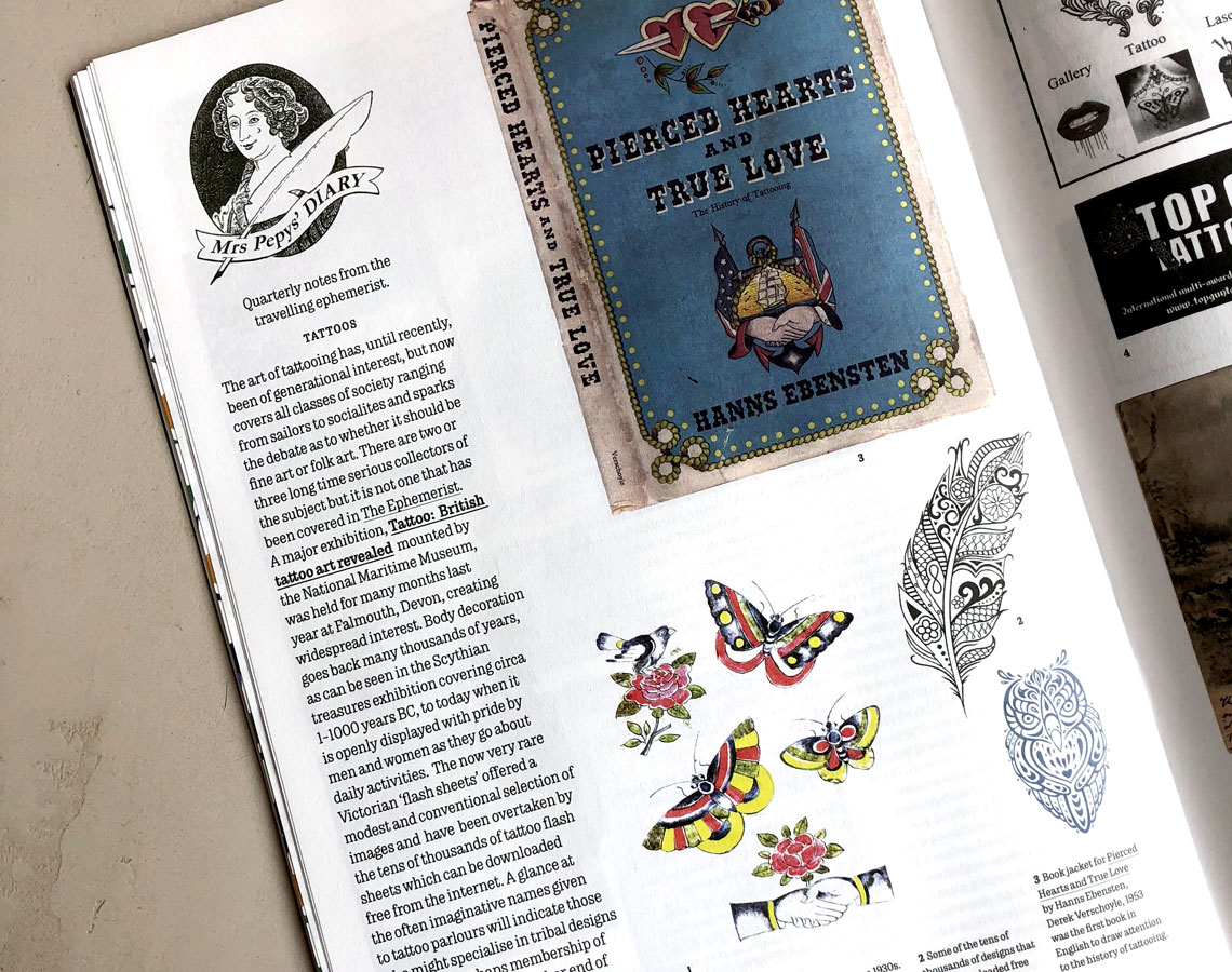
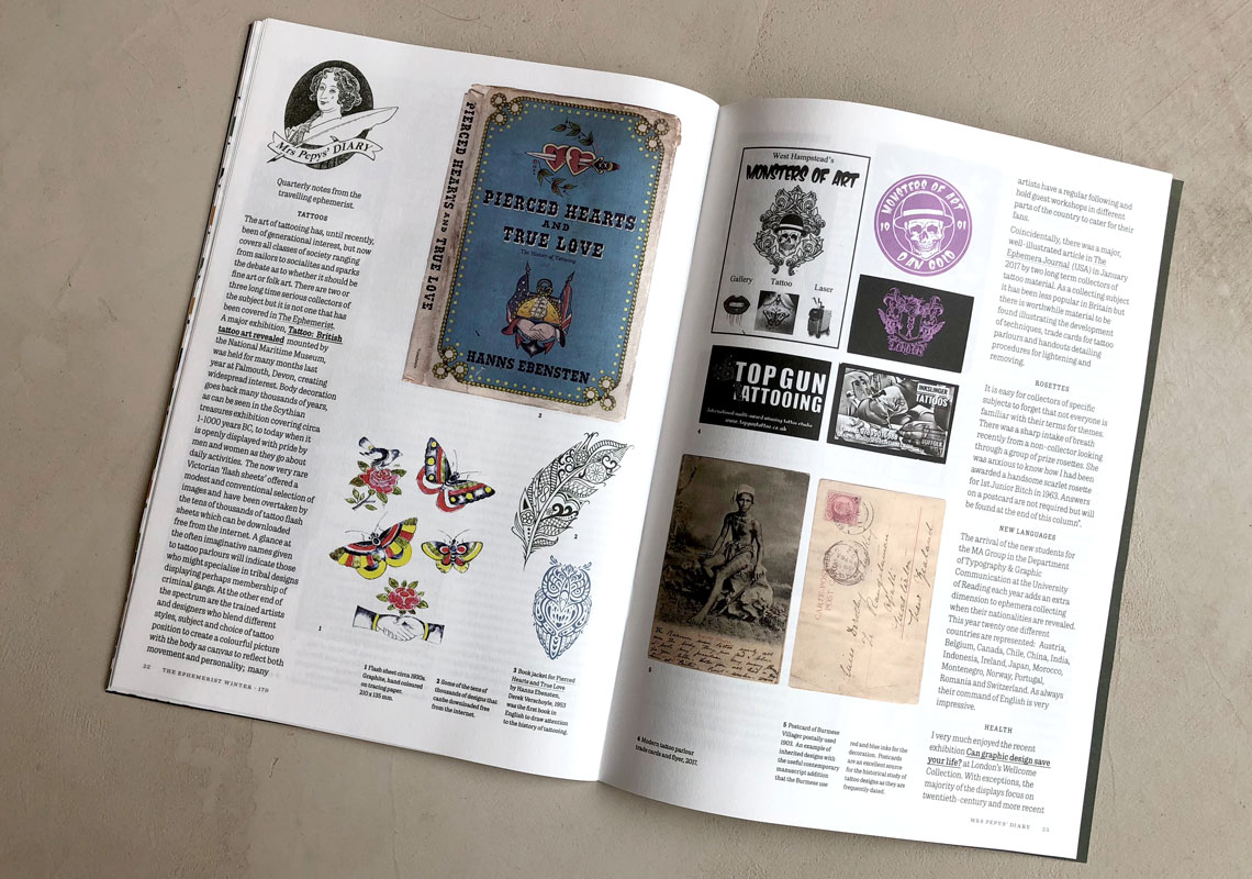
Trevor in use in The Ephemerist, an independent subscription-only magazine featuring writing about printed ephemera from academics and collectors from all over the world. Edited and designed by Sara Chapman.
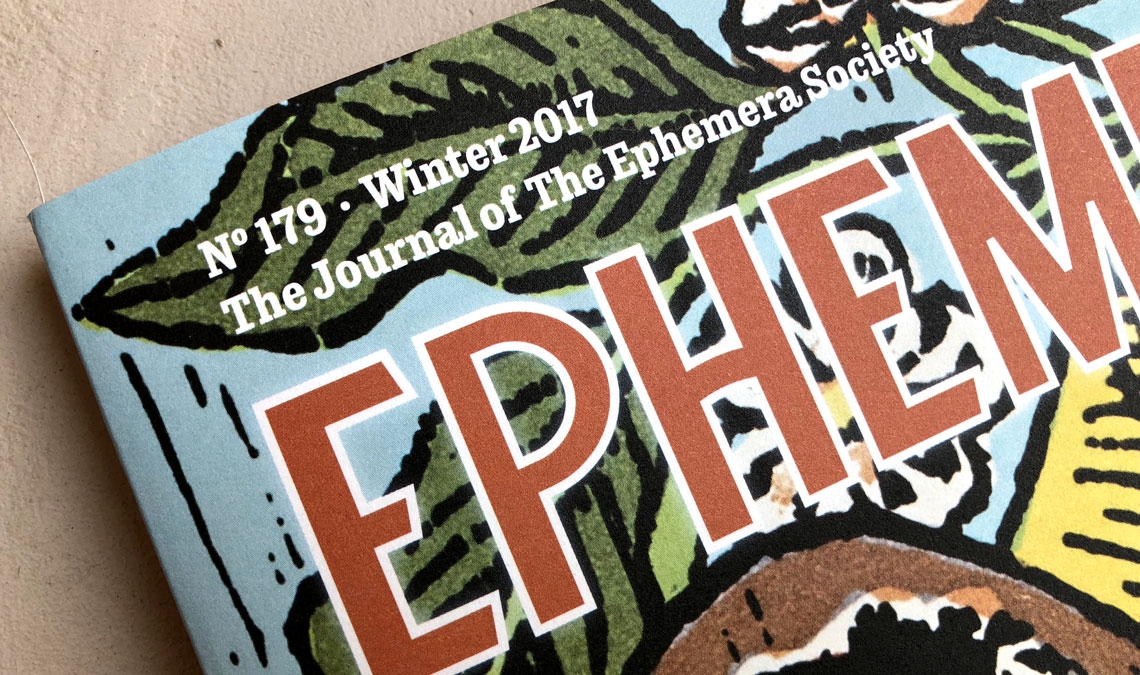
Trevor in use in The Ephemerist, an independent subscription-only magazine featuring writing about printed ephemera from academics and collectors from all over the world. Edited and designed by Sara Chapman.
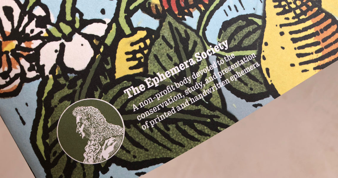
The Ephemera Society is a British non-profit organization devoted to the conservation, study, and presentation of printed and handwritten ephemera. Ephemera documents are all those materials used in our daily lives to which we don’t pay much attention and are not meant to last. As opposed to a book, it would be train tickets, bills, postcards, packaging, trading cards, invitations, small posters, fines, and IDs. These materials not only tell a social history that may be valuable for historians, but also they tell a story of printing, typography, and graphic design throughout the years.
The Society’s magazine, The Ephemerist is now in the hands of editor and designer Sara Chapman, whose first task has been to redesign and turn it into a more contemporary and attractive magazine.
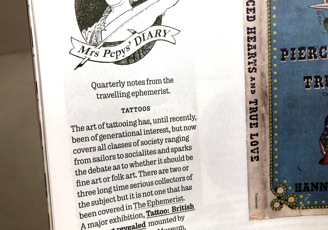
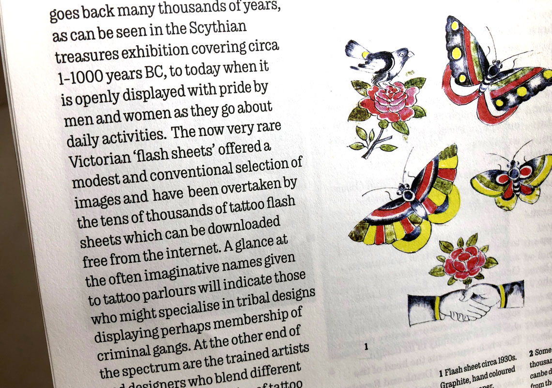
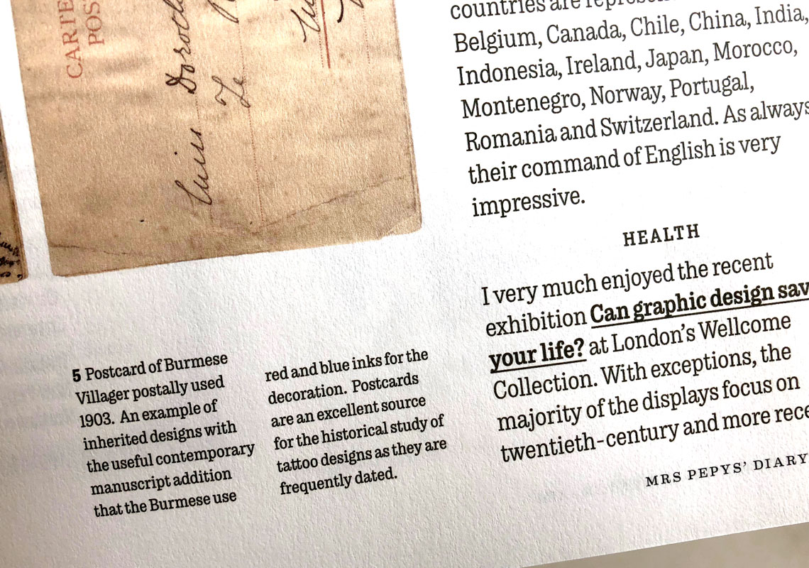
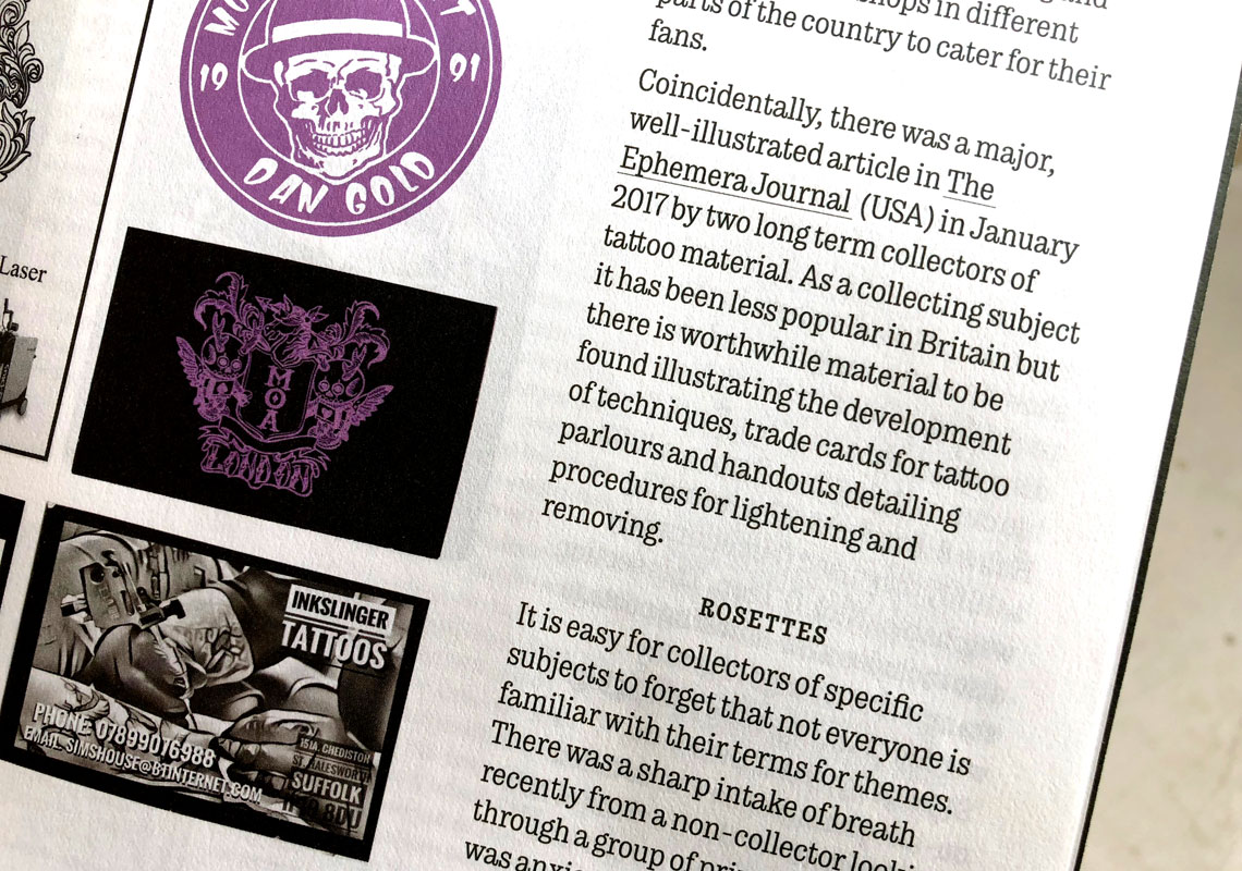
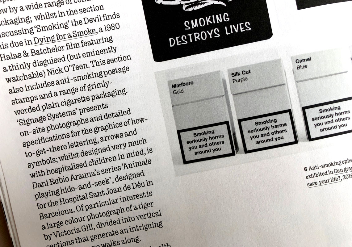
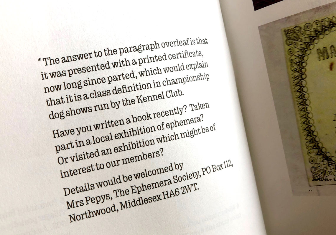
In Chapman's words: “As editor and designer, I wanted to make the magazine more accessible to both collectors and graphic designers, and to present the large numbers of very rich and graphically interesting images that feature on every page. I chose a variety of magazine fonts in my redesign, but I am especially happy with Type Together’s Trevor type family, which works perfectly for the numbered references and captions to the images. It has a good range of weights — the bold holds its own against strong images, and is also a good contrast to the lighter slab serif body text. Trevor is condensed and works well at small sizes — important because some of our captions are quite long and there are lots of them. The numerals are really sweet, and, crucially, it looks and feels ‘a little bit vintage’ without being too much of a pastiche, which is what we are all about. I’m delighted to hear the TypeTogether are adding an italic soon, which we need to cope with the academic references.”
Teo Tuominen’s Trevor is an almost monolinear slab serif, that has a slight typewriter look, but is narrower to help it save space and play into its neighbourly tone.
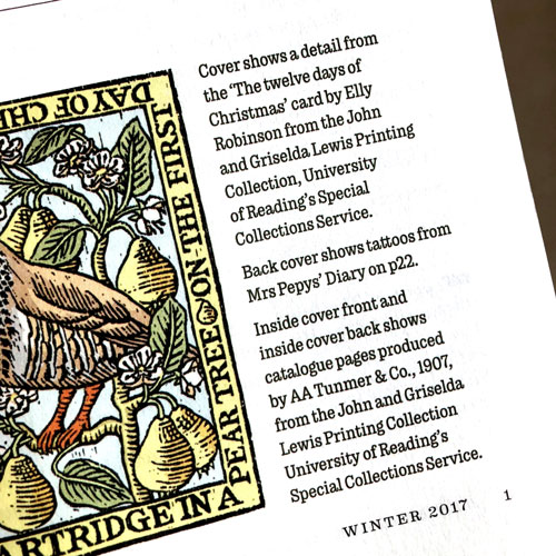
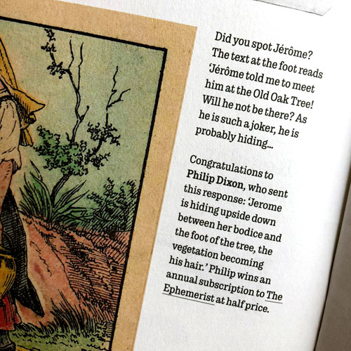
TypeTogether is an indie type foundry committed to excellence in type design with a focus on editorial use. Additionally, TypeTogether creates custom type design for corporate use. We invite you to browse our library of retail fonts or contact us to discuss custom type design projects.