Inspired by 15th century Italian letterforms, Marco is Toshi Omagari’s lively textface with a touch of informality.
Inspired by 15th century Italian letterforms, Marco is Toshi Omagari’s lively textface with a touch of informality. It stems from Italian humanist typefaces, such as those by Nicolas Jenson and Aldus Manutius which are esteemed for their beauty and ingenuity.
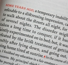
Marco’s strong calligraphic disposition makes it an excellent choice for continuous and intensive reading conditions — think of epic poems and complex plays with myriad characters and emphases. Its angled asymmetric serifs along the baseline and slightly flared stems lead the reader’s eye up and to the right in the Latin-based languages. This effect propels the reader through sentences and paragraphs for effortless reading.
While Marco has six capable styles, in OpenType programs its italics have an uncommon range available and can therefore be used to emphasise text or as a display style on their own. The italics, from their stem angle to the outstrokes and unique characters, such as ‘w’ and ‘x’, were created to show a distinct contrast from the roman styles and to highlight writing speed.
Numerous swashes and stylistic alternates in the italic styles increase the connection to the family tree of calligraphy. With stylistic alternates on, vertical strokes extend further, the dot on the ‘i’ becomes a jab, and ascenders bend to the right. With swashes activated, capital letters are released from some of their restraints, some leading letters gain a captivating instroke, and trailing characters receive a final flourish.
Marco is full of features required for high-quality book typography, including strong language support in extended Latin, Cyrillic, and polytonic Greek, lining and oldstyle numerals, fractions, ligatures in excess, stylistic alternates to obtain the best possible solutions, a multitude of swashes in the Latin and Cyrillic italic styles, and other typographic niceties. As a result of these elements, Marco is a mature and unique textface where its lively and somewhat informal style is an ideal counterpart to its careful and ingenious crafting.
Marco’s feature set is enormous — over 1900 characters per style and almost 2600 in the italics — and the type family is available in regular, semibold, and bold, with their matching Italics. The complete Marco family, along with our entire catalogue, has been optimised for today’s varied screen uses.