Bree

Designed by Veronika Burian José Scaglione . Released 2008.

The Bree font family is a spry sans serif that delivers a spirited look and feel for branding and headline usage. As an upright italic, Bree shows a pleasant mix of rather unobtrusive capitals with more vivid lowercase letters, giving text a lively appearance. Bree is clearly influenced by handwriting, has a touch of cheekiness, a wide stance for each character, and an extra-large x-height, which equals a big personality. The full bundle includes variable fonts.

Bree Latin
  • 2008 Tipos Latinos exhibition
  • Appeared on several 2008 “Best Of” Lists
  • 2009 Bronze Award, European Design Festival
Bree Multiscript
  • Special mention at 2019 GRANSHAN competition

How do you cook Super Noodles?

Click to Edit
Change Font Settings

Councils are being “hounded” by some weird and wonderful questions such as, “What size tin do I need for a Mary Berry tart?”

Click to Edit
Change Font Settings

How do you cook Super Noodles? What are the rules for mice racing? Can I exercise my kestrel at the tip? These head scratchers have been voted the top three wackiest questions put to council staff last year. Also in the Top 10 was a lady who wanted help with her crossword and a baker who needed to know the tin size for a Mary Berry tart. Another caller asked what time a council website shut. The LGA Peter Fleming said: “Staff will always try their hardest to assist.”

Click to Edit

Even Mary looks baffled as to why someone would call their council about baking tins. The hilarious queries are revealed by the Local Government Association which has compiled a list of the 10 wackiest demands from residents to 370 councils in the last 12 months. Sifting through the mountain of 50 million calls to local government offices in England and Wales, the LGA said they were often the first port of call for townsfolk. With mind-boggling questions like where to buy a shopping cart, they've gotten carried away.

Click to Edit
variable — wght
Provençal
USD 160,85BUY
Oblique Variable — wght
Shirataki
USD 160,85BUY

The Backstory

Bree

Clearly influenced by handwriting, the Bree font family is a multi-award winning spirited and rhythmic upright italic.

The Bree font family is a spry sans serif by Veronika Burian and José Scaglione that delivers a spirited look and feel for branding and headline usage. As an upright italic, Bree shows a pleasant mix of rather unobtrusive capitals with more vivid lowercase letters, giving text a lively appearance.

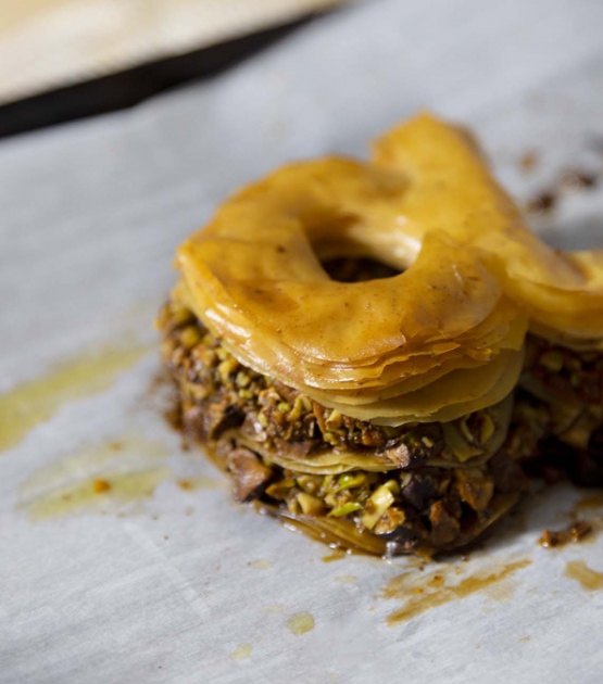
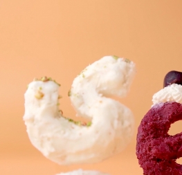
Bree is clearly influenced by handwriting. As such, some of its most characteristic features are the single-story ‘a’, the cursive ‘e’, the outstroke curves of ‘v’ and ‘w’, the flourished ‘Q’, and the fluid shapes of ‘g’, ‘y’, and ‘z’. Alternates of these letters are available when a more neutral look is desired. Bree has a touch of cheekiness, a wide stance for each character, and an extra-large x-height. All this adds up to a big personality, so even when set in small text there is no skimming past the words Bree voices.
 
In 2019, the Bree font family got a huge update. A few shapes were updated or added (the ‘k’ and German capital ‘ß’), two entirely new weights were added (Book and Book Italic), and spacing was perfected. More than that, Vietnamese support was added to Bree Latin, and the Bree Greek and Bree Cyrillic scripts were designed from scratch to parallel the Latin’s tone. Arabic and Thai scripts were added in 2021, along with Pinyin and refined Vietnamese diacritics being added to the Latin, and Devanagari is currently under development. Additionally, Bree was designed in the variable font format for those who want complete control over the font’s appearance while simultaneously saving digital weight in the form of megabytes. This means Bree is in the perfect position for the next digital revolution.
 
The complete 14-weight Bree Latin font family includes Pinyin, Vietnamese, and is available in standard OpenType or variable font formats. It has been chosen for such wide-ranging uses as the branding for the country of Peru, Breast Cancer Awareness Month in the US, organic food brands, and numerous layouts including mobile apps, newspapers, online magazines, and books. Be sure to check out the other scripts in the full multiscript Bree family: Arabic, Latin (including Pinyin and Vietnamese), Cyrillic, and Greek.

CREDITS
Lead design and concept
Veronika Burian
José Scaglione

Engineering
Joancarles Casasin

Quality assurance
Azza Alameddine

Graphic design
Elena Veguillas
 
Copywriting
Joshua Farmer