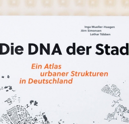
A tranquil and fresh geometric sans font family for clear text and headlines.
In the wrong hands, geometric fonts can be overly procedural, but
Wolfgang Homola’s sans serif type family excels at combining the spark of inspiration with mathematical precision. Soleil is an ostensibly geometric type family that cleverly avoids being dogmatic about its geometry.
Soleil’s letterforms are the result of a thoughtful design process that brings together simplicity with lively, fluid rhythm, as opposed to rote mathematics. Created for a wayfinding and signage system during a renovation of a 1950s modernist building – the labour office in Vienna – Homola’s design is subtle and refined, and based on a process that involved countless hand sketches before digitisation. Its design includes generous mirrored counters, tall ascenders, slow curves that stress a purposeful mechanic construction and a large x-height for legibility at a distance or in small sizes. Its personality is seen, for example, in the friendly lowercase ‘f’, the perfect curve of the open ‘c’, a narrow ‘s’ and ‘w’, and its three-stroke ‘k’. Upper cases feature rather contemporary horizontal proportions and obliques meticulously crafted to match the upright’s advance width to near perfection..
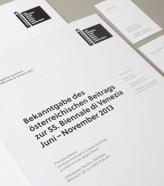
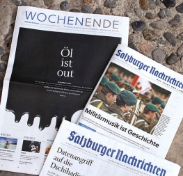
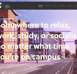
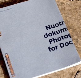
Soleil fits a wide range of potential applications: signage and wayfinding systems being the most obvious based on its provenance; book and magazine design; branding and corporate identity programmes.
Soleil consists of seven weights with respective italics and a twisting, two-sided MC Escher-like display style called Magic Caps — perfect for branding and merchandising when something eye-catching is required.
Soleil underwent an update in the spring of 2026 that added support for Vietnamese and Pinyin notation, as well as variable fonts using the weight axis, in addition to numerous minor improvements. OpenType features allow for the implementation of typographic niceties such as small caps, both tabular and proportional lining and oldstyle figures, ligatures, alternate characters, case-sensitive variants, and fractions. All together, Soleil’s contemporary and pleasing characteristics make it a great choice to replace overused or unpalatable geometric typefaces.
CREDITS
Lead design and concept
Wolfgang Homola
Type Design
Patrycja Walczak
Engineering
Joancarles Casasín
Sonja Stange
Quality assurance
Azza Alameddine
Yorlmar Campos
Kerning
Radek Sidun
Graphic design
Elena Veguillas
Felicia Priscillya
Copywriting
Joshua Farmer
Doug Arellanes
Social media manager
Doug Arellanes
