Inspired by fantasy gaming, an audacious serif family that brings the epic to any text.
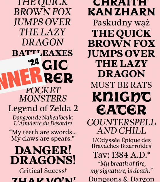
Winner of the 2023 Gerard Unger Scholarship, Dargon is a typeface forged in the fires of gaming legend – honed for razor-sharp legibility on colossal TV screens and console renders, where it commands UIs, menus, and dialogues from afar. Its uncial roots, steeped in myth and forgotten runes, unleash dramatic immersion for fantasy novel covers that beckon readers into shadowed worlds before a page turns, RPG magazines alive with lore, and game packaging where it fuses UI, epic cover art, and promos into a seamless saga of visual conquest.
Dargon walks between two worlds typographically with its display and text parts – five text and italic styles, and six uncial display fonts. Dargon has two parts – Dargon, an uncial-inspired set of six display fonts, and Dargon Text, for body copy, from on-screen user interfaces to short paragraphs to novels. Dargon’s uncials are where it truly takes flight. Each of its uncial-inspired stylistic sets is named for the schools of magic in a popular role-playing game: Ignis, Limen, Mutatio, Oculus, Aegis, Umbra. It’s instantly clear that any text set in these will look like powerful incantations. Dargon’s uncials are fantasy transmogrified into text, and will be a faithful companion on all kinds of quests.
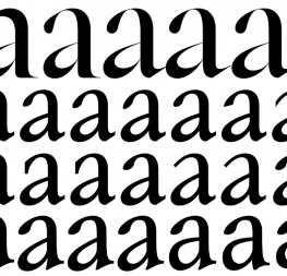
Dargon’s text styles feature sharp, prominent serifs, flaring stems, and a confident and expressive design with a rich texture that does not get in the way of legibility. On the contrary, Dargon Text performs beautifully in continuous text and its generous spacing guarantees an impressive performance on screens. The bottom line is that Dargon reads exceedingly well while being faithful to its design intention and theme.
Ideal for the full campaign of a fantasy video game, Dargon has been designed for maximum flexibility in everything from gaming and dialogue UIs to title fonts and promotional materials. Alternately, its text weights work well in an editorial context in magazines, game descriptions, and articles. Dargon Text’s low contrast and rich texture are a worthy match for screens and coated paper, especially when paired with illustrations.
Dargon comes with a total of 16 styles, support for more than 200 Latin-based languages, and a variable font format for the text subfamily. It is a worthy recipient of the Gerard Unger Scholarship, and a type family that more than likely will inspire to take up that sword – or that pen – and go out on another epic quest.
CREDITS
Lead design and concept
Anne-Dauphine Borione
Icon designer
Supervision
Veronika Burian
José Scaglione
Quality assurance
Yorlmar Campos
Engineering
Joancarles Casasin
Kerning
Anne-Dauphine Borione
Graphic design
Elena Veguillas
Felicia Priscillya
Motion Design
Cecilia Brarda
Copywriting
Douglas Arellanes
Social media manager
Douglas Arellanes