Twinkl Cursive

November 2017

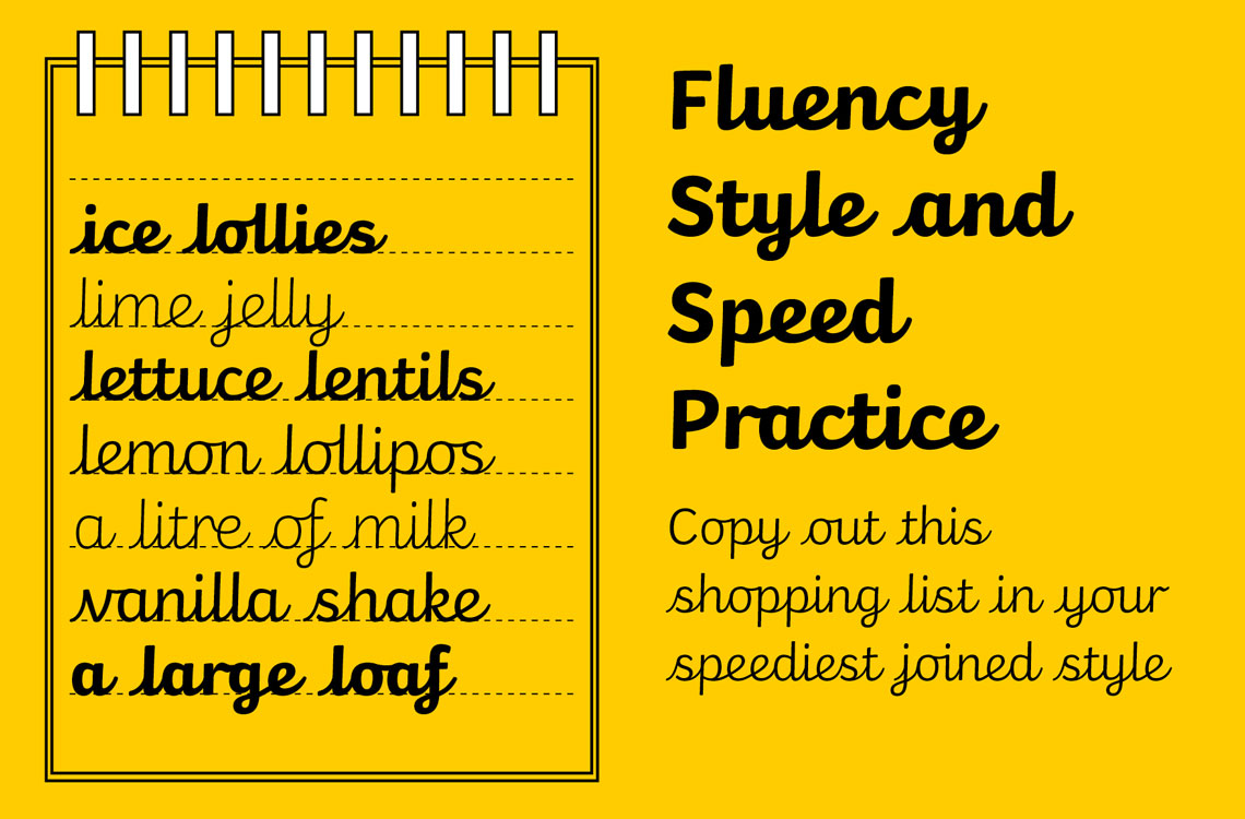
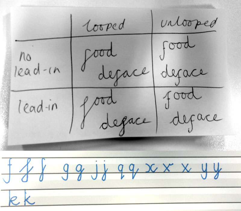
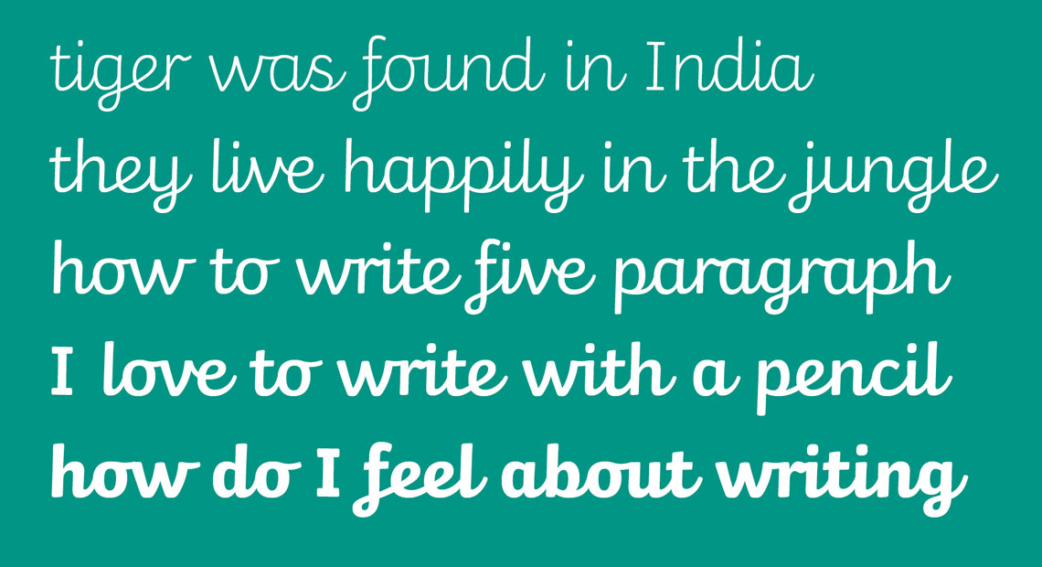
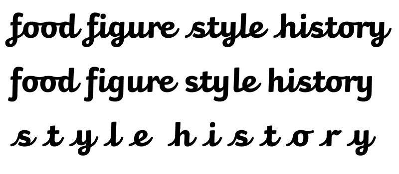
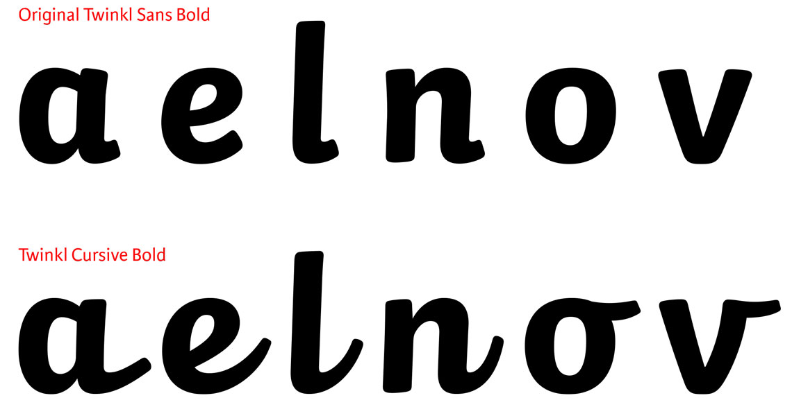
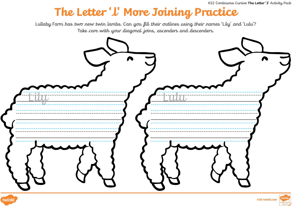
In 2016 TypeTogether developed an original typeface for Twinkl, a UK-based company that provides educational material and support to schools. Our original typeface for Twinkl solves the dual problems of establishing strong corporate branding across digital and printed media, while having the ability to typeset text for children and educators. In January 2017 we started work on a cursive font based on the Twinkl type family, primarily for use in-house at Twinkl to design resources that teach handwriting, but also for UK teachers’ own personal use.


The challenges

The new cursive typeface was mainly intended to demonstrate to KS1 and KS2 (age 5–11) proper handwriting. As we had learnt from the original Twinkl custom font family, this means that there are very rigid boundaries limiting what can and cannot be done with the letterforms. In other words, the shapes of the letters and the shape, style, and direction of the connecting strokes must adhere to the standards that are commonly used in the UK.

Moreover, the project would require multiple alternative glyphs to take into account the varying methods by which different schools teach particular letters. One of the most important challenges was that some schools teach the looped versions of characters like ‘g’, ‘f’, or ‘j’, while others favour the non-looped variants. This resulted in two separate approaches to connecting strokes: a looped version of the typeface that is a fully connected script and a non-looped version that has a number of ‘break letters’ — letters that do not have an exit stroke and therefore do not connect with other letters.


Other requirements for the new type family were that the words could be written with or without a lead-in stroke and that there is a pre-cursive version of the font. In the end the project implied three subfamilies:
–a looped and fully connected set of fonts, with an alternative lead-in stroke on each word
–a non-looped version that is partially connected
–a pre-cursive version with letters that appear separated from each other

the process

The new cursive type family was to be developed from the existing Twinkl type family so the two were easily identified as being related, both for brand purposes and for easy transition between the materials children used. But as you may have already guessed, the process was significantly more complex than adding exit strokes to an existing type family.

Exit strokes add complexity to a typeface, and especially to one that has rounded terminals and straddles the line between appealing to children and to adults as Twinkl does. We realised early on that some of the flair and curviness of the original Twinkl family had to be reduced to obtain a texture that looked generally less busy after adding the exit strokes.


One difficulty of a connecting typeface is that catering for all the scenarios of different letter pairs is almost impossible, so one of the first tasks was to devise the most important connections. We identified four main situations: joining to a straight stem, a curved stem, a triangular letter, and to an ascender. We decided that connecting to a straight x-height stem would be the default. All the other joins had to be coded as contextual alternates and alternate glyphs had to be drawn. Additionally, the letter ‘e’ had to be treated specially to integrate it with all letters in a fluid way that clearly suggests handwriting, and the letters ‘r’ and ‘z’ were combined with a range of characters as special ligatures. Compared to a regular character set, and including the lead-in alternates for each letter, the typeface has about 300 extra glyphs for an average of ten extra glyphs per lowercase letter.

As mentioned above, the standard method of writing for some letters is to have a loop. We started testing the variations between the looped and non-looped versions of these glyphs and found that the very small descender of the original Twinkl font proved to be problematic for the loops. There was simply not enough space. As a result we had to lengthen it which had the benefit of a larger line gap — helpful for early learners. Given that Twinkl Sans and Twinkl Cursive would never be used next to each other on the same line, the difference in descender height does not create a problem.


The complexity of designing Twinkl Cursive was fortunately reduced at one point: kerning. Connected cursive typefaces usually can do away with this laborious process. The connections between lowercase letters are designed in such a way that there is no need to fine-tune the spacing of specific letter pairs.


happy results

Twinkl Cursive is one more entry in our growing list of custom designed type families, and most of all we’re happy our clients are so enthused about the result. Keep your eye out for educational materials with a unique look and helpful structure by which children can learn. It just might be Twinkl Sans and Twinkl Cursive you’re admiring.

“We would like to say a big than you to Type Together for their work on the Twinkl Cursive font. We had very specific and complex requirement causing many obstacles which Type Together dealt with with patience and determination to succeed. The cursive font fits with our Twinkl font family really well, maintaining our friendly and lively brand. We are extremely happy with the final outcome, and recommend Type Together readily.”
–Imogen Wood, Chief Product Officer and Project Lead


About Us

TypeTogether is an indie type foundry committed to excellence in type design with a focus on editorial use. Additionally, TypeTogether creates custom type design for corporate use. We invite you to browse our library of retail fonts or contact us to discuss custom type design projects.