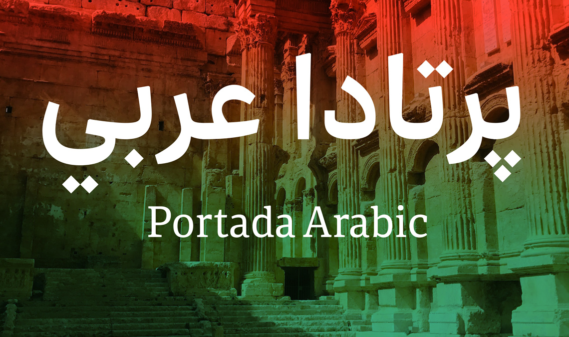
We originally designed Portada as a modern solution for serif typefaces on screens. It had the added benefit of feeling warm and welcoming in print without losing any clarity. (By the way, all the paragraph text on our website is in Portada and the headings are in Adelle Sans, so you can recognise how well it works.) We knew we would eventually want to extend it to other scripts, and now we are happy to announce the release of Portada Arabic by Sahar Afshar!
Why Naskh & how it connects to Portada Latin
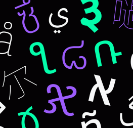
When considering the intention of the Portada family, one thing that really underpins the design is the pursuit of clarity, primarily in digital contexts but also in print. This was the main deciding factor for using a simplified Naskh style for the Arabic companion.
Naskh is known for being the most legible of Arabic calligraphic styles for its balance in the relation of straight segments to curved lines. There is a lot of historic precedent for the style being used in circumstances where legibility has been a priority, and in many countries, readers are accustomed to reading in Naskh-based faces. Considering this, it was a rather straightforward choice to design Portada’s Arabic counterpart in a style that follows in this convention.
Harmonising with other scripts
When work on the Arabic companion to Portada was started, the main focus was to design something that complemented the Latin in terms of concept and perceived use, but also with an eye to visual aspects such as size and colour. Both scripts needed to look balanced in terms of size and achieve a similar gray colour if looking at lines of text with blurred eyes. All of this was done while remaining faithful to the proportions and structure inherent to the Arabic script.
With Portada Italic, there is a clear calligraphic expression in the design of the instrokes and outstrokes; this was replicated in the Arabic as well. But instead of flaring the ‘tails’ on characters like ‘waw’ and ‘reh’ (a feature that is typical of fonts based on simplified Naskh), these terminals are tapered to convey a similar calligraphic touch. The amount of contrast in the Arabic mirrors what can be seen in the Latin, however, this is slightly adjusted to account for the fact that, in Arabic, the transition to the thinnest segment of a stroke or connection is typically longer than what exists in Latin.
Finally, the contrast in the Arabic design is the reverse direction of the Latin. Here the horizontal strokes are heavier, staying faithful to the inherent structure of the script, and basing the placement of the contrast on what would be achieved if writing with a calligraphic pen.
Optical size adjustments
There are certainly very few Arabic fonts that address the requirement for optical size adjustments, so Portada Arabic does its part to fill this significant need. As in the Latin, the Display and Text styles differ in several aspects. The Text styles have a subtle but crucial decrease in the amount of contrast, while simultaneously elongating the connections between letterforms ever so slightly. The latter adjustment combined with the modest expansion of letterform parts themselves makes the text version slightly more generous on the baseline.
Despite this, both Text and Display are designed with an eye to the requirements of setting type on screens and the ability to set more words in a given line of text. Other adjustments are also present between the text and display versions of the font: adjustments in the height of the teeth, the dot and diacritic positioning, and the general spacing all help answer the needs of distinct reading conditions.
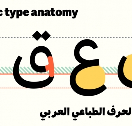
Optical sizes: Portada Arabic Bold in the headline and Portada Arabic Text Regular in the text. Text source: Vice.com/ar.
Language support
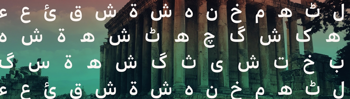
Our primary commitment as a company is to provide the world with modern multiscript typefaces for engaging reading and brand experiences. Toward this end, Portada Arabic supports Arabic, Persian, Urdu, Dari, Aimaq, Dehwari, Talysh, and Qashqa’i as well as the entire matching styles from the Latin family, and we have included Pinyin and Vietnamese.
As a whole, the Portada family includes Latin, Thai, now Arabic, our upcoming Cyrillic, and a Pinyin and Vietnamese extension will soon be added to the original Latin family. Head over to the desktop font tester and try it for yourself!
TypeTogether is an indie type foundry committed to excellence in type design with a focus on editorial use. Additionally, TypeTogether creates custom type design for corporate use. We invite you to browse our library of retail fonts or contact us to discuss custom type design projects.