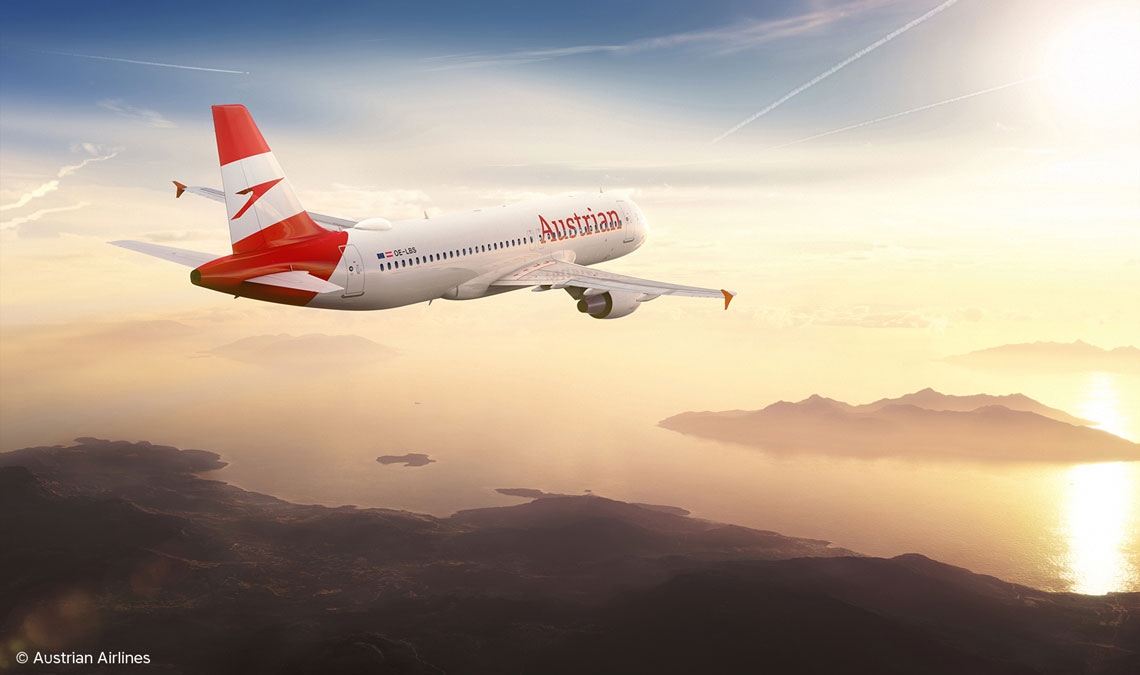
Austrian Airlines Rebrands with Portada

November 2019

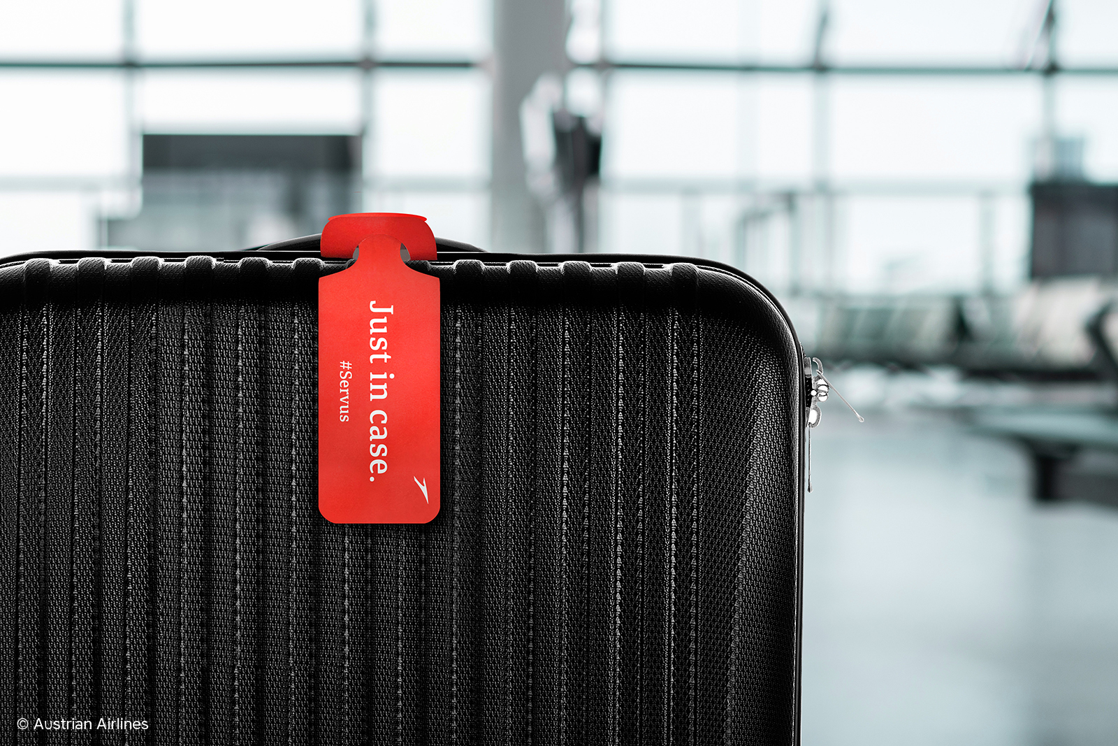
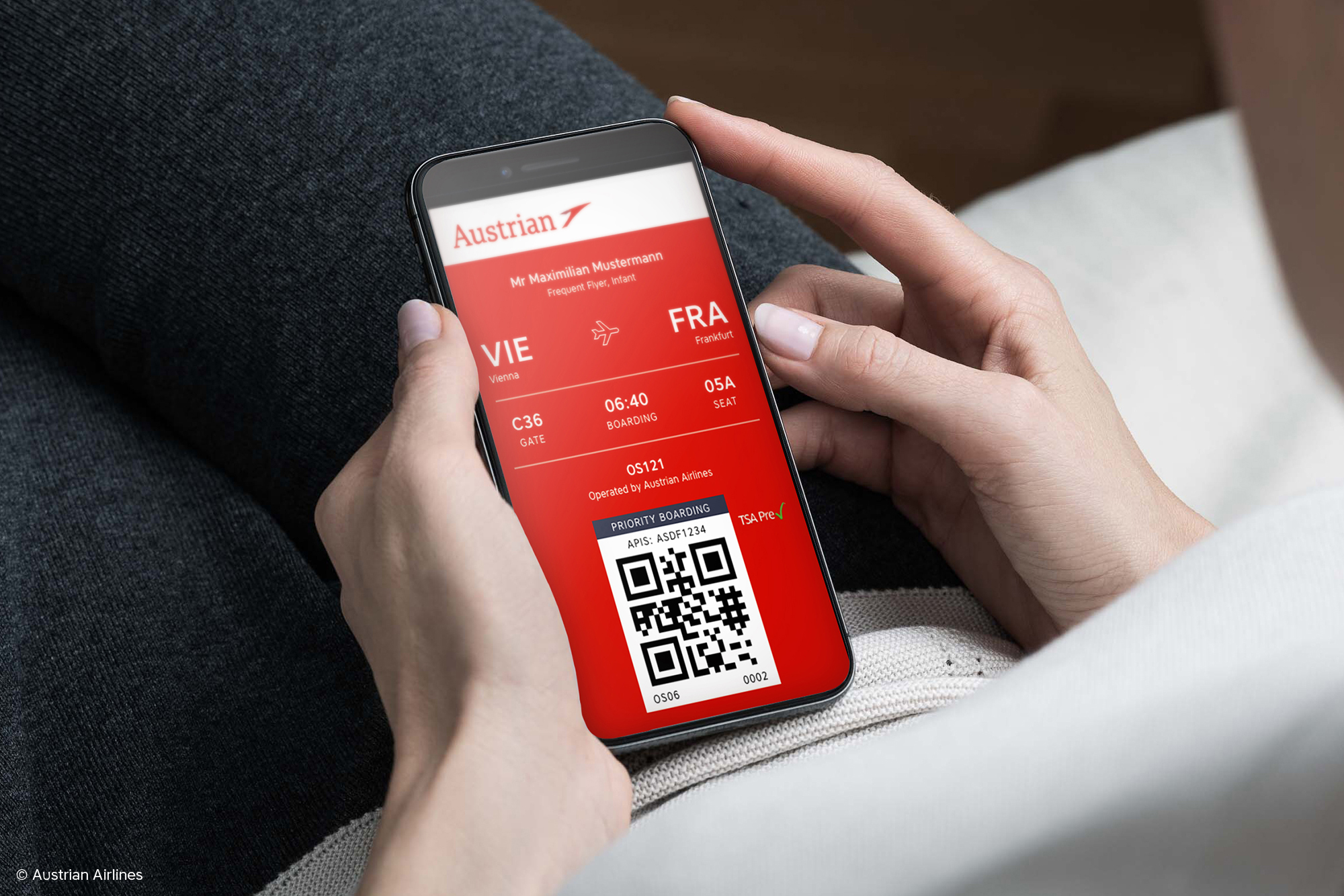
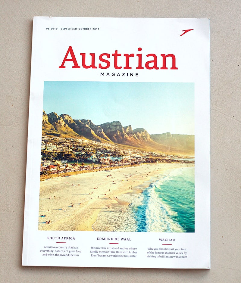
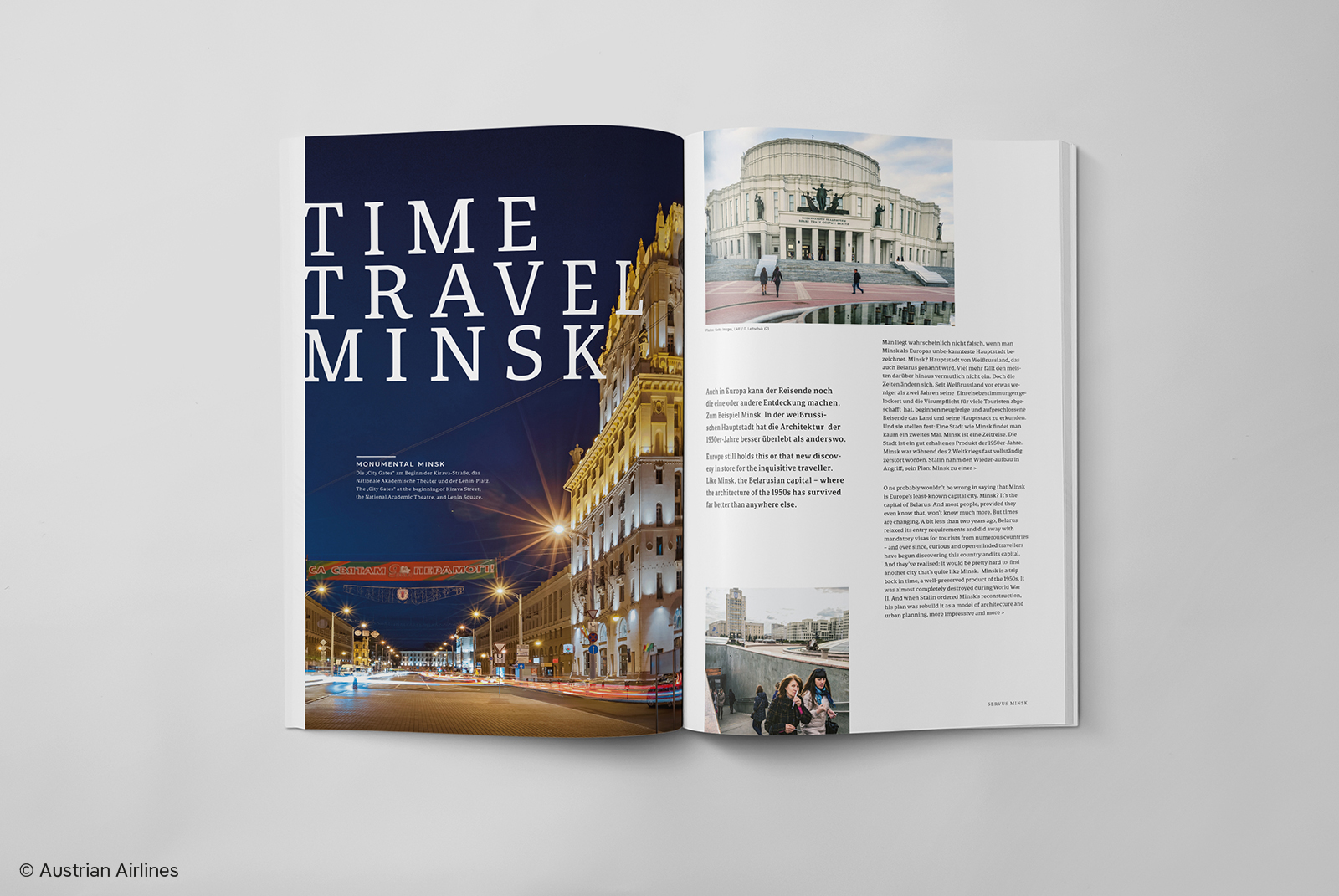
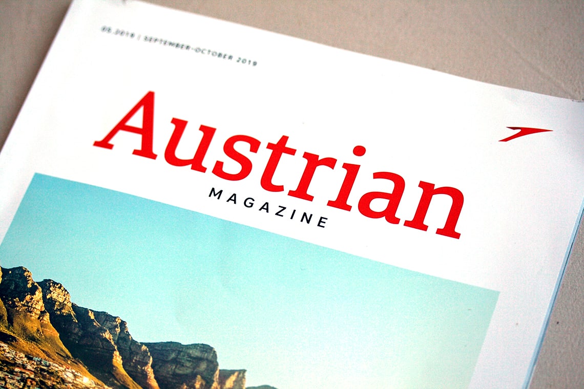
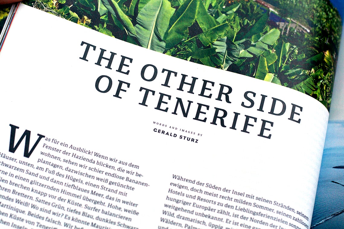
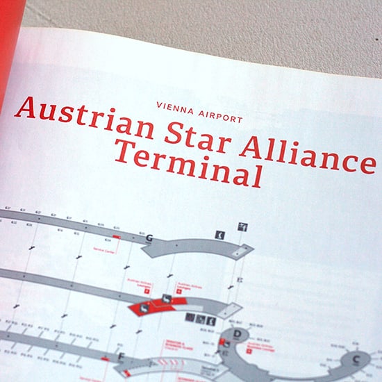
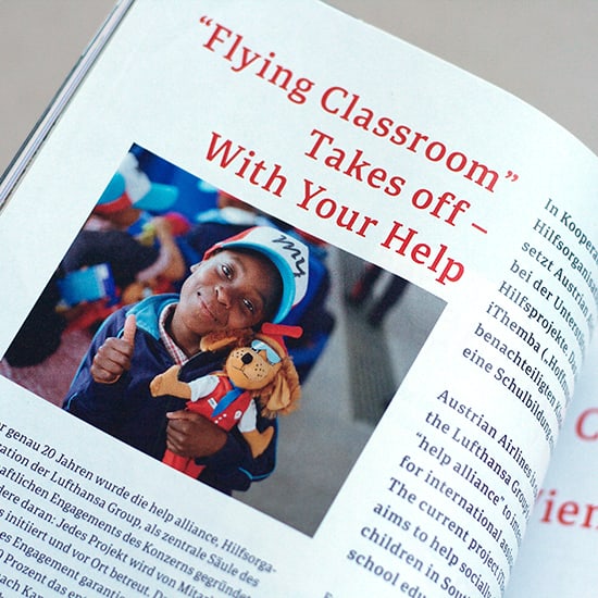
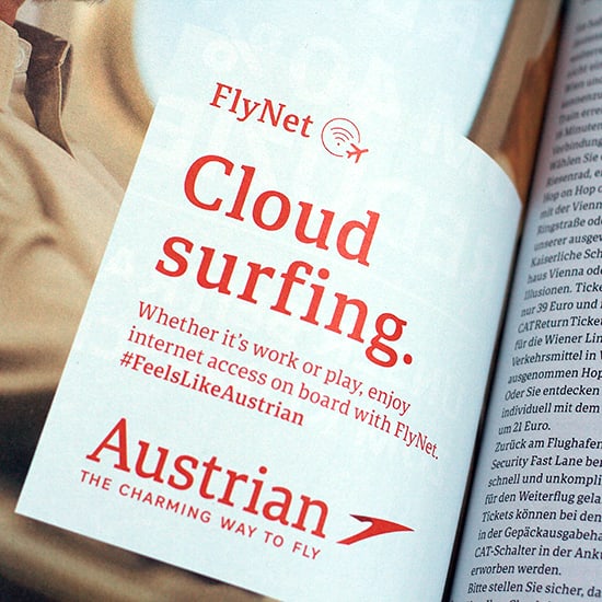
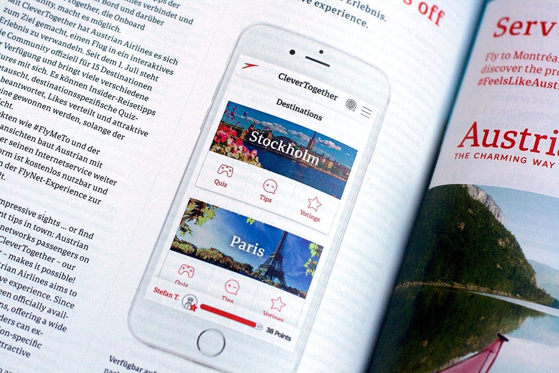
Every once in a while a respected brand will either have us create a custom font family for them or simply employ one of our typefaces to great effect. After a long research and iteration process, Austrian Airlines has rebranded with our Portada font for all customer interactions — digital and print.


You’ve seen our custom work with Apple, Google, and Twinkl, and our retail work with Evernote, Libora furnishings, and a range of newspapers, websites, and magazines. But this is the first time an airline has painted our typefaces larger than the side of a house.

Austrian Airlines hired consulting, strategy, and design firm Brainds to balance a look that is approachable and professional for their 60th anniversary rebrand. The rebrand had to respect the history of Austrian Airlines and modernise it without completely overthrowing its brand value and the good will it has garnered over more than the last half-century.

One priority for Austrian was to optimise for the digital world without losing their voice. Everything was scrutinised, from reservations and boarding to in-flight touchpoints and airport wayfinding. The logo was refined and given more prominent angles. The wordmark, previously an old-fashioned serif, was difficult to read on the side of their aircraft and was also deemed unsatisfactory for digital environments.


Austrian Brand Film from Brainds.


Brainds decided that everything from airport signage and their in-flight magazine to the digital app and the livery name should be set in Portada. Brainds said the Portada family brings the modern warmth they wanted to every touchpoint and company representation with which the customer comes into contact. As a subsidiary of the Lufthansa Group, Austrian Airlines also knew Portada would easily translate from print to digital and from orientation signage to social media without any fuss.

Austrian Airlines carries as part of its DNA a friendliness, hospitality, and service orientation upheld by their tagline “the charming way to fly”, as shown in their brand video. Brainds won a prestigious Red Dot Award as a result of their efforts to boldly update Austrian Airlines with a contemporary classic. And we are proud to see the Portada family used in such a wide range of applications.


Comparison of old and new logo (using Portada) of Austrian Airlines. Note the old wordmark’s thin serifs and contrast, and the lower x-height, making recognisability difficult.


 Note the strong colours, sturdy letterforms, their height on the side of the plane, and their legibility. Courtesy of Austrian Airlines.


New flags using Portada. Courtesy of Austrian Airlines.


The newly designed boarding pass for Austrian Airlines. Courtesy of Austrian Airlines.


Courtesy of Austrian Airlines.


Courtesy of Austrian Airlines.


Courtesy of Austrian Airlines.


Courtesy of Austrian Airlines.


Courtesy of Austrian Airlines.


Courtesy of Austrian Airlines.


Courtesy of Austrian Airlines.


 alt=


 alt=


 alt=


 alt=


 alt=


 alt=

About Us

TypeTogether is an indie type foundry committed to excellence in type design with a focus on editorial use. Additionally, TypeTogether creates custom type design for corporate use. We invite you to browse our library of retail fonts or contact us to discuss custom type design projects.