The Calm-fidence of Ploquine
March 2024
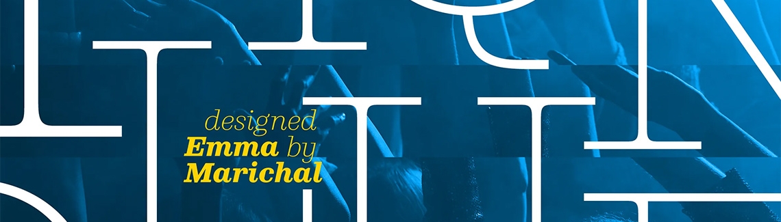
We are proud to announce Emma Marichal’s brand new Ploquine font family, an editorial typeface of structured delicacy and wide applicability.
We are proud to announce Emma Marichal’s brand new Ploquine font family, an editorial typeface of structured delicacy and wide applicability.
There are few things that bring a sense of nervous relief like releasing into the world something you have created. Artists, designers, writers, developers, chefs, musicians, and architects feel this each time their projects are placed in front of others. Typeface designers also spend years creating thousands of glyphs in hopes we would use them well, both as they were intended and in crazy and unexpected ways for unique effect.
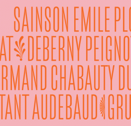
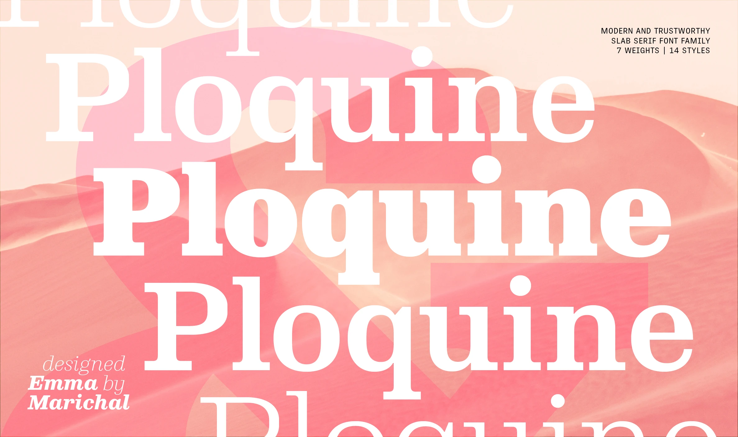
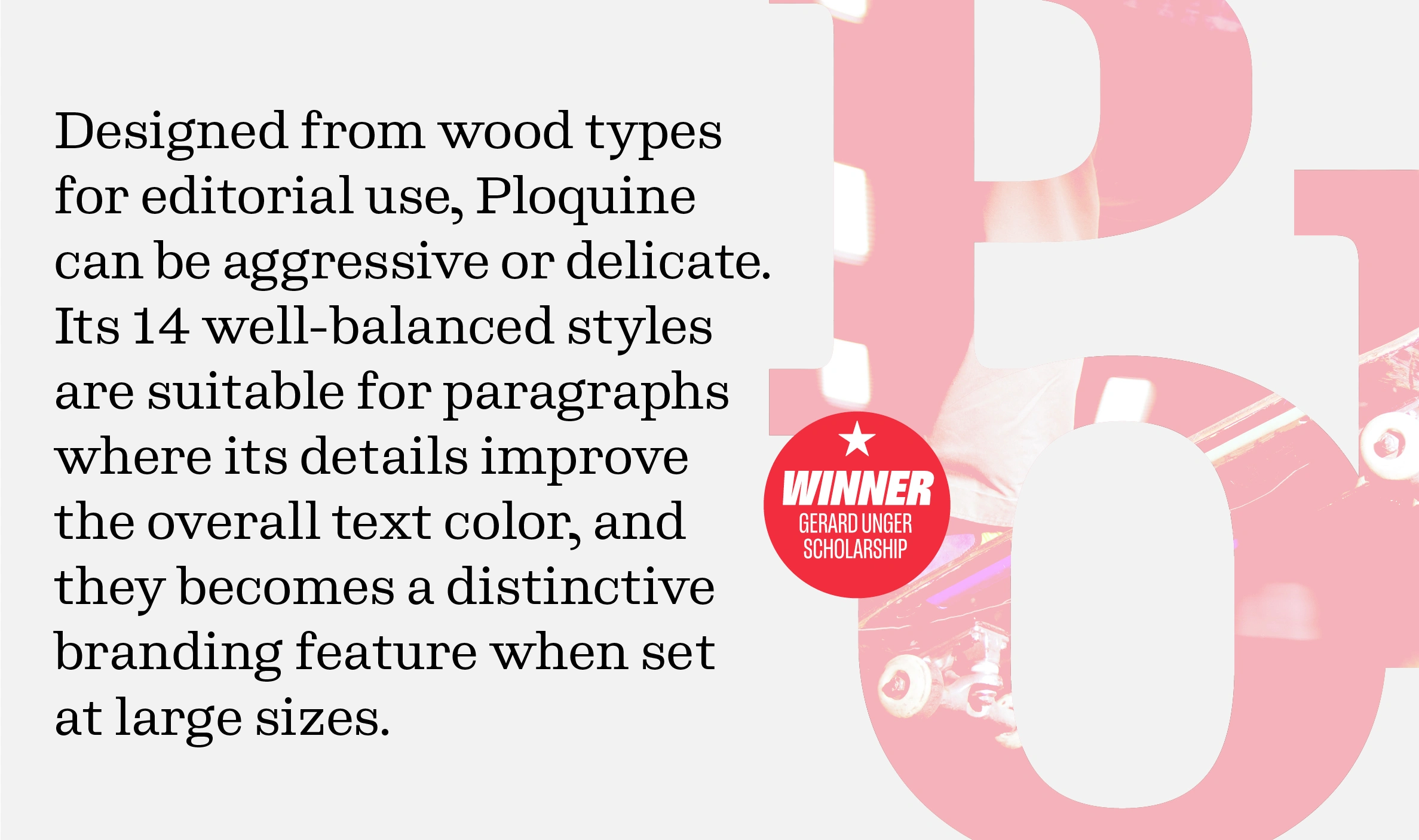
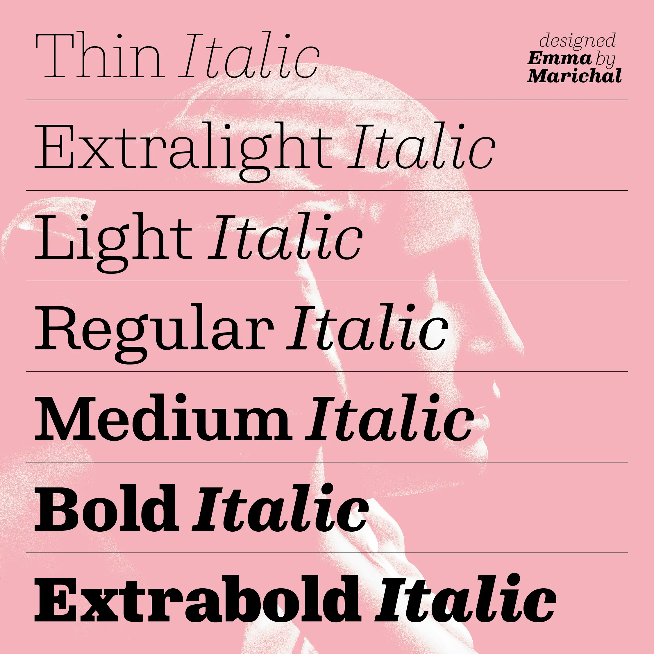
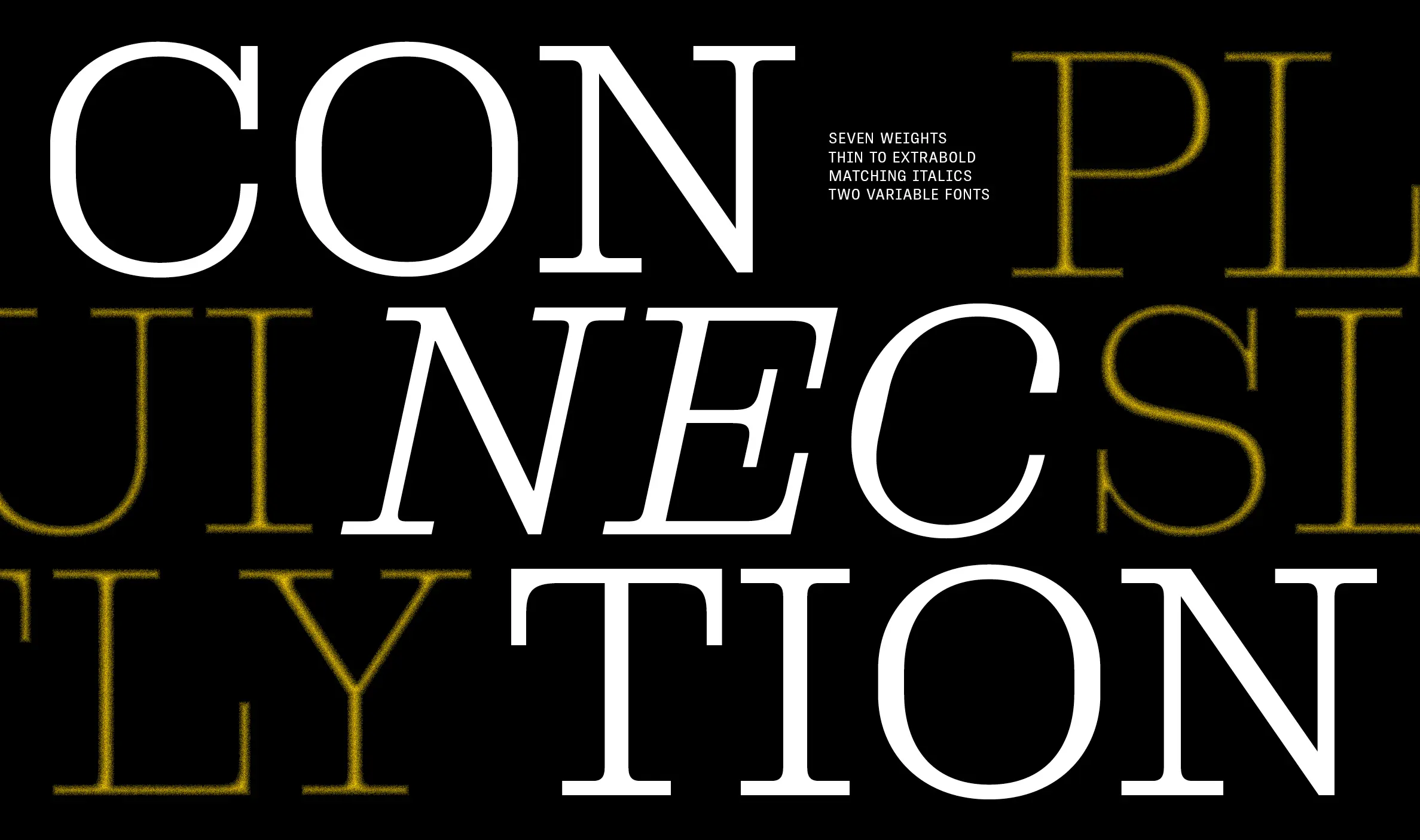
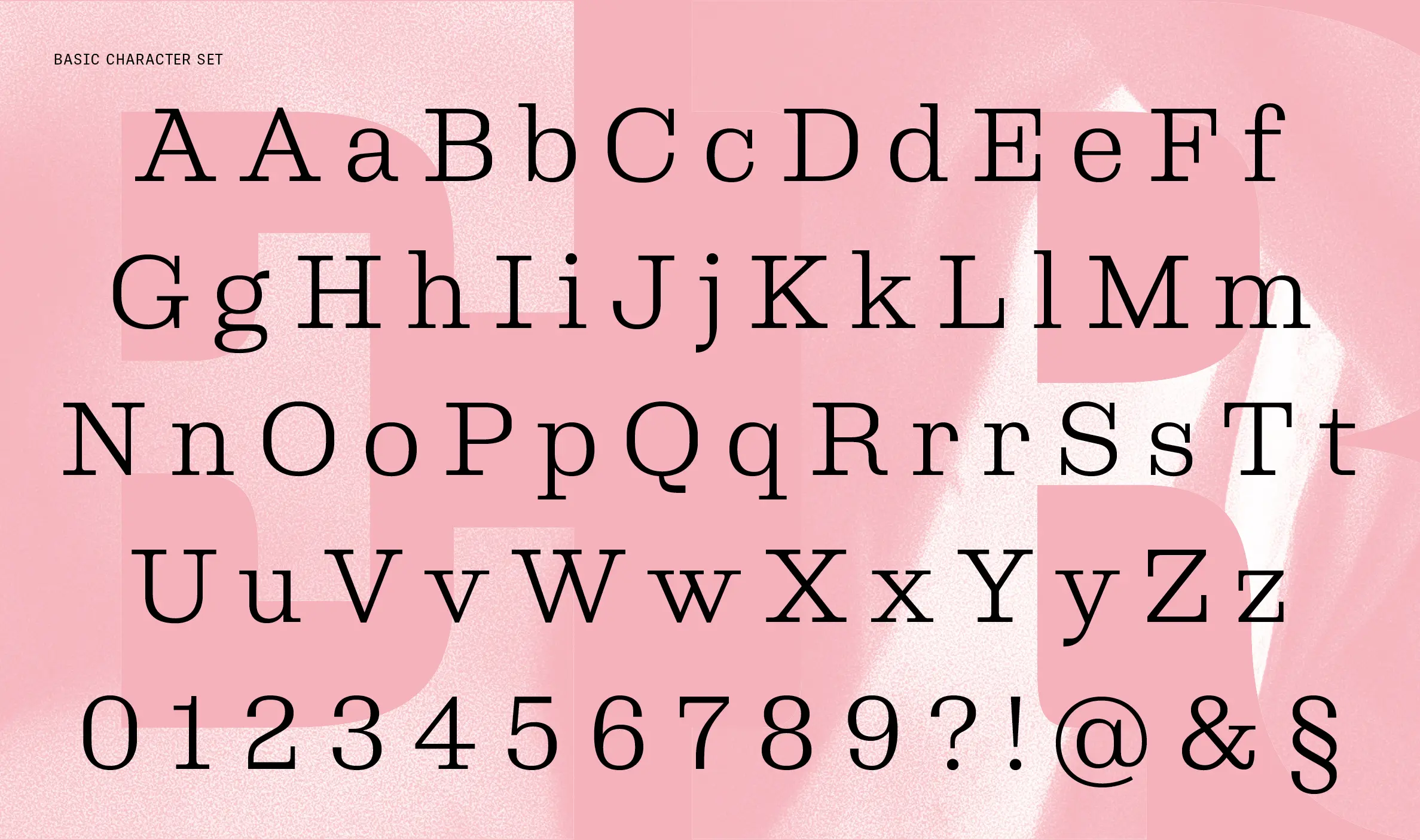
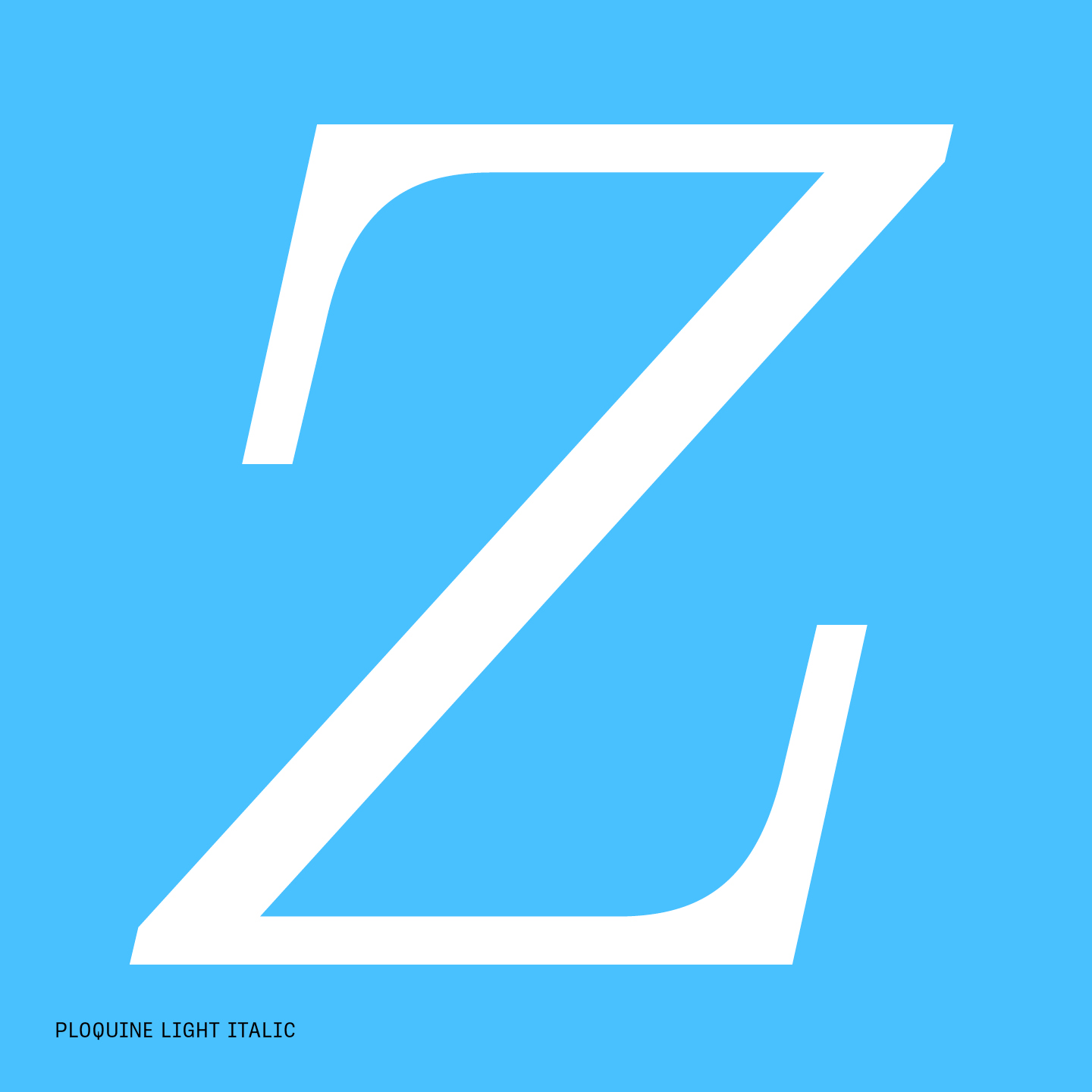
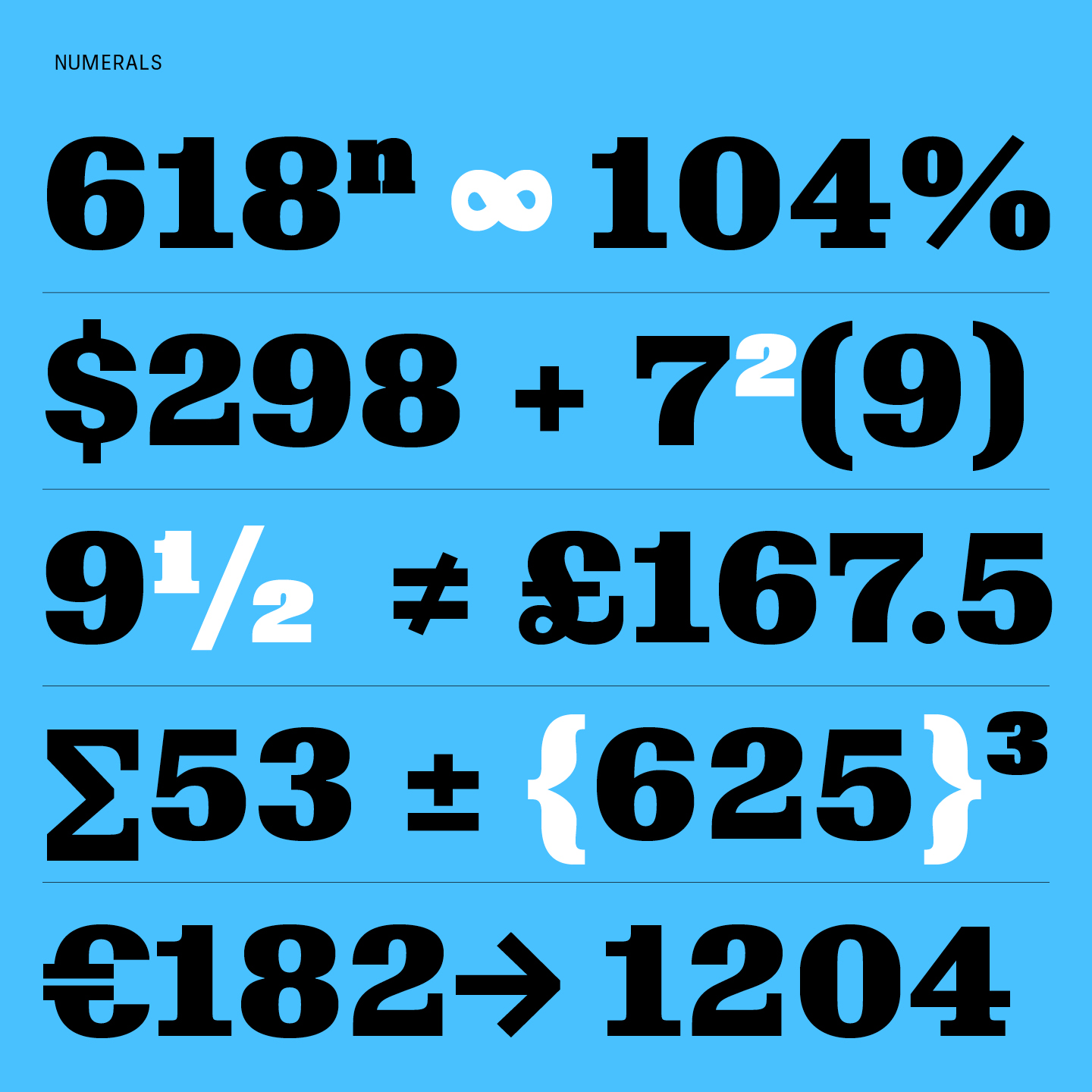
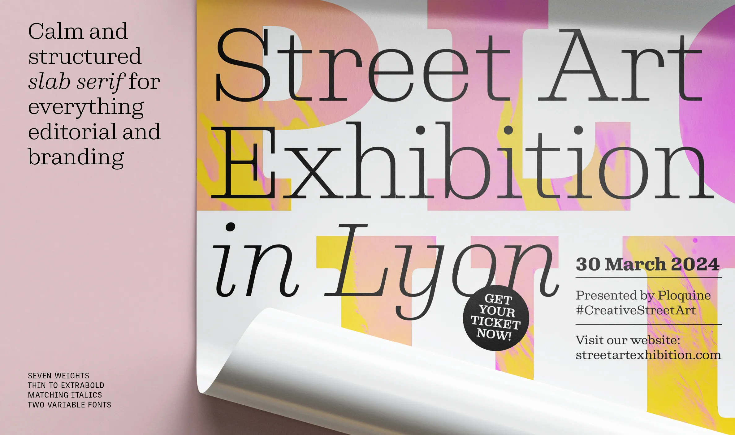
We are excited to announce the release of 2022 Gerard Unger Scholarship winner Emma Marichal’s Ploquine font family! All designers need a few trustworthy slab serifs in their toolbox: a boring and clumsy standard one, a sharp and edgy one, and at least one more that will always feel modern and be able to speak with multiple voices in many digital and analogue situations. Based in historical typefaces made of wood, Ploquine is a calm and structured slab serif for everything editorial and branding.
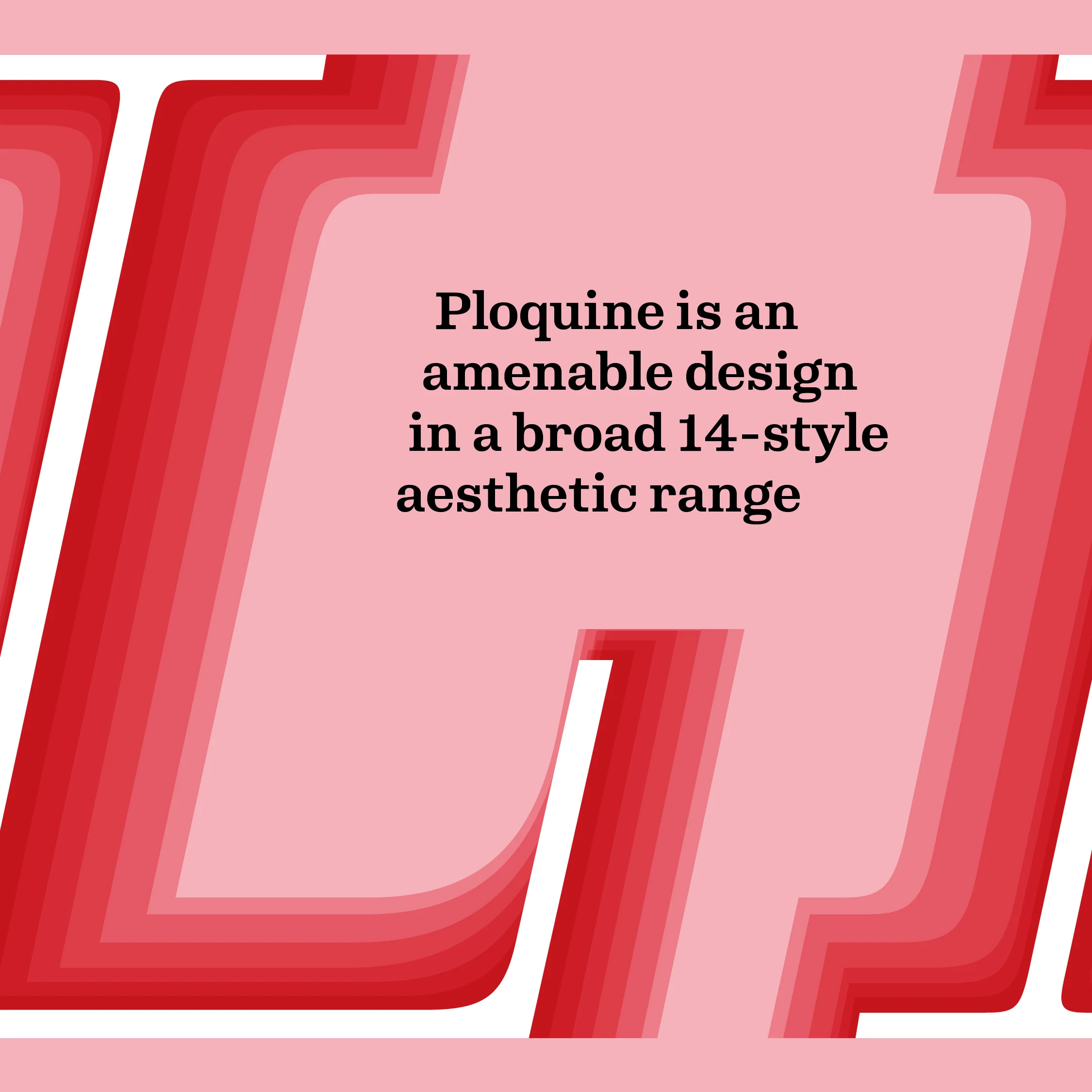
Ploquine’s lighter weights carry a ton of air within their forms to lean into the emotions of delicacy and subtlety. Its heavier weights claim territory on a page and state its message with confidence. And each style in between shows varying levels of squared counterforms and unique details. Use it for a logo or masthead, find delight in how this slab can be perfect for magazine text, and revel in its details in large-format posters. Ploquine’s range is immense and we can’t wait for you to enjoy it!


TypeTogether is an indie type foundry committed to excellence in type design with a focus on editorial use. Additionally, TypeTogether creates custom type design for corporate use. We invite you to browse our library of retail fonts or contact us to discuss custom type design projects.
Schedule an introduction meeting to learn more.