We are happy to announce the winner of the Gerard Unger Scholarship 2022: the Ploquine typeface by Emma Marichal, developed while studying the Type Design post-diploma course at Esad d’Amiens under the tutoring of Sébastien Morlighem.
Ploquine
We all tell stories of bad problems, but sometimes in life there are good problems. The last few years have shown us that one of these is how many wonderful typefaces are being produced by promising university students. We see it every year as we open our Gerard Unger Scholarship for submissions and receive a flood of novel and useful multiscript designs.
In fact, last year’s Gerard Unger Scholarship entries we so impressive and compelling, we have decided to grant the 2022 scholarship to one of the entries from last year: Ploquine by Emma Marichal. While we will not be taking official entries this year, next year we will accept entries from students graduating in 2022 and 2023. So keep working on your typefaces so they’re ready when we begin taking entries next year, and join us in congratulating Emma on her well deserved win!
The potential & freedom the engravers had: interview with Emma Marichal
Hi, Emma! Could you briefly describe the Ploquine font family?
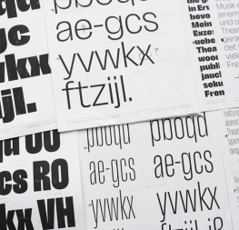
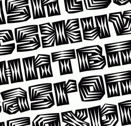
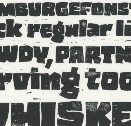
Ploquine is a family inspired by wooden typefaces and is intended for editorial use. The main challenge of this project was, within the design and operation of the family, to implement a tribute to wooden typefaces, which are normally intended for display rather than paragraphs.
The family consists of a variable display and five styles for text. The drawings for the text styles are directly inspired by the specimens of E. Ploquin and the French Typographic Foundry. With generous serifs and mechanical shapes, this solid typeface employs contrast to be perfectly suited for long texts.
The display style offers a multitude of choices to the graphic designer and reinforces the interactive and creative aspect engravers used to have in the past. With two variable axes (weight and width) and a wide range of different serifs to use, the graphic designer will be able to dial in what will best suit their project.
Ploquine’s wood type inspiration is obvious indeed. How did you come across the technique of using wood type in printing?
The first time I drew typography was at a workshop during my graphic design studies. The workshop resulted in the printing of a poster with wooden type. There was a whole process where we cut our letters from wood with a laser, then printed it with old machines from the printing museum of Nantes. This gave rise to an exhibition, and a magazine came out on the theme of wooden type. So I was completely immersed in the theme.
What did it for me was all this diversity of forms and the freedom the engravers of the time had. I immediately imagined all the potential to explore in a font family.
Which characteristics of wood type were important for you when working on Ploquine? And did you, on the other hand, intentionally skip any others?
There were several challenges in a project like this. First, there are a multitude of shapes so I had to choose which ones would be most appropriate for my work. The second difficulty was to find relevant references for the text styles. Wooden typefaces were essentially displays, printed large with varying degrees of embellishment.
There were all kinds of serifs, widths, weights, colors, patterns, and contrast.
I chose rectangular serifs to have the mechanical feel that was very much a part of the industrial revolution — the era of wooden type. I thought it was the style that best represented the era. Then, I wanted a certain contrast for beautiful use in text and to obtain a certain smoothness. I was inspired by Emile Ploquin’s specimen (hence the name); I liked a certain model with rather flat and atypical counterforms.
The display will not just be variable, but very variable (on the width, weight, serifs, and maybe colours or patterns), because I really want to pay tribute to all this diversity of forms. I want graphic designers to have as many choices for their titling as printers had back then.
Type design can be a lonesome job. What role does cooperation play in your work?
I can confirm this, especially since the first sketches for this project were drawn at the end of February 2020. A big part of Ploquine’s development took place at the beginning of Covid, during three months of confinement where we didn’t see anyone and it was difficult to collaborate. It was a very complicated time and starting a new project was a real challenge. But I felt our class really worked together and helped each other because of this particular situation.
In a larger context, I try to get as much feedback as possible from very different people. Everyone has something different to contribute, whether it’s technical, design, or usage. I was lucky to be well accompanied during this project by my teachers, friends, and colleagues. These exchanges helped the project progress.
You have been awarded the 2022 Gerard Unger Scholarship. How do you imagine it could help improve your typeface?
The Gerard Unger Scholarship will obviously help me in many ways. First of all, to feel accompanied regularly on a project and to have different feedback will give me more intense motivation.
Having input from professionals at the top of their field also helps me a lot to define my design space. For example, some styles I initially wanted were not necessarily useful, and when I created the project I was not considering the marketing aspect. With the team’s input, I discovered it is better to prioritise other aspects of the family to make sure it is uesful and worthwhile.
And the mentorship will obviously allow me to have a better defined and higher quality design, because when we’re alone we don’t often realise our mistakes.
TypeTogether is an indie type foundry committed to excellence in type design with a focus on editorial use. Additionally, TypeTogether creates custom type design for corporate use. We invite you to browse our library of retail fonts or contact us to discuss custom type design projects.