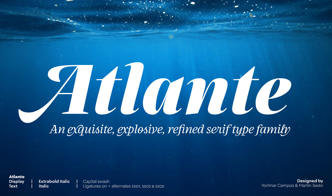
Yes, the images are beautiful. And yes, the typeface is as useful as it is beautiful. As an introduction to Atlante, read the designers’ own words that burst with passion, thoughtfulness, and commitment to their best work — even through the years and “rough seas” of redesign.
By Yorlmar Campos & Martín Sesto
Because Atlante is such a full-featured font family, Yorlmar Campos and Martín Sesto wrote this introductory article as a proper introduction to go beyond the normal descriptive website text. Atlante’s design began with calligraphic extremes: the italic swashes that filled old maps. Over the course of more than four years, it has been tamed into something to handle all kinds of text while remaining a scene-stealer in display formats. It’s packed to the brim with special features for those who love to control and imbibe in each particular detail. And Atlante is available now for your viewing and design pleasure.
Atlante’s background
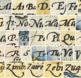
Atlante began with a digital sketch inspired by the italic letters we had seen in maps made during the late sixteenth and early seventeenth centuries by the cartographer and geographer Abraham Ortelius. We found fascinating the hybrid structure of the letters: the main strokes were typical of the flat pen while the decorations and flourishes had an appearance associated with the flexible pen stroke. We cannot be sure that they were originally drawn by mixing the two pen tools to create each character, but we embraced this concept in our first digital sketches. This hybridisation was approached as an integral system, which is why the roman and italic are so different — to emphasise their differences while letting them coexist naturally.
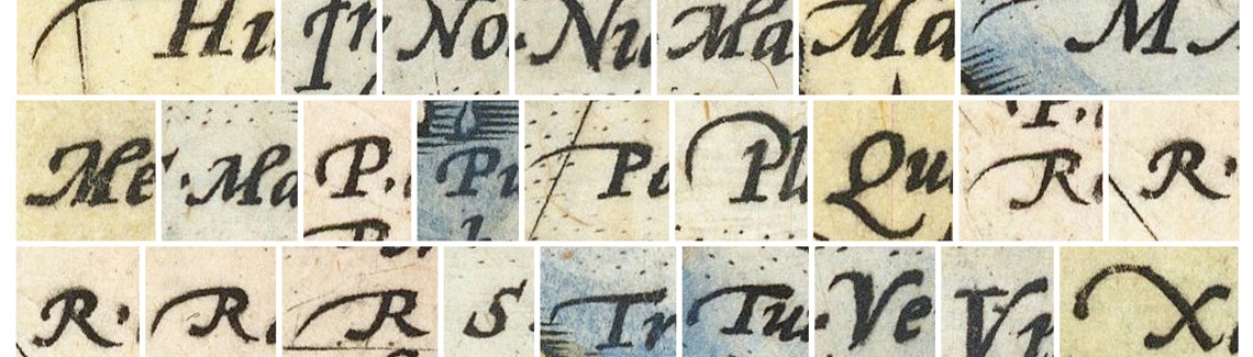
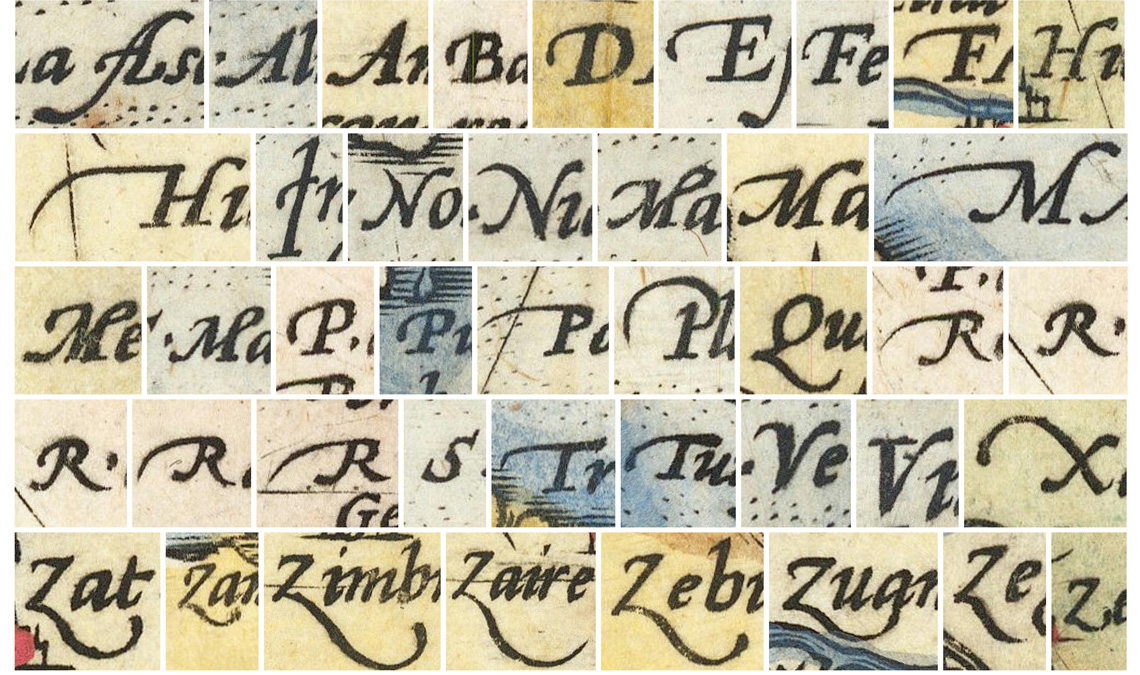
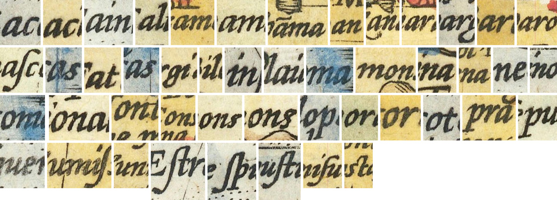
Swashes and initial forms culled from the map ‘Africae Tabula Nova’, from the ‘Theatrum Orbis Terrarum’ published by Abraham Ortelius in 1570 — considered one of the first modern atlases.
Connected letters used as inspiration in Atlante, also from the ‘Theatrum Orbis Terrarum,’ 1570.
The project took its own course from that cartographic idea and morphological hybridisation. We let our minds wander around the practical implications of ‘facing the sea’ to develop cartographic maps for someone like Abraham Ortelius; these thoughts led us to another place... the one made of fantasy elements that were not mapped, such as the mythical continent Atlantis. And this is how Atlante was named.
Naturally, many elements evolved through different stages of maturation and distillation from the early sketches to the final result. From general things like reducing the length of the serifs or the incline of the italics, to more particular details like the lowercase ‘y’, which had too much personality for continuous reading. (We opted to keep it as an alternate character.) The final design is probably best described as eclectic and hybrid.
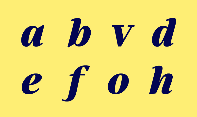
Changes to lowercase letter z.
Changes to lowercase letter v.
Changes t lowercase letter s.
Changes on lowercase letter f.
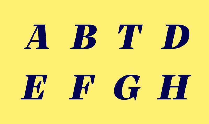
Changes on capital letter Q.
Changes on alternate capital letter A.
Changes on capital letter G.
Changes on alternate capital letter H.
Changes on capital letter M.
Uprights and italics, similitudes and differences
Atlante was initially an italic typeface to be used in headlines, large body copy, and short words, highlighting the elegance and appeal that a large word would need. Its somewhat condensed shape and high contrast between thin and thick were features born from the need to be appealing. But when we decided that the typographic system had to be expanded to incorporate other uses such as small body copy for continuous reading, we added a counterpart upright that would respond to those needs.
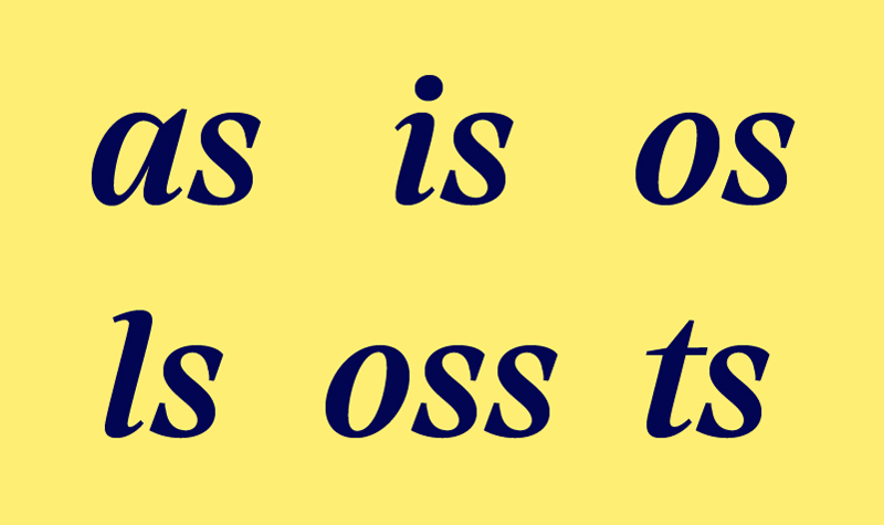
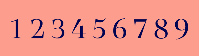
The italics were based on the concept of cursiveness, thereby gaining a greater degree of expressiveness and spontaneity, as opposed to the more stable and calm uprights. While the uprights are based on interrupted construction — that is, slower strokes and greater control — the italic emphasises how it is possible to achieve greater fluidity and cursiveness with fewer interruptions in the ductus. This concept of continuous construction can be seen in the forms and bifurcations of a, b, d, e, g, h, n, m, r, q, u, v, w plus the terminals in some numbers (2 and 3), and various currency signs.
The italic also contains other features that provide cursiveness and are related to handwriting: a descending stroke in the letter f, inverted weight in the letter z, plus the noticeable increase in the speed of the curves. Another aspect contributing to fluidity is how the entry and exit strokes relate to the arrival from the previous letter and its departure to the next.
The italic capitals construction is similar to the uprights but slanted, except for the Q, whose shape and tail are cursive. An alternate set of ornate uppercase letters were added to provide an additional degree of personality.
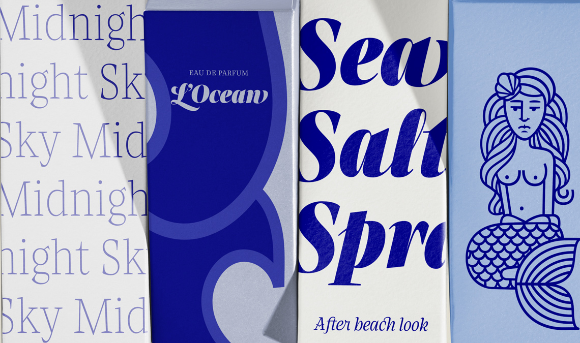
The cursive italic reinforces the concept of fluidity by including alternative characters with a fast curve ratio, ligatures related to manual writing, and ornamented lowercase to be used at the beginning and/or end of a word or sentence. Its usefulness is tangible in highlights, logos, complex compositions, and in titles with large text.
Range of use
Atlante went through three stages of development. Initally, Atlante was a small, cartographic family with only a display italic and its matching upright (rather than the other way around, which is most common).
In the second stage, we explored the possibility of extending its range by adding thinner and heavier weights. This took a long time to develop. When it was finished, we felt that it was beginning to function as a comprehensive system, rich in publishing and editorial possibilities.
We then decided to take it to the field of continuous reading and book design, which took us to the third stage. In order to improve legibility in smaller sizes, we needed to make some significant changes. We added an optical axis that would allow size reduction while improving legibility. This axis includes changes in three main respects:
the increase in the x-height allows characters to grow and gain larger internal countershapes for added clarity
the increase in spacing compensates for white gain by the glyphs
the thickening of the thin strokes and serifs reduces contrast so they don’t disappear in smaller sizes
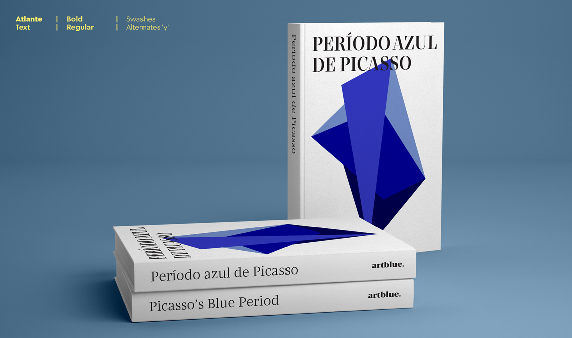
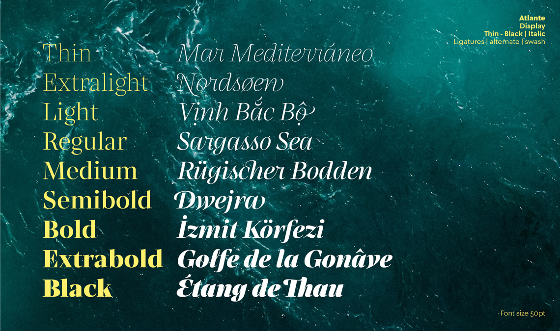
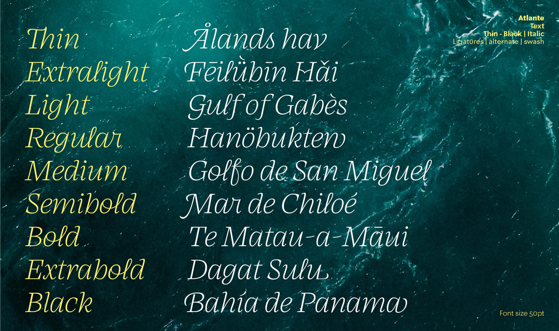
Atlante is now a large family that includes a total of 36 static fonts in two optical sizes (display and text), each of them with nine uprights and matching italics, as well as cursive alternates and swashes, ornaments, and textures.
Icons and textures
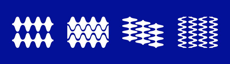
The iconic aspect of Atlante lies in its genesis as related to cartography, the sea, and the myths. This, in turn, provided us with a challenge to include icons and ornaments that would combine appropriately with Atlante’s eclectic typographic style.
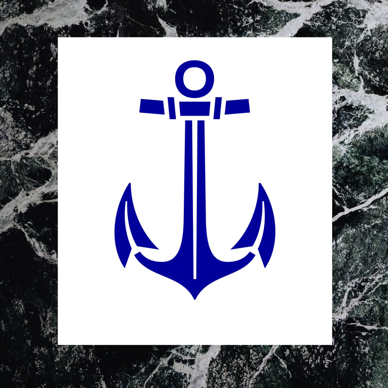
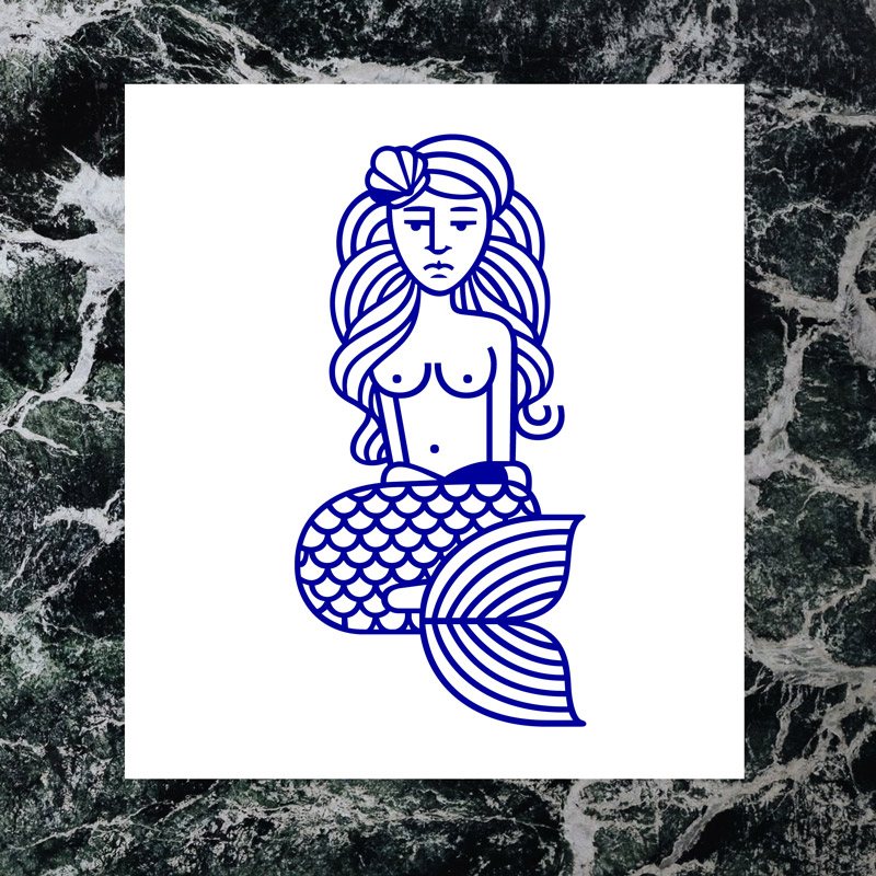
The first icons had evident connotations of Atlante’s origins: ship anchors, a northward compass rose, manicules and arrows pointing the course of the trip, and textures that denoted a calm or rough sea. But the family was in need of an inhabitant, and this could only be something deeply magical and mythical: a mermaid.
Typographic refinements
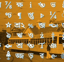
With such a large family intended to be used in extreme scenarios, we knew we had to pack Atlante with significant technological abilities. Following the normal standard of ~300 glyphs per style simply wouldn’t accomplish the goals for which this family was created, so our uprights contain over 1,200 glyphs and the italics have over 1,700 glyphs.
Designers can easily swap out a standard character for small caps, initial glyphs, ending glyphs, the normal italic set for the more cursive version, swashes, and ligatures galore. Overall, we have hopefully exceeded expectations and given designers something they can truly appreciate and can use for decades to come.
TypeTogether is an indie type foundry committed to excellence in type design with a focus on editorial use. Additionally, TypeTogether creates custom type design for corporate use. We invite you to browse our library of retail fonts or contact us to discuss custom type design projects.