Making of Noort Bengali

October 2021

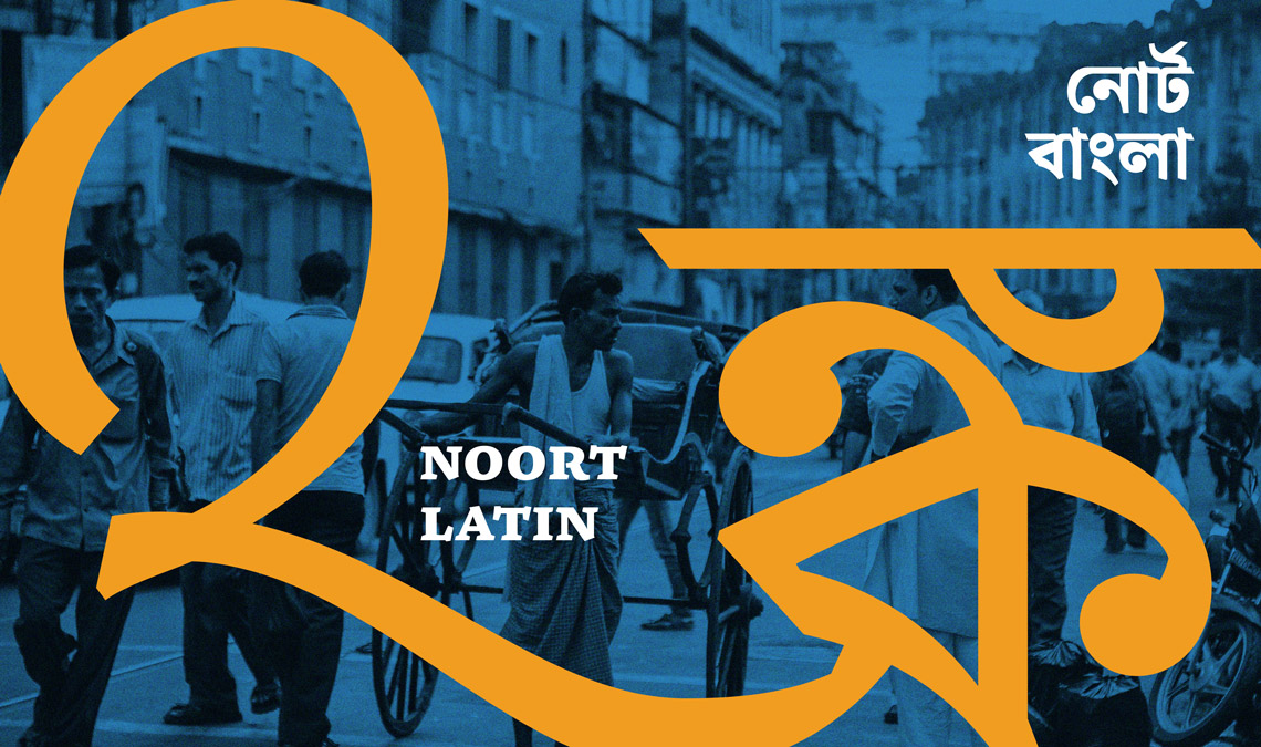
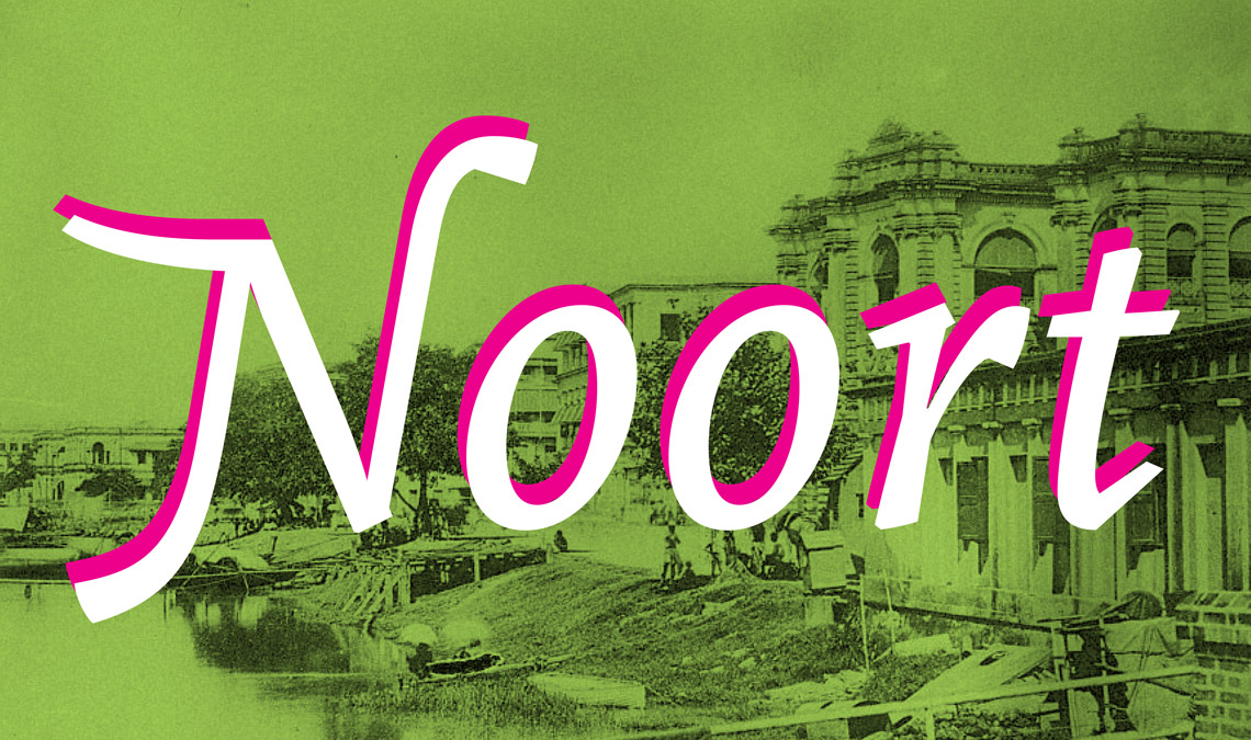
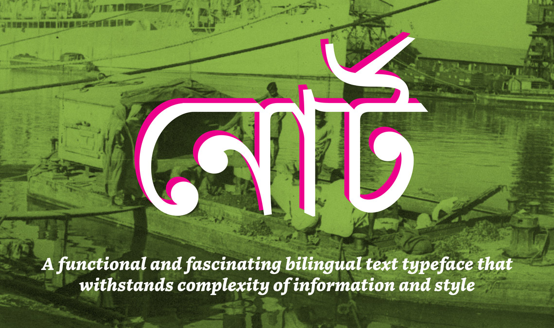
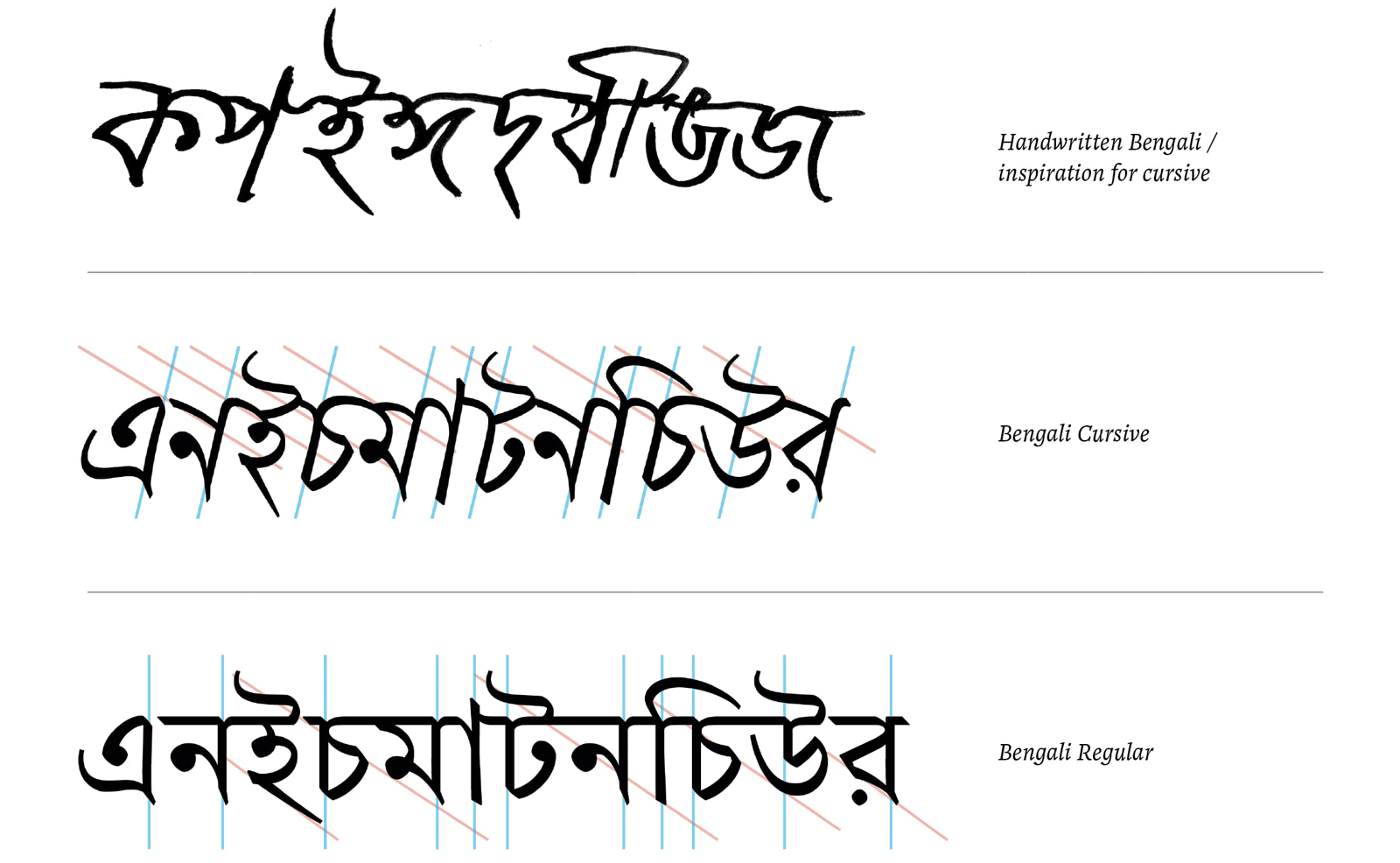
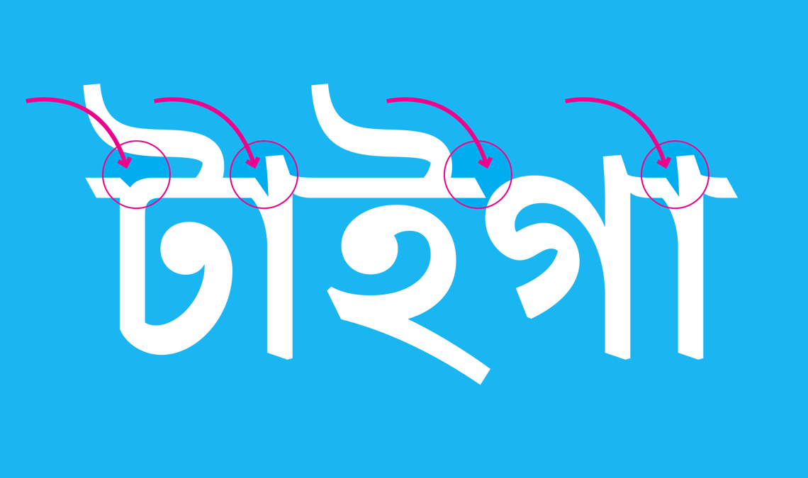
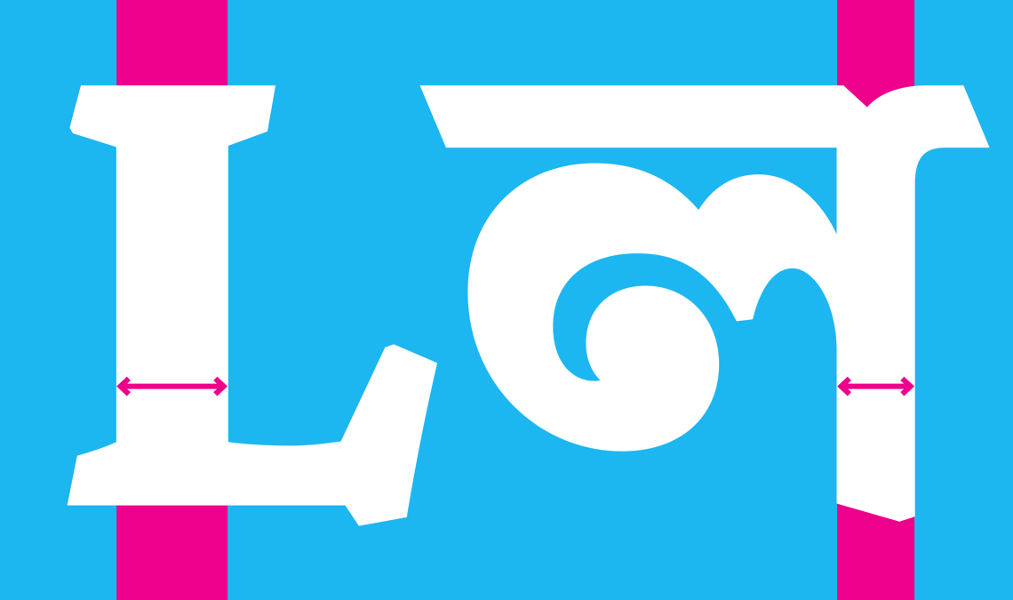
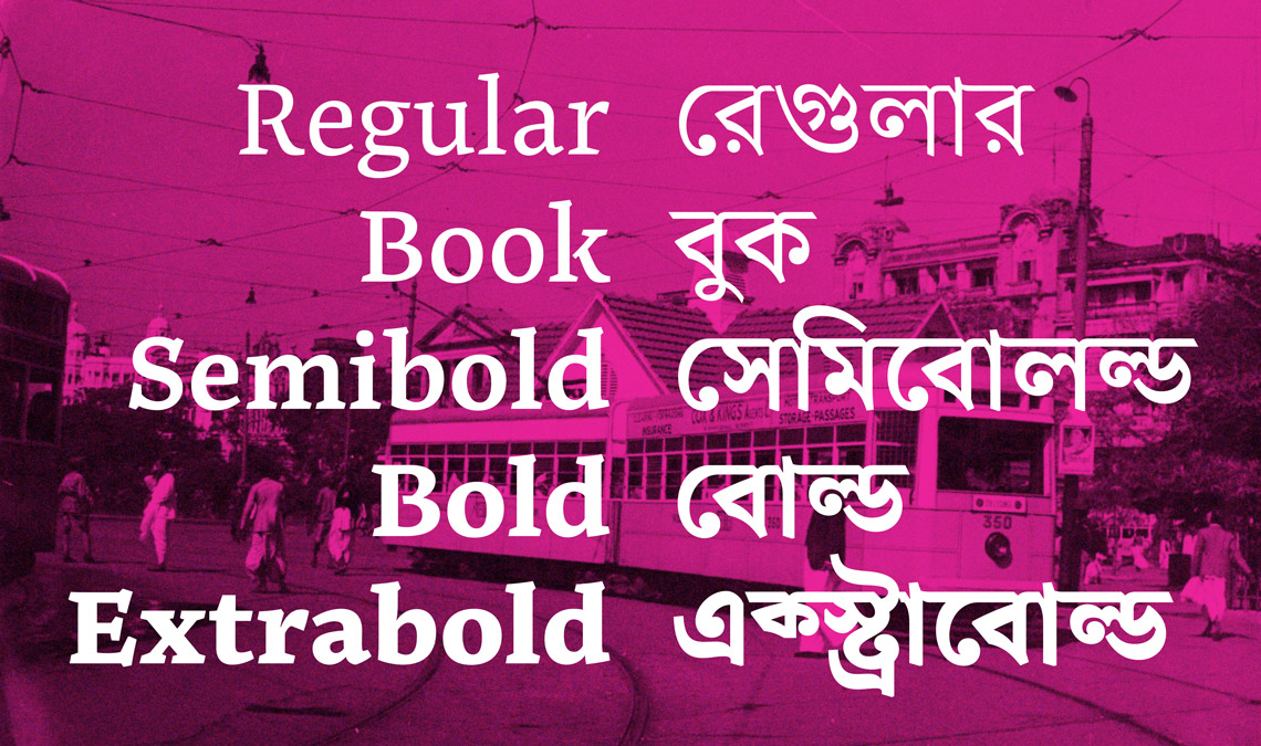
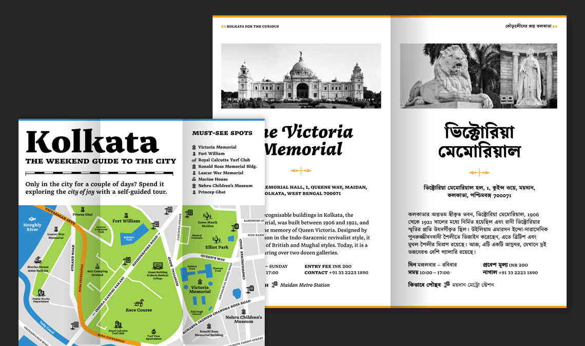
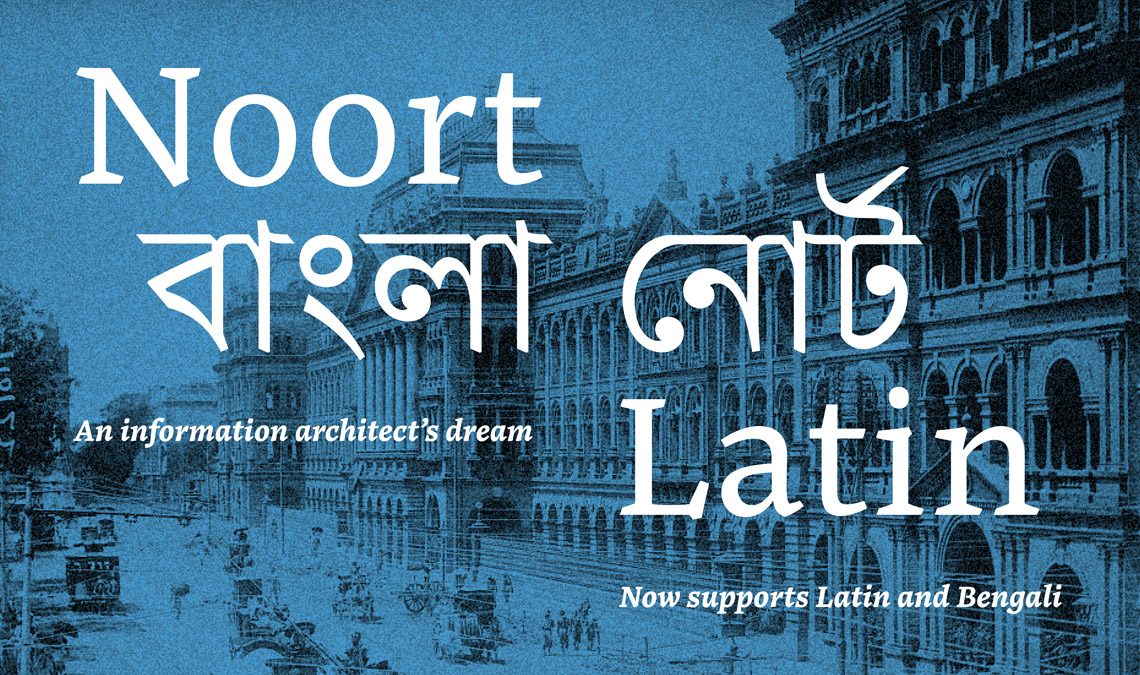
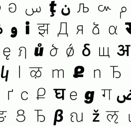
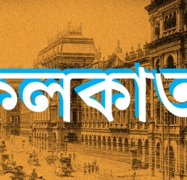
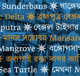
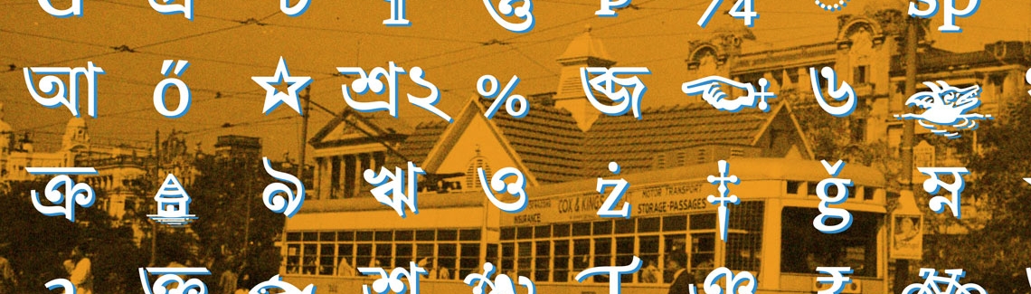
Years in the making, Juan Bruce’s Noort Bengali is a dynamic and energetic Bengali text typeface, and TypeTogether’s very first step in supporting this script. Read on to learn how Noort Latin got a Bengali companion and what to expect from this dual-script design.


The origin story

Chilean designer Juan Bruce has been associated with TypeTogether since 2016, when he was selected for the second Typeface Publishing Incentive Programme (now known as the Gerard Unger Scholarship). Next year saw the release of his typeface Noort, a serif font family influenced by 17th century Dutch maps, which went on to win the TDC Award of Excellence. Since then he has added a display weight to the family and a suite of cartographic icons, but this is Noort’s largest extension yet — a companion Bengali typeface family, which also happens to be TypeTogether’s first foray into the script.


Noort has its beginnings in Juan’s time at Reading University’s MA in Typeface Design programme. He imagined it as a multiscript project from the start, with Latin, Greek, and Bengali components. Juan was attracted to Bengali, a script he had been unfamiliar with until then, because of its unique texture. Bengali is one of the most popular scripts in the Indian subcontinent and is used by languages spoken by over a quarter billion speakers in the region, as well as expats elsewhere in the world. [We published an interview with Juan about Noort, his background, processes, and much more some time ago].


Kolkata, West Bengal, India. Photo by Ujjwal Jajoo, 2020.


Unlike Latin, its letterforms have a large number of diagonals with different starting and ending points, something that caught Juan’s eye. This is complemented by vertical stems that hang from a horizontal headline. The multidirectionality of strokes, matched with the flourishes in the letterforms and their traditional ball-like terminals, creates a lively interplay of black and white to which Juan was immediately attracted. While at Reading he not only sowed the seeds for an upright Bengali design with Noort’s DNA, but also experimented with a cursive counterpart which sought to capture the rhythm of handwriting in typographic form.

After the drawings of Noort Bengali fell into place, there was still much to be done to make the typeface functional. Indic scripts need a cooperative approach to drawing and devising OpenType features to ensure that a typeface is compactly made and also meets the rigours of typesetting. So Noort Bengali was completed in a truly collaborative fashion, with engineering support for Bengali from TypeTogether’s Pooja Saxena. Working across time zones (Juan and Pooja live nine hours apart), especially during a pandemic, was challenging but they persevered and couldn’t be happier with the result.


Speaking together

Juan’s approach for this design was to harmonize the two scripts while maintaining a degree of independence from each other in order to honour their different origins, cultures, and history. The Bengali does not try to replicate the style of the Latin, but instead picks up on the influence of the hand in the design and interprets that using its own visual vocabulary. Noort Bengali’s interrupted headline is a nod to calligraphy, lends the design an active texture, and echoes the design of its Latin counterpart.

The most challenging aspects of harmonising Latin and Bengali within Noort’s overall design was weight matching. Stroke thickness is not transferable between Latin and Bengali because shapes are more complex in the latter. This makes each Bangali letter busier, and if one were to apply the same weight to them as the Latin, the result would be heavier, awkward Bengali letterforms. This weight imbalance between the two scripts was meticulously worked out in Noort Bengali using optical adjustments and decreasing stroke weight as necessary.


The issue reared its head not only while working between scripts, but also within the same weight of the Bengali design and across all the weights together. Bengali conjuncts are more intricate than the basic conjuncts and vowels, and thus required further refinement. And the heaviest weight, the Extrabold, was a test in tuning forms and counterforms to create legible and hefty Bengali letters that retained the gestural tension that makes Noort distinctive.


A typographer’s dream

Noort Bengali contains both Bengali and Assamese letters, and comes along with the family’s Latin glyph repertoire, making it an ideal typeface family for multiscript and multilingual projects. It offers typographic finesse in Bengali thanks to a wide range of conjuncts, and specially-designed vowel signs matched according to width.


Conjuncts and vowel sign matching in Noort Bengali.


It also comes with a set of punctuation marks designed to work seamlessly with Bengali letterforms, keeping in mind their headline, as well as marks below and above the primary character. Whether in books or magazines, in print or on screens, the text weights of Noort can bring subtle drama to long passages, while its heavier weights are showstoppers in display sizes.


Latin versus Bengali punctuation.


Noort can be an asset in the tool belt of the seasoned information designer, one who is not afraid of using letterforms with flair and personality to tell a complex and compelling story. The analogue charm of Noort, whether in Latin or in Bengali, creates an engaging reading environment and leaves a memorable impact. After all, simply because an overwhelming amount of information has to be conveyed, one needn’t do away with warmth.


Noort Bengali numerals.


Five matched weights allow for the designer to build deep hierarchies. Niceties like proportional and tabular Bengali numerals and a large collection of cartographic and wayfinding icons are means to achieve sophisticated results. Luckily we have coded the icons in such a way to make them an automatic substitution. As with the example below, just type the name of the icon and choose the alternate to replace the word with the stylised icon.


Noort icon substitution.


About Us

TypeTogether is an indie type foundry committed to excellence in type design with a focus on editorial use. Additionally, TypeTogether creates custom type design for corporate use. We invite you to browse our library of retail fonts or contact us to discuss custom type design projects.