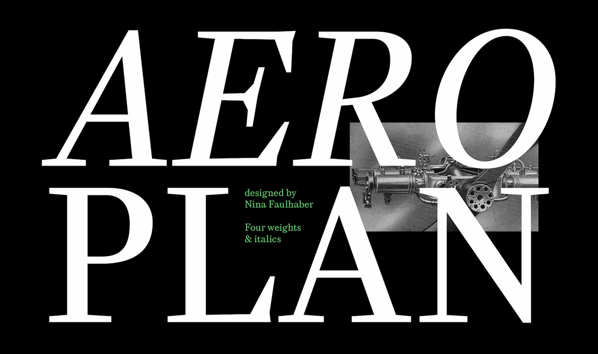
New release: Aeroplan
June 2023
We are excited to announce that Nina Faulhaber’s Aeroplan font family is now taking flight! Make sure you visit Aeroplan’s webpage, read about its design, and put it through the paces on our website type tester.
We are excited to announce that Nina Faulhaber’s Aeroplan font family is now taking flight! Make sure you visit Aeroplan’s webpage, read about its design, and put it through the paces on our website type tester.
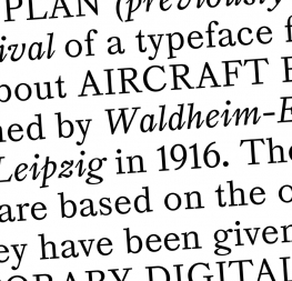
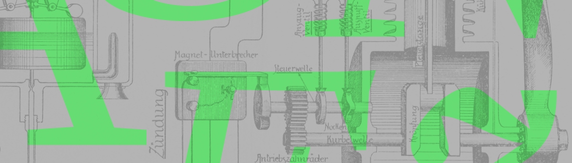
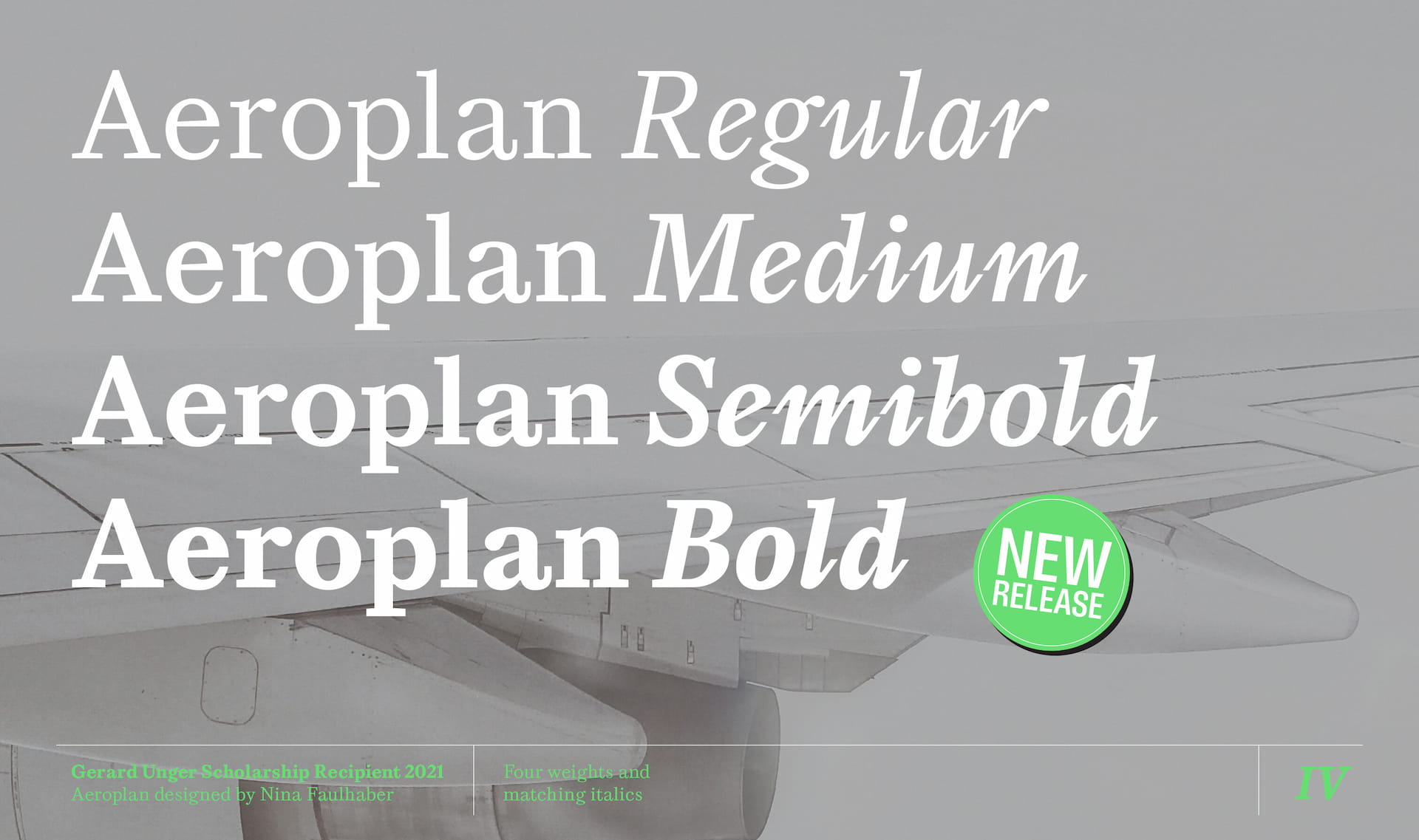
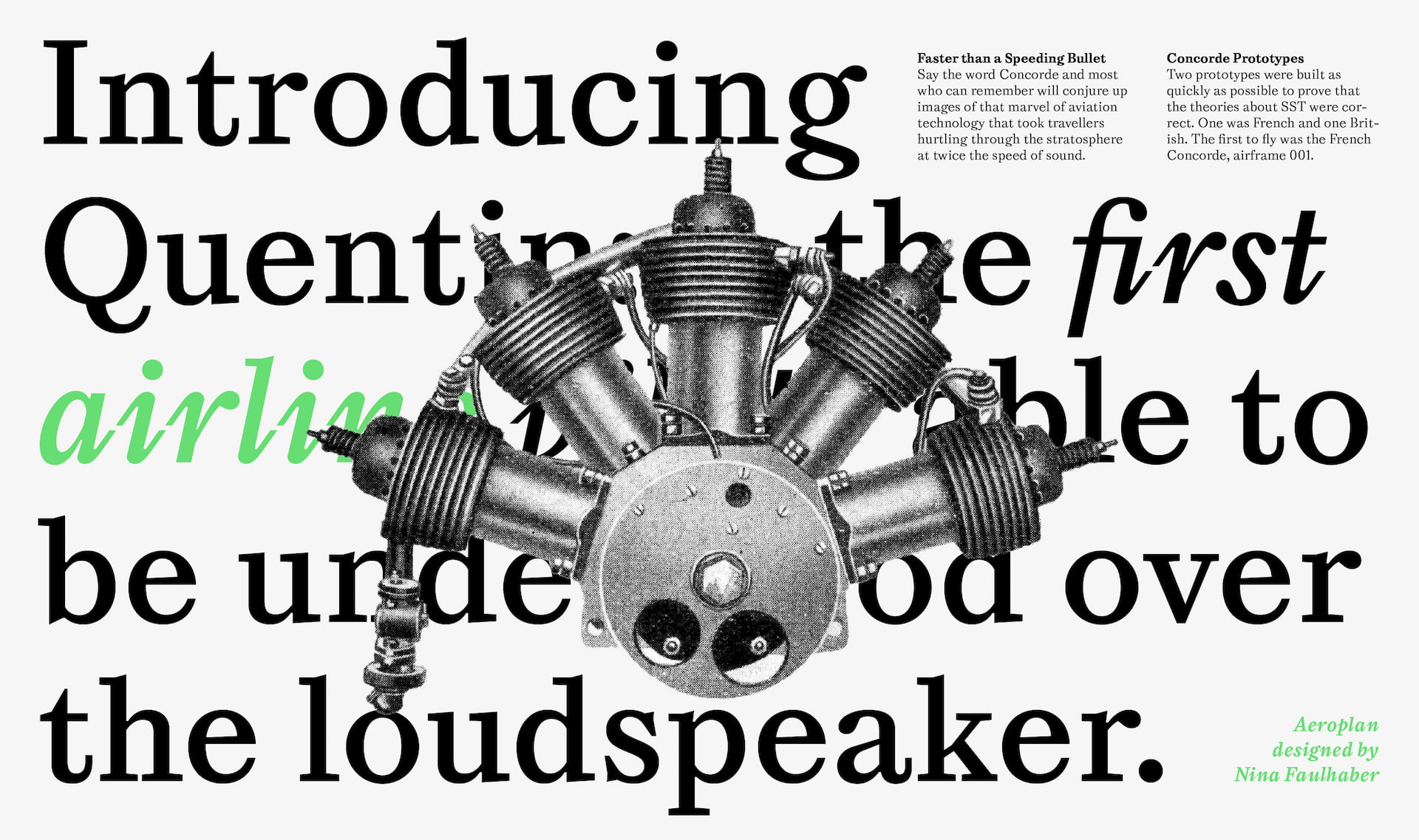
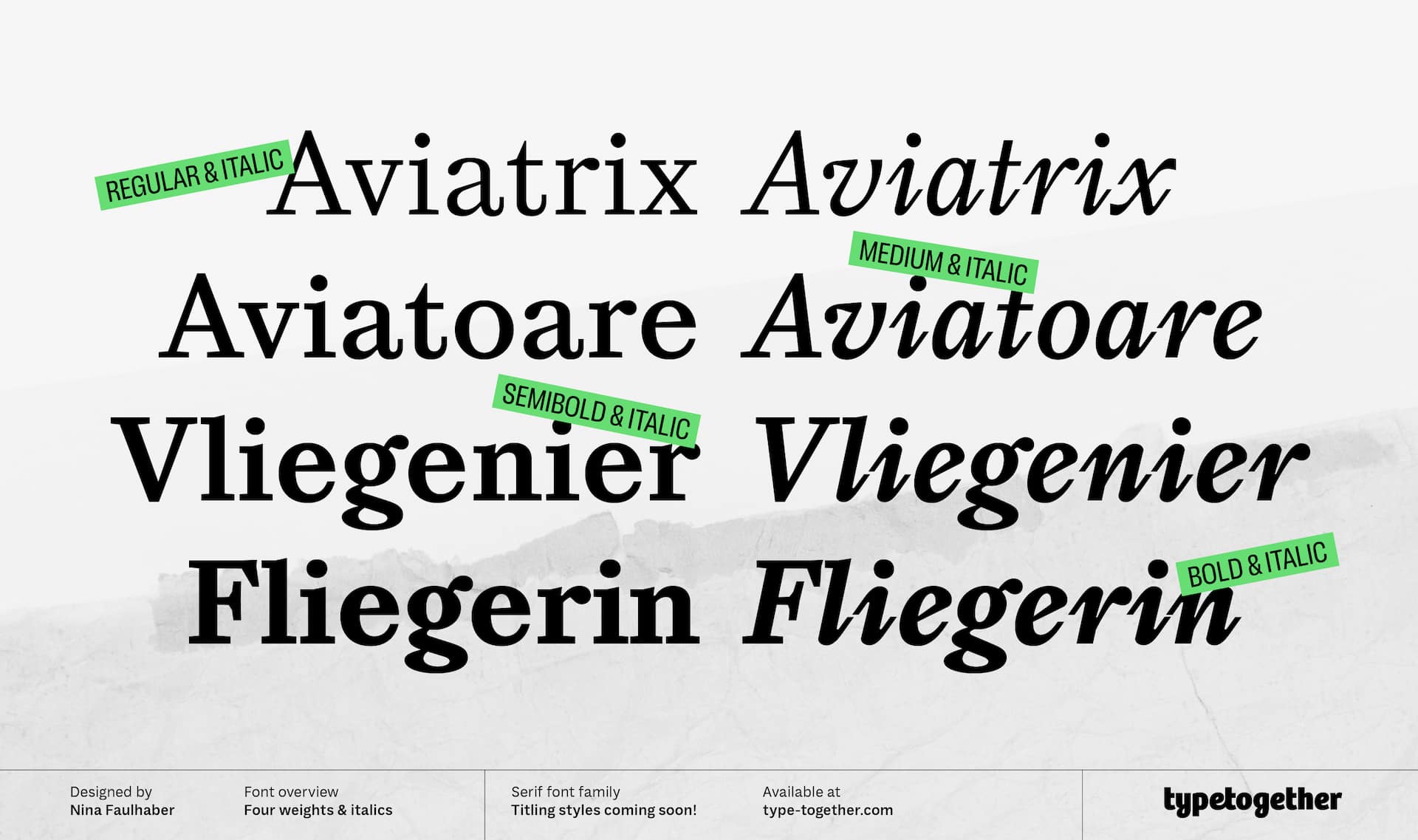
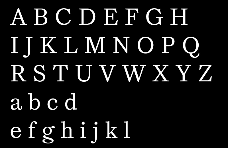
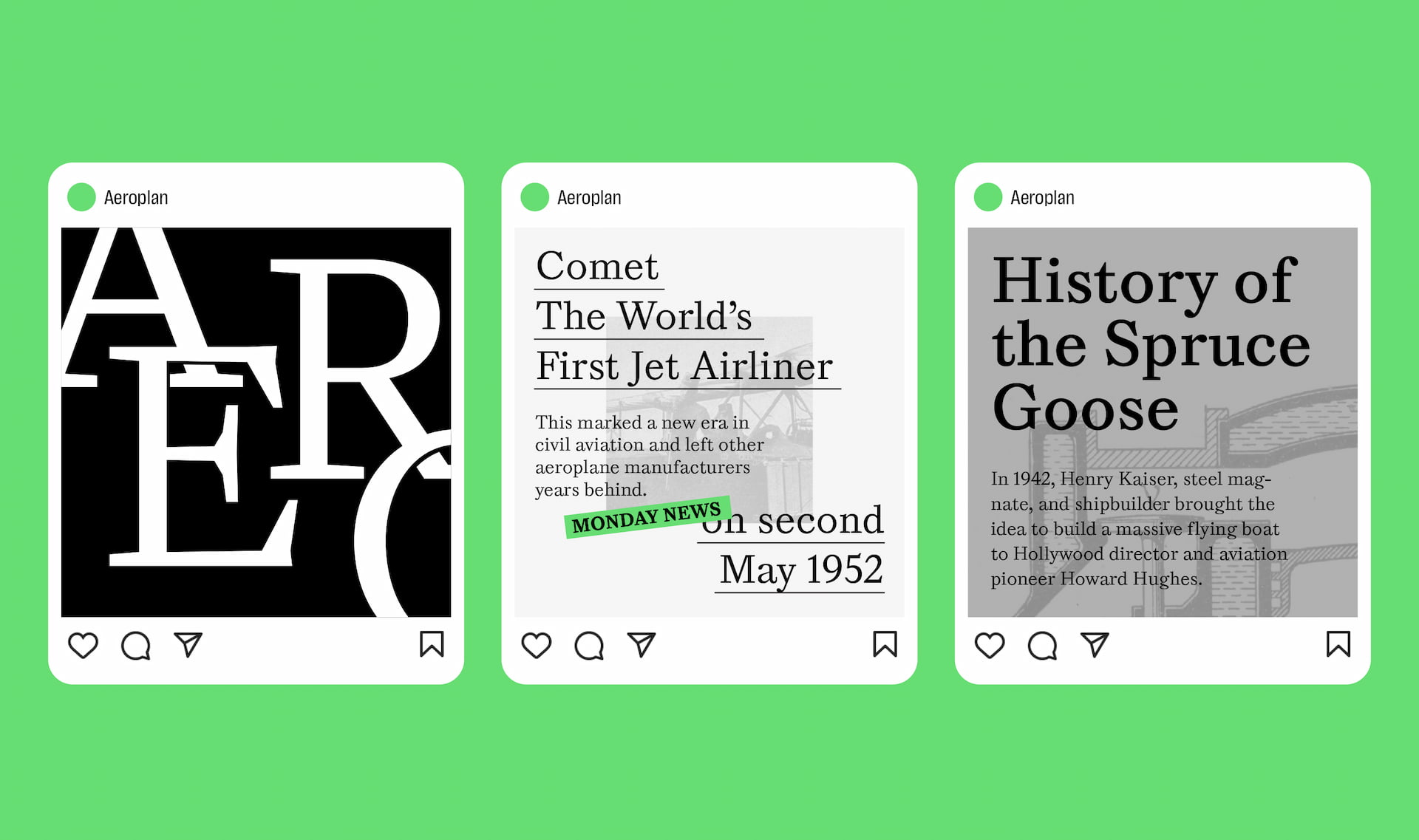
As TypeTogether’s Gerard Unger Scholarship winner in 2021, Nina Faulhaber’s Aeroplan typeface proves that vision and skill go hand in hand with testing and patience. What began as wonky text inspiration from a book over 100 years old has been modernised with sturdy shapes, sharp turns, and digital precision worthy of book covers, long narratives, and edgy content.
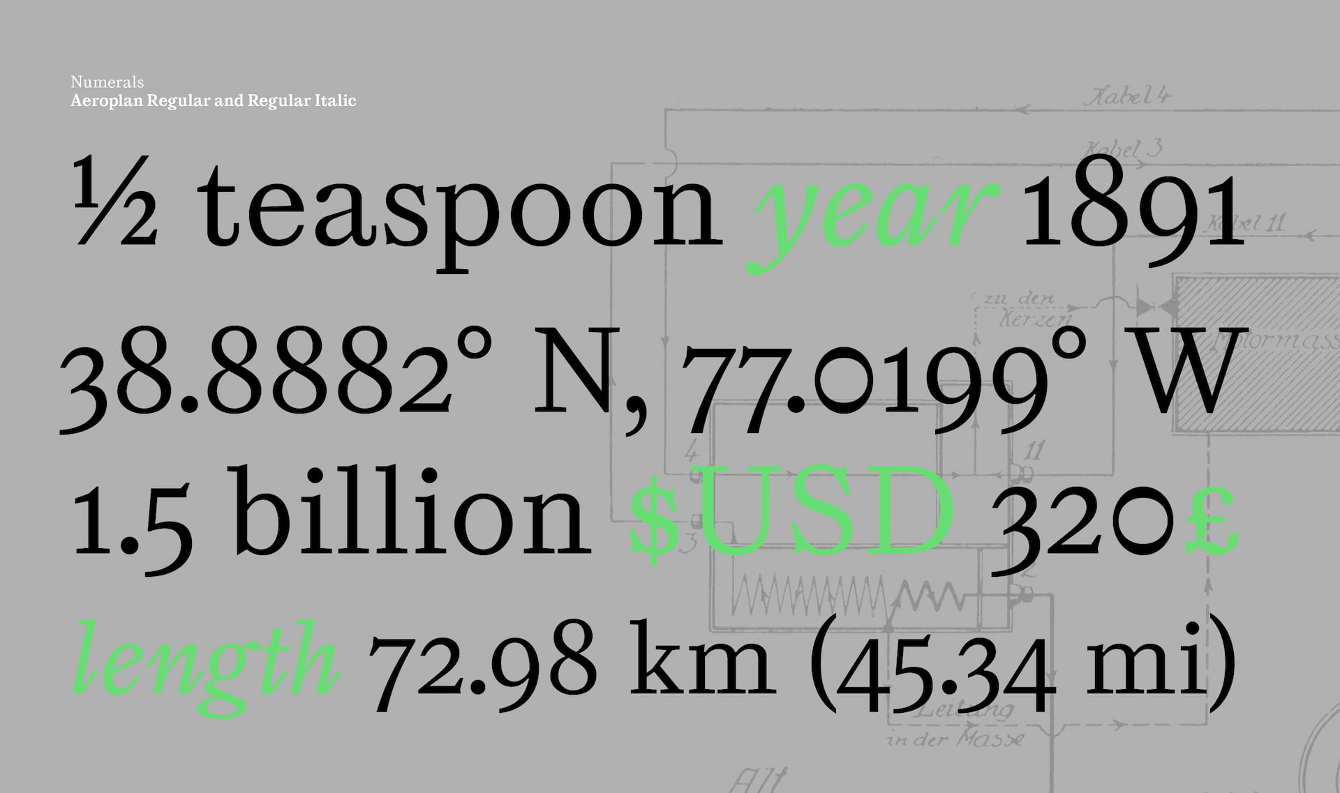
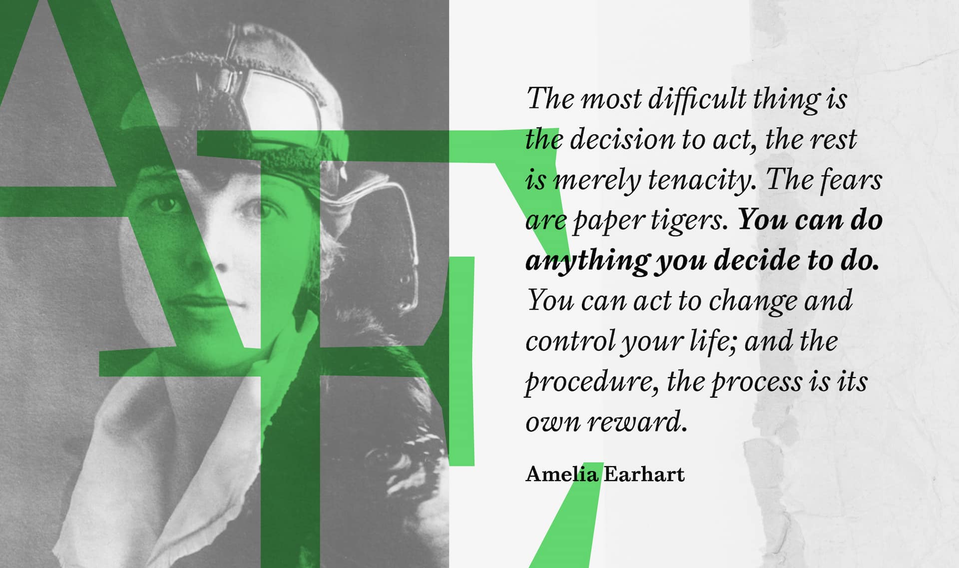
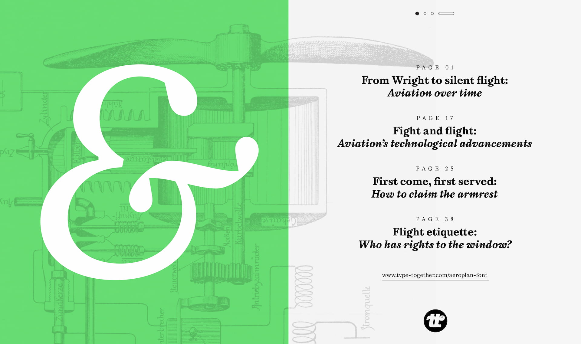
Into our current world filled with screens and bland sans serifs, Aeroplan brings the best lessons from metal type and a healthy does of personality. Add to this the sheer presence and singular voice of its italic, the extra arrows and geometric shapes, and the contextual alternates, and Aeroplan becomes the best friend of your text.
It’s time to write your own story with a typeface that is the serif equivalent of optical poetry. Meet Aeroplan.

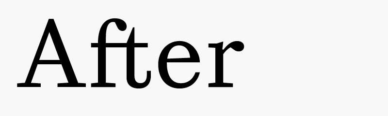
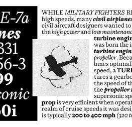
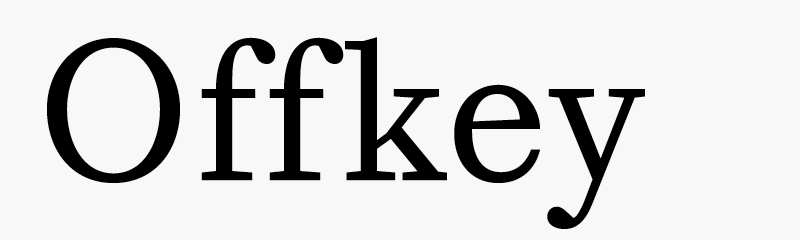
This image and the following images show how two characters are joined with a ligature for better fit and clarity.
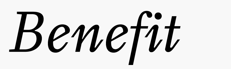
The f–i ligature.
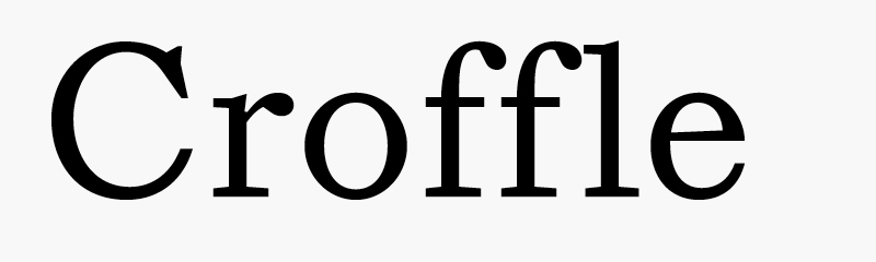
The f–f–l ligature.
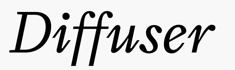
The f–f ligature.
The f–f–k ligature.


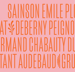
Arrows and geometric shapes in SS01 and SS03.


TypeTogether is an indie type foundry committed to excellence in type design with a focus on editorial use. Additionally, TypeTogether creates custom type design for corporate use. We invite you to browse our library of retail fonts or contact us to discuss custom type design projects.