Bhutan: Alverata rebrands the Asian gem
September 2022
With the help of MMBP & Associates, the country of Bhutan recently left the branding of a script logo behind for the contemporary, eclectic, and readable Alverata family.
With the help of MMBP & Associates, the country of Bhutan recently left the branding of a script logo behind for the contemporary, eclectic, and readable Alverata family.
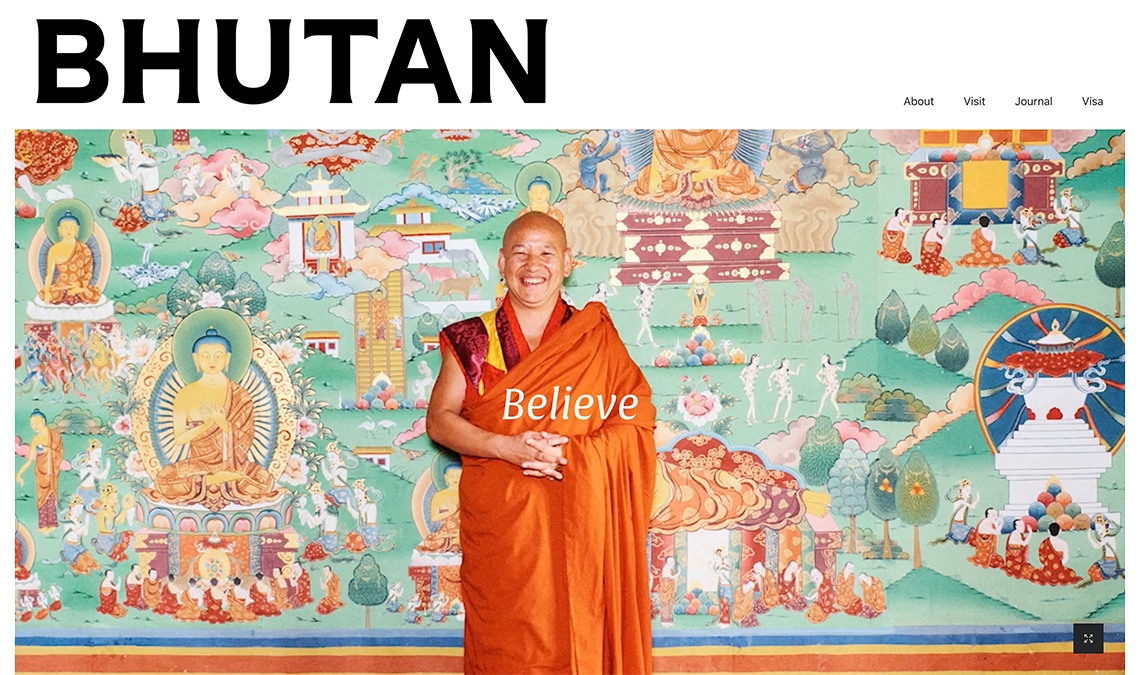
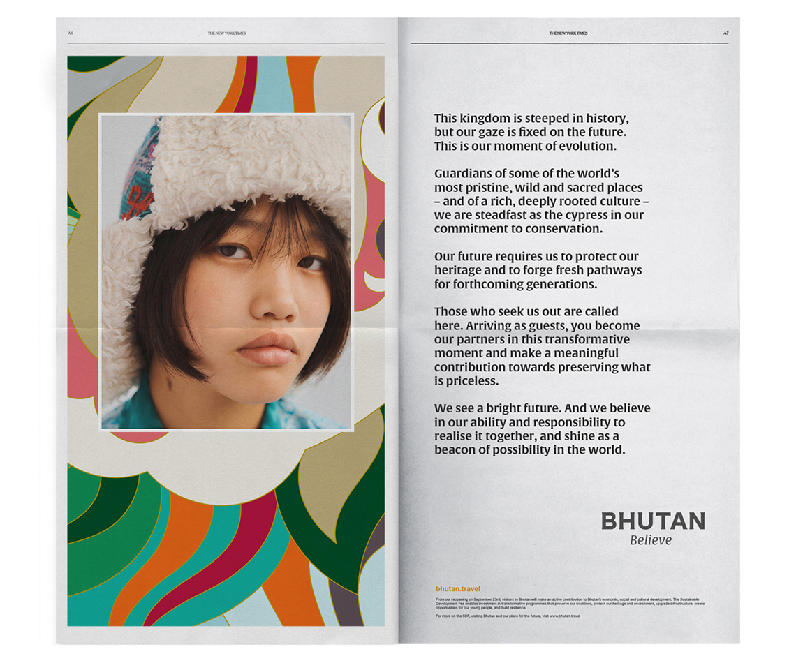
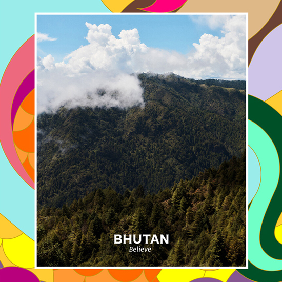
Bhutan is steeped in tradition and overflowing with untouched natural landscapes; a true hidden gem amongst the countries of the world. As such, it closed its borders for two and a half years during Covid. In September 2022, it reopened and simultaneously reintroduced itself to the world with a national tourism rebrand by MMBP & Associates: Bhutan believe — an invitation to believe in the nation’s capabilities, its values, global contribution, responsibilities, and its future driven by an engaged young adult population.
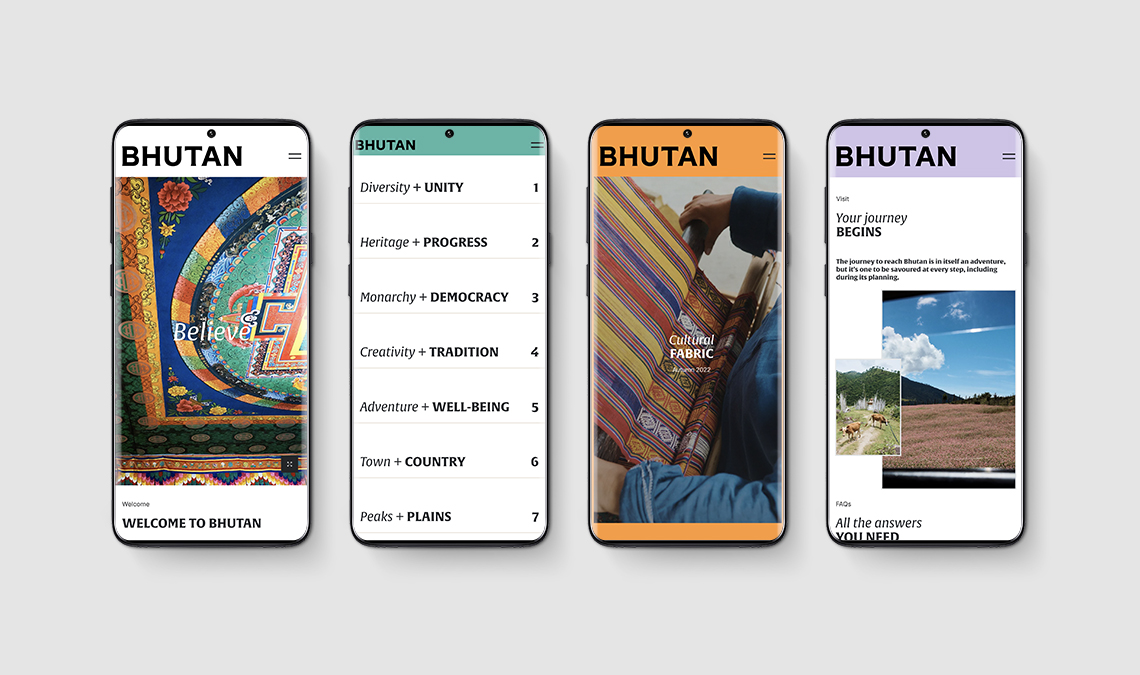
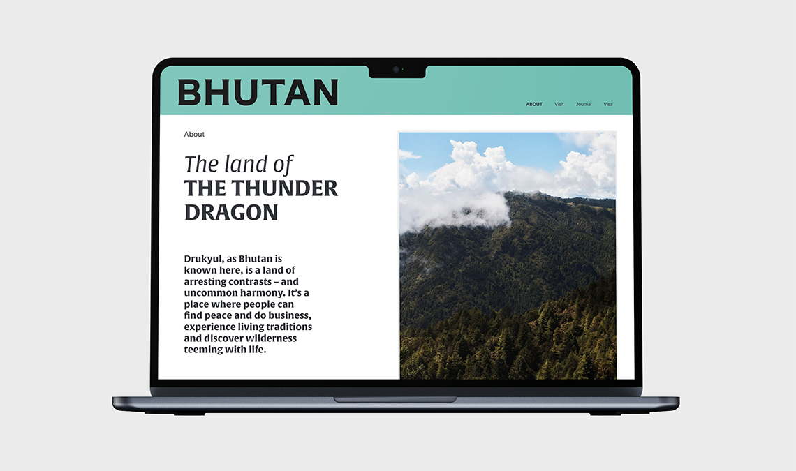
Among its chosen rebranding kit was our Alverata family by the late Dr Gerard Unger, which showed up in headlines, large text, and its manifesto, as well as a customised version for the Bhutan wordmark. The wordmark is a particularly well suited application since it has an internal balance at very large sizes and still maintains clarity and distinction when rendered quite small. Its details are not lost and it carries a contemporary voice wherever it appears in various media.
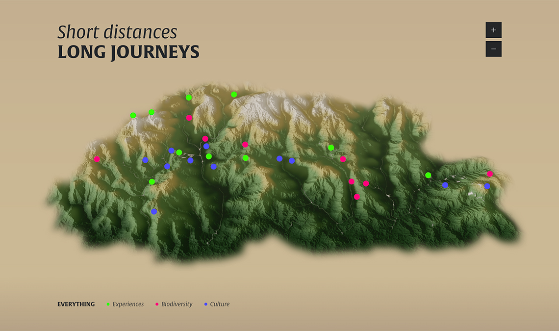
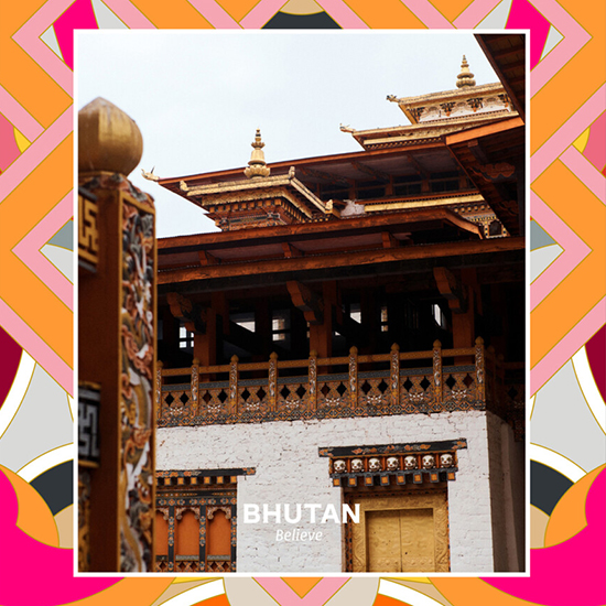
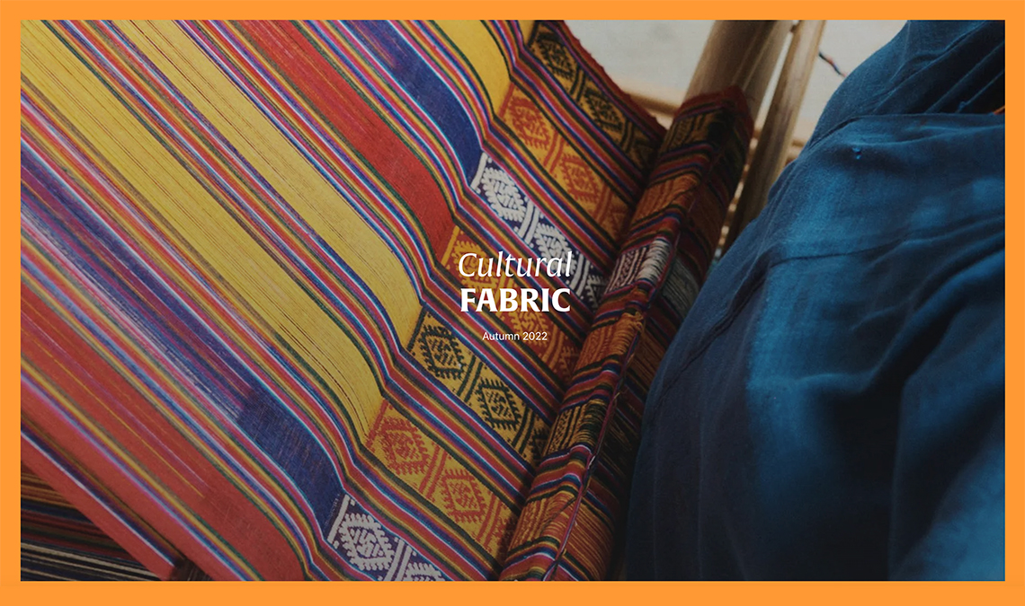
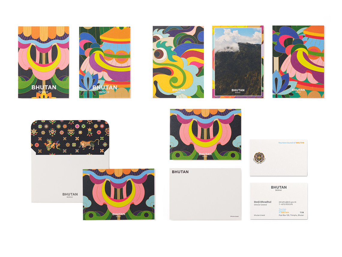
Combining Alverata’s text features with the redesigned ornaments, symbols, and mythical creatures creates a tapestry of both the historical and the current. It’s much more than “one is all and all is one”. With the priceless assets of the country, the people, the culture, and the possibilities, Bhutan desires to continue as a distinct kind of place that avoids consumerist tourism. It aims to be a place of centering the self amidst nature and history rather than engaging in overt self-centeredness.
The new logo is a customised version of Alverata, with less contrast, a wider B, no inktraps in the apexes of A and N, and less flare on the serifs.
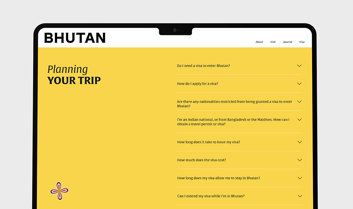
The new country tagline, also in Alverata, encourages vision for the future based on traditions of the past.
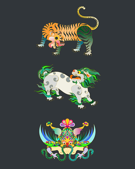
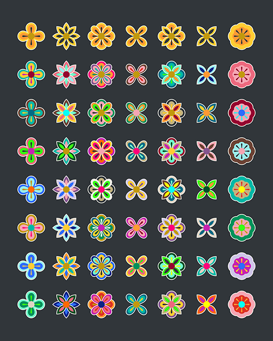
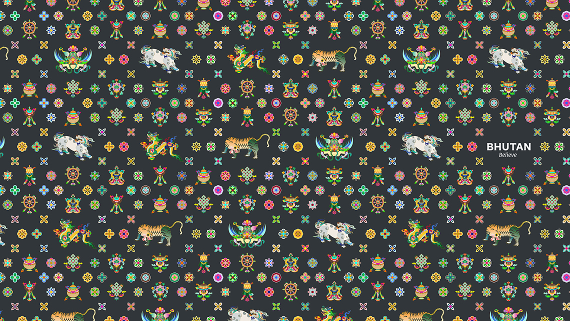
All graphic elements together form a tapestry of tradition with modern representation.
TypeTogether is an indie type foundry committed to excellence in type design with a focus on editorial use. Additionally, TypeTogether creates custom type design for corporate use. We invite you to browse our library of retail fonts or contact us to discuss custom type design projects.