Interview: Catalpa wood type
November 2022
We interviewed talented designers and researchers Rafael Dietzsch & Rafael Neder about the idea, background, and process of creating the Catalpa wood type and the letterpress posters.
We interviewed talented designers and researchers Rafael Dietzsch & Rafael Neder about the idea, background, and process of creating the Catalpa wood type and the letterpress posters.
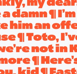
In the autumn of 2022, a box of beautifully handcrafted letterpress posters from São Paulo finally arrived at our Prague office. Our new woodtype-inspired font Catalpa shines bright on each one of them, but the adventure began four years earlier.
At the 2018 ATypI conference in Antwerp, Rafael Dietzsch presented his Brazilian woodtype project research, and his talk inspired Veronika Burian and José Scaglione, who were at the time working on Catalpa typeface. Veronika, José, and Rafael decided to join forces and test Catalpa in a real environment, since nothing proves the quality of a typeface like using the original technology and material: letterpress and wood.
A few days ago, still excited with the results, we talked with the two main protagonists of our woodtype project — Brazilian designers, researchers, and educators Rafael Dietzsch and Rafael Neder — about the idea, background, and process of this amazing experiment.
First of all, could you tell us about the history of wood type in Brazil? Where did the tradition come from?
Rafael Neder: This history is still being written. It may look strange, but much of the traditional knowledge has been lost to time.
Rafael Dietzsch: Of course wood type existed in Brazil, but most of it was imported from the United States and Europe. During the 20th century, wood type in Brazil was made mostly by Funtimod, the country’s largest manufacturer.
Rafael Neder: Sadly, there are also frequent reports of how wood types were discarded or burned during the 1990s. Today we can get a glimpse of this scene by looking at type catalogues from local manufacturers and distributors.
As far as I know, of the two most important manufacturers of the 20th century, only one sold wood types but with German designs. Despite this, I have some seen large types handcrafted with plywood. There is a lot to be researched about this past.
You both are graphic designers, researchers, and educators. How did you personally get to work with such a physical discipline as letterpress?
RN: My interest in letterpress was born from my teaching practice. In mid-2000 I was a full-time UI/UX designer, but when I started teaching I felt the need for a better understanding of how traditional technologies shaped contemporary typography.
It’s funny because I was the kind of nerd who likes to code, but in my spare time I practised calligraphy and letterpress printing. At that time, I took some workshops with local printers including the Oficina Tipográfica São Paulo (OTSP), but it was at Tipografia Matias where I found my main laboratory. It wasn’t until around 2009 that some friends and I started to teach in regular letterpress classes.
Over time I designed and printed several works exploring the letterpress technique (both on academic and commercial scales). Meanwhile, I started researching digital fabrication (3D printing, CNC, lasercutting, etc.) and see them as a way of repairing old types and producing new ones.
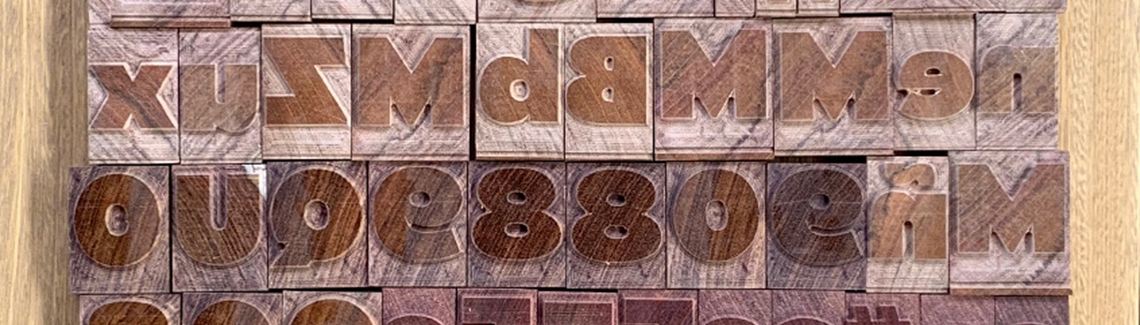
RD: My first contact with wood type was at the letterpress workshop at the University of Brasília (UnB) and, since I was always snooping around and asking questions, the typographers in charge of the workshop taught me the basics of letterpress composition. I remember I spent quite some time playing around with wood type at UnB. In comparison to lead type, wood sorts are easier to handle, to compose, and to make small print runs, and also easier to clean and organise back into the type cases.
How did you come to work with TypeTogether on the Catalpa wood type project?
RD: Our research on wood type in Brazil started around 2017, with an invitation by Rafael Neder and Leonardo Buggy to join the project. The first outcome of this research was presented at the ATypI conference in Antwerp in 2018. After my presentation I was hanging around during the coffee break and had some of the wood sorts in my hand. I had a conversation with Veronika Burian, who showed an interest in the project while looking at the types. She mentioned she was working on a project that had a lot to do with wood type and about her wish to see that project cut in wood.
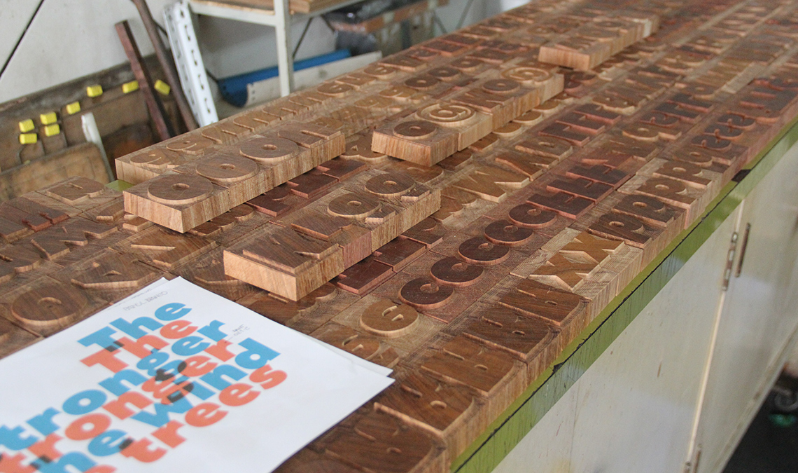
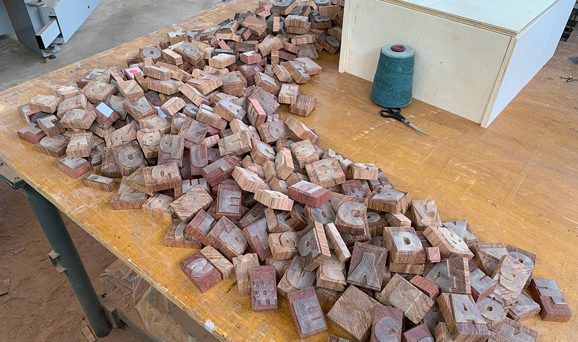
In August 2020 during the COVID-19 pandemic, José got in touch and asked me about the possibility of cutting one of TypeTogether’s typefaces in wood. Discussing the topic with Rafael Neder, we had the idea to invite into the process Nícolas Loiola Camargo, one of his students at the Typography Postgrad course at Senac, São Paulo. Apart from being a brilliant designer, Nícolas also makes a living as a carpenter. For his degree project he developed the Ibirapitanga type family, from its inception as a digital font to its materialization as wood type. It was clear that Nícolas was the right person to help with the project since he had the skills and all the woodworking tools at his home workshop.
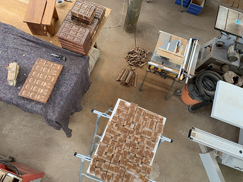
With Nícolas on board, we joined forces to produce the third generation of wood types. This meant improving the methods and final results. I was responsible for organising the whole process and preparing the digital files to be cut in wood. Nícolas was responsible for selecting and preparing raw materials and for supervising the CNC milling process. Rafael Neder was responsible for printing the final posters.
Could you explain the actual process of cutting the letters?
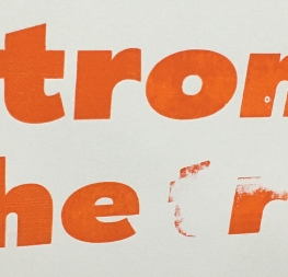
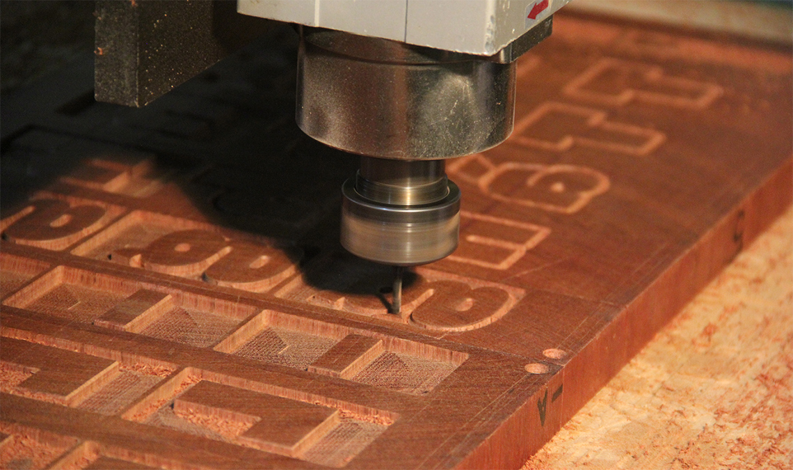
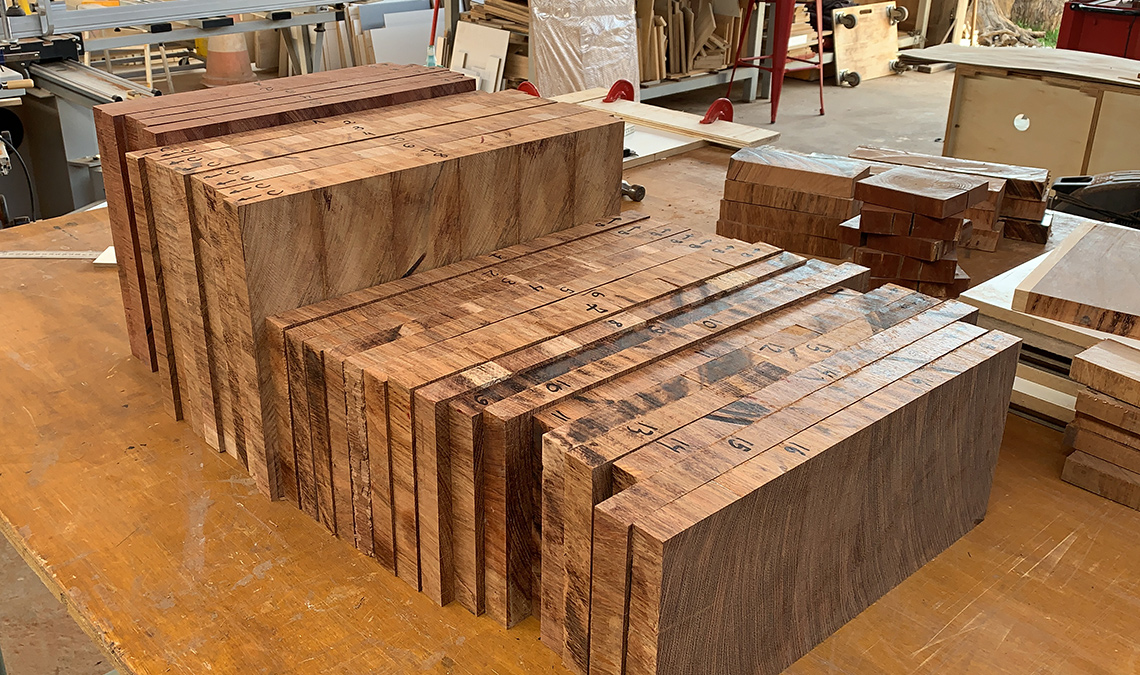
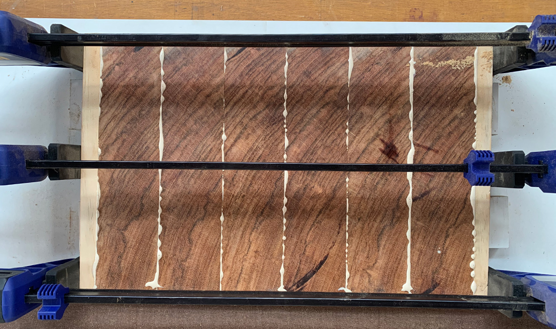
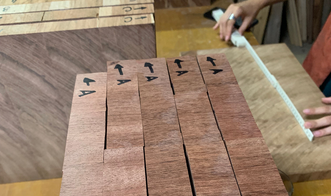
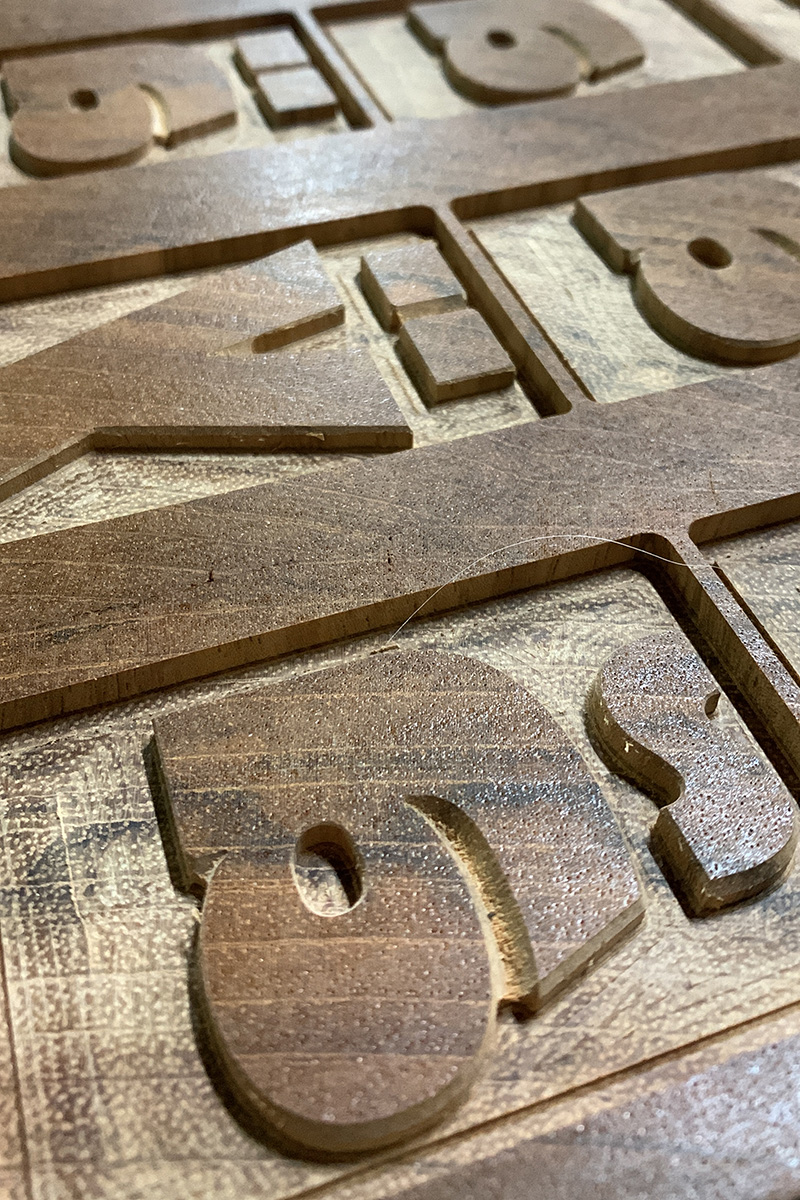
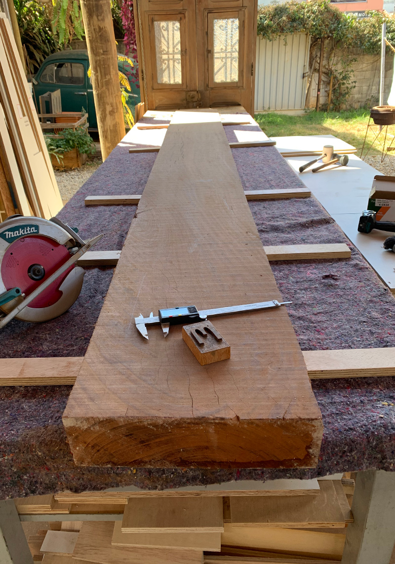
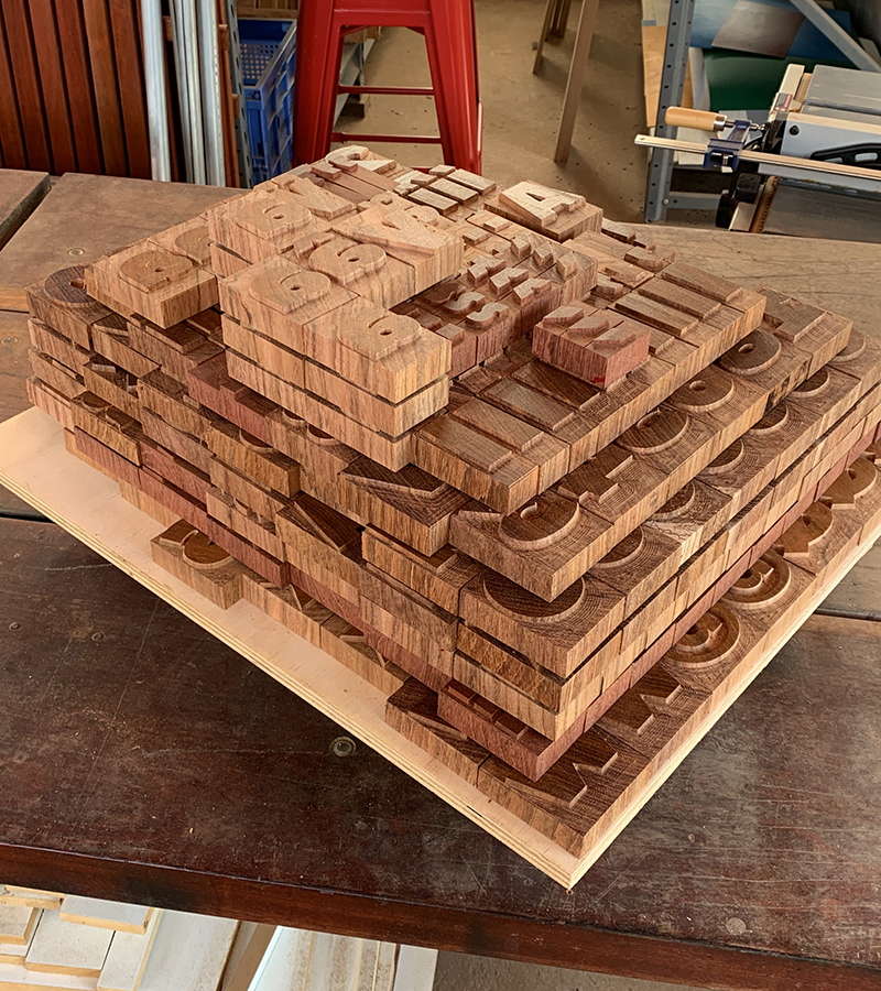
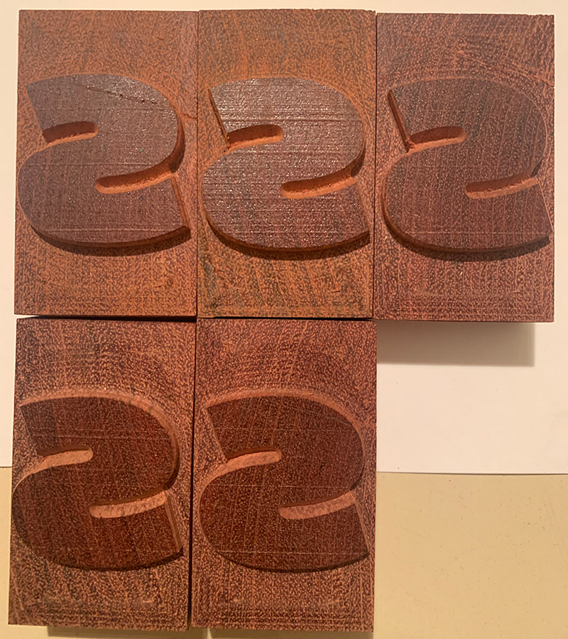
RD: The process starts with the selection of raw materials. The lumber must be the right species and the wood has to be seasoned correctly to prevent warping. After that, the lumber is trimmed using a planer to a consistent thickness throughout its length. The lumber is then sliced into slabs of around 2.5–3 cm and the slabs are glued side-by-side with the help of clamps to form a larger board. In our CNC milling process, larger boards (e. g. 30 x 40 cm) are easier to work with compared to smaller slabs (e. g. 10 x 10 cm). The boards then must be levelled, sanded, and polished in order to bring everything to the correct type height.
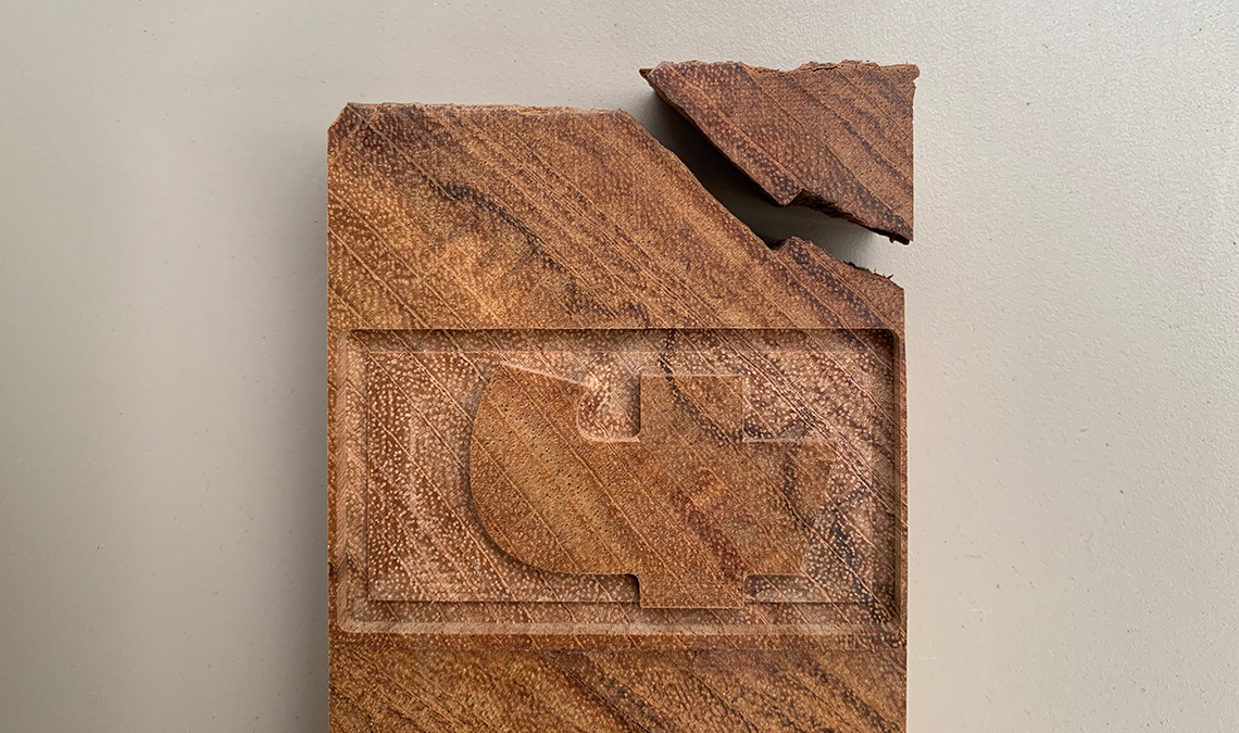
The actual CNC milling is the last process and we usually do this in two or three steps. The first step uses a larger bit* (e. g. 6mm) to cut the bulk of the negative space away from the character. The second step is slower and it contours the letters with finer bits to bring more detail. The last process is even slower and uses a v-shaped bit to give the types a precise contour and a good finish.
*CNC milling makes use of bits (or milling cutters). A bit is very similar to a drill but instead of drilling with the point, it cuts using the side of the bit.
What are the rules for selecting the right wood for letterpress? I remember in the ATypI Antwerp talk you mentioned the necessity of a hard wood that resists termites.
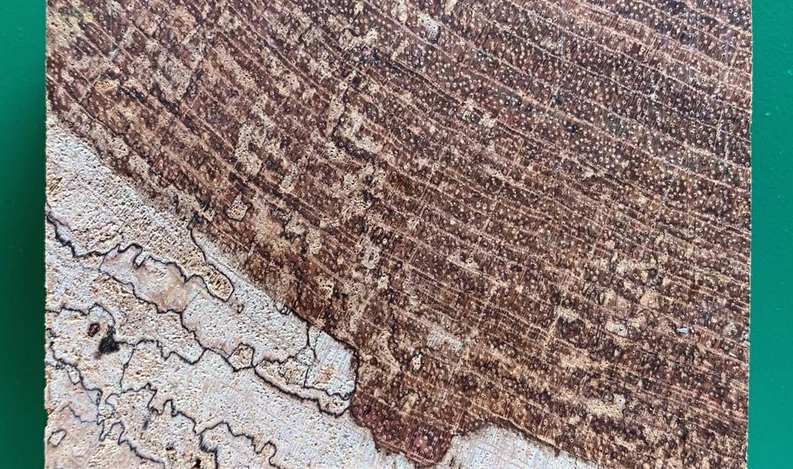
RN: Yes, in addition to being resistant to biological agents, it is also necessary to observe other aspects. The hardness and density of the wood directly affect the resistance of the blocks and the effectiveness of the milling process. Another important aspect is the desired printing surface. The porosity of the pores, the presence of mills and other imperfections greatly influence print results.
RD: Alexandre Gontijo and his team at the Forest Products Laboratory (LPF) in their article about identification and characterisation indicate a variety of species that can be used for the production of wood type. Their study suggests the usage of hardwoods with fine grain is best. I noticed that many of the species suggested are commonly used for structural purposes in construction in Brazil.
We have completed tests with around a dozen species. So far we used two species for the production of larger sets: Jatobá (Hymenaeacourbaril) and Cumaru (Dipteryxodorata). It is also important to mention Ipê (Handroanthussp) as the most common type of wood used for making types in Brazil in the 20th century.
What are the other technological aspects that affect the final outcome?
RN: Since we don’t have access to old cutting machines, from the beginning we chose to cut the types using modern methods. For good results it is necessary to combine good CNC gear, attention to details, and enough time to get it right.
RD: Quality of raw materials and equipment definitely have an influence. I remember we had some issues with the quality of CNC milling. Something had to be re-cut and by luck we had some extra slabs.
Could you explain the process of translating the digital font into its analogue version?
RD: Translating a digital font into an analogue version means simplifying things, in many respects. But there are some complicated steps in this process.
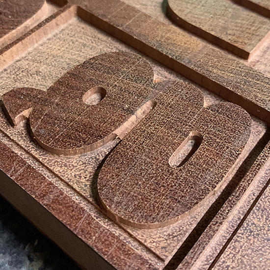
First thing is the character set. For example, the Latin version of Catalpa contains 464 characters, while its final version in wood contains ~100 sorts: UC and LC letters, numerals, a very basic set of symbols, punctuation marks, and some accented characters. Actually, the final font in wood contains more than 400 sorts, but many of them are repeated letters. This character set makes it possible to compose texts in Portuguese, Spanish, and English, for instance.
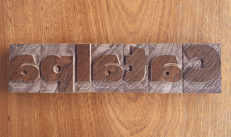
It is also important to keep in mind that these types are quite large: each sort is almost 8 cm (3.15 inches) tall. With letters this big, fitting a whole sentence onto an A3 sheet of paper can be a challenge. Therefore, there is no need for a complex character set.
The second thing to worry about are metrics and kerning. (This will get very nerdy.) Roughly speaking, let’s assume that kerning wood type is not possible. But spacing is something that can make the difference in terms of production, and this is related to the unit system.
In digital fonts, type designers usually work with a system of 1,000 units, a modular system that provides the type designer a lot of flexibility. Therefore, the metrics of a font (the general width of characters and amount of white space around the contours) need to be related to this system. In theory this means each character in a font can have a different width, based on this system.
But it has not always been like that. Other technologies employed different unit systems for spacing. For example, in a Monotype system of 18 units, the width of every character needs to be a fraction of 18. The result is that characters can be grouped in sets of similar width (e.g. M/W/m/w or i / I / l / !).
Having control of the general character width and being able to make groups of characters with a similar width is helpful for the CNC milling process. If all the characters are grouped in a limited set of widths, it is easier to plan, organise, and wisely use the wood slabs. This makes modular and monospaced fonts an ideal model for wood type. But imagine if all fonts were monospaced… it simply does not work for everything.
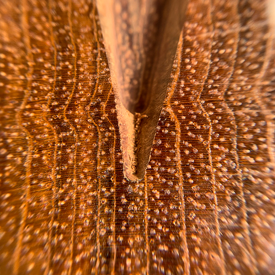
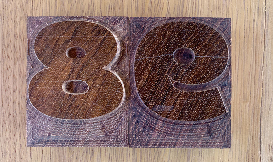
Another thing to take into account while translating a digital typeface into a woodtype font are acute angles, like in the interior of letters like A/V/W etc. It is possible to cut these inside angles, but it is difficult and takes more time. Are ink traps a solution to this problem? Well, if they look nice in the font or if you like to see the ink traps in large sizes, then yes, it is a possibility.
Lastly, it is important to adapt the digital font to an existing system of point sizes because the wood types will have to be combined with legacy typographic materials in a letterpress workshop. In the end, it is a matter of bringing everything to the same height and making sure that this height is a multiple of the point sizes being used.
To make it simple, is there anything like an “ideal typeface” for letterpress?
RN: It’s always a matter of context. For body text, fine and delicate strokes should generally be avoided. As inked type contacts the surface of the page, there is a point gain, so spacing should be a little looser than usual. Also, more generous apertures usually make a difference. In large sizes many of these problems are minimised, but it is important to choose less fragile shapes, especially in wood types. To me, Catalpa is a great typeface for letterpress. It combines personality and functionality, strength and charm.
Did you learn anything in particular when experimenting with Catalpa wood type project?
RN: It was a real gift to work with so many talented people. As a bonus, we were also able to experiment and improve our process.
RD: All our wood type experiments are a big challenge. Work on Catalpa was a challenge in particular because it was a huge set made by different people in several locations. We learn something new every time!
*
Rafael Dietzsch is a designer, professor, and researcher based in Brasília, Brazil. After finishing his studies at the University of Brasília in 2002, he worked as a freelancer in his hometown, designing identities, publications, and other printed matter for local clients. In 2011–12 he attended the MA in Typeface Design at the University of Reading, UK. In 2021 he concluded his doctoral research on the typography of the Brazilian indigenous languages at the University of Brasília. Today Rafael is an Adjunct Professor in the Audiovisual and Advertising Department at the University of Brasília and a partner at Estereográfica, a publishing house specialising in typography and design books.
Rafael Neder is a designer, professor, and researcher from Belo Horizonte, Brazil. He has been teaching undergraduate design courses since 2004 at FUMEC University and in graduate courses in Typography, Graphic Design, and Editorial Design at Senac, São Paulo since 2015. As a researcher, his interests are the intersections between design, society, and technology (analogue and digital). Rafael’s Master’s thesis was about the contemporary scene of letterpress in Brazil and his ongoing doctoral thesis is about the value of letterpress as an educational tool.
TypeTogether is an indie type foundry committed to excellence in type design with a focus on editorial use. Additionally, TypeTogether creates custom type design for corporate use. We invite you to browse our library of retail fonts or contact us to discuss custom type design projects.
Schedule an introduction meeting to learn more.