How to choose the right typeface
February 2020
Typeface selection is an art and a science because it involves creativity and problem solving. Veronika Burian and José Scaglione offer ten tips on selecting typefaces.
Typeface selection is an art and a science because it involves creativity and problem solving. Veronika Burian and José Scaglione offer ten tips on selecting typefaces.
To a great extent, graphic design involves written language, regardless of the designer’s field of specialization or personal abilities. You may have heard the saying, “95% of the Web is text.” The designer’s task is to transform information into effective pieces of communication. In most cases, writing is used as one of the main means to transport information to the reader’s mind, and in contemporary design this is mostly done with typography.
This article will simplify the complicated task of selecting fonts, help you stretch beyond your typographic comfort zone, and abandon recipes that tend to create repetitive, inefficient, and boring work.
1. Nine points small or nine feet tall?
The first point to be considered is the relationship between the structure of letters and content. Is it a long article printed at 9 points, or is it a very short title printed at 96 points?
As a rule of thumb, fonts with large counters, open terminals, and distinctive shapes tend to perform better in body copy sizes since they increase legibility. A font with oldstyle figures and with capitals that are slightly shorter than ascenders is more conducive to achieving an even texture in a block of text. Bits and pieces should not visually jump off the page and disturb the flow of reading.
On the other hand, headlines require compressed shapes to allow many characters onto a single line. Very short ascenders and descenders are needed to avoid a flag-like appearance in multi-line titles.
Consider fully the needs of the typeface — where and how it will be used — because those answers will dictate what forms the characters must have.

In the headings above, Protipo Compact and Abril titling Condensed are two examples of type families with short descenders and condensed forms to give headlines a solid look (more or less). But Athelas and Noort are designed for reading long paragraphs: open counters, low contrast, strong terminals, etc. Even though both are designed specifically for a similar context, they offer a very different outcome: different texture, different gray value, different use of space.
2. How many fonts?
Designers should also consider the number of fonts necessary to follow the logic behind the desired layout. Having just a few typefaces is always better than using too many.
A single typeface with italics and small caps will suffice for plenty of projects. However, as the design piece grows in size and complexity, an appropriate typographic response is indispensable.
Magazines and newspapers require a wide range of fonts (and even entirely different font families) in order to correctly present various sections, technical information, pull-quotes, navigation elements, footnotes, and much more.
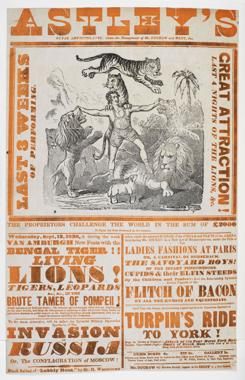
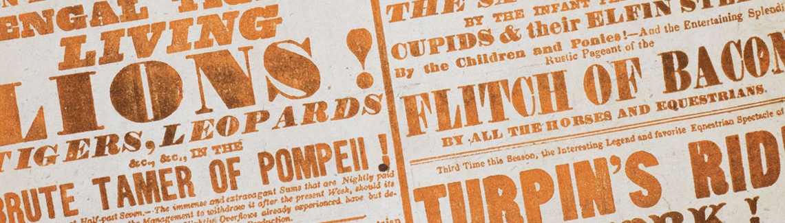
Unless you are setting a revival of a 19th century poster like the one above, using few typefaces is generally preferred. Image: courtesy of British Library, Public domain, poster of Astley’s Amphiteather, 1838.
3. For reading or for researching?
Another important factor is the way readers relate to the application. In the case of a novel, the reader starts on page one and reads steadily toward the end of the book. In a reference book such as a dictionary, the reader navigates the book swiftly, skipping unnecessary data until they find the one very short entry they were looking for. It should be no surprise that each scenario calls for a very different typographic choice.
In the first case, the user interacts with the text for an extended period of time, making reader’s fatigue the main problem. A serif typeface that has enough air overall (i.e., white space), has good typographic colour, and preferably low contrast would be appropriate here.
In reference books, however, reader’s fatigue is not a concern because the user is not exposed to the text for a prolonged period of time. Reference books instead usually require special characters (such as the International Phonetic Alphabet), a large amount of styles as an aid to navigation and structural guides, and compressed shapes to save printing space.

Typographic dissection of a dictionary entry to show the complexity of this kind of publication, usually requiring the use of multiple variants (italics, bold, small caps, ornaments), each of them adding a new layer of knowledge and content. Image from Nicolien van de Keur’s study on microtypography for dictionaries for her dissertation at the Master in Typeface Design.
4. Can it set Molière, façade, Beyoncé, and Čapek correctly?
Selecting a font family with correctly designed diacritic marks is the most neglected issue — and probably the most important — when selecting fonts. In other words, does the font contain all the required glyphs to produce the work?
It is alarmingly common that designers find out they are missing a few accents, fractions, or small caps only after convincing their client that this is “the right font for the job”. Nowadays most people don’t think beyond what’s included on their computer. But even when the text is in English, there may be references to foreign names, places, or simply the need for specific characters because of how words have been adopted into languages from which they did not originate.
Therefore, it is highly recommended to familiarize oneself with the text and gain information about the selected typeface as much as possible beforehand. Designers can also ask the type foundry to confirm certain glyphs are included in the font file and for a special testing licence.
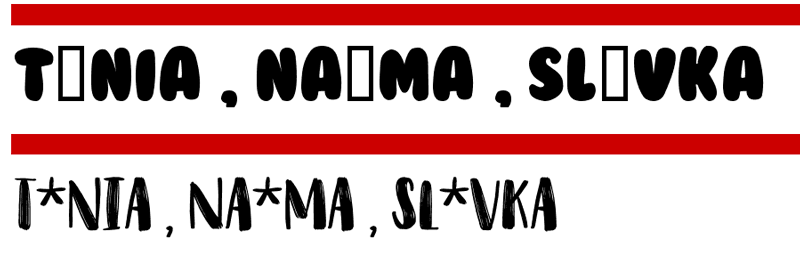
When choosing a typeface, it is essential to make sure it will cover all the linguistic needs. You may not need certain characters from day one, but finding out that there is one or several characters missing when everything is ready to be published, or even worse, once it has already been printed, can be frustrating. In the image above, this is what happens when typing names of three well known type designers: Tânia, Naïma, and Slávka, in a popular free fonts website.
5. Book, newspaper, or screen?
To the trained eye, the construction details of lettershapes will say a lot about when and at what size a typeface may be used. The fine details of a book type family like Maiola or Sabon hint at the need for high-resolution printing and rather generous reproduction size so as not to destroy their delicate shapes.
On the other hand, typefaces engineered for newspapers or screens are more robust and seem to lack that refined personality at first glance. Typefaces like Georgia or Abril Text, while not looking as fragile to the eye, will perform much better in low-resolution rendering or when printed in small sizes.
Many of these problems can be foreseen by exercising a certain level of common sense: How will very thin Bodoni-like serifs react to the use of very rough paper? (Usually not well.) What will happen with that lovely extrablack font weight if printed at 8 point size? (It will usually become globby and unreadable.) If in doubt, print and compare.

The fine details of Maiola and Sabon will perform better in fine printing, while Abril and Georgia, with their robust terminals and lower contrast, can handle low resolution situations much better.
6. Devil in the details: Have you heard of hinting and kerning?
Some fonts are specially created for proper screen rendering or Web publishing. They have been “hinted”, a post-production process which provides a significant qualitative difference when selecting fonts for websites or software embedding. The hints help to keep the typeface from being down-sampled incorrectly or too much, and ensure that parts, such as stems, will have a consistent width even within coarse pixel grids.
Kerning is part of the initial design and production process that makes letter pairs distinguishable. All type designers should complete this process, and all professional level foundries do, but smaller foundries may not have the know-how.
Because of some lettershapes and how they combine in various languages and with diacritics, some combinations cannot grant nice and even spacing. These are identified and tweaked manually. This process allows letters such as “T–a” to be moved closer together, but not as much as “T–ä”. As you can imagine, the more characters and languages a font supports, the more purposeful and exhaustive kerning should be. Foundries should state which languages they support with their fonts and the desginer should always be alert for possible problems.
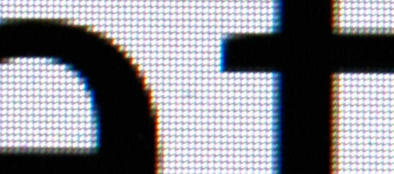
Portada, a typeface designed and engineered for screen, photographed on a 27-inch (3840 x 2160) screen, using an SLR camera with a 55 mm lens, and digitally augmented 600%. The position of each pixel influences how typefaces are perceived on screen.
7. And how about OpenType?
Designers should also consider problems related to system compatibility. Fonts are bits of software so they may not work in certain operating systems or network environments.
The OpenType format provides type designers with endless typographic possibilities and better language support. Today, small caps can be part of the same font file as the lowercase letters, and there are many different typographic niceties accessible in some fonts (discretionary ligatures, swash characters, contextual alternates, and much more). Similarly, OpenType now supports the variable design format which, when available, can pack multiple styles in a single, unbelievably small font file.
The availability of these features is dependent on the support provided by the DTP application, the operating system, or the browser. So designers must carefully check the most technical aspects of selecting fonts.
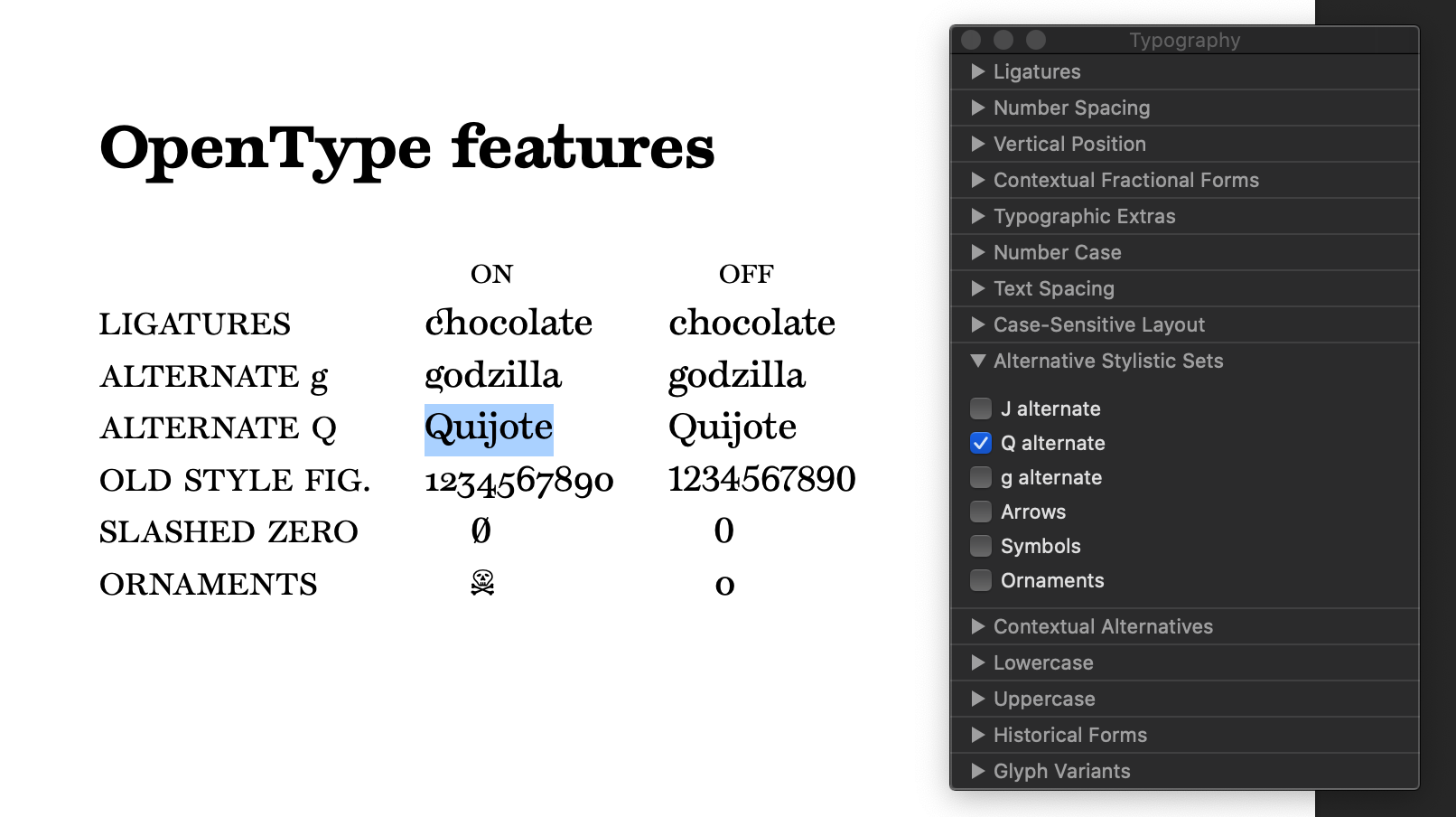
In many Mac applications, the Typography panel is hidden under the Fonts submenu, or shown with the keystroke Command-T. If one manages to find it, most of the OpenType features can be controlled. Temeraire’s typographic features are shown above in Apple’s Pages application (version 8.2).
8. Trendy, beautiful, emotional?
Once morphology, functionality, and technical restrictions pare down the universe of typefaces to choose from, aesthetic aspects can be discussed. While judging the aesthetic value of shapes is highly subjective and personal taste always takes the front seat, there are still a few general recommendations to consider when choosing a typeface for your project:
– Be careful, even hesitant, about following trends. Designers can use fashionable type or composition styles to generate an immediate effect, particularly in pieces with a short life span. Trends change rapidly though, and the design can quickly look outdated when they do. Therefore, take special care when developing designs with a more permanent goal.
– Think about how the texture of text blocks and formal qualities of the lettershapes relate to the content. Letters carry different emotional properties and create a general atmosphere. It is important that this impression feels in harmony with the message that is being conveyed. Information design and news design require fonts that do not add any emotional sway, while a wedding invitation or poetry book needs just the opposite.
– Typefaces not only establish a relationship with the content but also with the reader. It is worth considering how prominent the project’s typefaces are and with what volume and tone they communicate to the reader. Titling types are by definition louder — they need to grab attention. The designer can get away with display fonts that are more personal or include certain particularities in their shapes that make them unique, even in the most demanding environments, like daily newspapers. Text fonts require a more subtle approach to balance very complex issues, such as character repetition rate, character recognition, and readability.

There is nothing wrong in using a grotesque sans serif like Tablet Gothic (bottom) for setting a wedding invitation. But using a serif like Garalda (top) will set a different tone and very different expectations of what to expect in the ceremony, especially when using italics and taking advantage of the OpenType features: swashes, ligatures, and proportional oldstyle figures.
9. How can typefaces be combined?
If typefaces create a relationship between content and reader, they definitely establish a relationship with the other fonts used. Sometimes several font styles need to work together in the same block of text, for example a dictionary or table. Trying to match the x-height and carefully choosing the different levels of visual stress in the text are one key to success here. The so-called font super families are generally well prepared for combining fonts in the same block of text, because their overall proportions and weight already match each other.
Type families are easier to combine when they fulfill separate tasks on the page and when set at different sizes for clear hierarchy. While it is true that almost any font combination is possible if using contrasting sizes, it is advisable to choose typefaces that share a design intention (such as the level of formality or how modern or vintage fonts look like). This is another way to stress design consistency and create some sense of familiarity for the reader.

One possibility for complex settings, like newspapers, reports, and magazines, is combining two families that have been specifically designed to be compatible. It’s a bonus if they include different levels of condensation, optical sizes, pictograms, and the like. The image above combines the display versions of Protipo and Portada, two families meant to work together in complex enviroments: infographics, newspapers, reports. We would also suggest Tablet Gothic and Abril, and of course, super-families like Adelle and Adelle Sans.
10. What is the budget?
This is the most straightforward factor — easy to figure out. And in some cases it may also be the most limiting. Budget may force designers to work with open source fonts or to work with fonts that are included in certain software packages, such as system fonts. It may also mean that some fonts are a fixed choice, i.e., the client already owns a license for them. Designers are sometimes asked to only look for other typefaces that will get along with the fonts already in use. It is highly advisable to learn about any budget constraints before going on a wild goose chase. (Or is it a wild font chase?)
We also recommend taking the time to look into some limitations that font licenses may or may not have. For example, deployment as webfonts, embedding in software applications, use in mainstream broadcasting, storage and use from a central server, and some commercial applications may require additional and sometimes much more expensive licensing. If in doubt about the particulars of license requirements, the designer may always contact the type foundry and request additional advice and guidance.
This brief overview of the matters related to choosing fonts is just the tip of the iceberg. We invite readers to think about the concepts we mentioned and come up with new ones. Whatever the procedure and conceptual framework is, it is important to understand that type selection should be an informed task. It is a process that does not leave much room for already-made recipes or capricious tastes.
Beware of blindly using any of the many font lists out there. Some are better than others, but even the ones that are correctly compiled may not be a good match for a particular design problem since all design problems are unique.
A font selection process that is fully aware of the complexities that go beyond decorative issues can only help to achieve better design, and it will hopefully guide graphic designers through a journey of type discovery. Selecting the right typefaces does make a difference — it sets the tone for everything to come.
TypeTogether is an indie type foundry committed to excellence in type design with a focus on editorial use. Additionally, TypeTogether creates custom type design for corporate use. We invite you to browse our library of retail fonts or contact us to discuss custom type design projects.