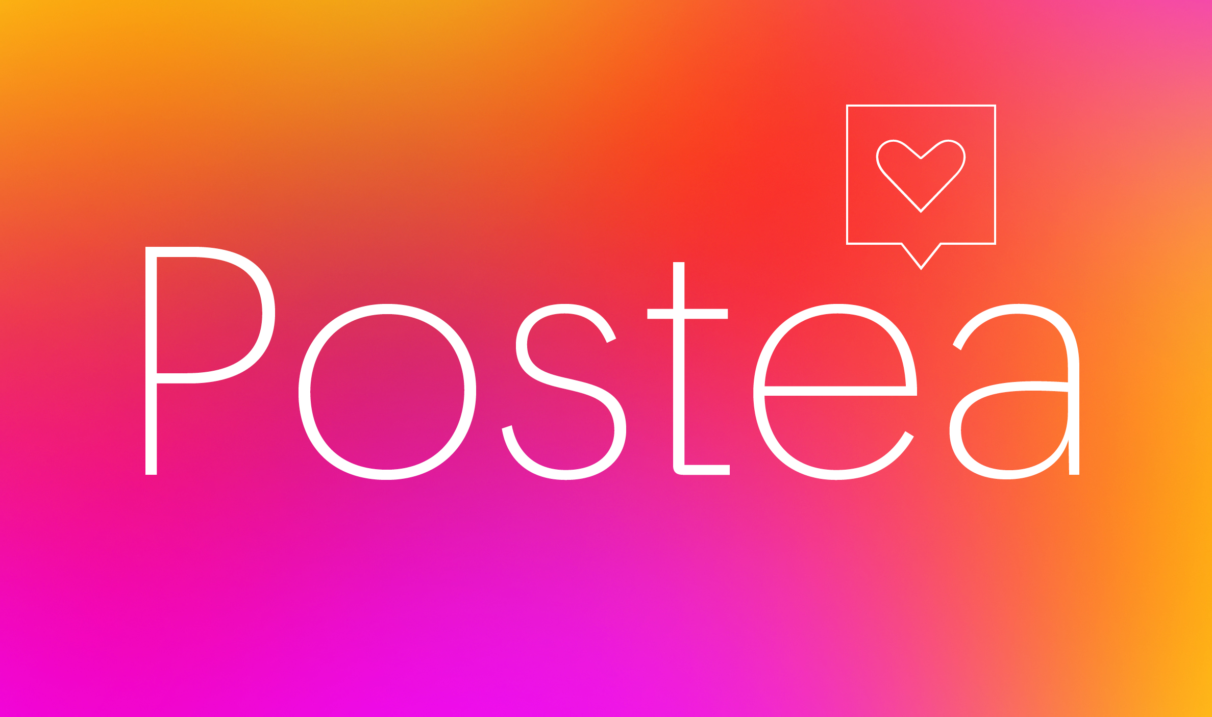
New release: Postea
April 2021
We’re happy to release our newest type family, Postea. Get to know its origins and outlines, its icons and constructs, its tech and magic.
We’re happy to release our newest type family, Postea. Get to know its origins and outlines, its icons and constructs, its tech and magic.
There’s something about geometric forms in typography that draw and inspire us. Users can see a brand and have an immediate impression about what it represents. Designers are looking for something able to represent more than the sum of its parts. So to reach both categories, we created Postea — a charismatic sans serif that taps into geometric forms. Read the full behind the scenes here.
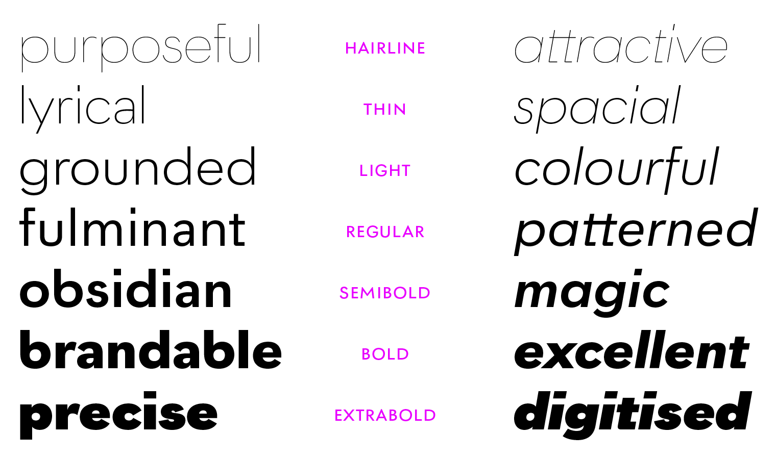
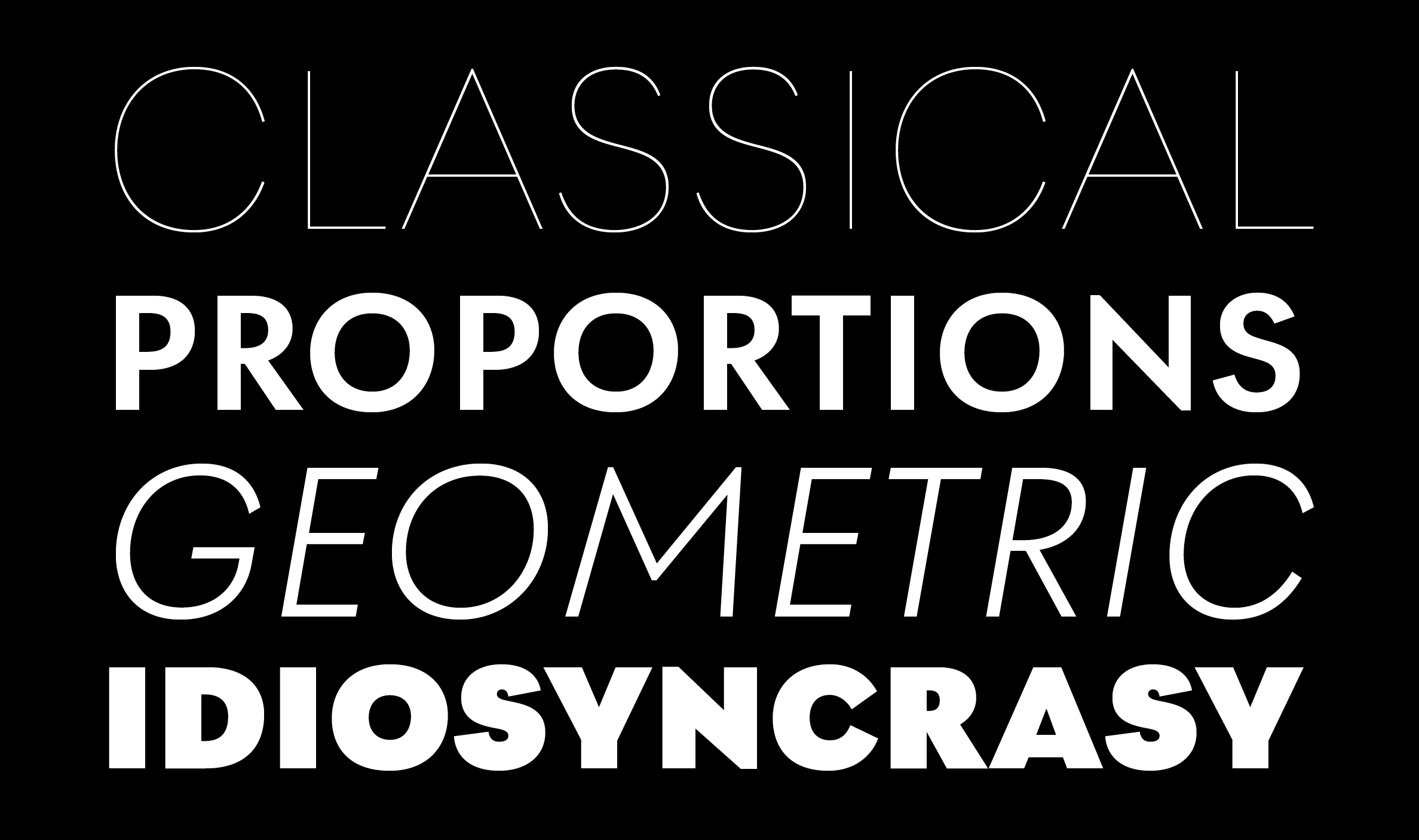
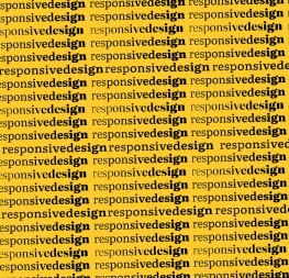
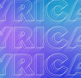
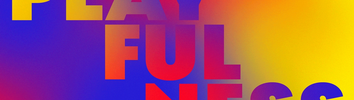
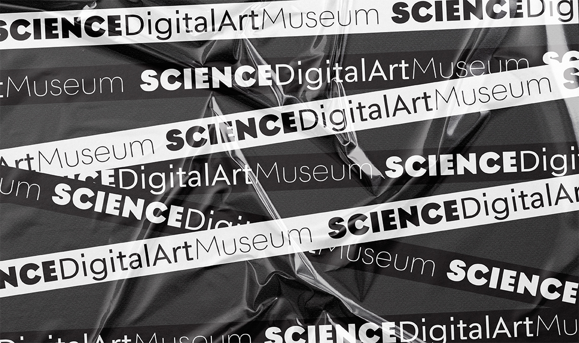
Beginning with midcentury virtues, Postea is the rational response for pixel or paper text — a lyrical take on geometric sans serifs. Classic curves and purposeful details make it ideal for branding, signage, corporate typefaces, and magazines. And that’s just the start.
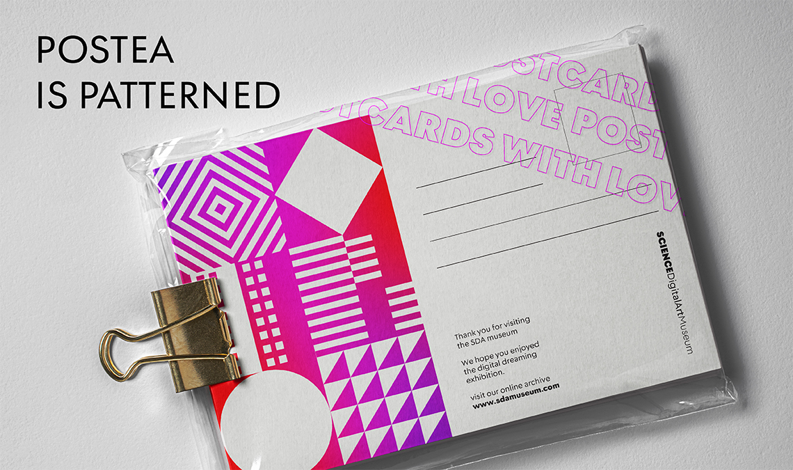
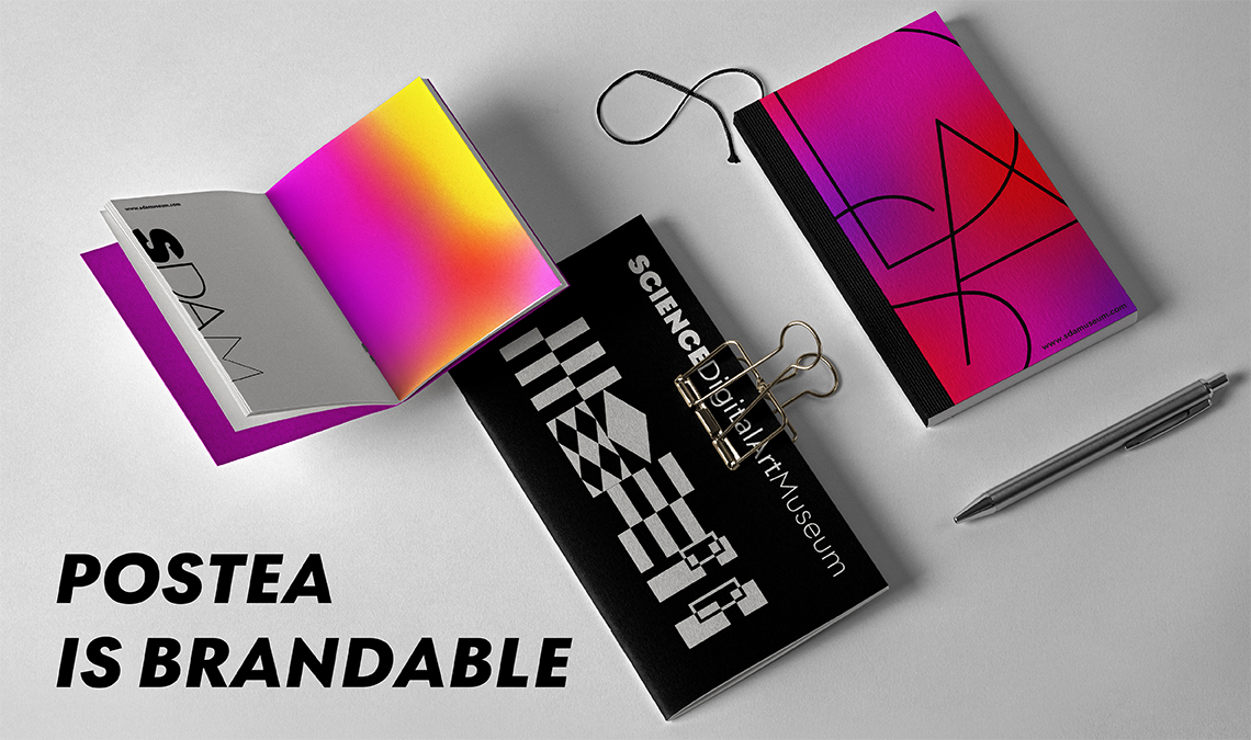
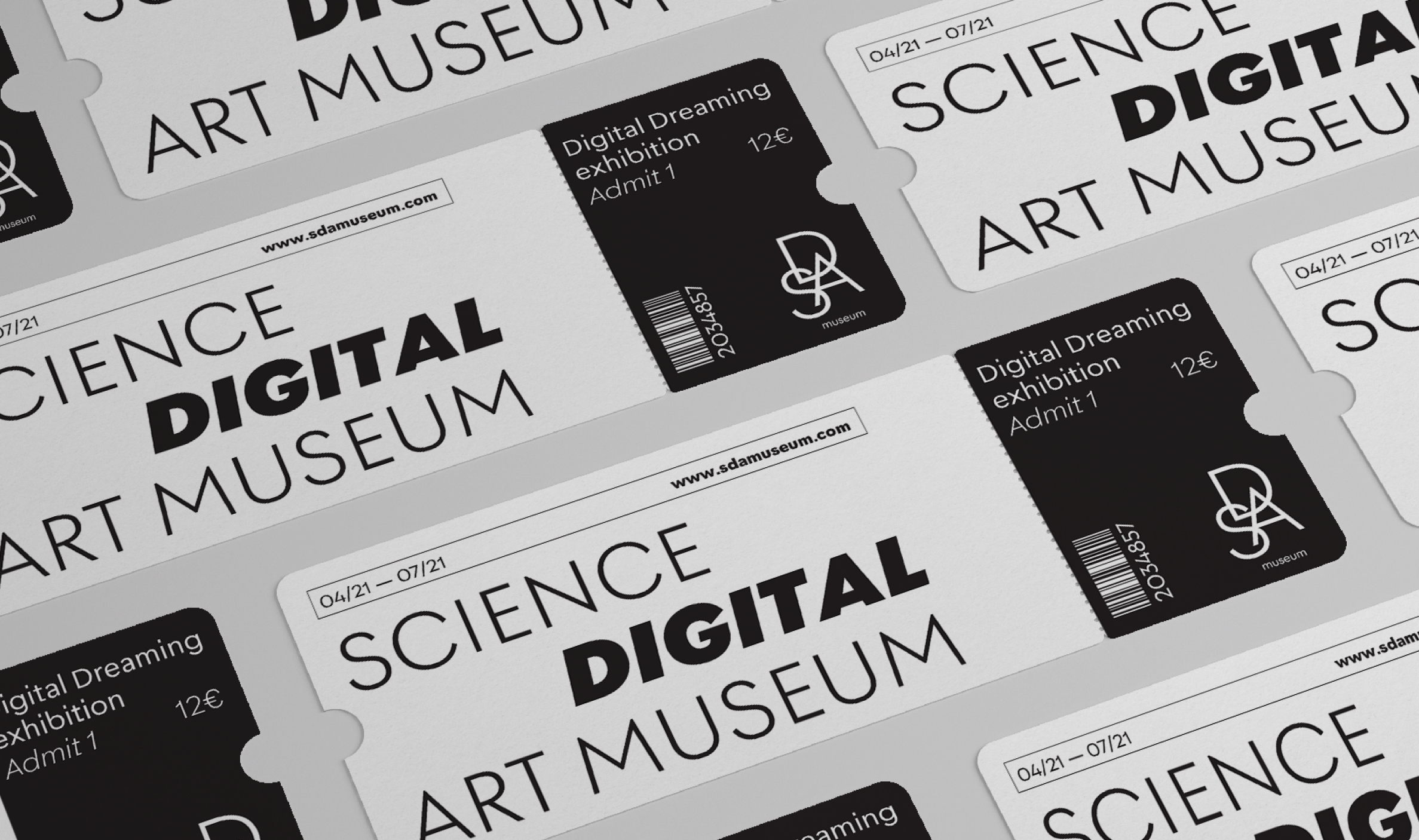
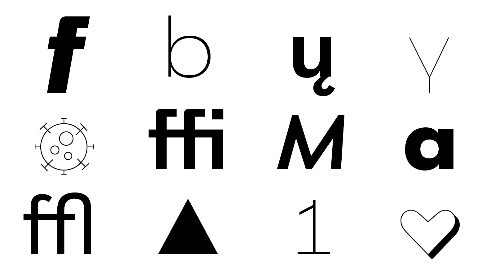
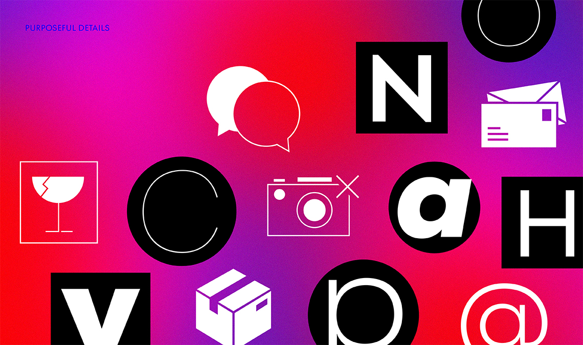
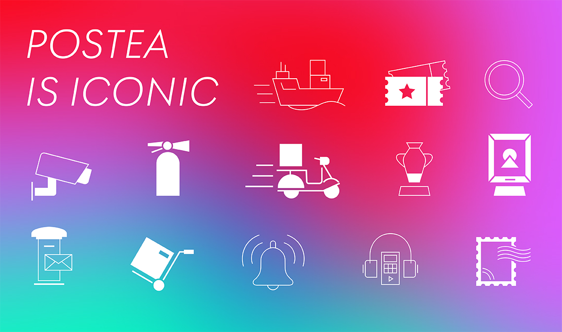
Postea is resilient in the number of ways it can be used, and its 14 styles come decked out with stylistic sets, icons, ornaments, two tech-savvy (and bandwidth sipping) variable fonts, and more. Even better? We created a simple way to call up the modern icons. Write the icon name as one word, bookend it with colons, lowercase the first letter and camel-case subsequent words, then select SS05. Magic!
TypeTogether is an indie type foundry committed to excellence in type design with a focus on editorial use. Additionally, TypeTogether creates custom type design for corporate use. We invite you to browse our library of retail fonts or contact us to discuss custom type design projects.
Schedule an introduction meeting to learn more.