Interview with Danielle Duncan (Evans)

May 2021

In this interview we have connected with Danielle Duncan (Evans), the woman who created the recent “food type” design and advertising category. She talks about her history, intersecting interests, and the typefaces she loves.


Danielle Duncan (Evans) (aka: MarmaladeBleue) is an acclaimed designer specialising in the “food typography” category, which combines graphics with grub. Her originality and wit has brought about great success and she still retains a cool head at each step, which always seems two steps ahead.

Even though Danielle practically carved out the entire food type niche herself, she has many other interests and talents, not the least of which is her ability to connect with the design world at large and express ideas back to designers and to those who employ them. In her writing Danielle lobbies for sanity and openness, for creativity and purpose, for the melding of worlds and the protections thereof. Meet Danielle Duncan (Evans): queen of food typography and developer of deep thoughts.

TypeTogether: Danielle, how did you initially get drawn into the intersecting worlds of typography, design, messaging, and food?
Danielle Duncan (Evans): I have found power in the words I speak and write. I first found inspiration in my cupboard (of all the crazy places!). I was able to connect food to an understanding of people and culture from the places the food was supposed to come. It’s easy to get hung up on a crossbar or a ball terminal, but I wish to avoid empty messages. Food play and word play — puns, contrast, and unexpected irony between the two worlds — are interchangeable for me. The world around us reaffirms who we are and what we believe. In so many ways, we are what we eat with our eyes. So let’s eat well!


Danielle Evans food type

start with a feeling

TT: How do you start a project?
DDE: When I start a new project, I have to start with a feeling, which sounds counter-intuitive and not to be confused with “something cool”. Feeling, most importantly The Feeling™, is the crucial connection point for audiences everywhere. I’d like to think I’m above buying into a mood because the majority of creative work is the commercial arts, but I’m also a consumer. When a typeface, brand, or product speaks to me, I’m buying into something I don’t fully understand but perceive to be present. And strangely enough, The Feeling™ may not be the same for everyone. But it’s important nonetheless to choose what I am evoking.

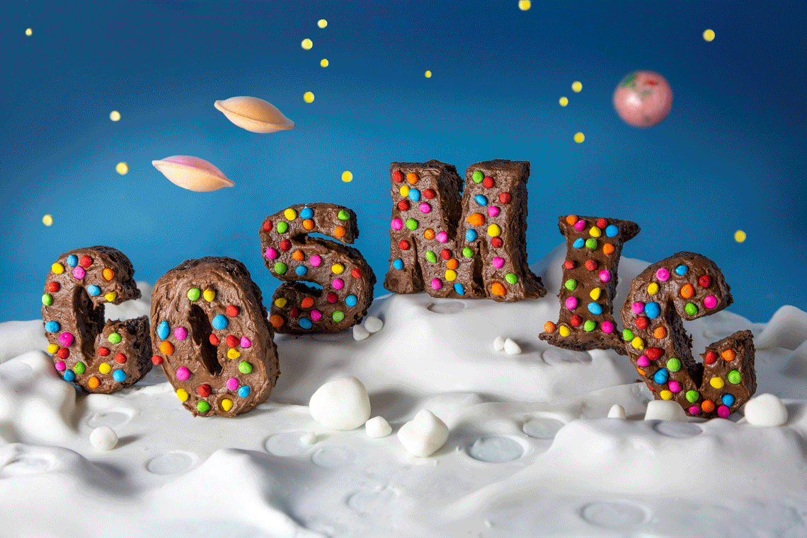
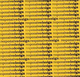
In a simple sense, food typography isn’t much different from typeface design: I’m creating rich and subtle stories by using the materials, type treatment, and copy to create a setting. The end point is the same: where will it live? The difference being that typography lives everywhere. Since typography is one of the first elements of design that people encounter from a young age, type’s humanity is less obvious, especially when heritage families like Times New Roman are taken into account. One of the most delightful moments of my undergrad career was asking the question, “Who made this font I love so much?” I realized how deeply human our writing systems are, and digitizing these systems did not alter this truth. Thanks to the emerging internet, that question was easily answered.

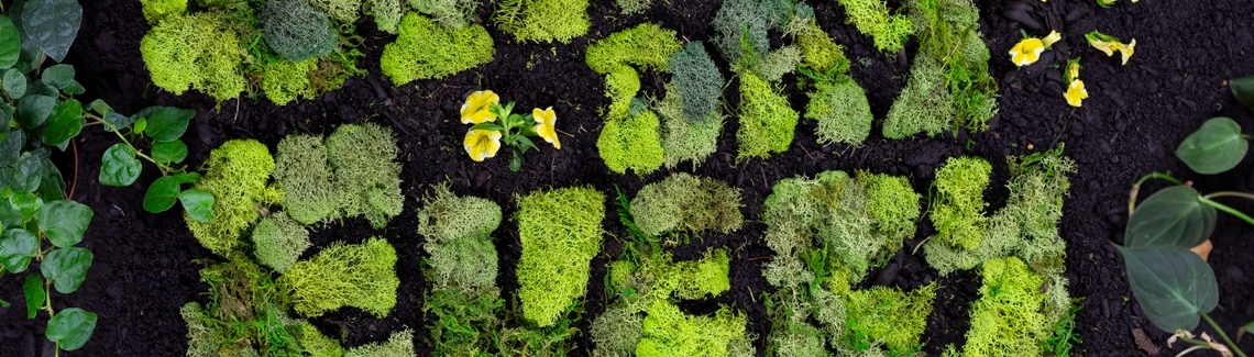
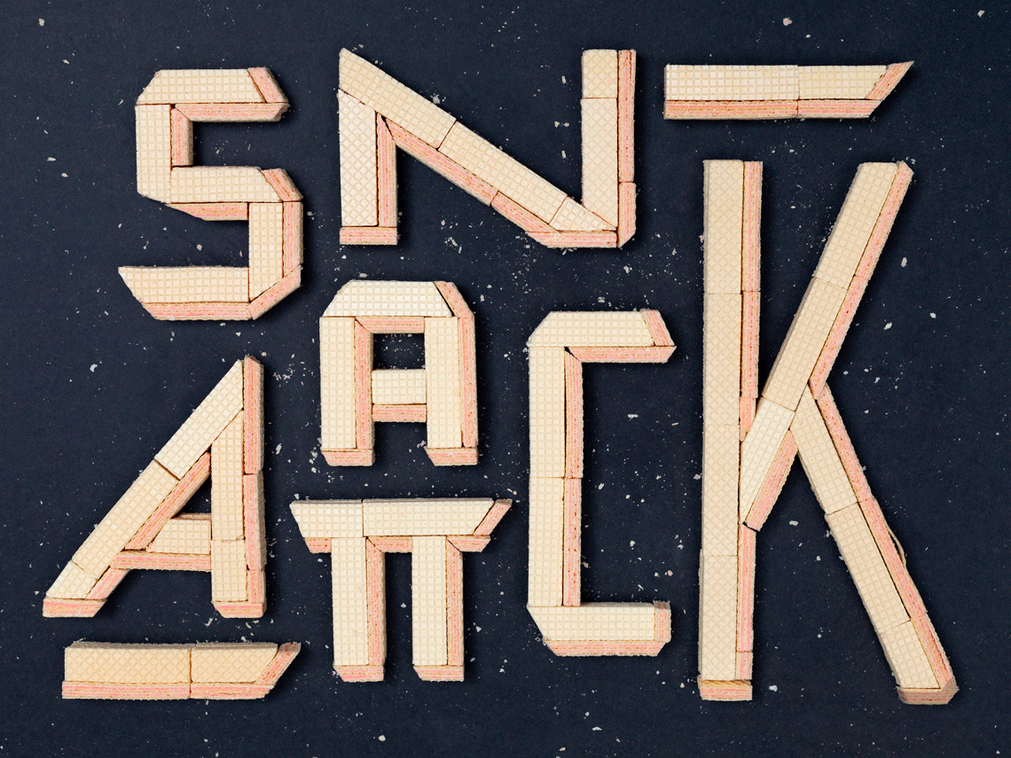
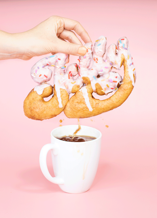
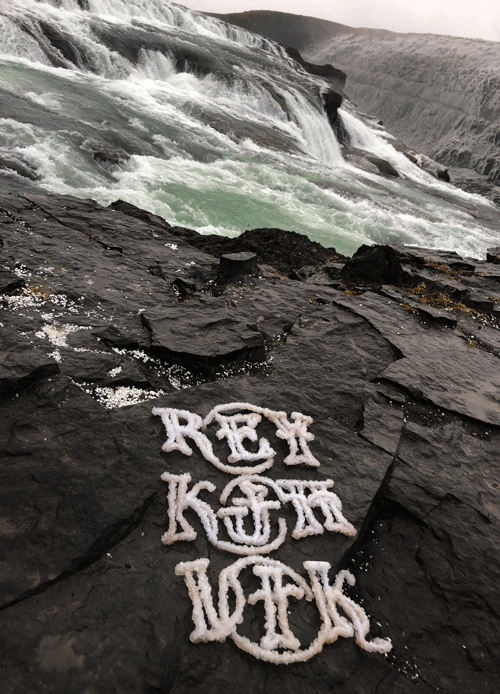
Where we diverge is the human touch, in that the fingerprint I leave on my work is more evident to untrained eyes. As a food typographer, an onion in my hands is no longer an onion. It becomes a many-layered metaphor that compliments or contrasts the copy and the greater message. This mimics a designer’s color palette, but only slightly. Nature only gives me so many options, so ornamentation is driven by contrast — again, that’s a type designer’s concept. I often test different interpretations... slicing, dicing, and melting these items into their most interesting essence. Additional items or props are meant to ground the concept and create a rich visual stew so the viewer does the unthinkable in the digital world: linger and savor the work.

One question I’ve asked myself more during this time is, “Why is this idea helpful?” Sometimes a project is individually fulfilling. Other times it pays the bills. When possible, I inject a little more humanity into digital spaces. I show the viewer that wherever they are in the world, they are seen. Sometimes this is through languages, histories, and interests. Sometimes I speak to cultural or environmental issues. My ultimate goal is to create dignity and connection that achieves a higher good. Am I furthering humanity in a modest way? If I can look in the viewfinder and see this potential, I find the project is a success.


Danielle Evans food type


TT: What does it take to be a good typographer?
DDE: To be a good anything one should start as an observer of everything. And not just design — people, systems, history, problems. Developing our ability to perceive broadens our ability to group ideas and solve them in unexpected ways.

Sometimes good typography means creating a full puzzle from as little as one or two pieces, which means the designer has to deduce what the unwritten alphabet could be from a handful of hints. One of my favorite ways to explore new styles comes from taking a picture of a couple letters and imagining what the rest of the character set looks like, how related or unrelated the rest will be.

I think of typography like an orchestra, and when I teach I ask students to consider the range of visual loudness. Having up to four characters will be very distinctive like the brass section; they’ll carry the personality of the system. Having up to ten characters will be consistent and require little variations like the string section. And the rest are like the woodwinds, which require more chairs because they aren’t as loud. They carry the system and create legibility and balance. Too much personality all around, you get noise; too little and it’s not noteworthy.


Danielle Evans food type

living my !?*# life

TT: How do you find inspiration?
DDE: By living my !?*# life. I’ve spent too much of my middle career with my nose buried in a phone. Social platforms have trained creatives to question ourselves and platformed our peers as examples of success.

As I take greater social media breaks I realize my metrics for fulfillment are found within my life experience. When I cook I learn new techniques. I love tracking fun signage and noting variables when I visit new cities. I’ve learned many of my favorite hobbies are physical expressions of my mental processes. I love salsa, juggling soccer balls, snowboarding, even classical guitar has an element of joyful play. A light touch. Agility. Those are opportunities within my own experience to find inspiration, which I almost always have.

Outside of my experience, I am moved by seeing others reach their potential. I am inspired by musicians, athletes, public figures, my colleagues, and my neighborhood kids excelling at their talents. When I feel stuck, sometimes someone else’s success can reveal a roadblock in my path or provide an uncharted pathway to my own goals. I try not to look outside my own pathway before I’ve exhausted my internal options because it’s easy to feel jealous or resentful. Wishing the best for others in their alignment is the way I convey my respect.


Danielle Evans food type


Thank you Danielle for this inspiring and insightful interview!

Danielle also prepared a special “edible font collection” for our Premier members. To apply for free access to Premier and to read Danielle’s font recommendations, please go here.


About Us

TypeTogether is an indie type foundry committed to excellence in type design with a focus on editorial use. Additionally, TypeTogether creates custom type design for corporate use. We invite you to browse our library of retail fonts or contact us to discuss custom type design projects.