Expansive typographic system: making Playpen Sans

December 2023

Our expansive typographic system began with the Primarium research and continued with two type families. Read the full story of how the first typeface, Playpen Sans, designed by Veronika Burian, José Scaglione, and Laura Meseguer, came to life within this multi-pronged system.


Casual typefaces have long been a staple in the design and communication world. Their easygoing tone is often desired, but their aesthetics are just as often lacking or overly childish, and they fail to look like genuine handwriting. This seemed like an opportunity to solve a real problem that is backed by extensive research, so we created Playpen Sans to fill this void — something engaging and casual for the layperson, and still technologically advanced with just the right aesthetic tone and usefulness for the serious designer. Read the full story of how Playpen Sans, Playwrite, and Primarium got their start, how we struck the right balance amongst competing needs, and where the Playpen Sans project stands today.


In early 2022, we at TypeTogether embarked on a groundbreaking research project to study the methods of Latin script-based handwriting instructions for primary school children, spanning five continents and about one-quarter of the world. The result of this ambitious and extensive project is Primarium, a freely accessible resource designed to serve the typographic and educational communities. Research was led by José Scaglione, Pooja Saxena, Cecilia Brarda, and Sandro Fetter, with additional significant input from Caroline Schäfer and Veronika Burian.

In an era where digital devices are increasingly prevalent, the issue of handwriting education has become a topic of debate in educational, pedagogical, and typographical circles. Primarium offers an unique and comprehensive perspective, enabling in-depth contextual analysis of the complex factors that influence how children learn to read and write, from the benefits of learning to write by hand, to the most effective current handwriting models and teaching methods. (To learn more about the Primarium research, watch Veronika Burian and José Scaglione’s presentation at the Herb Lubalin lecture series.)


Typefaces as resources

Right from the outset, one of our primary objectives was to leverage the research results to develop a practical and valuable set of typographic resources: an expansive typographic system that places different facets of handwriting in the spotlight.

First in the system, we developed the Playwrite font engine, capable of producing educational fonts that are tailored to specific countries, regions, and pedagogical approaches. The initial release of these school font families is scheduled for the end of 2023, and we will release more details about it at that time.


This image shows Playwrite’s different styles (versions, models) looped, cursive, etc. These are accesible via stylistic sets in the OpenType features.


The second font family we designed within the system mirrors a very different type of handwriting — an informal style that represents everyday writing but is not connected to cursive styles. This family became the Playpen Sans typeface, a fresh and casual counterpart to corporate fonts that can be used equally for wider audiences, in everyday documents, in apps and websites, and non-professional design. And this font family has now been released — for free, for everyone to use!


The relation between Playpen Sans and the Playwrite school fonts currently being developed is stronger than it might initially appear. At the core of our design challenge lies the fact that school children often learn two very different alphabets: the unconnected letters resembling print styles used for everyday reading, and the letters for writing which are a joined or semi-joined script that favours fast handwriting.

A good solution to this issue was promoted in England in the second half of the 20th century, even though the seeds for the idea were planted nearly 50 years earlier. The concept was to bridge the gap between these two sets of letters, allowing students to transition progressively from printed letters to handwritten ones. This connection is achieved through a pre-cursive style, a calligraphic model where letters feature a small exit stroke pointing in the direction of the next letter. As students gain speed and proficiency, they continue this exit stroke to seamlessly join letters without lifting their pen.

Since children use the pre-cursive as a stepping stone to go from print to cursive handwriting, we used that style as a starting point to design fonts in two distinct categories: casual and educational. The construction comparison can be seen in the graphic below.


Our schools font series (Playwrite) and the Playpen Sans informal type family stem from the same structure.


Style: human and casual, or strict and systematised

The casual handwriting style has been in print for many decades, possibly popularised by the first comic books in the early 1930s. Incorporating these somewhat narrow and dark letters into speech bubbles with proper alignment and consistent proportions can be a challenge, but this was a common approach in comic books for many years. Even with a skilled scribe, the resulting letter shapes exhibit slight variations, lending the page a relaxed and organic appearance that has historically been difficult to replicate with a standard typeface.

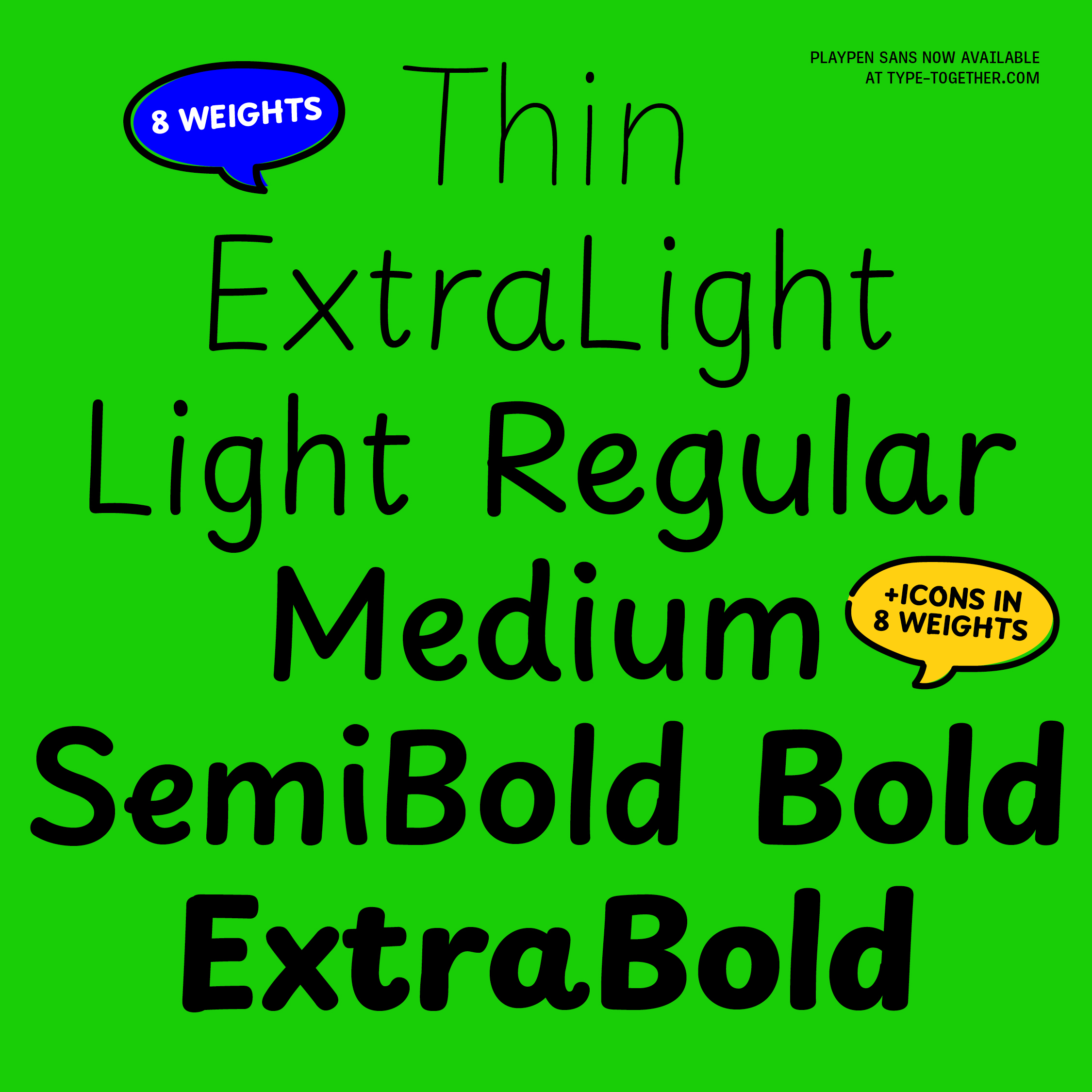
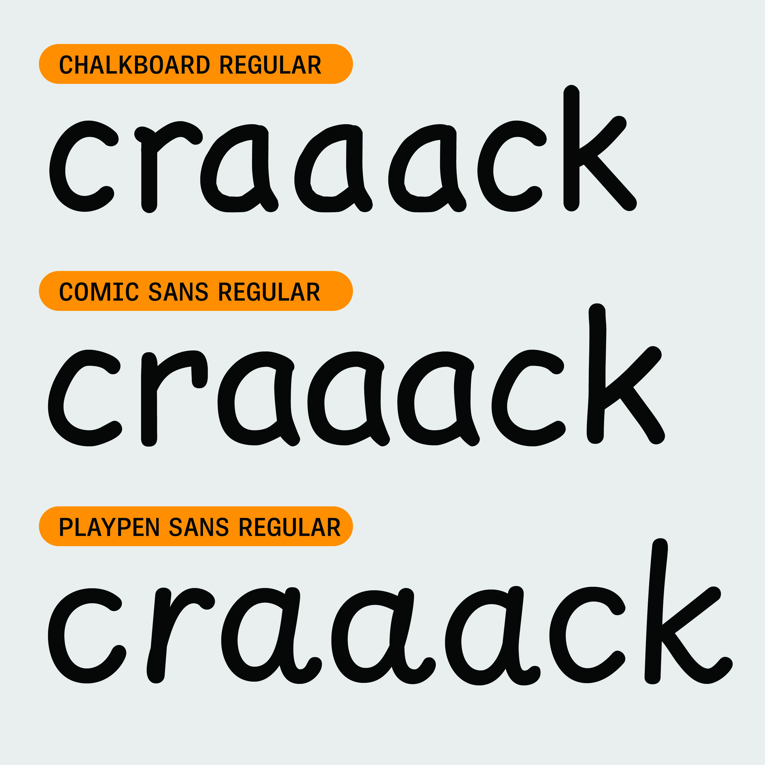
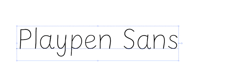
Typography is essentially systematised writing, which values consistency as a fundamental rule. We type designers therefore craft each glyph to be placed before and after any other glyph, knowing they will be reproduced multiple times on a page. The repetition rate is a significant problem in casual-looking system fonts, such as Apple’s Chalkboard or Microsoft’s Comic Sans, both of which were developed before the creation of OpenType features. With Playpen Sans, our goal was to achieve a natural feel that reduces the strict, systematised look of typography in a noticeable way. Playpen Sans needed to feel uniquely human.


Letter transformation

To transform the design of our educational Playwrite project into the informal, handcrafted letterforms of Playpen Sans, we enlisted the help of Laura Meseguer, a skilled letterer whom we hold in high regard. Laura used her tablet and digital pen to write on top of the font skeleton we provided, experimenting with various tools, pen thicknesses and techniques, working on single letters, words, and pangrams at different sizes and writing speeds.

Laura’s initial starting point was to use one of the master styles of Playwrite’s variable design space, but this resulted in too much variation of angles, position, and x-height. The text impression was too disturbing and needed to be calmed. So after some experimentation on slant and curve speed, we settled on a simplified print style that features the same shapes as the precursive but has no exit strokes, except for a few selected letters. We selected a point along the two variable axes that seemed most natural to handwriting to serve as a base for the retracing.


While the technical proof of concept spanned several weeks, we eventually arrived at a procedure that yielded excellent results while remaining efficient in terms of workload.

Laura’s work produced organic shapes that, as is typical of casual, handcrafted letters, were delightfully imperfect. We then selected up to seven different designs for each alphanumeric character. To maintain the fresh and natural shapes, we refrained from making excessive optical corrections for joins and alignments, and we preserved looser word spacing that mimics natural handwriting rather than the spacing of typesetting.


Character-randomising code

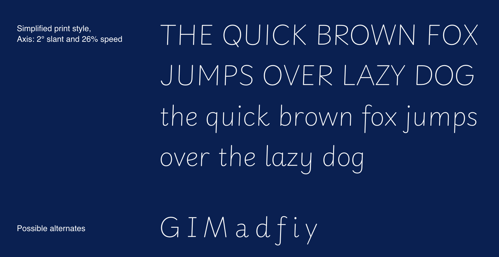
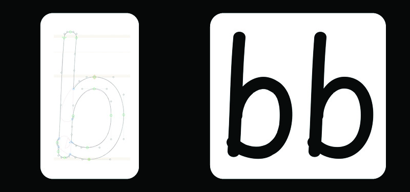
Our idea was to introduce a degree of randomness in the appearance of letter combinations to impart a truly informal tone to the page — an effect that cannot be achieved without complex OpenType code. Therefore, our type engineer, Joancarles Casasín, developed a glyph shuffler that ensures different letter variations are displayed based on context, and that no shape is repeated consecutively. The font creates the illusion of aleatory letterforms, resulting in different combinations within every word. Even the spaces between words exhibit occasional variations in width.


The freely available Playpen Sans family has eight weights, emoji stickers for breezy and encouraging uses, and supports over 150 Latin-based languages. There are both straight and curved endings for ‘i, l, y’, a two-storey ‘a’, and optional shapes for ‘f, G, I, M’, all of them with their own design variations and easily available through a stylistic set. The entire font family also comes in a variable font version for developers and designers who value ultimate control and bandwidth savings.


Embracing the unpredictable

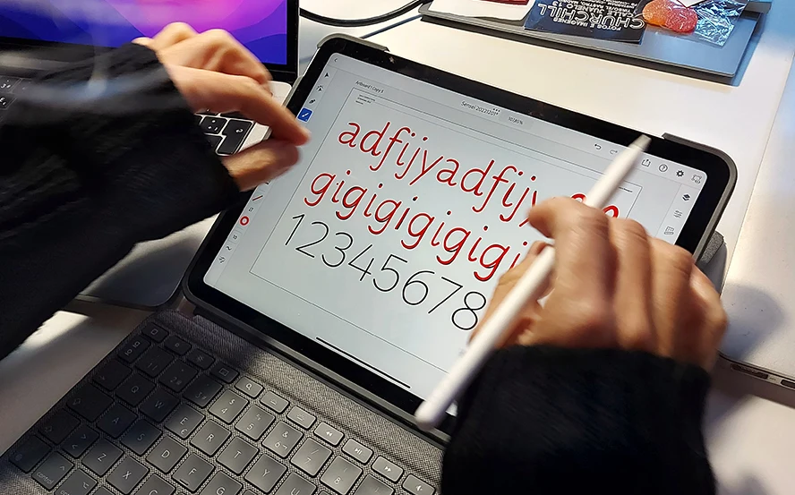
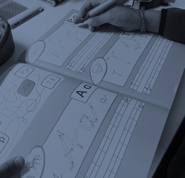
The development of Playpen Sans undoubtedly pushed us beyond our comfort zone — an exercise we both enjoyed and valued. It provided us an opportunity to experiment with probability, unpredictability, and even errors, all of which became integral parts of the design process. The journey also presented technical challenges, from experimenting with tablets, digital pens, and various applications to developing tools capable of generating randomised OpenType code.

Ultimately, it was a rewarding process that resulted in a font family of which we are immensely proud. While we celebrate its release, we can’t help but envision how it might be adapted to other writing systems, even the more complex ones. So as one project concludes, another begins and we eagerly embrace the future.


About Us

TypeTogether is an indie type foundry committed to excellence in type design with a focus on editorial use. Additionally, TypeTogether creates custom type design for corporate use. We invite you to browse our library of retail fonts or contact us to discuss custom type design projects.