New research: primary handwriting education

November 2022

We are thrilled to announce our latest groundbreaking research project — an in-depth examination of how handwriting is taught today in regions around the world that use the Latin script. We started at the beginning of 2022 and we are excited to share some fascinating, early insights. And don’t forget, we need your help making this a success!


In the debate between digital and analogue, and doomsday predictions about the death of cursive handwriting, the one essential factor often missing is a true picture of what handwriting education for today’s children looks like — a view not just from one country or region, but from across the world. And so in early 2022, a research team at TypeTogether set out to fill this gap.

We are studying the state of handwriting education in primary schools in over 40 countries that use the Latin script, and our unprecedented research will culminate in a free, first-of-its-kind, and publicly-available resource about handwriting education that will serve the educational and typographic communities alike.


A global perspective

Our goal is an ambitious one: we plan to study how handwriting in the Latin script is taught to primary school children in about a quarter of the countries of the world, spanning six continents. For each country, we are looking for answers to a set of interconnected questions: how does handwriting fit into educational goals and primary school curricula? When do students learn how to write? What styles of handwriting do they learn? And what models and methods are used to teach them? In academic circles, we are doing what is called primary research, meaning this is a first of its kind. And while historical background is important to us, our focus is clearly on the nature of handwriting education today.

With that as our foundation, we’re identifying the main approaches to handwriting education in every country and the specific models from which students are most likely to learn. We have already identified and carefully catalogued dozens of models developed by a variety of stakeholders, like government bodies, handwriting experts, teachers and schools, publishers, calligraphers, and designers.

Our multilingual team spread across the Americas, Europe, and Asia has been an enviable asset as we have embarked on this global study.


Interdisciplinary and collaborative research

Very early while conceptualising this project, we realised the importance of seeing the issue of handwriting education in primary schools from diverse viewpoints. We didn’t want to be limited by what may come easily to us as visual designers, but instead cast our nets widely and learn from a range of sources and fields.

As a result, our research has taken us from poring over legislative documents to investigating historical threads; examining curricula and syllabi to surveying teaching materials; reading academic publications to reviewing marketing information from educational publishers; and examining typefaces as well as lettered samples. All of this desk research has been complemented by interviews with teachers, parents, educationists, administrators, and designers who have helped us contextualise our learnings with their real-world experiences.


Invitation to help

To make our research even more robust, in early October we announced a public call to expand our network of collaborators and contributors. If you think you can help us understand Latin-based handwriting education in your region more deeply, please fill in this form and we will get in touch with you.


Early insights

At a little over six months in, our research and analysis are far from complete, but important and thought-provoking insights are already becoming apparent.

For starters, the very notion of what constitutes primary school cursive writing varies dramatically. It could be vertical or slanted, fully joined or semi-joined, uppercase letters can be ornate and decorative or simply borrowed from print styles, lowercase letters can be based on round or oval foundational shapes, and the proportion of the x-height vis-a-vis the ascenders and descenders can differ. Even terms to describe the same type of handwriting diverge, and some of them were surprising to us given our type design-focused vocabularies. Unconnected print style letters, for example, are known as “manuscript” in many countries, including the Philippines and Ireland.


Cursive handwriting in primary school education around the world takes many forms, and that is evident in the typefaces used in teaching materials. Here are some examples: Briem Script by Gunnlaugur S.E. Briem and Freyja Bergsveinsdóttir used in textbooks in Iceland; Cursive Dumont Elementaire by Danièle Dumont, popular in France; Schulschrift SAS by Just van Rossum used in the eastern parts of Germany; Twinkl by TypeTogether, used in textbooks by the eponymous publisher in England and other parts of the world; and Learning Curve by Jess Latham, which is used in Colombia.


The ins and outs of teaching

The logistics of how handwriting is taught also offers a study in contrast. Take, for instance, the age at which children are expected to write in fluent handwriting according to national curricular requirements. It is 7–8 years old in New Zealand, but 12–13 years in neighbouring Australia — a difference of half a decade!

Similarly, the degree to which national governments are involved in preparing and recommending handwriting models changes from country to country. As recently as 2013, the French Ministry of Education introduced new models of handwriting called Modèles d'Écriture Scolaire A et B to reform handwriting teaching. Compare that to the United States, where models developed and marketed by private companies, such as Zaner-Bloser and Getty-Dubay Italic, rule the roost.

 

The Romain styles of Écriture A, by Laurence Bedoin-Collard and Heloísa Tissot, and Écriture B, by Marion Andrews. These typefaces, along with their italic, ornamental, and lined styles, were published by the French Ministry of Education in 2013 in a single package called Modèles d'Écriture Scolaire A et B, which sought to reform handwriting education in France.


Argentinian and Brazilian students usually learn unconnected print letters first, followed by cursive writing. But in countries like England this approach has largely fallen out of use, and schools tend to follow progressive handwriting models.


International currents

We’ve observed a marked influence of geopolitics as well as colonial and 20th century history when tracing the popularity of handwriting models across regions.

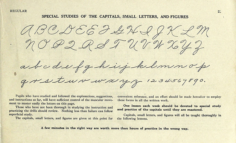
Handwriting models based on the works of renowned calligrapher Austin Palmer are popular not only in the country of his birth, the United States, but also in nearby Canada, Cuba, Mexico, and Colombia. Coquito, one of most popular handwriting booklets in Colombia last century, was not produced locally, but came from Perú.


The Palmer Method of Business Writing. Palmer, A.N., 1901. New York, etc., Page 29. Source: https://archive.org/details/palmermethodofbu00palmrich


Typefaces for cursive handwriting education based on the Palmer Method of Business Writing shown above. From top to bottom: Schoolhouse SmartFonts Set D by vLetter Inc. used for teaching in the D’Nealian Method in the United States; Schoolhouse SmartFonts Set Z used for teaching in the Zaner-Bloser Method in Canada and the United States; Progreso Cursiva designed by Cristobal Henestrosa for publishing company Editorial Progreso in Mexico; and Learning Curve by Jess Latham, which is used in publishing company Fabriescolares’s handwriting booklet Coquito Escolar in Colombia.


Vertical cursive writing from Spain, Portugal, Italy, and France has travelled to former colonies like Brazil, Uruguay, Chile, and Argentina. The official cursive script adopted in Vietnam in 2002 also bears a striking resemblance to traditional French models.


Typefaces in the vertical cursive style popularly used in handwriting education in France, Spain, Chile, and Argentina, respectively: Cursive Dumont Elementaire by Danièle Dumont, Memimas Pro by José Manuel Urós, Grafito by Kote Soto and Felipe Cáceres, and Lumen Dots by Luciano Arnold.


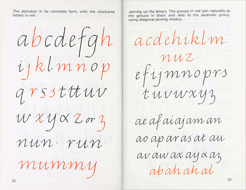
Developments in the United Kingdom have impacted how handwriting is taught in Commonwealth countries. In Australia, for example, handwriting education borrows heavily from Scottish calligrapher Tom Gourdie’s Simple Modern Hand, which incidentally didn’t gain a lot of currency in his home country.


Sample pages of The Ladybird Book of Handwriting. Gourdie, Tom, 1968. Wills & Hepworth, London. Source: https://archive.org/details/ladybirdbookofha00gour


Handwriting education typefaces by Graphitype GT that are specially designed to meet government-mandated specifications in different states in Australia. While each has its own peculiarities, they are all based on the progressive approach espoused by Tom Gourdie in his book The Ladybird Book of Handwriting (1968) shown above.


Stay tuned for more updates from us in the coming months, including the publication of our full research, complete with illustrations and a comprehensive bibliography. In the meantime, please get in touch if you would like to contribute, and feel free to share this form with others you think could help.

This project is supported by Google Fonts.


About Us

TypeTogether is an indie type foundry committed to excellence in type design with a focus on editorial use. Additionally, TypeTogether creates custom type design for corporate use. We invite you to browse our library of retail fonts or contact us to discuss custom type design projects.