History can be a great instigator for creativity. In Quentin Shmerber’s case, it has won him awards for his Temeraire font family, which has shown up in wonderful uses. We reconnected with Quentin to discuss that typeface and the process needed to prepare it for release.
In 2016 Quentin Schmerber was awarded as the third recipient of our Gerard Unger Scholarship (back then called Typeface Publishing Incentive Programme), after Roxane Gataud and Juan Bruce. His Temeraire font family, developed during his postgraduate studies at ESADType (Amiens, France), was a collection of typefaces designed as contemporary interpretations of the English lettering tradition.
With the support of our TypeTogether mentorship, Quentin shaped them into a coherent family, making the hard decisions to let go of parts that did not fit together, and polishing and extending those that would uplift the family. In this interview we discussed inspirations, processes, English lettering, and life beyond the environment of the school.
Hi Quentin, it’s so good talking with you! Tell the readers a little about you, your background, and how you ended up at ESADType. I graduated in 2012 with my bachelor in graphic design from the Haute École des arts du Rhin Strasbourg (formerly École Supérieure des Arts Décoratifs de Strasbourg), where I had the chance to discover lead typesetting, thanks to Bettina Muller. I decided to pursue my Masters at the school in Amiens because I was already getting interested in type design and was aware that they were providing an introduction as part of the graphic design courses. Happily, I was accepted and joined the school. It’s a pretty small school and the teachers eventually noticed my interest in type design and convinced me to apply to the ESADType postgraduate course. I was even invited to workshops by Frank Grießhammer, Martin Major, and Christian Schwartz before applying!
I got hooked and it became a no-brainer that I should do it, despite having some job opportunities in graphic design after my Master’s graduation. Thankfully the school librarian, Peggy, offered me a position to assist her several days a week, and this allowed me to sustain my living during my extra stay at the school. I applied and got accepted, along with my best friend, one of my good classmate friends, and three other people whom I didn’t know at the time.
From left to right: Erwan Beauvir, Martin Pasquier, Roxane Gataud, Quentin Schmerber, Hugues Gentile, Isaline Rivery, Dorine Sauzet. Post-Diplôme «Typographie & Langage», at the 2015 FDK Workshop 2015 run by Frank Grießhammer. Photo courtesy of Frank Grießhammer.
Let’s start at the beginning. Where does Temeraire come from? Was there a particular brief for this project?
The ESADType course starts with roughly five months of training and design exercises. Then we have to focus on a personal project for the remaining year. Our teachers advised us to start with a fictional brief so I chose to design a bespoke typeface for a British pub, which was actually just an excuse to explore some source material from the UK.
This is problematic to say today, but my first contact with British lettering were very cliché inscriptional typefaces by an awful human being (purposefully unnamed here), and Albertus by Berthold Wolpe, who is not even British. I replicated some of their gimmicks in the first draft of what would become Temeraire.
It’s only when I discovered the body of work by the late Alan Bartram that my perspective completely shifted to something else. I found so many unexplored styles and letterforms on the gravestones he documented in his books, which got me really excited. The (re)discovery of John Baskerville’s work and the English Vernacular genre were significant for what Temeraire would become.
Alphabets from Carrington Bowles’s lettering manual (London, 1775) — reproduced in motif magazine, James Mosley, “English Vernacular“, p. 16.
Alphabets from Carrington Bowles’s lettering manual (London, 1775) — reproduced in motif magazine, James Mosley, “English Vernacular“, p. 16.
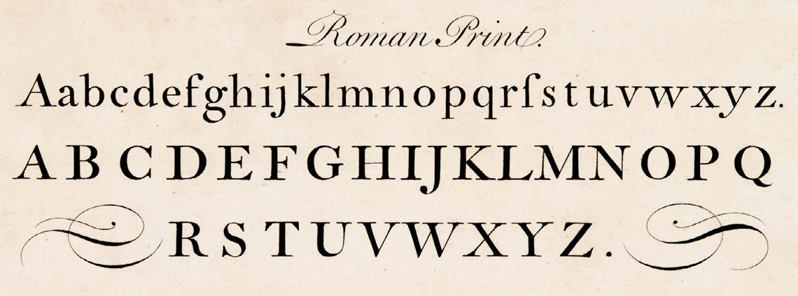
Roman Print by Joseph Champion (1709–68), engraved by Georges Bickham. From “The Universal Penman” (1733–41).
Let’s talk about inspiration. Obviously, the English lettering tradition is embedded in Temeraire, but there is also a formal connection to families like Jeremy Tankard’s Trilogy series (2009). Are there other sources of inspiration that were part of the process?
The ‘Call it what it is’ essay by John Downer has helped me understand and explain what I was working on, and should be listed as one of the main inspirations for the project. Of course, I was also inspired by contemporary type design in general, as I didn’t want Temeraire to be old-fashioned or nerdy, but to look fresher than ever. Type designers like Maria Doreuli, Robin Mientjes, Paul Barnes, and Kai Bernau have shaped my way of drawing letters and envisioning type design. The design practice of the John Morgan studio and Alaric Garnier were also heavy influences on Temeraire.
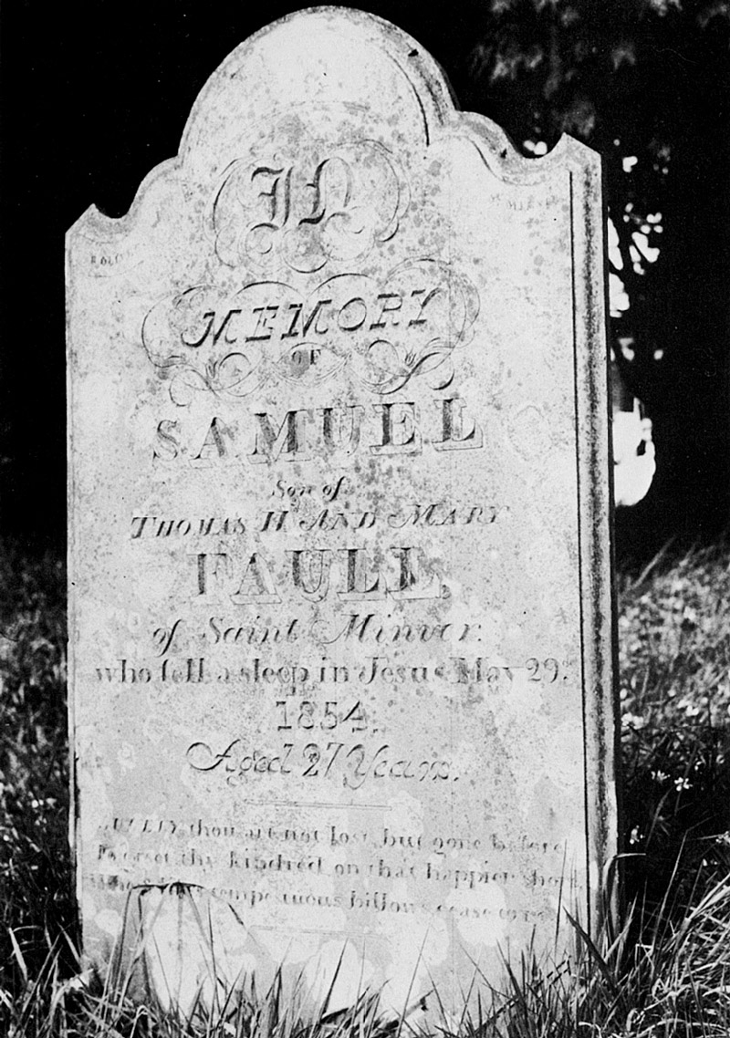
Tomb in St Teath, Cornwall, presenting a combination of styles that triggered the possibility of creating a nontraditional type family. Image from Alan Bartram, “Tombstone lettering in the British Isles”, p. 80.
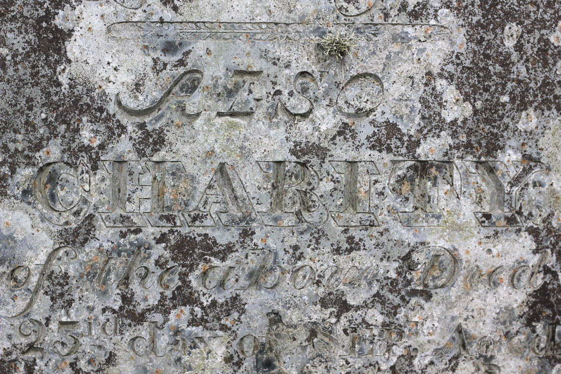
Lettering in St Breage’s Church in Breage, Cornwall. Courtesy of Paul Barnes.
Conspicuous inconsistency
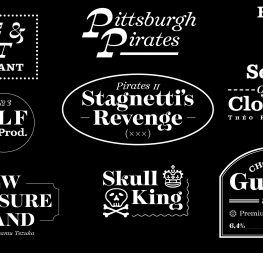
Temeraire is a challenging type family in the sense that the styles don’t follow the traditional set of regular, bold, and italic. The family is instead constructed as a framework of individual styles that bring together “conspicuous inconsistency”. At what point was it clear that you were not creating a traditional family in that sense? What was your journey for setting up a nontraditional family?
Indeed the relationship between Temeraire’s various styles is pretty peculiar, and not exactly what you would normally expect from a commercial font family. Significant shapes are different in almost every style, and what ties them together is only the fact that they match conceptually and stylistically.
I didn’t give much thought to that during the process, it emerged organically from all the sources I had and somehow it made sense to me to continue in that direction. I guess it’s pretty similar to Stephen King’s philosophy that when you write a story for some characters, the characters end up carrying the story for the writer. Temeraire took on its own identity and just led me there.
In my practice of graphic design, I like to mix and match contrasting fonts and styles to achieve a result with more visual interest. I’d like to point out a piece by Bethany Heck on the subject; this idea likely comes from there. Of course, this weird family construction is definitely one of Temeraire’s weakest points, but I’m convinced it’s also one of its strengths!
We definitely believe that too! Was there a moment during the process you thought of shaping the family into a more traditional set?
Sure. After discussing that possibility with Veronika and José, I tried to investigate it by drafting an Italic for the Bold and intermediate styles. I never managed to reach a satisfying state with them so I eventually dropped the idea.
Something I haven’t mentioned so far: I dropped one style entirely from the family. And it’s a good thing I did since it was too estranged from the rest of Temeraire. It eventually became a different typeface on its own and is published somewhere else.
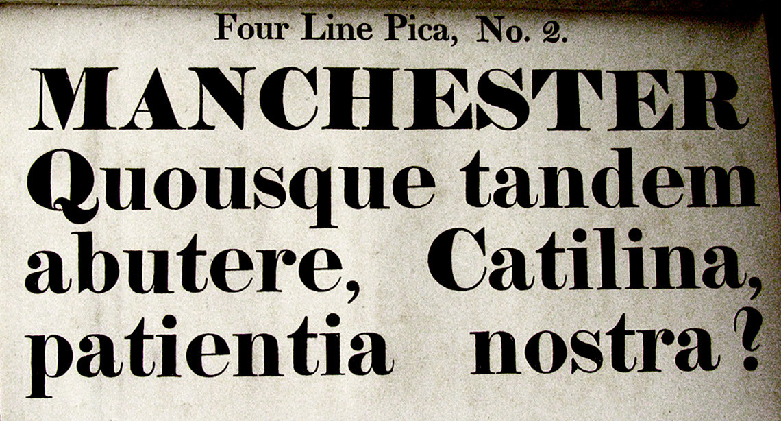
Four Line Pica, No. 2 from Thorne’s specimen, ca 1810, one of the first examples of the Fatface. Courtesy of Sébastien Morlighem, Nicolas Barker collection.
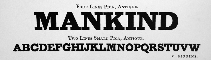
Vincent Figgins’s Four Lines Pica, Antique & Two Lines Small Pica, Antique, from Specimen of printing types, 1815–1817.
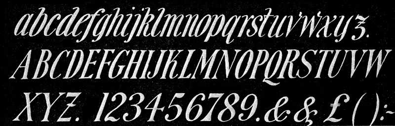
Italienne italic
The Italienne Italic is absolutely fantastic. Could you tell us where it comes from? What was the process behind its design and what were the design decisions to make it work with the other styles?
Italienne Italic was born from a Twitter conversation! At that time, I was drafting an italic for the Display Black style but was not satisfied with the result and ended up discarding the idea. A few weeks later, Paul Barnes, emeritus type designer and British gravestone enthusiast, posted a tweet showing the rarely seen italic Italian swash on a tombstone. It sparked the idea that it could be the style I was looking for to complement my Display Black.
Coincidentally, a few days before, I had seen this kind of lettering on a whisky bottle at a friend’s place and was so intrigued by it that I took a picture of it to remember it later on. Planets were aligning and I dug into my sources again, found a few more instances of that style, and just went for it, candidly. It was good fun to conclude the school project.
After the release, it became pretty popular but I’ve never wanted it to be the signature style of the family. To me, Temeraire Regular is the signature style of the family and Italienne Italic is the goofy sidekick!
This style reproduces the characteristic British lettering from the beginning of the 20th century. Lettering by L. Monk, George Brown Ltd, 1961, image from James Mosley, “English Vernacular”, p. 28.
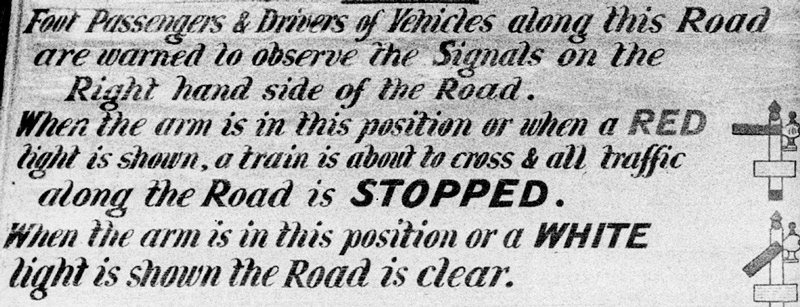
Railway signage that combines different styles. Image from Alan Bartram, “The English Lettering Tradition”, p. 110.
Process
All these ideas, how do you execute them? Do you sketch on paper or directly on screen?
Most of the process of Temeraire happened directly in the software, and it’s still my preferred way of working today. In that sense, the spirit of the first drafts are still there in the final product, even though they have been refined numerous times. Being able to test and experience something that you’re still designing is also invaluable in making it better and better.
How was the process of developing Temeraire from the earlier glyphs to later stages? Was it a linear process or was it iterative?
If you have already seen the Temeraire family, you can probably tell that it was far from linear. The Regular Text style came first and was the one I explored the longest and put the most effort into. I have a folder with 50+ iterations in it. It was all about channelling vernacular influences into a usable and contemporary product.
The Italic and Bold styles started shortly after and allowed me to explore even more creative routes, as none of them is based on the Regular. But they also needed to be channelled to perform well on their own, and alongside the Regular. I was very focussed on the rendering of the text and the gray density on the page. Obviously, that required numerous proofing sessions and detailed adjustments.
The two display styles (Black and Italienne Italic) came later on and were a bit more straightforward as they were conceived in a more playful and relaxed way. But looking back at the project, I now realise that some key features were there from the beginning: concave stems, no drops on the lowercase ‘a’… also the lowercase ‘g’ and ‘t’ in the Black style.
We’ve talked about historical inspiration, so what about Temeraire’s contemporary competition? Was there something you definitely wanted to avoid?
I never thought about competition because I never dared thinking about selling it. The goal was to make a fun project I’d like to use in my graphic design practice. Best case scenario: my designer friends would love to use it too. I think I just wanted to avoid boredom!
characters and ornaments
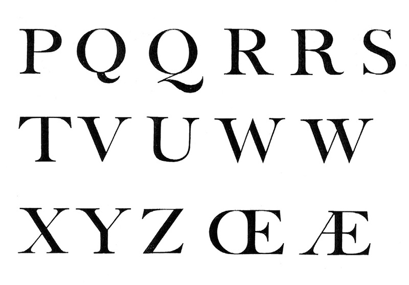
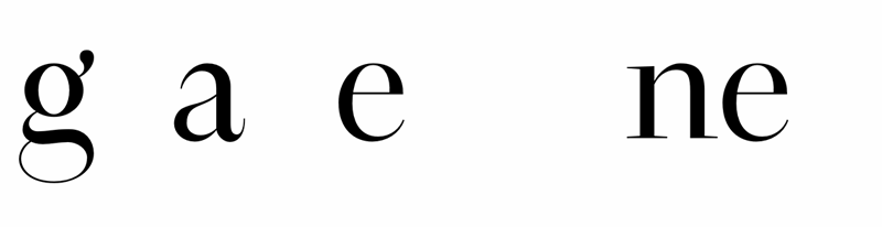
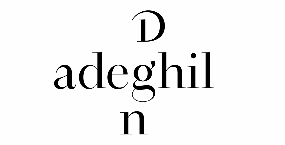
Temeraire is not a shy typeface — neither in concept nor in details. Some characters in Temeraire are definitely there to grab attention: the alternate ‘g’ and double-‘g’ ligature, the dagger in the regular weight, the lowercase ‘g’, and the alternate figures in the Italienne Italic. None of these can go unnoticed! What’s the story behind those characters? Is there any you are particularly proud of?
There are indeed plenty! I could probably tell a story about every single one of them but here are the ones that come to mind:
–I’ve been lucky enough to have been given a first name starting with the funniest letter to design (Thanks, mom!), so I have to praise all the forms of ‘Q’ from Temeraire.
–The various ‘g’ are aimed at my two friends and graphic design mentors Guillaume Grall, aka ‘GG‘, and Frédéric Tacer, who is obsessed with this letter.
–The double-‘g’ ligature was designed that way because I’m always making sure I can write ‘Snoop Doggy Dogg’ with one of my fonts, without the letters clashing.
–Listening to an interview with Matthieu Cannavo made me realise I should design my daggers as sharp pointy weapons!
–The Italic capital ‘S’ is also one of my favorite. I was not happy with my drafts and I firmly remember the small epiphany I had when I realised I could combine a drop ending at the bottom with a serif at the top to achieve a satisfying result.
–The gravestone-shaped .notedf glyph is the font Easter egg!
Temeraire includes a set of ornaments and they, like the rest of the family, have their own idiosyncratic style. Can you explain their origin? How do they relate to the family?
When I started doing fake mock-ups of gravestones to test the typeface in context (yes, I did that), I noticed something was missing. Most of the British gravestones were either featuring a skull, an hourglass, or a heart. Sometimes all of them! Conveniently, I had found some ornaments in an Edmund Fry facsimile specimen. I loved the look of the skull so I started digitising it, continued with the hourglass, and then designed a heart of my own.
Designing ornaments was a light refreshment between two heavier work sessions, so I kept going with them. Even though they are often judged useless nowadays, ornaments were also useful to showcase the typeface and create specimens, which was also part of the school program. It was a win-win situation.
Eventually, when working on the commercial version of Temeraire, they turned out to be too daunting to complete on my own. So I spent a bit of the scholarship prize to hire my friend and fellow schoolmate Pauline Fourest to help me finish them.
Trivia: As Temeraire is named after a famous ship, I started digitising a boat ornament too. But after I realised Maria Doreuli had already done one for her William typeface, I gave up and erased it. If you want the boat ornament, then use the one from William!
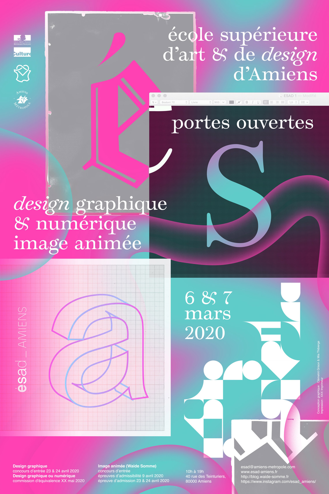
Temeraire in use to promote the open day at ESAD Amiens, 2020. Poster design by Clément Grison and Mia Thibierge.
The Scholarship
Let’s talk about what happened once you finished the course. You began working on the typeface with established type foundry TypeTogether as part of the Gerard Unger Scholarship. How did you handle the change from academic practice to professional production?
I instantly became a full-time type designer straight out of school, and soon enough I became quite busy working on other projects than Temeraire. During the school year I worked daily and exclusively on Temeraire, then suddenly I was only able to dedicate a few hours a week to it. This was quite frustrating to me.
Working with TypeTogether, I also realised the quality gap between my student project and what it takes to make a decent retail font. So on the rare moments when I was able to work dedicatedly on Temeraire, it was mostly about fixing stuff rather than really expanding the character set as it should have been. But it’s part of the process, and I wanted to deliver a top-notch product since it was my first typeface.
I would probably have quit before the finish line and failed without the help of the TypeTogether team. Type design is a collective process and Temeraire is no exception.
Did the mentorship meet your expectations?
Sure, the whole team has been very helpful, and without them Temeraire wouldn’t have seen the light of the day. I couldn’t have done it by myself alone!
And finally, what did you take with you from the making of Temeraire (from a school project to a commercial one under mentoring) that won’t forget?
Turning a student project into a professional commercial release is a hell of a task: first you need to brush off the design part and need to make all the choices and sometimes compromises (I did slightly cheat on that as I left several stylistic sets in the fonts). Then you’re going into the production part, a bit more ungrateful and long, but very rewarding when it’s done. And then start the testing and quality assurance phase, which probably any student never thought about.
After that the fonts are done, but there’s still the specimen and the promotional material to think about and design. All of these require time and various skills, and that’s why I am very thankful to have benefited from the help of several individuals from the TypeTogether team for each and every one of these steps. Actually, the poster is the only thing I eventually designed by myself!
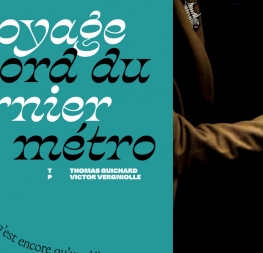
An early version of Temeraire in use at the film festival Le Grand 8. Designed by and courtesy of Julien Lelièvre, 2018.
TypeTogether is an indie type foundry committed to excellence in type design with a focus on editorial use. Additionally, TypeTogether creates custom type design for corporate use. We invite you to browse our library of retail fonts or contact us to discuss custom type design projects.