Sanserata in Life in letters
November 2021
Christopher Burke’s book, Life in letters, dives into Gerard Unger’s professional life, design perspectives, and productivity.
Christopher Burke’s book, Life in letters, dives into Gerard Unger’s professional life, design perspectives, and productivity.
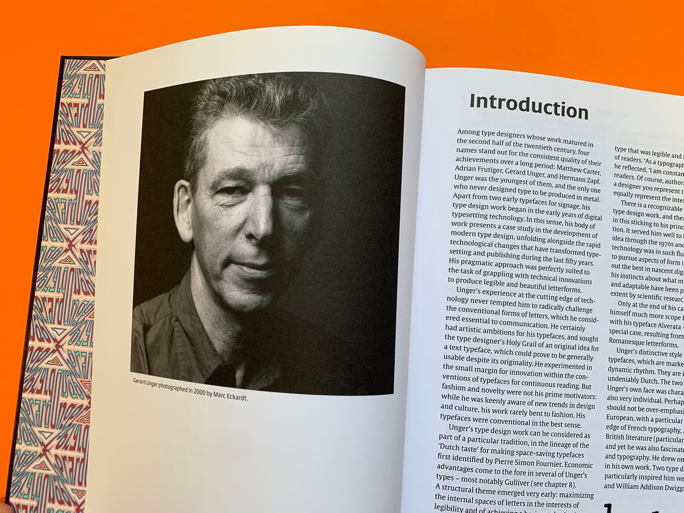
There is something arresting and satisfying about the late Dr Gerard Unger’s typefaces. They are a perpetual lesson to the open-minded learner, an decisive hinge along the modern history of type design itself, and an aesthetic beacon to those looking to meld form and function.
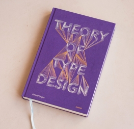
But how did Unger get to be this good, this productive, and this renowned? Those lessons, along with his personal philosophy on design generally and type design specifically, are found in the extensive monograph Life in letters, by English design historian Christopher Burke.
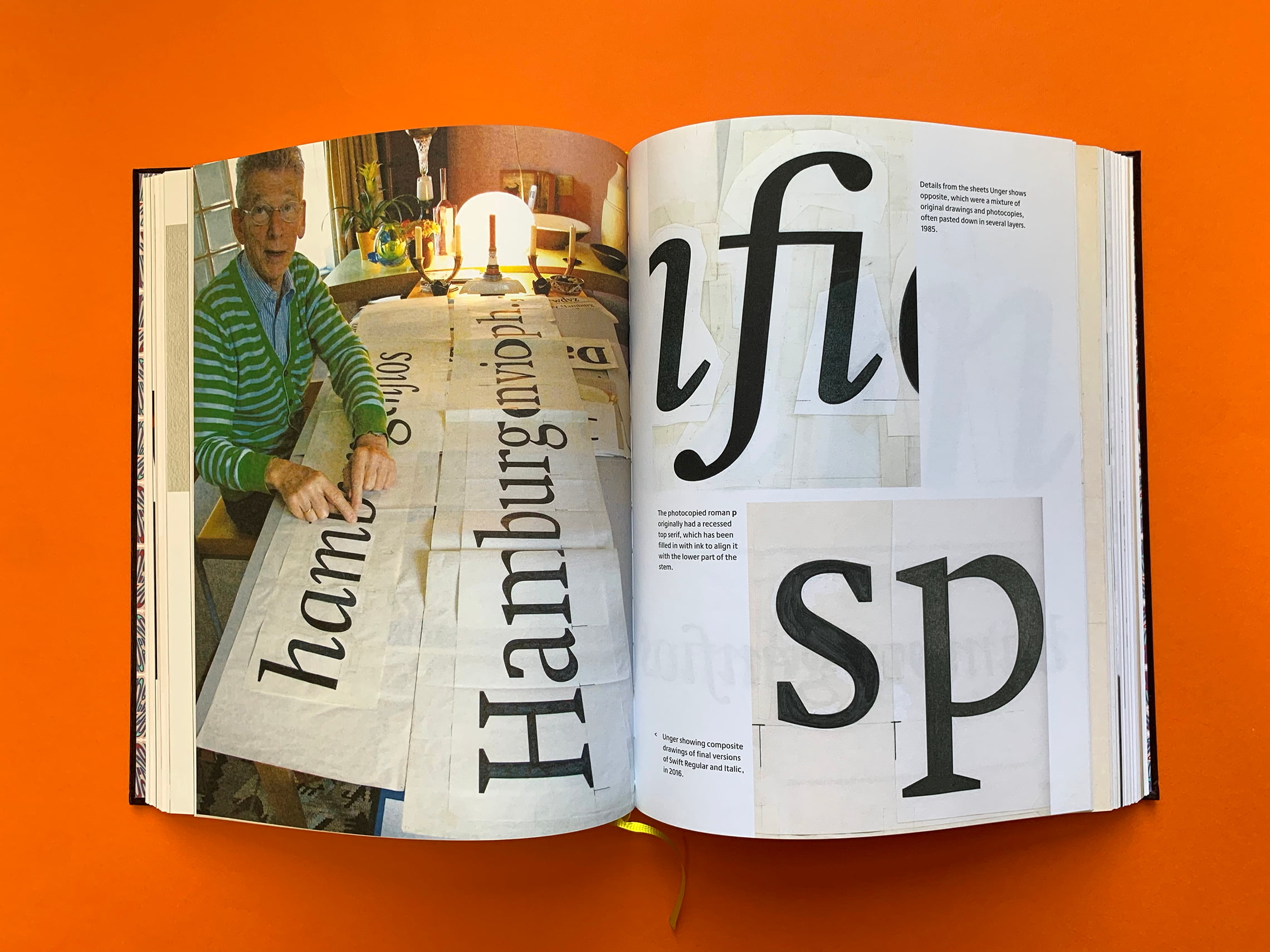
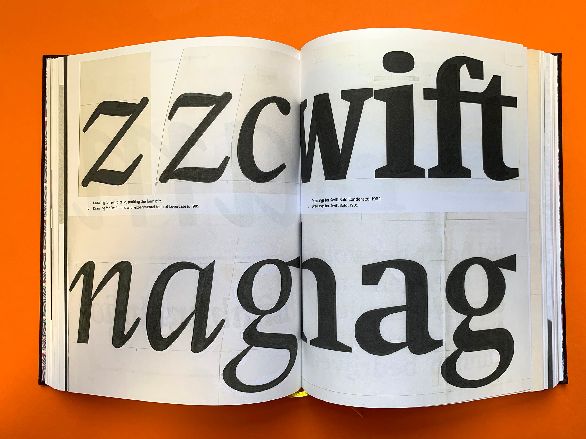
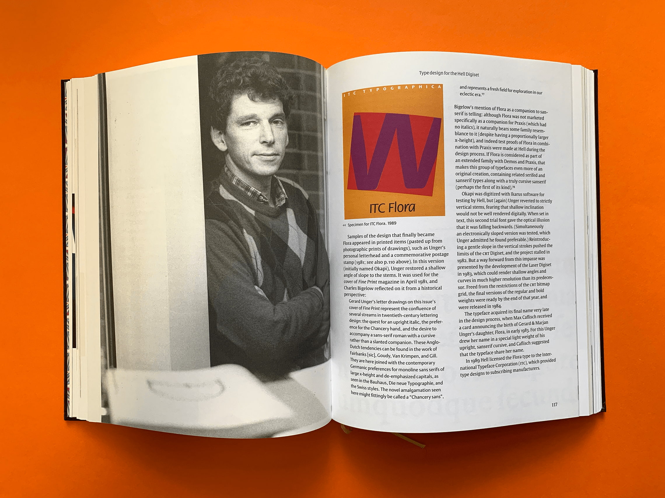
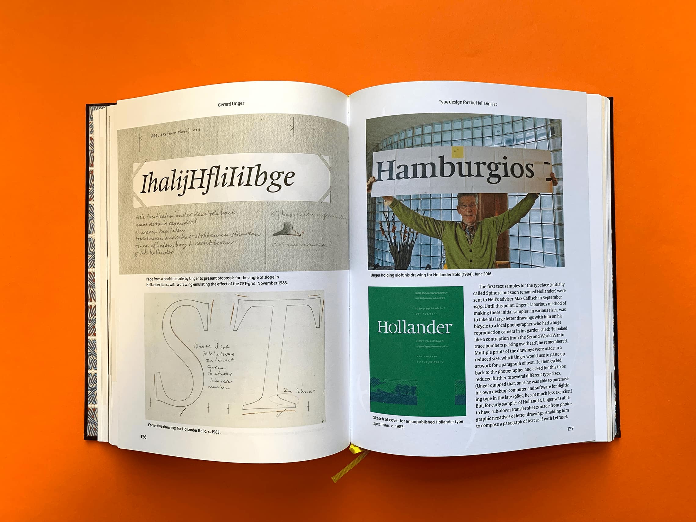
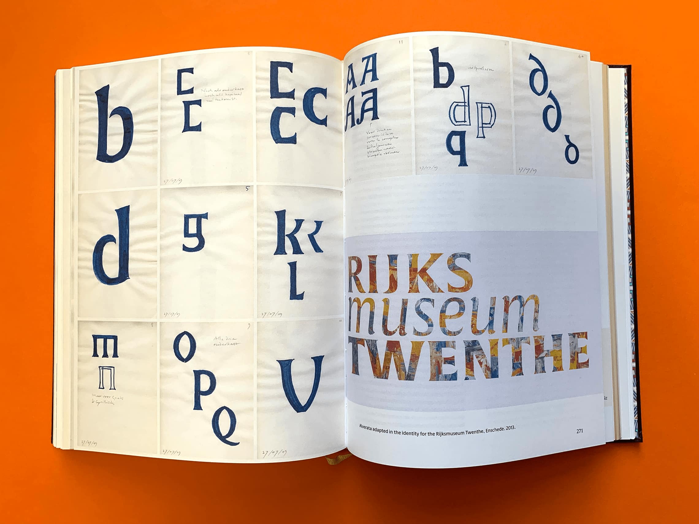
Gerard Unger’s body of work presents a case study in the development of modern type design, unfolding alongside the rapid technological changes that have transformed typesetting and publishing during the last 50 years.
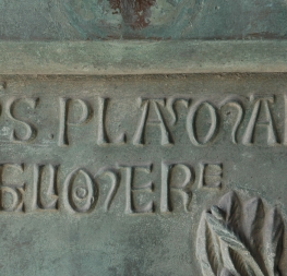
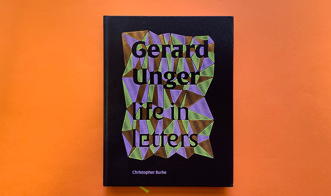
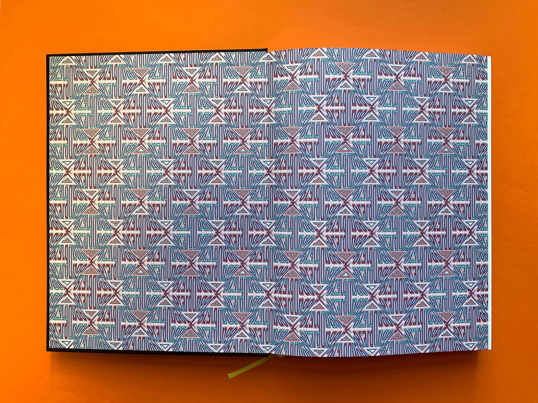
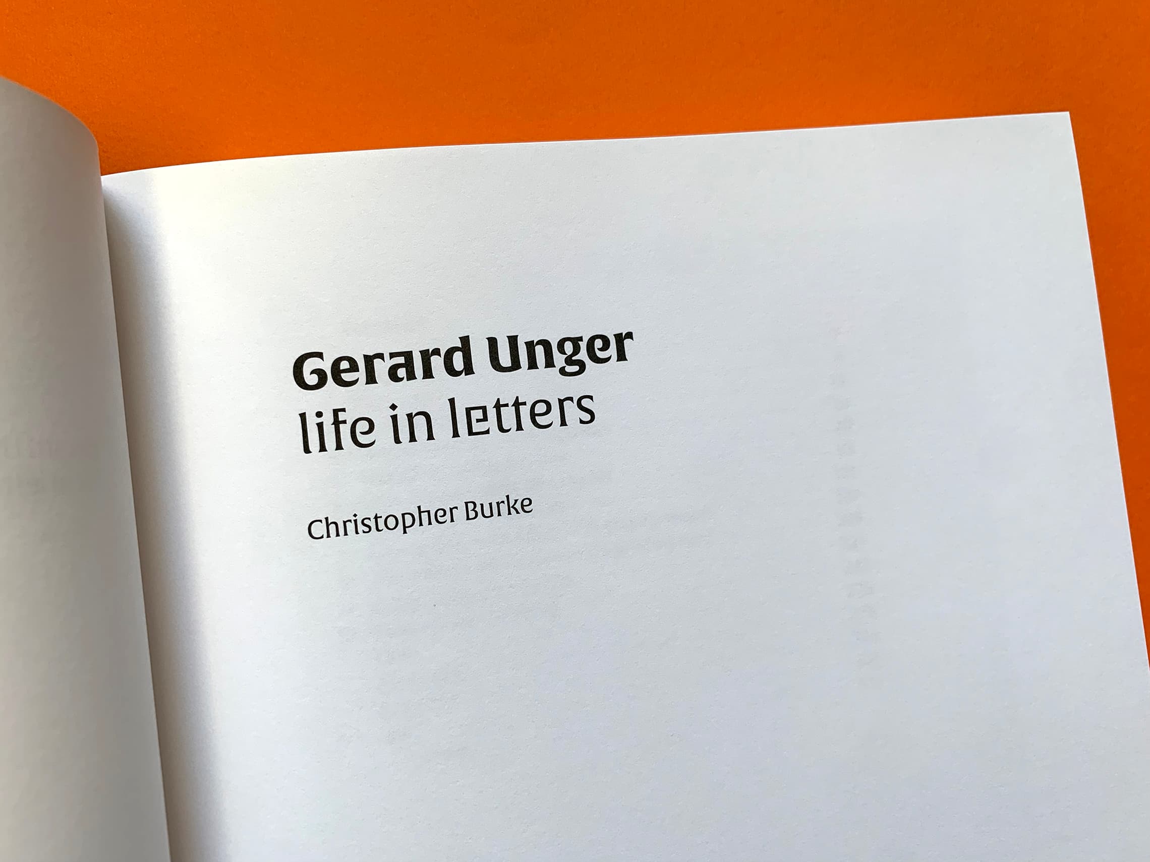
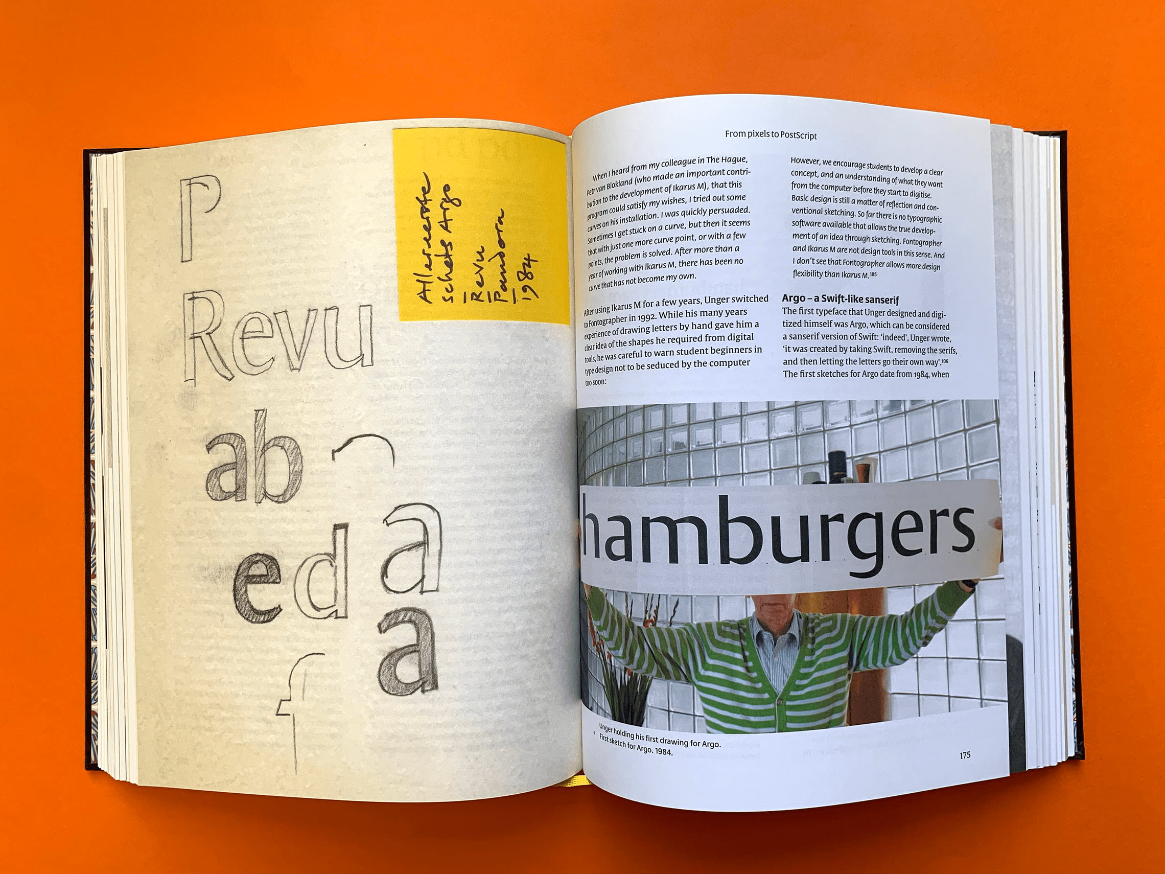
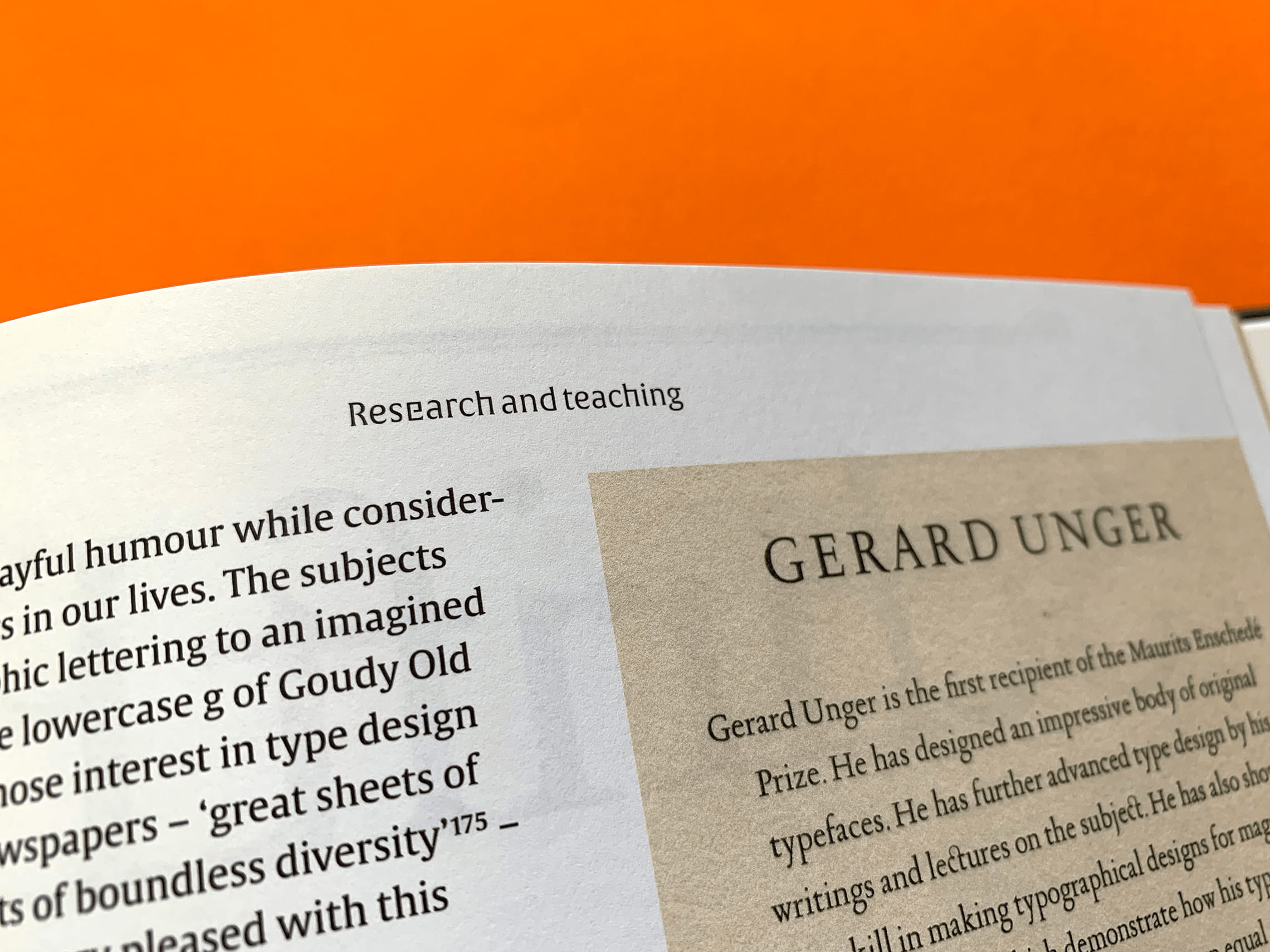
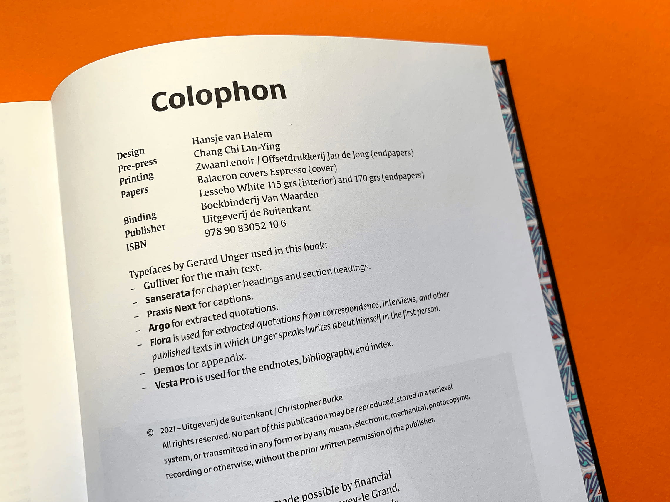
The hardcover book, mostly illustrated with archive material, is designed by Hansje van Halem. It features a three-colour foil print cover over a spun steel-like texture with vertical directionality. As expected, Unger’s own Alverata typeface is featured prominently on the cover, spine, and page headers. Sanserata takes its place in section headings and subheads. Gulliver is the primary text face, and several other of his typefaces play supporting roles.
Do yourself a favor and grab the exquisite monograph to read one designer’s story through the changing technologies, expectations, and incisive lessons on how we communicate.
Published by De Buitenkant
336 pages / illustrated / hardcover
Design: Hansje van Halem
TypeTogether is an indie type foundry committed to excellence in type design with a focus on editorial use. Additionally, TypeTogether creates custom type design for corporate use. We invite you to browse our library of retail fonts or contact us to discuss custom type design projects.