Fino and Fino Sans in use in Vogue Taiwan
April 2021
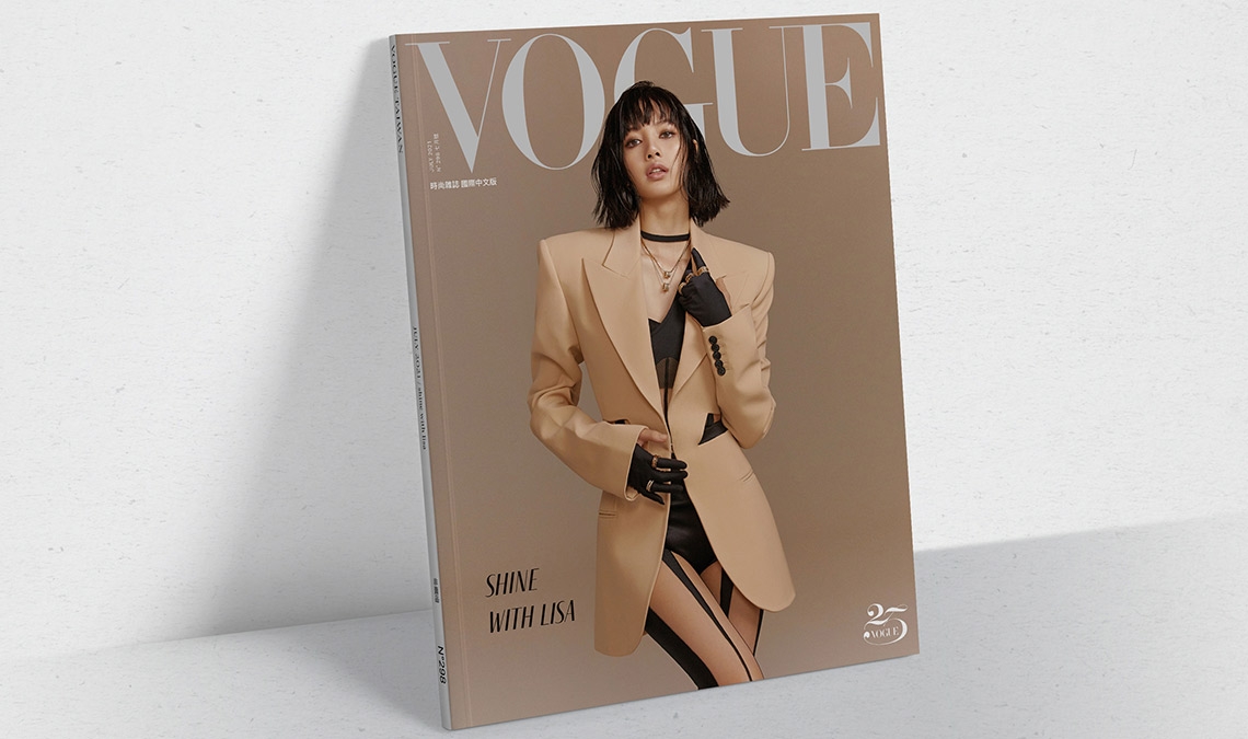
Fino and Fino Sans, the dramatic Didone by Ermin Međedović, have been used on the cover and internal pages of Vogue Taiwan.
Fino and Fino Sans, the dramatic Didone by Ermin Međedović, have been used on the cover and internal pages of Vogue Taiwan.
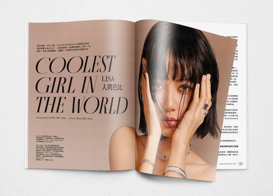
Fino Sans and Fino, the dramatic Didone designed by Ermin Međedović was used by Art & Design Director Jeter Chou in the cover story of the Taiwanese edition of Vogue magazine. Large headlines appear in Fino and smaller calls in Fino Sans, a family naturally born for fashion magazines.
Tall, stately, and refined, with a showy contrast between thick and thin, a certain kind of titling Didone has become synonymous with fashion. Ermin Međedović’s Fino font family amplifies the most theatrical aspects of this genre while bringing an uncommon flexibility of style and variation to any type palette — particularly those required for editorial design.
This stage is set in three acts: Fino, Fino Sans, and Fino Stencil. Each of these offers six weights and italics, and each actor is comfortable speaking any Latin-based language, from standard Hollywood English to Parisian runways and the many accents of Eastern Europe. Finally, every style comes in two optical sizes, with Title having the finest hairlines for the biggest parts.
https://www.type-together.com/fino-font
TypeTogether is an indie type foundry committed to excellence in type design with a focus on editorial use. Additionally, TypeTogether creates custom type design for corporate use. We invite you to browse our library of retail fonts or contact us to discuss custom type design projects.