Design, strategy & type: an interview with Andrea Braccaloni of Leftloft
January 2022
Leftloft studio has created or rebranded the biggest names in the world, from Moleskine journals, Pirelli, Mondadori and Ferrari to renowned museums, book publishers, and the Subito brand. They are global leaders in strategy, design, and everything under that banner. Lucky for us, TypeTogether has a long-running relationship with them and are the exclusive publisher of their unique and modern typefaces.
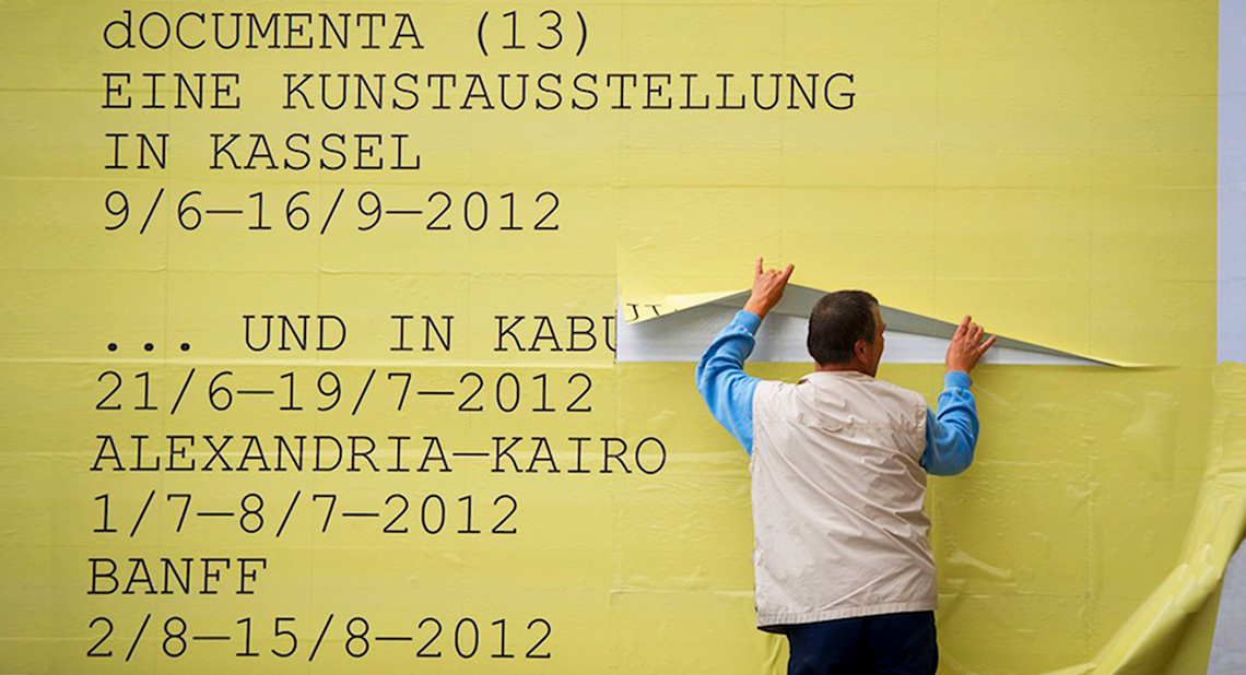
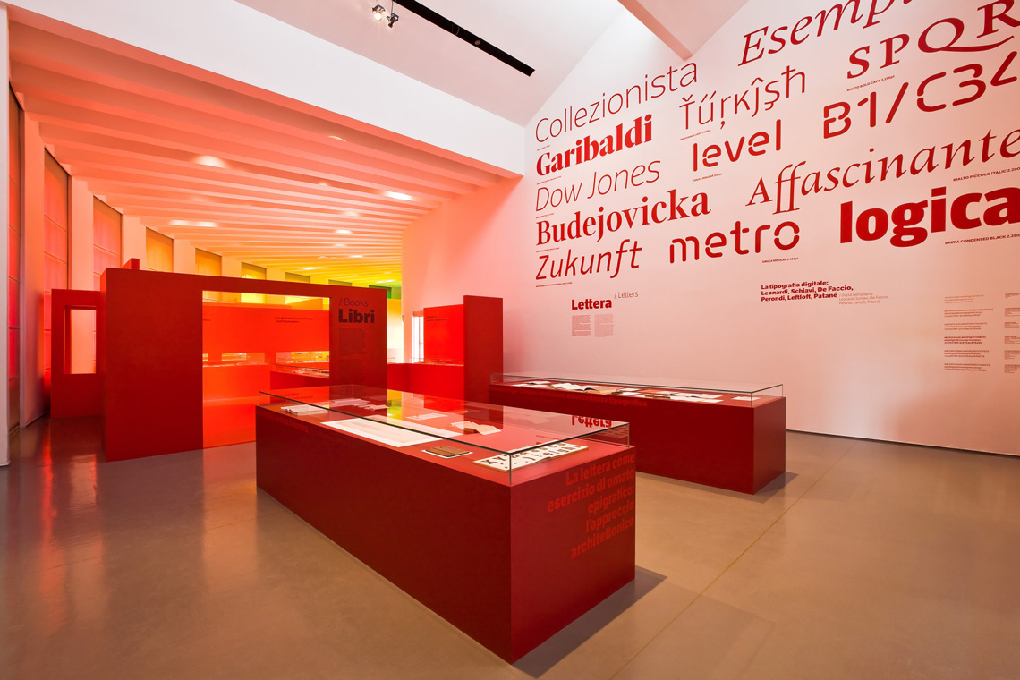
For dOCUMENTA (13) — the largest contemporary art exhibition that takes place every five years in Kassel, Germany — Leftloft “did not build a visual identity, but an analytical grammar,” a flexible grammatical structure designed over a three year period.
Introducing Mr Braccaloni
Andrea Braccaloni studied at the Milan Polytechnic Faculty of Architecture, where he also met his future partners. In 1997, with Francesco Cavalli, Bruno Genovese, and David Pasquali, he founded the Leftloft design and communication agency in which he works as design director, type designer, and expert in communication strategy and analysis. For this interview we discussed his loves of typography, all things design, and creating award-winning strategy for top-tier brands worldwide.
Hello, Andrea! Thank you for taking time out of your busy schedule to talk with us. Let’s start with the basics. You studied architecture at the Milano Politecnico and then ended up being the founder and creative director of one of Milan’s leading graphic design studios, as well as a type designer. Can you walk us through what took you from architecture to graphic design?
Sure. As you mentioned I was studying architecture because my father is an architect and my plan was to join his studio sooner or later. But at the beginning of the second year I met my future studio partners at an Urban Planning class. So my plan was updated and I became very committed to becoming an urban planner, and maybe an academic in the field one day.
Our new friendship was propelled by a lot of new interests and we started taking the same classes. In order to have some space to design the big boards requested by university projects, we ended up renting an old workshop. We were also doing some politics at the time so, to pay the rent, we started designing political posters, brochures, flyers.
We started having more fun designing stuff than pursuing our academic career. So, after a while, I had to update my plans once again and tell my father once and for all that I was not going to be an architect.
And more specifically, what initially attracted you to type design? Did a certain kind of schooling lead you to create fonts?
As most kids, I spent my childhood drawing all the time. Then, as a teenager, I mastered the fine art of VHS label hand lettering (!), and around 16 I started painting graffiti with my best friend. Hip-hop culture definitely drove me toward letters.
When I moved from my hometown Bologna to study in Milano, I quit with graffiti. But as soon as I realised I wanted to be a designer, letters again became a huge interest of mine. Since I didn’t have any formal schooling in the field, it took me a while to figure out how things were supposed to work. I designed Leftloft’s first typographic logo with Autocad because Freehand didn’t seem precise enough to me!
Then, I randomly met Sebastiano Cossia Castiglioni, who at the time was running a studio named Font Lab with his wife Jane Patterson. They’ve been very nice to me. I shamelessly showed them my first typographic efforts and they gave me a copy of Bringhurst’s The Elements of Typographic Style along with a bunch of advice. Among them, the existence of Altsys Fontographer. It was more than enough for me to completely fall in love with type.
An informal meeting during ATypI 2018 in Antwerp with Beatrice D’Agostino (left), Andrea Braccaloni, and José Scaglione.
Die kleine Fonderie: Teach & Help
In the early 2000s the ‘Die kleine Fonderie’ was part of Leftloft. Was it an experimental lab for type design? Can you explain its structure, its focus, and how it worked?
Well, Die kleine Fonderie was born as a sort of deal between a few friends and colleagues and myself: “I’ll teach you what I’ve learned so far in type design and you help me finish my fonts.” It [finishing the fonts] never really happened, but it was fun.
Basically we met in our studio after work and each participant was supposed to design a simple typeface that I would review each time.
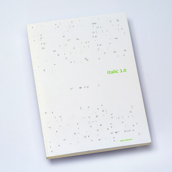
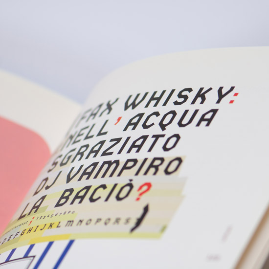
And, don’t tell anyone, but Veronika (Burian) took part in it too and I have proof: the workshop itself was actually named in German to honour Veronika. She came from Germany and it sounded so exotic to us! By the way, some of the typefaces developed by Die Kleine Fonderie have been published in a book named Italic 1.0. Il disegno di caratteri contemporaneo in Italia, edited by Silvia Sfligiotti, Paola Lenarduzzi and Mario Piazza, and was published by Aiap Edizioni in 2002.
Cover and details of the book Italic 1.0 il design di caratteri contemporaneo in Italia, edited by Paola Lenarduzzi, Mario Piazza, and Silvia Sfligiotti, Aiap 2002. It included early versions of Etica and other typefaces developed by Die Kleine Fonderie.
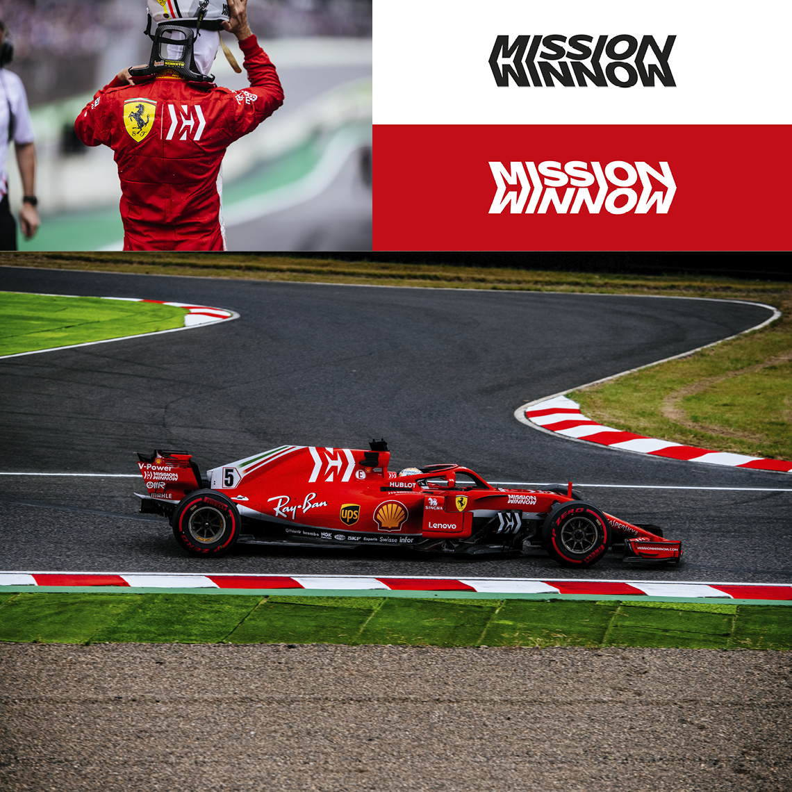
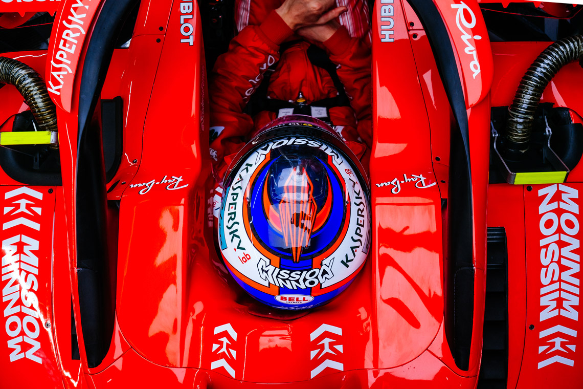
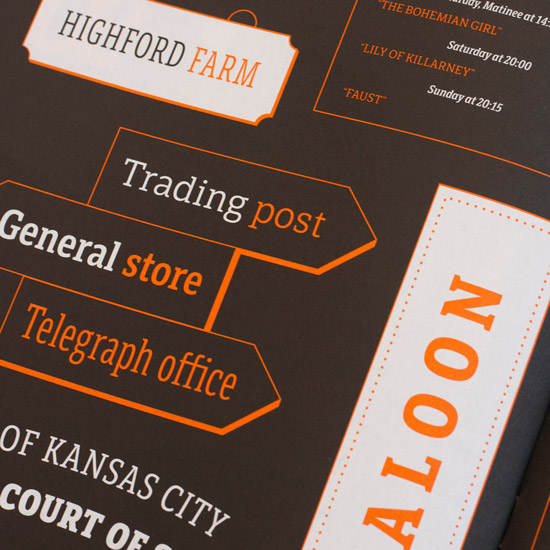
Mission Winnow is a Philip Morris International initiative created with its partner Scuderia Ferrari. Brand identity developed in collaboration with Studio Fabio Novembre. Notice the connections and sharp turns of the letters, along with the negative space creating a dynamic arrow.
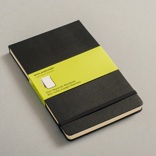
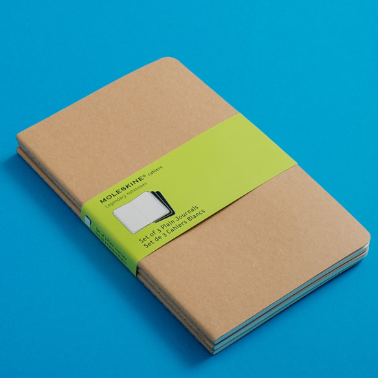
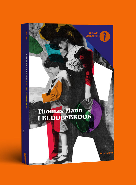
Packaging design for moleskine. The project aimed at making EACH NOTEBOOK easily recognisable among the wide Moleskine range.
A VIBRANT BRIGHT COLOUR PALETTE, WIDER BANDS, AND A SET OF BRAND NEW ICONS HELPs to identify the MOST DESIRABLE NOTEBOOKS.
Type design
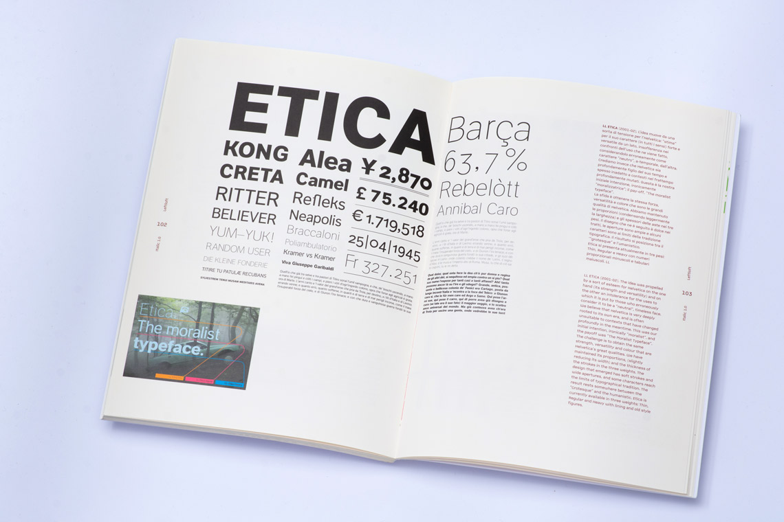
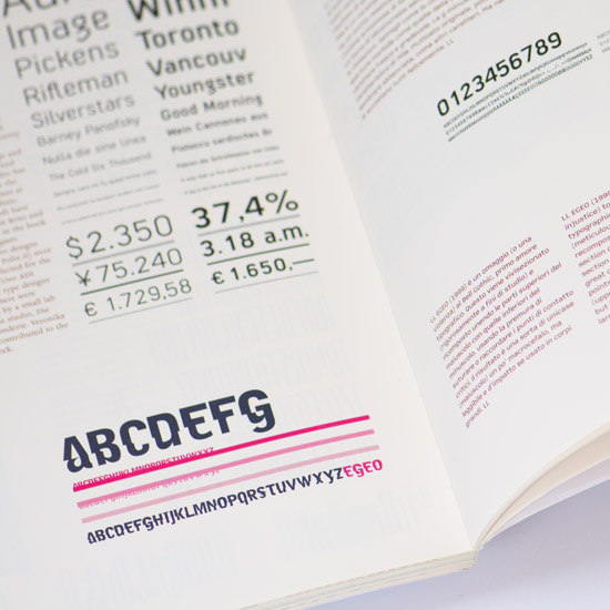
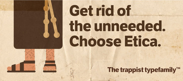
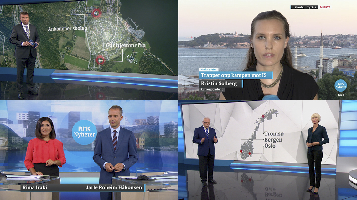
Your LFT Etica family has been expanded over time. It started with Etica, then a serif counterpart cheekily named Etica Sheriff, and most recently a monospace version. What was the process of revisiting the family, and what made it so special and worthwhile? Etica has followed me for too long! I started its design in 1999 and it was eventually produced and sold by TypeTogether at the end of 2009. After that yes, we added quite a few variants. A condensed version, a compressed one, then the Sheriff. The latter was actually a request from Norwegian television company NRK which asked TypeTogether for a seriffed Etica.
The process was okay. I have to say that after Etica started making a little money, I persuaded my studio partners to hire a resident type designer in the studio. So with the decisive help of Octavio Pardo first and Beatrice D’Agostino now, we delivered the new versions I mentioned and Etica Mono recently. Without their help, I’m not sure I would have had the time and the will to work on Etica again.
TDM5: Grafica Italiana was one of the permanent exhibitions hosted at the Milan Triennale Design Museum (2012–2013). Leftloft was responsible for the graphic design both of the exhibition and catalogue, using LFT Etica for the editorial work as well as the exhibition signage.
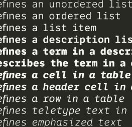
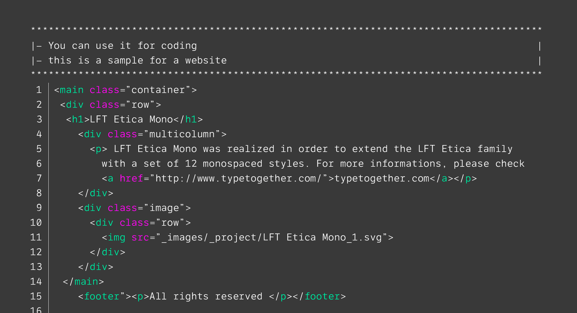
LFT Etica Mono, published in 2019, carries the same modern, recognisable DNA of the Etica family while hewing to the defined requirements of a coding typeface: space, density, distinct forms, and clarity.
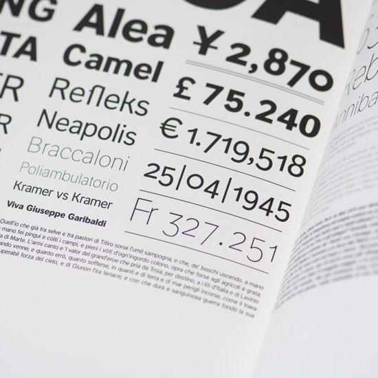
The Norwegian public TV station NRK was already using LFT Etica as part of their branding when they decided to expand the typographic palette by adding condensed versions of Etica and a slab typeface, what eventually would become LFT Etica Sheriff.
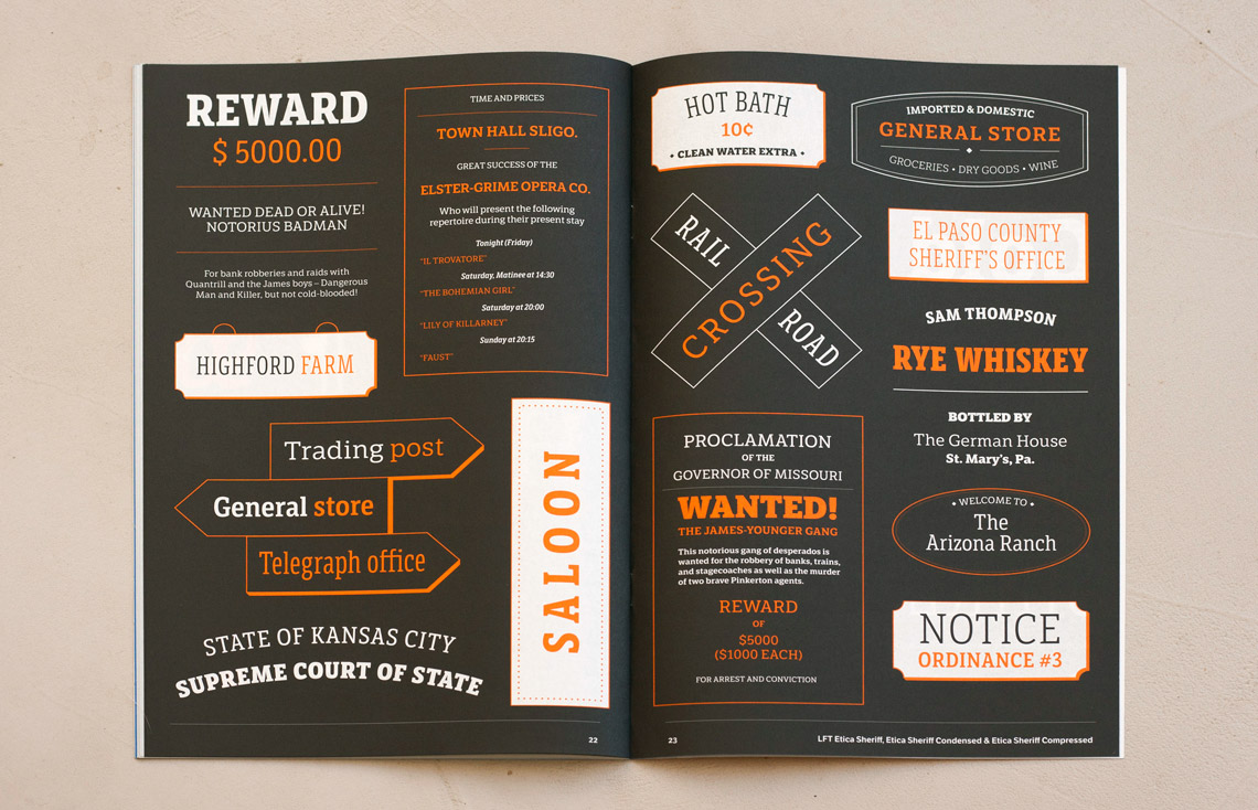
A spread of the Leftloft catalogue showing LFT Etica Sheriff; both the catalogue and typeface designed by Lefloft.
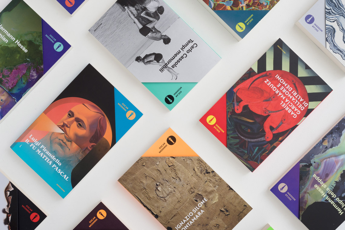
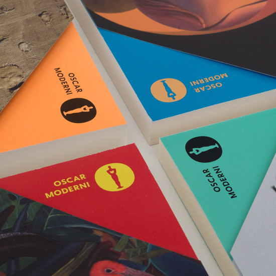
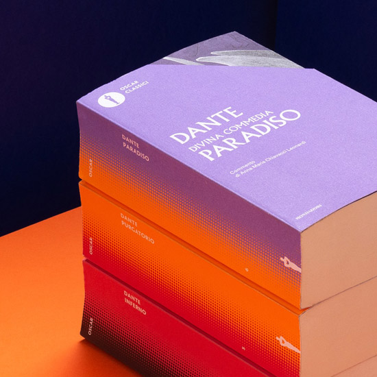
LFT Arnoldo started as a custom typeface for Oscar Mondadori, the paperback collection of Mondadori. It is the most important Italian publisher and one of the largest in all Europe. How do you encapsulate the thousands of titles, authors, and the legacy that defines a company like Mondadori, founded by Arnoldo Mondadori in 1907, in just one typeface?
The rebranding of Oscar Mondadori and the complete redesign of its book series was a huge effort and something we are really proud of. Typography played a major role in the process: first, since we had to provide a format to be used for titles ranging from 1000 BC to present day, we divided time into eras. Each era is represented by a few typefaces to be used for titling. And second, in order to keep everything under the same brand umbrella, we designed LFT Arnoldo for series logos, spines, and recurring elements.
To define its appearance, we wanted it of course to be as timeless as possible. So we gave the typeface classic capitals, Latin proportions, and worked on the outlines to provide an incised tapering on the strokes to recall fundamental, engraved sans serif letters.
Mondadori still uses LFT Arnoldo set in all caps and bold, which was the very first version we designed.
And how did you make LFT Arnoldo mature from a bespoke typeface to a fully commercial one?
As I said, the original version was just one bold, all-caps style. When TypeTogether showed interest in publishing it for retail, we started by adding the lowercase and then a quite versatile range of weights. We are still supposed to work on a display version, but I’m not sure when or if we will ever finish it!
LFT Arnoldo in use on books whose publication spans thousands of years.
Note the physical branding choice of cutting the cover page corner to reveal color, wordmark, and logo.
Spines and covers combine the modern with the classic.
Two covers showing how type and image combine to set the tone.
Different publication eras demand different title type treatments.
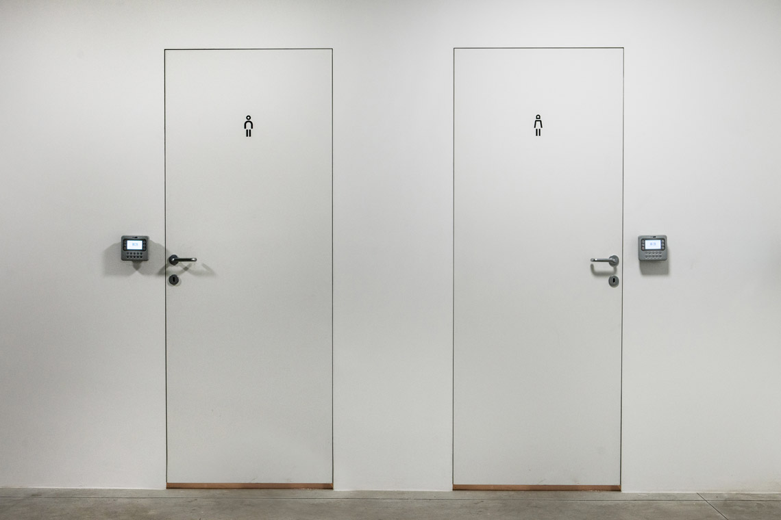
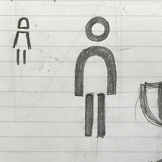
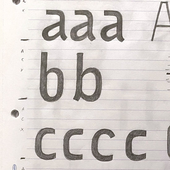
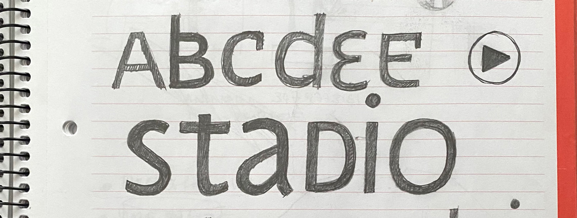
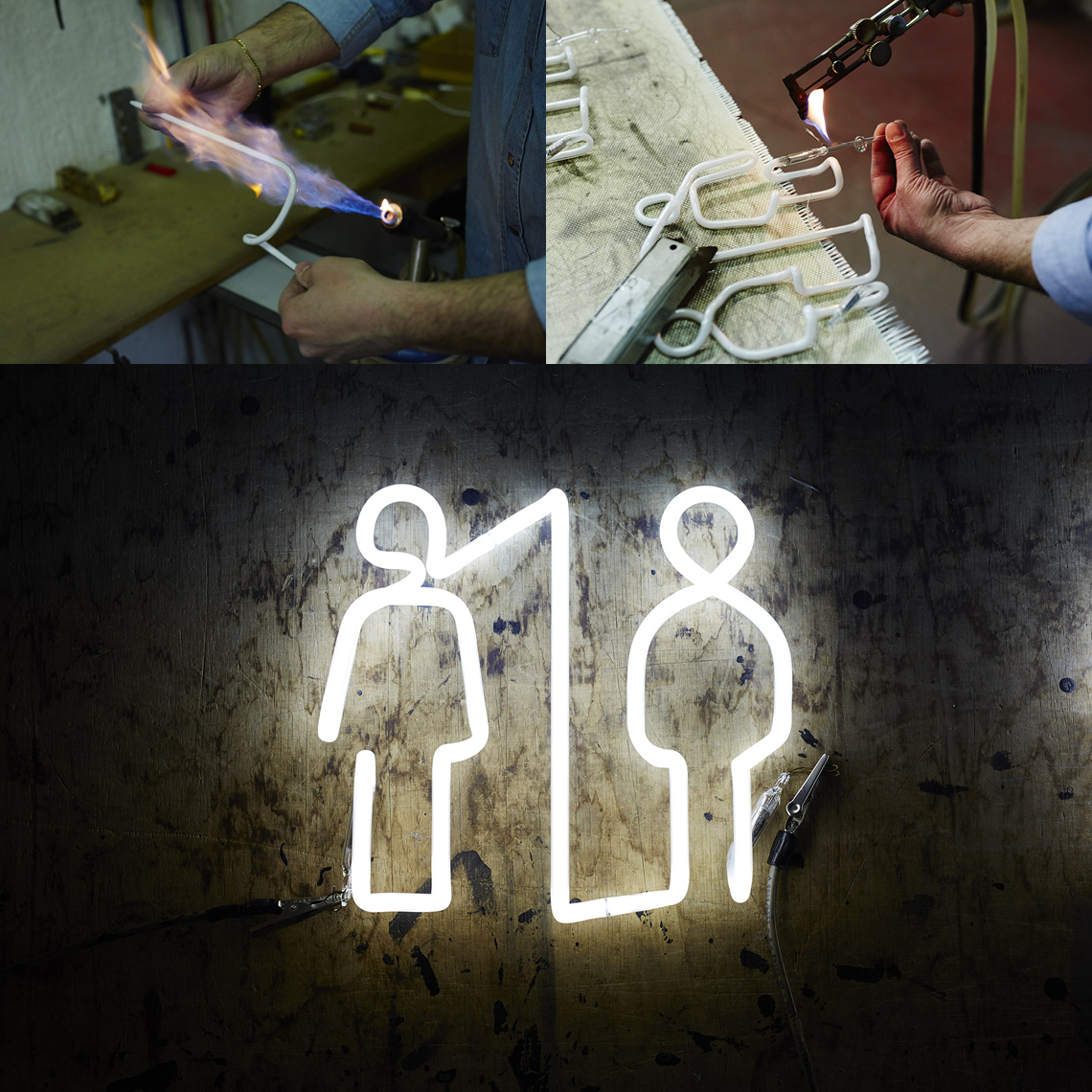
LFT Iro Sans is a completely unique type family. It was born as part of the wayfinding project of San Siro stadium in Milan, home of AC Milan and Internazionale, but it became an enormous family that can be used in almost limitless applications. Take us back to the beginning of the project and tell us how it got started. What was created initially for the stadium and what came after?
The Boeri Studio was asked to work on fixing several architectural issues with the stadium. Part of the problem was the signage system, which was not compliant with Union of European Football Associations (UEFA) rules, making San Siro unfit to host European finals or other prestigious events. Mario Piazza’s studio and Leftloft were hired to redesign the signage system, to create a brand for San Siro, and to design its merchandising. LFT Iro Sans was the typeface we designed for that purpose.
When did you decide it could, and should, become a large family available to others?
Unfortunately, after we delivered the final design for hundreds of signs, the project was put on hold… then it remained on hold… and then it stopped completely. So we proposed that TypeTogether make it a retail typeface to take advantage of the work already done.
The actual delivery was not effortless because we added a bunch of styles and features not present in the original designs, like a very wide range of pictograms in two weights. But I think we finally came out with an extremely flexible tool to help people understand and move within public spaces. And it is also a powerful solution for branding and editorial issues.
Unicase typefaces are not a new genre, but they are definitely rare these days. Where did the idea come from and how did Iro Sans develop into having unicase styles?
We were asked to work also on the brand and the merchandising of the stadium. The unicase was the counterpart of the signage typeface and it was meant for that purpose.
The Fondazione Giangiacomo Feltrinelli, a Milan-based centre for research and documentation in the fields of politics, economics and social sciences, moved to their new headquarters in 2016. The overall wayfinding project was developed by the architectural agency Herzog & de Meuron. Leftloft were also responsible for creating the building’s signage. For this they used icons from LFT Iro Sans.
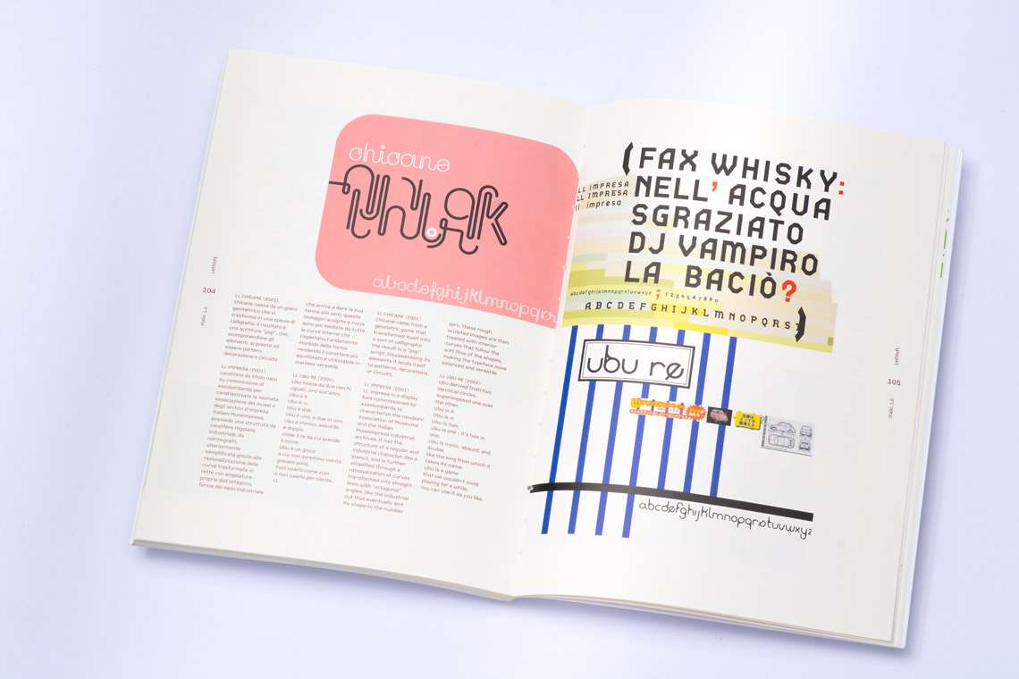
Apart from the typefaces you have released with TypeTogether, you have designed other typefaces for particular jobs (Brera and Solferino for Corriere della Sera, LFT Zeno for Comlar, LFT Flea for Subito, LFT Combo for Combo…). What makes you decide to create a custom typeface for a particular project instead of choosing something already available?
This is one of our studio’s defining characteristics: we have a very strong typographic approach, for branding projects in particular. We firmly believe in the power of type when it comes to provide personality to brands, so we usually suggest our clients take this path. And, in the end, you rarely have the perfect typeface for every project. So when the brand calls for something more capable and current, we design it.
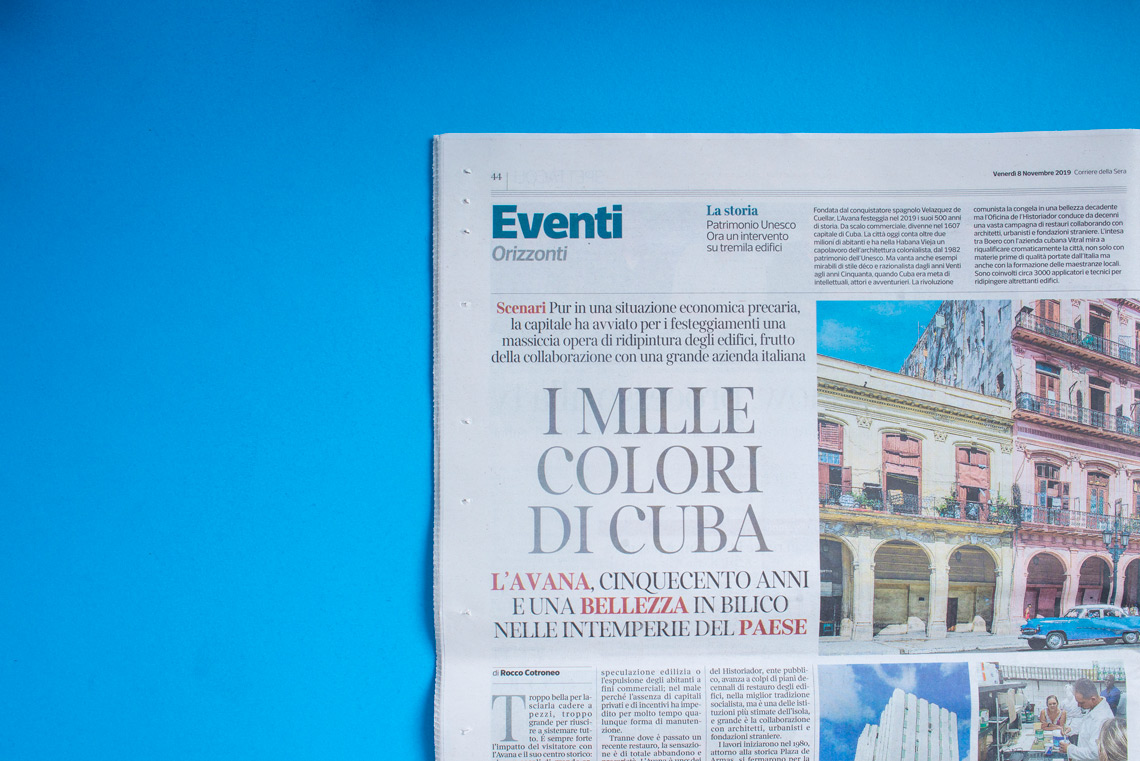
A collection of Leftloft typefaces in newspaper use.
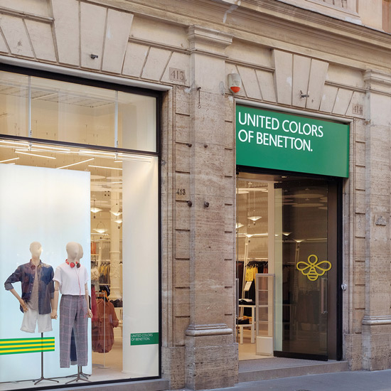
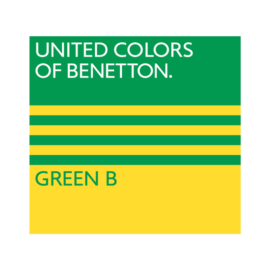
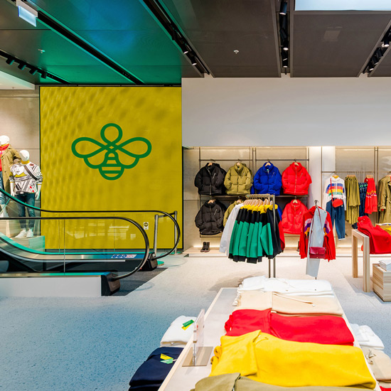
Leftloft created Green B, a specific brand for United Colors of Benetton, highlighting their environmental commitments.
It is difficult to avoid the current state of the world in our conversation. So how has the Covid-19 pandemic changed your studio business model (and life)?
Well, this is difficult to answer without expressing what probably most of us already know. Long story short, it changed the way we relate to clients, amongst ourselves, to the studio as a physical space, and to our homes, of course. There is no border now between work and life. There’s much less “divertimento”, which is “fun” in Italian. It comes from Latin of course, and it roughly means to deviate from the usual road, to depart from duty and have a diversion, somehow. I’m really missing that.
What is Leftloft working on right now?
Lots of projects, luckily! We just finished helping Benetton to convey their sustainability efforts with a new little brand. We are currently working with Ferrari, designing catalogues and exhibitions for Pirelli HangarBicocca in Milan and Castello di Rivoli in Turin, which are both contemporary art venues. We are also working on several branding projects I can’t mention yet and, most of all, we are very busy with a typographic project for a huge brand. I really hope it will reach the end sooner or later and we’ll be able to share the experience… It’s gratifying work but we are really, really exhausted.
And last question for the football fans out there: Inter or Milan? Bologna FC 1909! But my studio partners would probably disagree!
TypeTogether is an indie type foundry committed to excellence in type design with a focus on editorial use. Additionally, TypeTogether creates custom type design for corporate use. We invite you to browse our library of retail fonts or contact us to discuss custom type design projects.
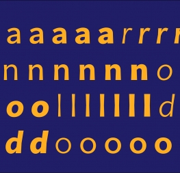
 LFT Iro Sans styles, including icons.