The Making of Adelle Mono & Mono Flex

July 2020

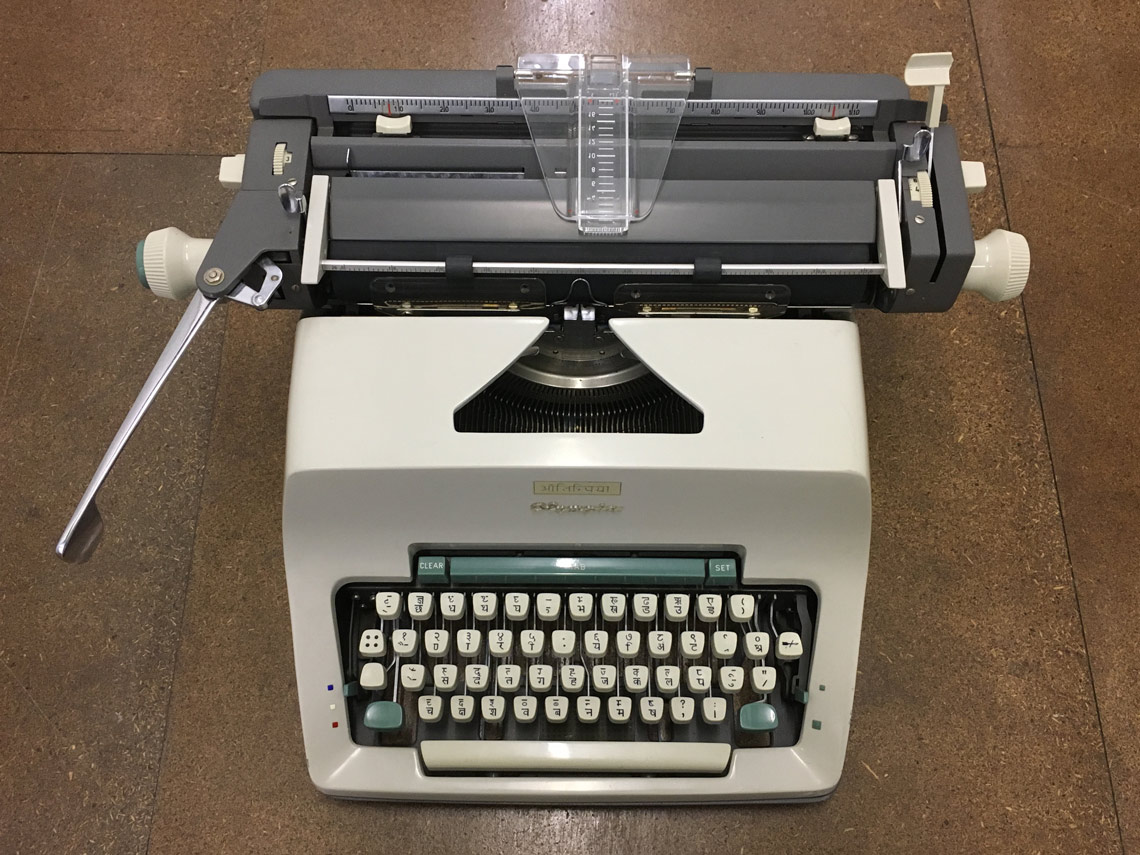
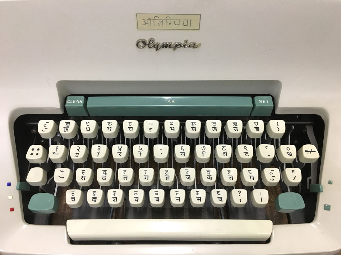
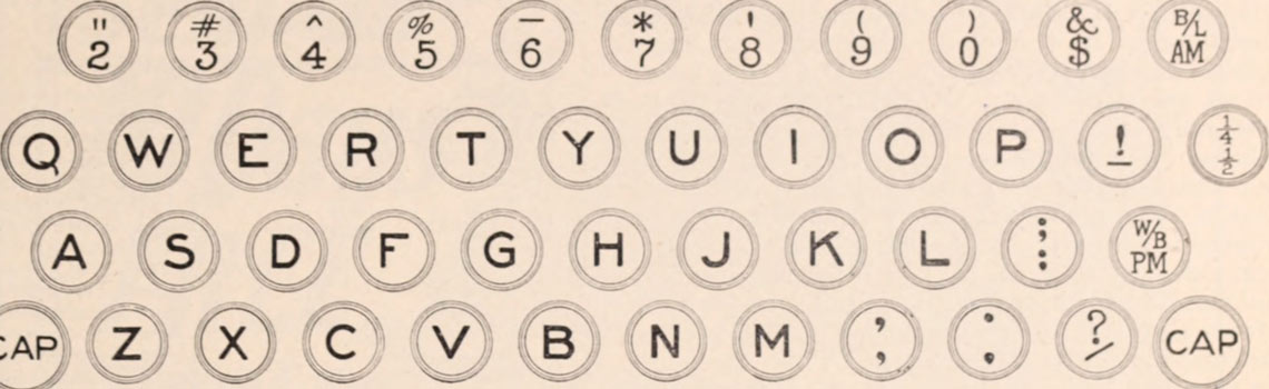
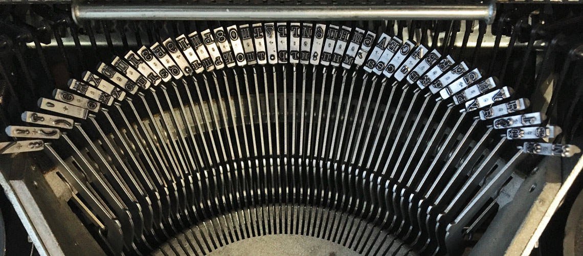
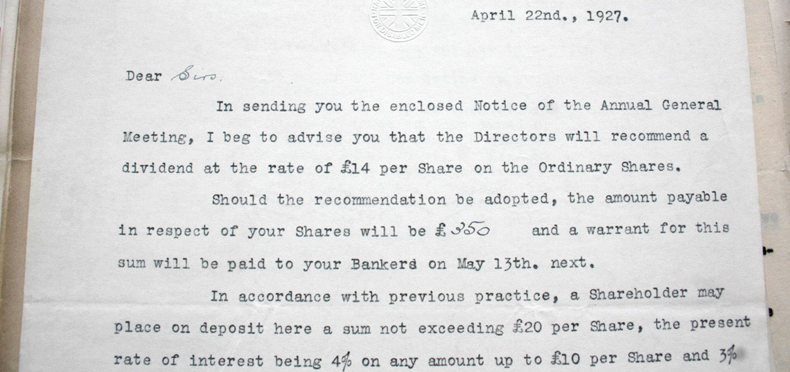
Adelle Mono and Adelle Mono Flex find their origins in Veronika Burian’s keen observations about graphic design. First, that monospaced typefaces are used for their aesthetic qualities and in a range of applications that do not have the same limitations that birthed them; second, her type-designerly instinct to provide a better solution for that need. Pooja Saxena writes about this unique type family’s development.

Both images: Olympia SG3 typewriter with Devanagari script. Image courtesy of Contextual Alternate.

by Pooja Saxena

Monospaced typefaces are relics of the age of mechanical typewriters. [To discover more about the typewriter’s history, take a look at Dr Vaibhav Singh’s online tour of his vintage typewriter collection, exploring text and technology]. With a mechanical typewriter, when any key was pressed by the typist the carriage moved the paper the same, fixed distance. This meant that every character had to take up an equal width. While this was useful for the typist when they wanted to make tables or go back and make corrections, it also led to letters which should have different widths — the lowercase ‘m’ and ‘i’ for instance — being forced into the same horizontal space. These restrictions of mechanical typewriters created distinctive visual characteristics in monospaced typefaces.


Notice the almost square ‘E’, wide ‘Y’ and ‘J’, and condensed fractions (second row, right side). The capital letters are clearly sans serifs but the figures are serifs. Image: page 226 of Baltimore and Ohio employees magazine (1912), from University of Maryland, College Park.


Clearly seen here: all the glyphs occupy the same amount of space. In this case the script is Cyrillic, but the technical constraints are the same. Image: Olivetti Lettera 22 typewriter with Cyrillic script, courtesy of Contextual Alternate.


What makes monospaced typefaces unique
Monospaced typefaces live in a hybrid land, neither completely serif nor sans serif, with serifs being added or subtracted to meet the single-minded goal of fitting each letter in a fixed width. Wide characters, like the lower- and uppercase ‘M, W’, are routinely compressed horizontally and made serif-less. Narrow letters like the lowercase ‘i’ and ‘l’ tend to have wide bottom serifs that fill up the empty space around the letter.

Monospaced typefaces don’t enjoy typographic subtleties like kerning either. Kerning, which fine-tunes the spacing between two characters in a proportional typeface, is foreign to monospaced typefaces. The result often is a somewhat awkward but very recognisable texture. Add to this the ingenious solutions that designers create to accommodate wide characters like the at sign @, per cent %, per thousand ‰, and fractions, and what we have is a style of typefaces with a rather unique visual DNA.


Since all characters in monospace fonts occupy the same space, signs such as per cent and per mille require ingenious solutions and sensible compromises. Top left: LFT Etica; bottom left: LFT Etica Mono. Top right: Adelle Sans; bottom right: Adelle Mono.


This monospace DNA doesn’t mean much by itself, but the design community and the general public perceive strong, innate connections between the quirks of monospaced typefaces and the contexts in which they are used. This bestows upon them personality and qualities beyond mere function. We feel what we read.


Letter from 1927 produced on a typewriter. Notice the white space to add the quantity by hand, and the percentage signs in the bottom line.


Where monospace typefaces are used

The most obvious of these connections is between contemporary monospaced typefaces and the heyday of the mechanical typewriter. It reminds us of physical letters typed on typewriters and the analogue charm of typewriter art, made as much by the machine as it was by the resourcefulness and creativity of artists who worked with tools much less sophisticated than ours today.

Text in monospace typefaces still conjures the image of a manuscript in progress in stark contrast to professionally typeset, published work. Even those of us who have never touched a typewriter have inherited a fondness and nostalgia for this technology and its curious visual inheritance.

Monospaced typefaces have also come to signify their polar opposite — computing and the future, by way of developers and programmers who use them in their code editors and development environments. Many developers swear by them because of their exaggerated character designs which are easier to read in a non-text setting. Since development environments are typographically limiting, they depend heavily on indentations and spacing to make the code easier to read. In such a context, fixed-width typefaces help developers parse code faster and understand its structure. Expectedly, use of monospace typefaces extends beyond this functional necessity into graphic design that attempts to capture the spirit of computing.


Introducing Adelle Mono & Adelle Mono Flex
Adelle Mono Flex was developed specifically for use in situations where the aesthetic quality of monospaced typefaces is desired to evoke a feeling or personality, but where the severe limitations of typewriters (or even code editors) don’t exist. In other words, in text and design situations where reading is important, but the piece still needs the monospaced feeling.


The Adelle Mono family has five fixed widths for characters instead of one. This allowed us to more carefully adjust each character to fit within the width that was most suitable for it. Obviously, five widths is far less than the innumerable, perfectly-calibrated character widths of proportional typefaces, and herein lies the brilliance of this design. By giving ourselves just enough room to manoeuvre, we were able to retain the awkward charm of monospaced typefaces, but improve readability by creating a more even cadence to the black of letters and the white space between them.

Adelle Mono and Mono Flex preserves not only the delightful oddities of monospaced typefaces, but also some of its functional qualities, such as consistent character widths across weights and styles, making it the perfect choice for graphic design.


On the left is Adelle Mono Flex and on the right is Adelle Mono. The difference in style means that the left column is more readable. Mono Flex has proportional spacing and design; it is designed to feel like a monospace, even though it is not. Adelle Mono is a true monospace font: spacing and proportions are constrained for the sake of function.


As is the case with many typeface design projects, Adelle Mono and Adelle Mono Flex have been years in the making. In the meantime the introduction of variable fonts equipped us to design not just a faux monospace, but also a true one. The variable font file gives users the ability to smoothly transition between the two (from Mono Flex to Mono) and choose the exact character width that suits the project at hand. Along with this flexibility in character width, both typefaces are also variable along the weight axis from light to extrabold.


From Mono to Mono Flex and back again, the variable font format allows infinite control along both the style spectrum and along the weight spectrum. But the file size can be as small as 10% what the original was — a major win for developers and users alike!


Adelle Mono
and Adelle Mono Flex are available from TypeTogether with a special introductory discount of 60% till July 20.


About Us

TypeTogether is an indie type foundry committed to excellence in type design with a focus on editorial use. Additionally, TypeTogether creates custom type design for corporate use. We invite you to browse our library of retail fonts or contact us to discuss custom type design projects.