Ötztal tourist board
February 2020
The famous holiday destination, the Ötztal valley in the Austrian Alps, completed an extensive brand overhaul, including a customised version of our serif and sans Adelle font family.
The famous holiday destination, the Ötztal valley in the Austrian Alps, completed an extensive brand overhaul, including a customised version of our serif and sans Adelle font family.
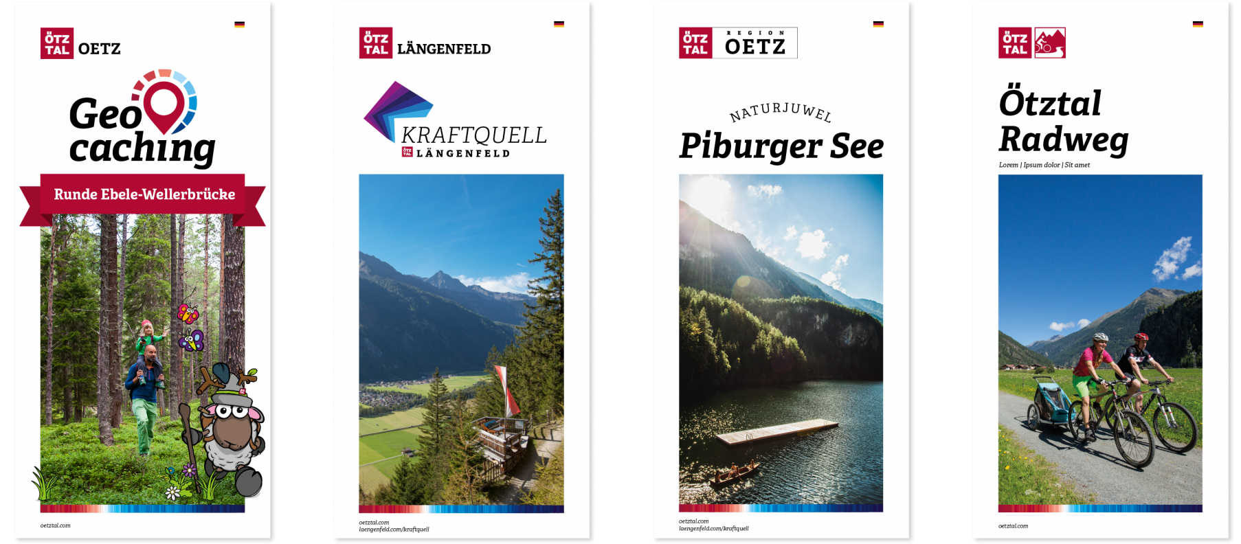
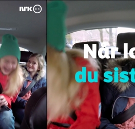
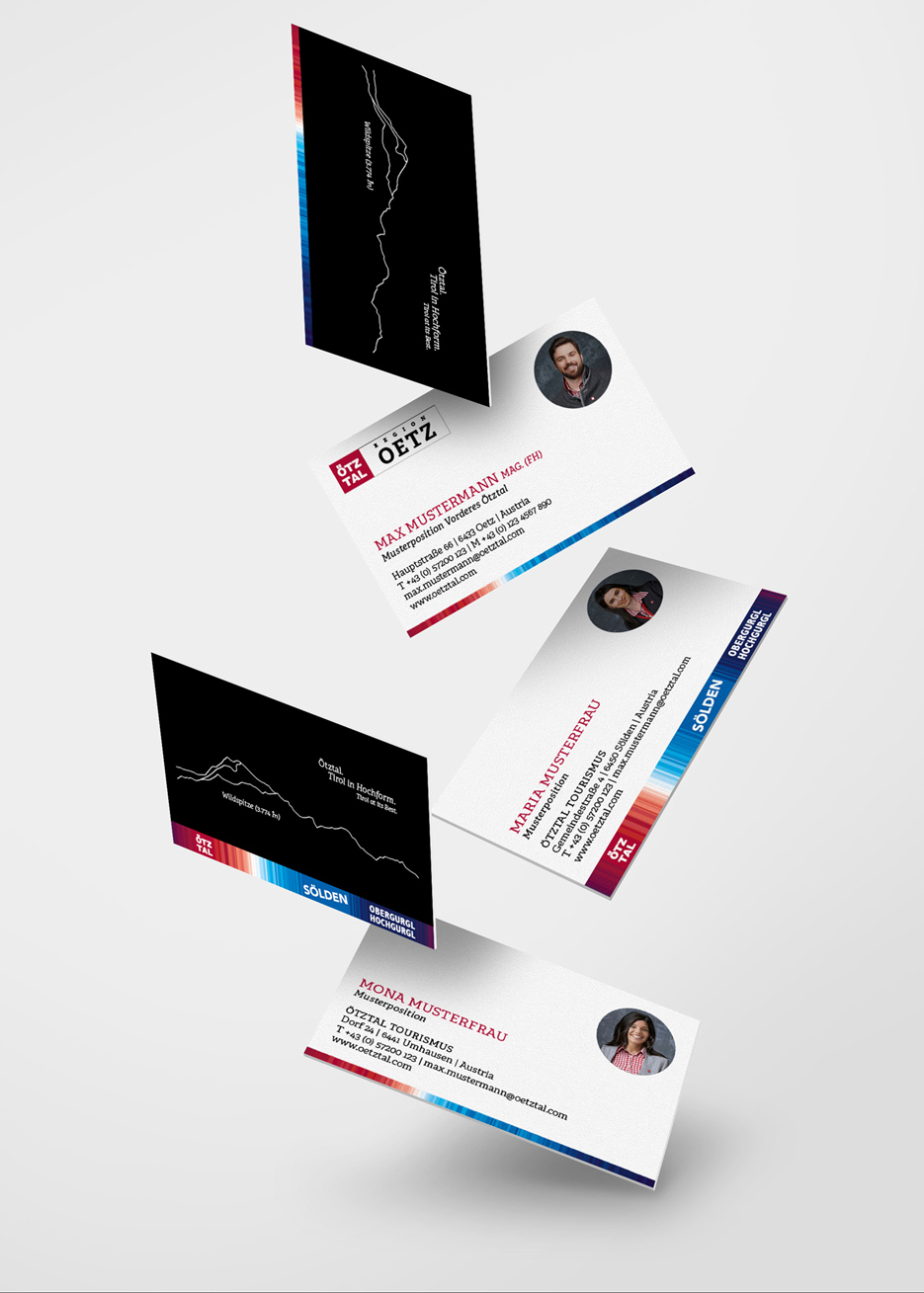
Some mock-ups of the tourist catalogues (image by NORDEN).
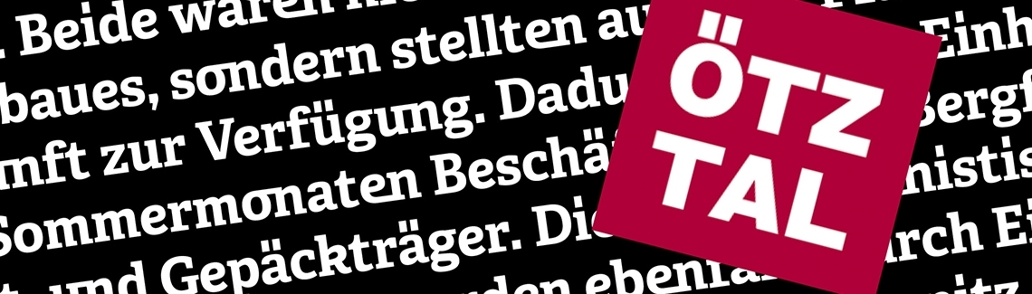
Austrian brand agency NORDEN from picturesque Innsbruck commissioned TypeTogether to create a special version of the Adelle and Adelle Sans font families for the tourist board of Ötztal, Sölden, and Gurgl. The project won NORDEN the prestigious 2020 German Design Award.
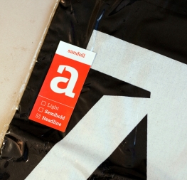
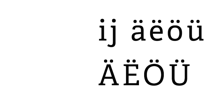
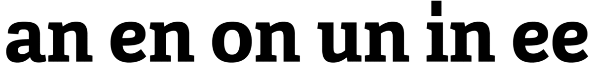
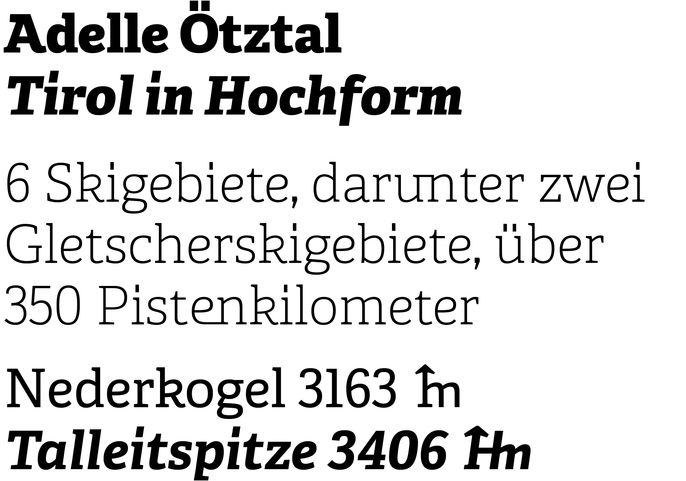
One of the tasks was to modify Adelle’s punctuation marks and the ‘Umlaut’ (dieresis) to fit the elongated square design of the existing Ötztal logotype and to emphasise the importance of the letter »ö« in the local dialect. At first it might seem simple enough to change the circular diacritics to squares, but once such a characteristic detail is changed, the entire design has to be modified to remain consistent. The resulting family contains around 40 modified glyphs per style.
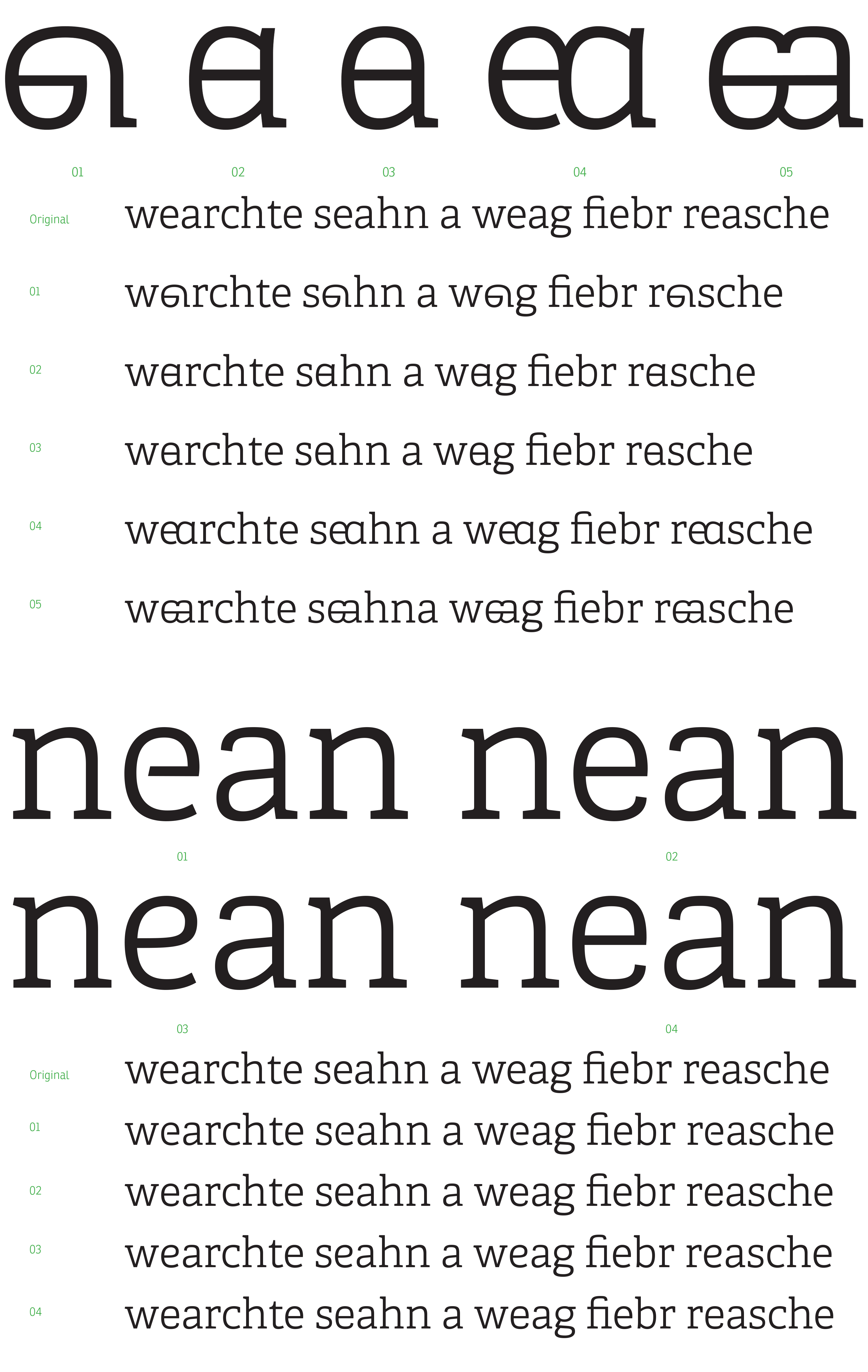
The second assignment was to create special letters that would reflect the unique dialect of the Ötztal valley. NORDEN asked us to explore and propose ideas to create special ligatures and alternate letters representing common sounds in the dialect (in German, «Mundart»). With these idiosyncrasies, the customised typeface became a strong element of identification within the branding system and is being used for all communication materials. The extra glyphs are primarily employed in advertising to increase brand recognisability.
In 2010 the Ötztal dialect was declared a UNESCO World Cultural Heritage. Locals are proud users (about 15,000 active) and foster this particular way of speaking, which goes back in untampered tradition for over 900 years.
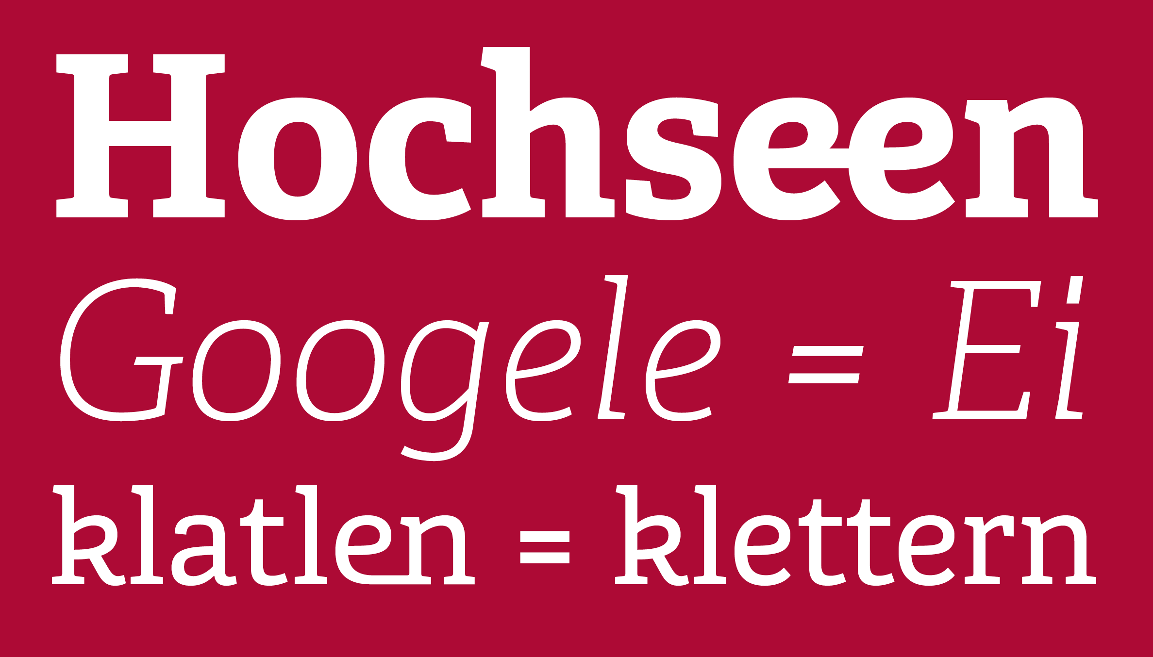
Special ligatures accessible via the OpenType feature «discretionary ligatures».
The process of developing alternate letters took us from some rather experimental shapes to something less radical and therefore more adaptable within text. Below are some of the wilder options we developed, but in the end it was decided to modify six frequently occurring letters in the local language. Such alterations are sufficient to make a unique typeface and become a key brand identifier.
Given the valley’s geography and alpine environment, height indications appear quite frequently in Ötztal’s communication. Therefore another typographic feature was added to symbolise this, »Meter« and »Höhenmeter«. The two special glyphs were integrated into the fonts and are accessible via the OpenType contextual alternates feature.
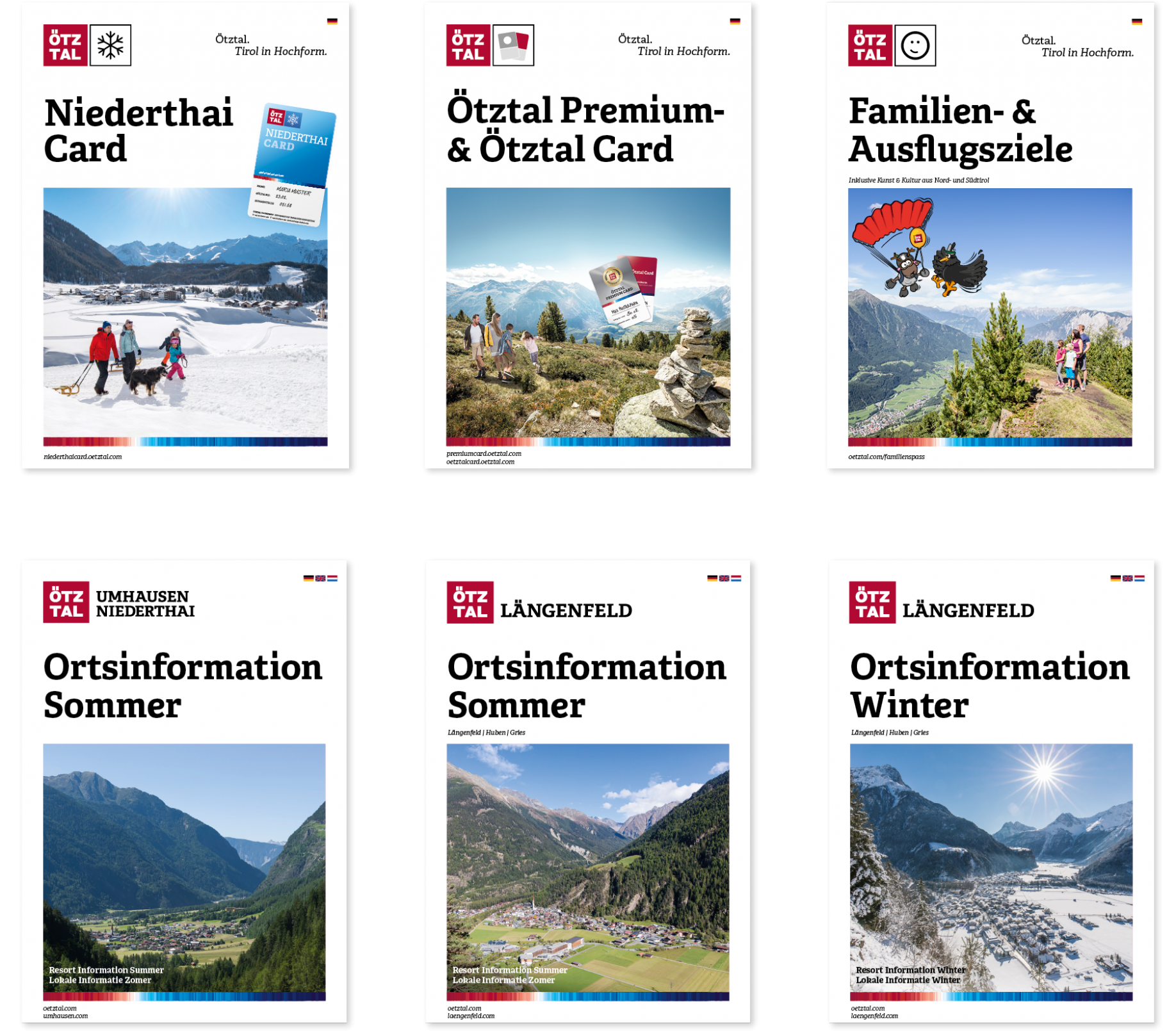
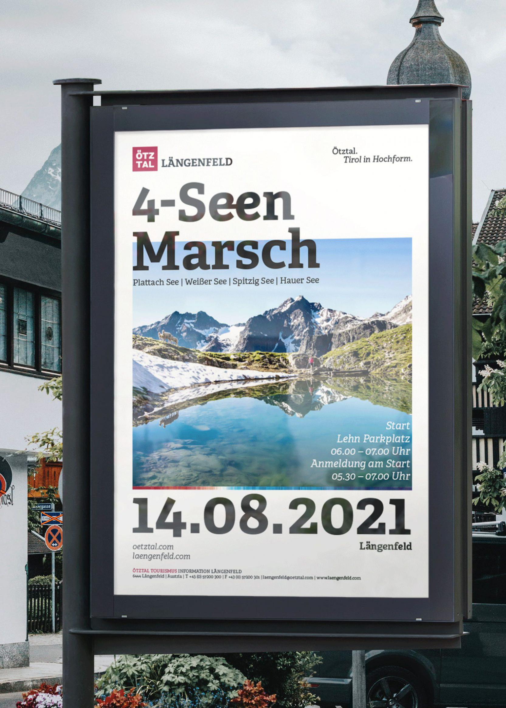
Some mock-ups of the tourist catalogues (image by NORDEN).
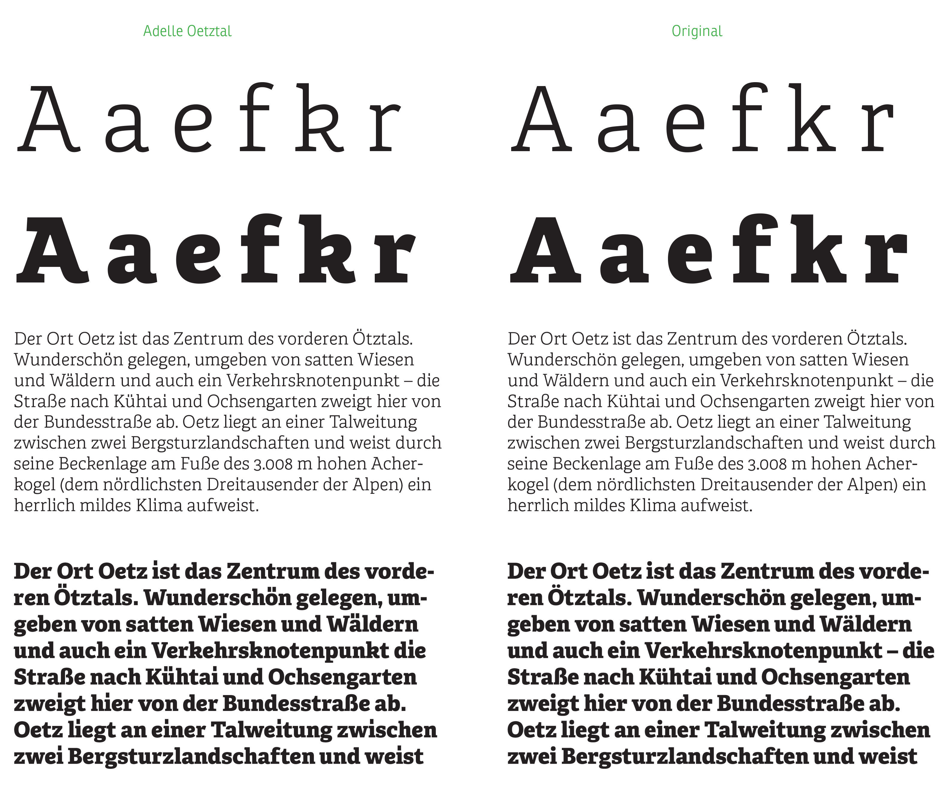
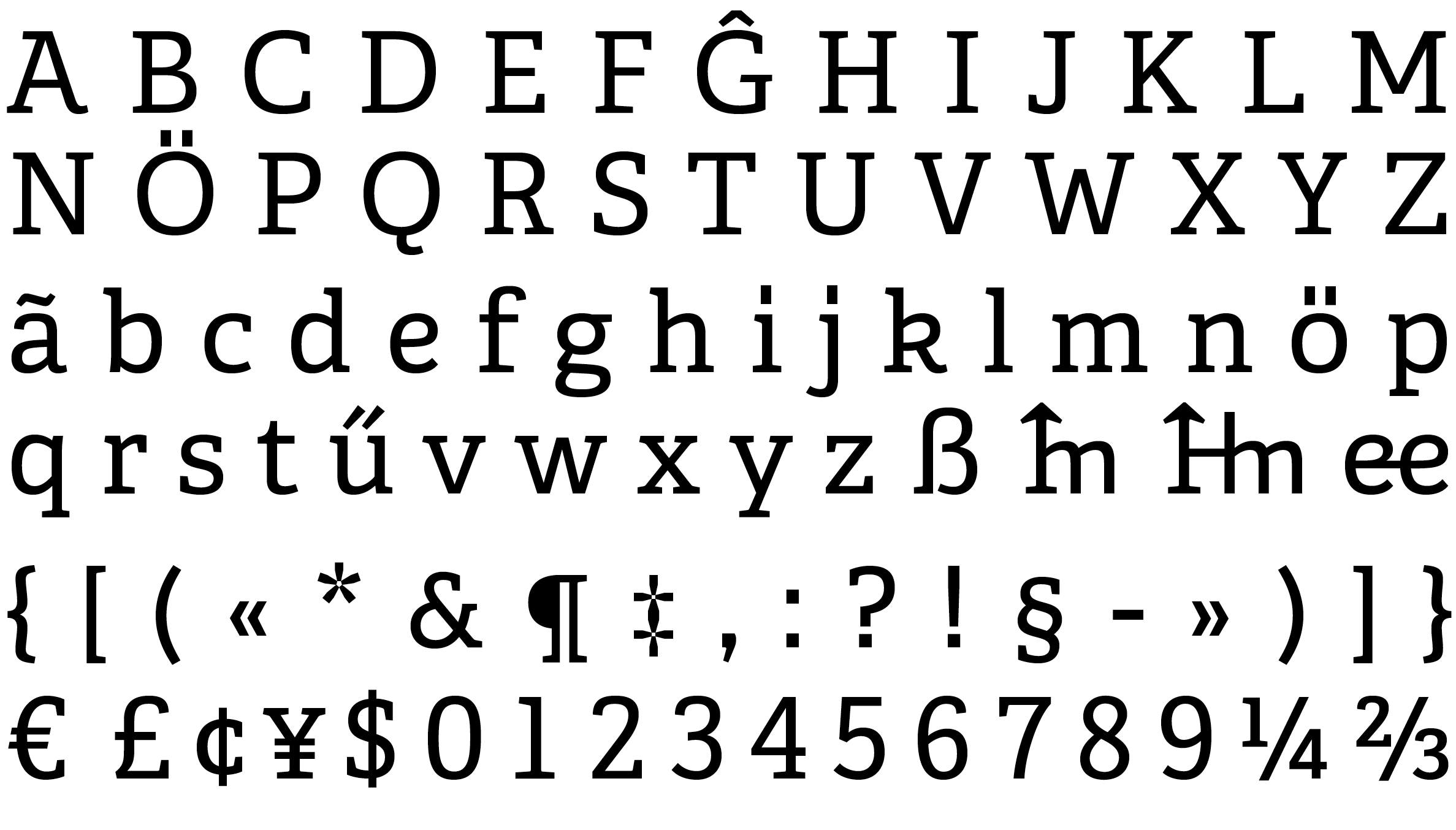
Comparison between the original Adelle (right column) and Adelle Ötztal (left coumn) with six modified letters as default characters.
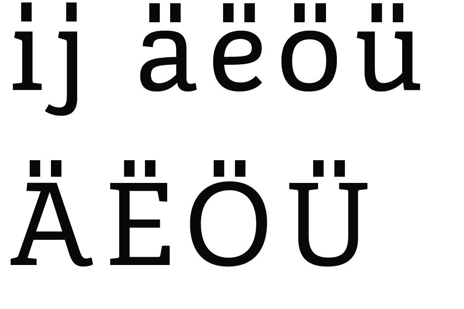
All dots were changed to elongated squares to resemble the Ötztal logotype, resulting in the need to modify other characters to maintain balance.
TypeTogether is an indie type foundry committed to excellence in type design with a focus on editorial use. Additionally, TypeTogether creates custom type design for corporate use. We invite you to browse our library of retail fonts or contact us to discuss custom type design projects.