Protipo and the Variable Font Format

March 2018

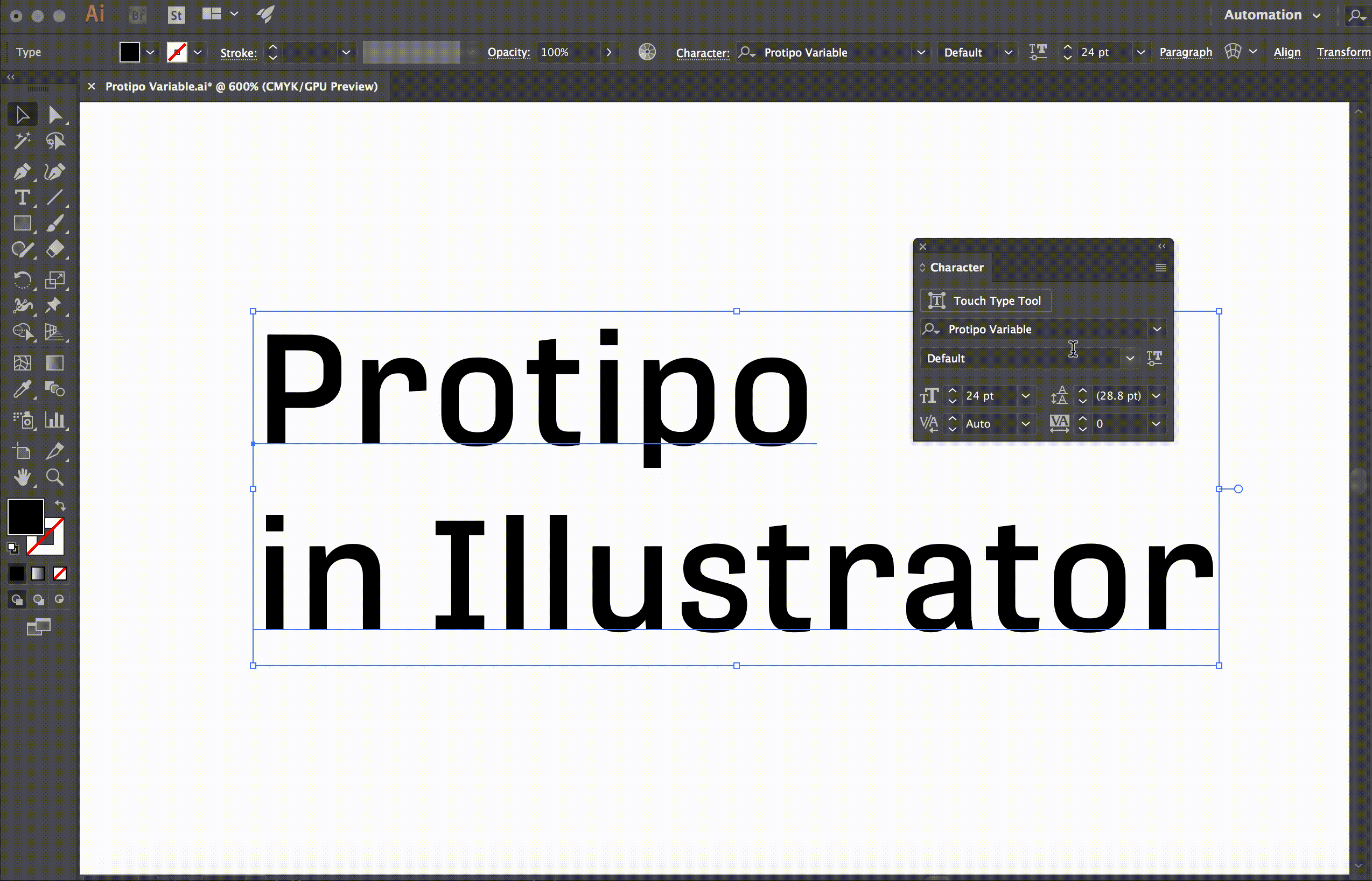
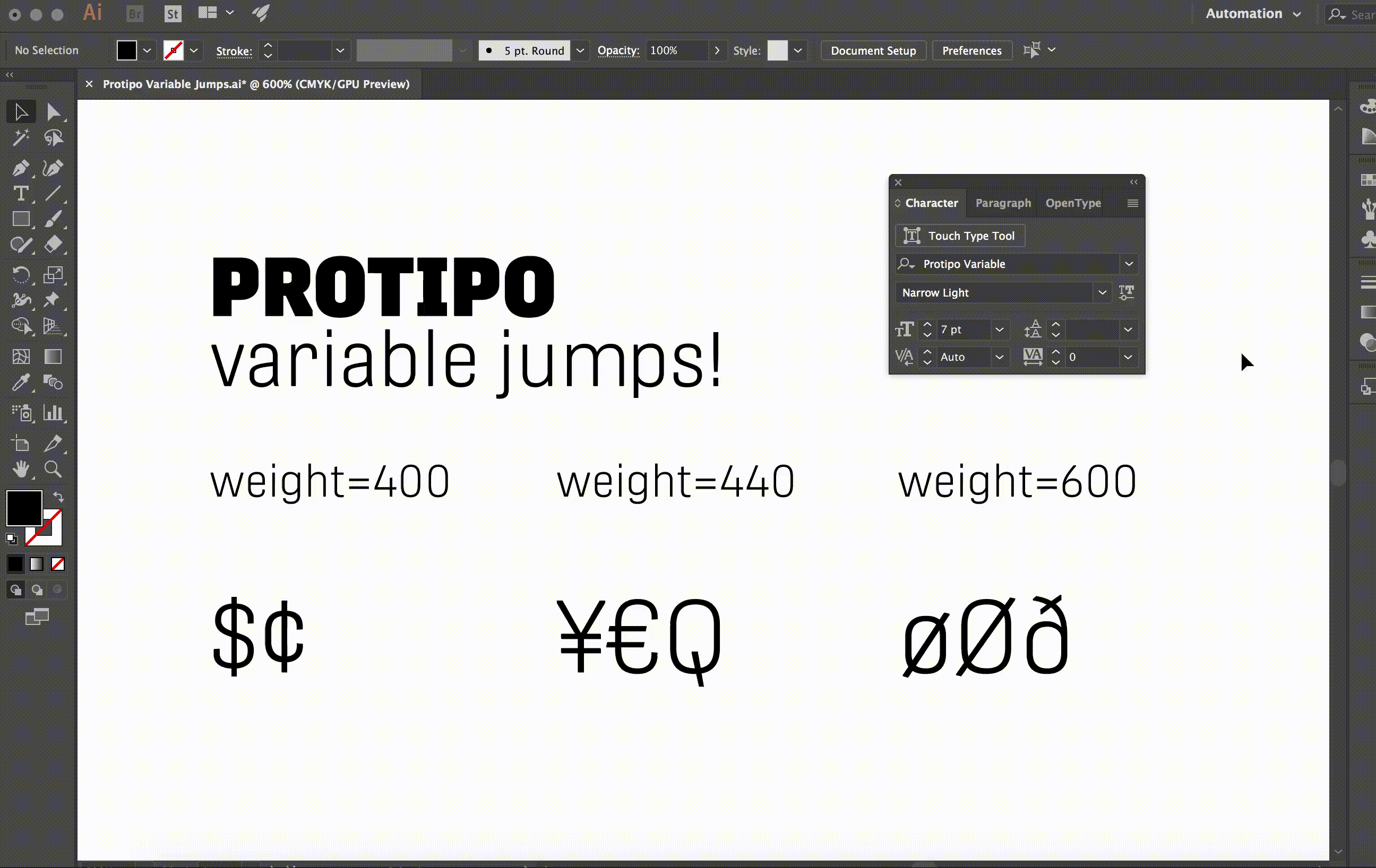
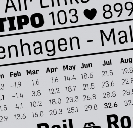
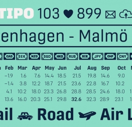
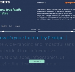
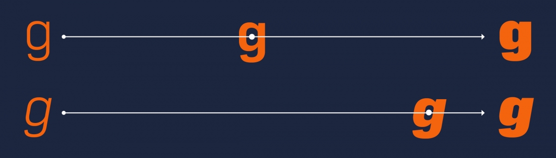
Protipo is a font family intended for information design where flexibility, precision, and fine-tuning are required. For these reasons we decided to include a wide variety of weights and styles. Halfway through the project we realised that these criteria match perfectly with the new idea of OpenType font variations, and it would be a real benefit for the user to be able to manually adjust the font to their exact needs.

by irene vlachou

In September 2016, the 1.8 update to the OpenType format was announced which added variable support — a feature that for many years type designers had conceived and used in their font development, web typographers had been craving, and for which the rest of us were filled with a mix of excitement and terror!

Type designers already had this kind of infinite design flexibility and versatility at hand in various font editing tools, but now it was to be unleashed into the hands of digital type users. Of course there are skeptics and believers. A very interesting statement from Indra Kupferschmid in her talk during this year’s Robothon (2018) was when she warned type designers of the sometimes boring results of this new technology. I’m one of the believers and in this article I’ll try to explain why, with the help of illustrations done in Drawbot by TypeTogether resident font-tamer Joancarles Casasin.


OpenType variations at use in the Protipo font family

variation feature

Variable Fonts, as have been described in the official announcement, are a single font file that behaves like multiple fonts. It is basically the same as a standard TTF or OTF file, but which contains information about multiple styles of a traditional font family and requires the user to install only one file.

This compressed file has many advantages, from the clean and easy installment of just one font file to easy navigation between styles. One variable font contains all the styles of a traditional family. For the convenience of the user, the variable file contains named instances that correspond to each weight of the family. So whenever you use the Protipo Variable font and you see in the application’s font menu Protipo Variable Bold, this is in practice just like using the normal Protipo Bold font.

Apart from the named instances, the user can navigate smoothly around the entire design space of the font: “in-between” stages of the design, a weight anywhere between SemiBold and Bold, and a width anywhere between Condensed and Expanded. These “in-between” styles aren’t defined by the type designer as such, but the type designer has explored the design space of this font family and has made the required adjustments in the master styles of the family in order to avoid bad interpolation of weights, widths, styles, etc. that don’t make sense to exist.

This hasn’t been fully explored yet and there is an ongoing discussion of how the type designer can predict and also forbid, if you like, styles outside the appropriate range.


small file size

Another advantage of the new Variable Font format, and for many the greatest advantage, is the small size of the file. That makes it more usable for online typography and embedding in applications.

Proof of the success of the launch is that the new technology has already been welcomed and supported natively in the majority of modern browsers (latest versions of Safari, Chrome, Firefox, and Edge on Windows). Richard Rutter’s article gives detailed tips on how to implement Variable Fonts in CSS.

Adobe Photoshop and Illustrator now support Variable Fonts and the user can find the controls in the font panel by pressing the Variable Font button next to the Font Style menu. Dan Rhatigan, in his presentation of Adobe Originals’ Variable Fonts, gives nice examples of how Adobe’s apps support them.


Protipo Variable fonts: glyph design details.

“jumps”

On that note, a couple of months after the announcement of the new 1.8 OpenType Variable format, Adobe published their own prototype Variable Font on GitHub, a prototype with source code that includes, apart from the basic functions, the code for the new FeatureVariations table. FeatureVariations allow character switching for typographic tweaks in specific regions of the design space. We call them jumps. Thanks to Miguel Sousa, the code is available online for everyone to read and adapt. Protipo Variable uses this technique for ten characters switching in three different values (at weight 400: ‘$’, ‘¢’, at 440: ‘€’, ‘¥’, ‘Q’, and at 600: ‘Ø’, ‘ø’, ‘ð’), values which are appropriately tuned for each character.

For a complete list of articles and video presentations on Variable Fonts visit the new Resources page on Axis-Praxis. For beautiful examples of web uses, visit the Codepen collections of Mandy Michael and Jason Pamental. And lastly, if you want to play with Protipo Variable, please visit our online specimen on Axis-Praxis: Protipo, and if you want to experience the full potential of Protipo Variable in your projects, simply get the full Protipo bundle. The variable font format is included.

Jump, stretch, and enjoy!

Article written by Irene Vlachou and edited by Joshua Farmer.


About Us

TypeTogether is an indie type foundry committed to excellence in type design with a focus on editorial use. Additionally, TypeTogether creates custom type design for corporate use. We invite you to browse our library of retail fonts or contact us to discuss custom type design projects.